Tracking events for

1. Onboarding started/project created
2. Onboarding finishes
3. API token generated
4. Sdk example clicked

Not tracking events that can happen multiple times and results are
skewed

1. Moving between onboarding steps
1. Now the dialog will not close when SDK got connected
2. It will start to show the suggested production code. ( this will be
attached in next PR)
3. Also, it has connected indicator on the right
4. Back button is removed in this stage.

---------
Co-authored-by: Tymoteusz Czech <2625371+Tymek@users.noreply.github.com>
Allow you to edit default strategies in the UI if you have the
update_project or project_default_strategy_write permissions. These are
the same permissions that we use in the API.

Previously, we used the update_feature_strategy permission here, but
that one is intended to be used for updating strategies belonging to
actual flags.

One of the trickier bits here is that we use the `StrategyVariants`
component, which previously had baked in the permission required
(update_feature_environment_variants). Because the permissions are
different for the default strategy, I updated the component to make it
configurable, but for the default to be the old permission (so that
other uses aren't affected).
Previously, you needed read access specifically to see default
strategies. So even if you could write default strategies, you
couldn't access them in the UI without the read permission too.

This changes it so that you can see default strategies if you have
write permission.
After we implemented new feature flag creation flow, this are not used
anymore.

Creation is now handled by **CreateFeatureDialog**.

Also edit component can be minified, because it does not need so many
fields anymore.
There's a bug where the UI will fetch all features every time you load a
project screen (including every time you filter the project results).

The reason is that the create flag dialog was rendered (just not open)
every time. To solve it, we instead wrap it in an extra component that
prevents all the fetching and setup from running when the dialog isn't
open.

Additionally, we'll lower the page size for the global fetch limit to 1,
so that we send less data.
Fixes a bug in the navigation when you create a project. It used to be
that we'd replace the current entry in the browser history when we
took you to a separate form for it. However, now that we instead
use a dialog, we don't want to replace the history.

Before: if you created a project and navigated back, you'd be taken to
the page you were at BEFORE you went to the projects page, whether
that was in Unleash or otherwise.

Now you'll be taken back to the projects page.
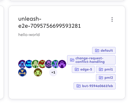
Extracts the Avatar Group component into a `common` component and adds a
standard tooltip to all avatars.
Relates to linear issue 1-2606
This is a suggestion / proof of concept for how we can solve it. While I
think we can merge this as is, I'd also be happy to take any discussions
on other ways to approach it etc.
## Why are these changes made together?
Because extracting the avatar group without adding the new tooltip data
made the existing tooltip misbehave (it'd show up in the top left of the
screen, not synced to the avatar in any way).
I probably could have (and still can if you think it's prudent) split it
out such that the avatar gets a standardized tooltip first (and disable
it for the group card avatars), and split out the avatars in a
follow-up. Happy to do that if you think it's better.
## What does this mean?
It used to be that we had no consistent way of dealing with avatars and
tooltips. Some places had them, some places didn't. This change makes it
so that all avatars that we can show tooltips for will get the same
tooltip.
Previously, we had at least 4 different ways of dealing with tooltips:
- The HTML tooltip (that would be standardized with this PR) in the
project flags table

- The "title" that you'd get on your user avatar
- The group card list tooltip

- And sometimes you'd get nothing at all

with this change, we'll always show the same kind of tooltip if we can:

## What goes in the tooltip?
We use the `UserAvatar` component for a fair few different things and I
didn't want to extract separate components for all the different use
cases. Instead, I wanted to get an overview over what we use it for and
what is relevant info to show.
I found all the places we used it and tried to form an opinion.
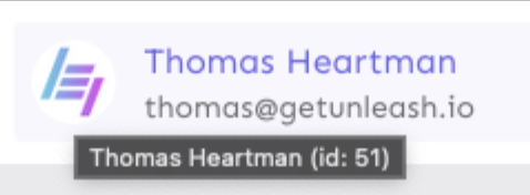
This tooltip will work with a user's email, name, username, and id. If
there is no user (such as for empty avatars and avatars displaying only
"+n" for remaining members), we show no tooltip.
Following the example set by the group card avatars, we'll try to use
email or username (in that order) as the main bit of text. If the user
has an email or a username and also a name, the name will be used as
secondary text.
If the user does not have an email or username, but has a name, we'll
use the name as the main text.
If the user does not have an email, a username, or a name, we'll try to
show "User ID: N" if they have an id.
If they do not have a username, a name, an email, or an ID, we bail out
and show nothing.
## Why can you disable the tooltip?
In some cases, you might want to disable the tooltip because you have
more information to feed into it. An example of that is in the project
flags table, where we want to show more information in cases where the
user is 'unknown':

## Additional fixes
This PR also adds a few lines of CSS to fix a minor avatar layout bug.
Before:
After:
