Use event.preventDefault to prevent the app from trying to submit the
legal values (or the strategy) form when you hit "enter" in the legal
values filter input.
Code for constraint accordion was copy-pasted before previous
improvement. Old version is still in use for Segments. When we get to
improving constraint editing we should rebuild segments editing, without
use of this code.
Implements the first step towards implementing the new design for
constraint editing. All the edit functionalities work as and when you do
them now, but there is no validation of the values you put in that's
happening.

The inverted / not inverted button and the case sensitivity button are
placeholders. They should use icons and have proper descriptions of what
they do. I'll do that in a follow-up.

The way to enter values is currently always in the section below the
main controls. Again, more work on this is coming.

Current look:

With case sensitive options:
<img width="769" alt="image"
src="https://github.com/user-attachments/assets/bfdfbac1-cc95-4f26-bf83-277bae839518"
/>

With legal values:
<img width="772" alt="image"
src="https://github.com/user-attachments/assets/14f566cc-d02a-46dd-b433-f8b13ee55bcc"
/>
This PR creates/steals the logic and basic components that we need for
the new constraint editing design and shows it instead of the old one if
the flag is on.

The interface needs a lot of work, but this essentially wires everything
up so that it works with the API on direct editing:

<img width="781" alt="image"
src="https://github.com/user-attachments/assets/97489a08-5f12-47ee-98b3-aefc0b840a2b"
/>

Additionally the code here will need a lot of refactoring. This is a
first draft where I've yanked all the constraint editing logic out of a
nested hierarchy of components that handle validation and lots more. I
expect to clean this up significantly before finishing it up, so please
excuse the mess it's currently in. It turns out to have been lots and
lots more logic than I had anticipated.

This is just a PR to get started, so that the next one will be easier to
work on.
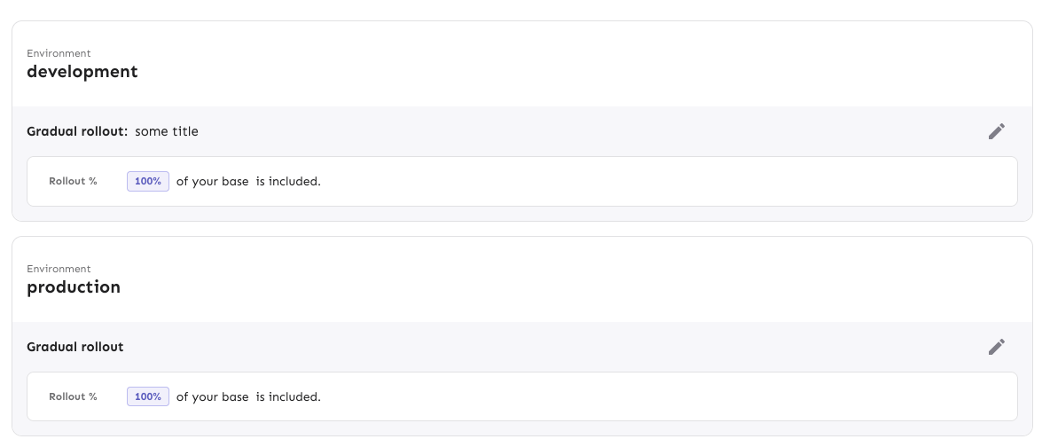
Adds focus styles to the env accordion header only when the focus is on
the header itself (not on the env toggle inside the header). The focus
style is consistent with what we do for other accordions (dashboard,
milestones).
Middle one is focused:

Focus is on the toggle inside the top one (yeh, we should have better
focus styles for toggles; but that's not for now):

Open and focused:

Getting the consistent background for the header when it's open is a
little tricky because the accordion container and summary are split into
different files. ~~This first iteration used a class name for the
specific header (because envs can have multiple accordion headers inside
them, e.g. release plans) and setting a CSS variable in the summary, so
that the background matches.~~ I found out that I only need to set it in
the parent anyway 😄
Without it, you get this (notice that there is a little white outside
the lower corners):

Implements the drag-n-drop tooltip the first time the user sees a
strategy drag handle on the feature env overview. It uses React Joyride,
which is the same system we use for the demo.
The design is a little different from the sketches because I couldn't
find a quick way to move the content (and the arrow) to be shifted
correctly.
If the demo is also active the first time a user visits a strategy page,
it'll render both the demo steps and this, but this tooltip doesn't
prevent the user from finishing the tour. It might be possible to avoid
that through checking state in localstorage, but I'd like to get this
approved first.
The tooltip uses the auth splash system to decide whether to show the
tooltip, meaning it's stored per user in the DB. To avoid it
re-rendering before you refetch from the back end, we also use a
temporary variable to check whether the user has closed it.
Rendered:

If the tour is also active:

Extracts the shared strategy list and list item into the `common` folder
instead of living in the environment accordion body file.

Also takes the disabled strategy handling that we use for
`StrategySeparator` and moves it into the file itself. It might be
something we want to decorate manually in the future, but we don't for
now, so this was the most straight-forward way to make it work.
Implements the new design for playground constraints. They're not in use
in segments yet, and strategy parameters have not been touched. This PR
establishes a pattern that we can follow for strategies and parameters
later.
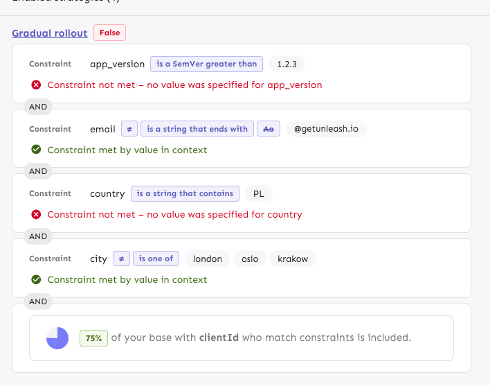
The PR also includes a change in how the constraint item organizes its
children: it now takes care adding padding and spacing itself, instead
of the children doing that. It looks right most places, but segments
aren't quite right anymore. However, as this is behind a flag, I'd
rather fix that in a separate PR.
---------
Co-authored-by: Tymoteusz Czech <2625371+Tymek@users.noreply.github.com>
- new way of showing strategy variants
- fixed wrapping issue in strategy editing, for a lot of variants
defined (`SplitPreviewSlider.tsx` change)
- aligned difference between API and manually added types
Implements the new strategy list design for default strategies. Moves
the old impl into a legacy file. Also: removes the description from the
strategy item. From my digging, we only showed this for default strategy
items and it didn't really provide any useful information. The only
other place you can add a description is for custom strategies (at least
that I could find), but these are deprecated and we never show the
description when you apply the strategy anyway.
Rendered:
Without the flag (nothing changes):

Moves strategy titles and names onto the same line, as per the new
designs.
In doing so, I've also updated the component to use a more semantic
hgroup with the header being the strategy title if it exists or the
strategy name if not.
The downside of being more semantically correct here is that we need to
know what header level we want the strategy to use. In most cases,
that's 3 (e.g. flag name > environment > strategy, release plan >
milestone > strategy), but for plans on flag envs, it's 4 (flag name >
env > milestone name > strategy).
I've also taken the opportunity to fix a little mistake I made earlier.
`ol`s can only have `li` children, and I'd forgotten to wrap a nested
`ol` inside an `li`. The changes in `EnvironmentAccordionBody` all
relate to that change. Because we now have several layers of lists
nested within each other, dealing with styling and padding gets a little
tricky, but CSS has the power do help us out here.
Rendered:

Avoids absolutely positioning the drag handle by instead creating a two
column grid where column 1 is the drag handle, column two is the
milestone card. The grid has a negative margin based on the padding of
the form container. I wanted to avoid modifying the form container
component (because we use it in so many places), so I used css variables
to store the information and hook into that further down the line.
Rendered:
Wide:
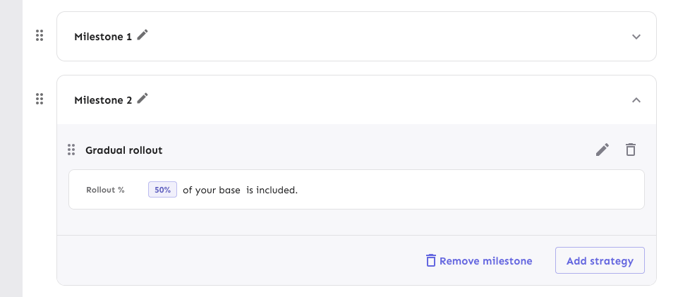
Narrow:

## Known bugs and limitations
The current drag implementation has some issues if you try to drag
something over a large, expanded card. They'll trade places visually,
but when you let go, the revert back to where they were. We can avoid
that by modifying the onDrop function in the drag handler, but I don't
want to do that before checking all the other places where we do drag
and drop ([linear
ticket](https://linear.app/unleash/issue/1-3458/drag-and-drop-is-a-little-finicky)).
I also want to get UX to sign off on this before making those changes.