On insights and project status, we would like to show "technica debt"
instead of "health". New value is that of `1/health`, or simplified:
`healthy flags / total flags`
We're migrating to ESM, which will allow us to import the latest
versions of our dependencies.

Co-Authored-By: Christopher Kolstad <chriswk@getunleash.io>
Fixes a bug where the dashboard would scroll you down from the top of
the page on load if your window was too short too see both the
selected flag and the selected project.

This solves it by immediately scrolling to the top of the page after
scrolling your selected element into view. Because this hook only runs
on page load, it shouldn't be safe. (At least I couldn't make this
misbehave with manual testing).

It also changes the list scroll behavior to scroll your selected item
to the top of the list instead of to the bottom (effectively). During
testing, that seems like a better solution to me.

## Background (or why do we auto-scroll here?)

The dashboard's flag and projects panels stores your last selection,
so that when you return to the page you'll be shown what you were
looking at last. This is especially useful if you have a lot of flags
but you're focusing on one in particular.

However, if you **do** have a lot of flags, then it's also quite
likely that your selection will be "below the fold" of the panel, and
you won't see your selected flag/project immediately in the
list (without scrolling).

It seemed like a nice UI affordance to automatically bring your
selected item into view (especially because without it, there's no way
to see what flag/project) you're looking at, so I added the

[`scrollIntoView`](https://developer.mozilla.org/en-US/docs/Web/API/Element/scrollIntoView)
hook.

What I didn't realize, however, is that it scrolls all scrollable
ancestor containers, which means that if your screen is too short,
it'll scroll you down the page.

From my reading of the docs and some local testing, I don't think
there is a way to limit the scrolling to only the nearest ancestor, so
the easiest way to ensure that we're always at the top seemed to be to
just scroll to the immediately after.
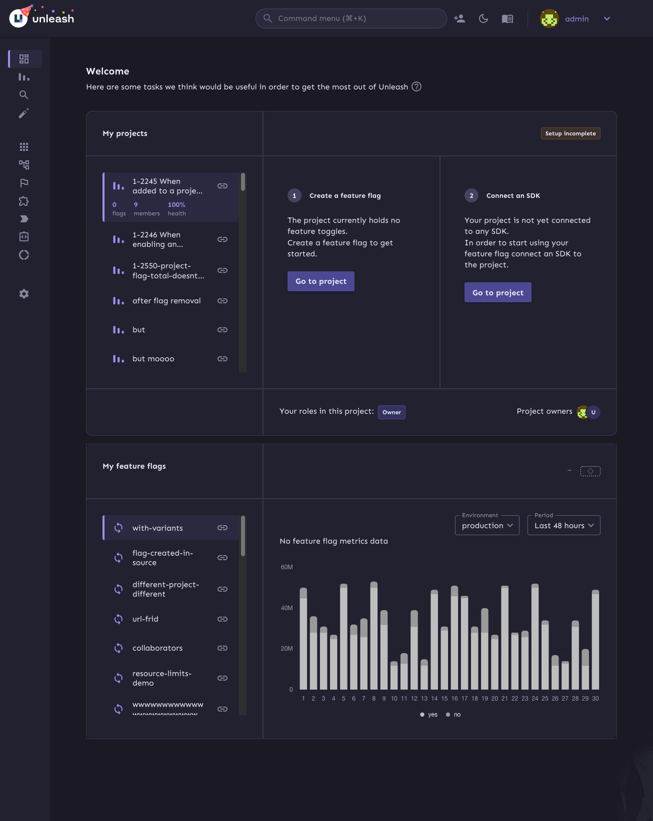
This PR continues the refactoring of the front end code for dashboards.
The main points are:
- Extracts the `ActionBox` component that we used in a lot of places.
There were some minor differences between the various incarnations, so
this also better aligns them.
- Extract other components (`AskOwnerToAddYouToTheirProject`,
`YourAdmins`)
- Move the `NeutralCircleContainer` into `SharedComponents`
- Delete the separate no content grid (this is now handled in projects
instead)
- extract my projects grid contents into a single function so that it's
easier to understand what content you get for what states
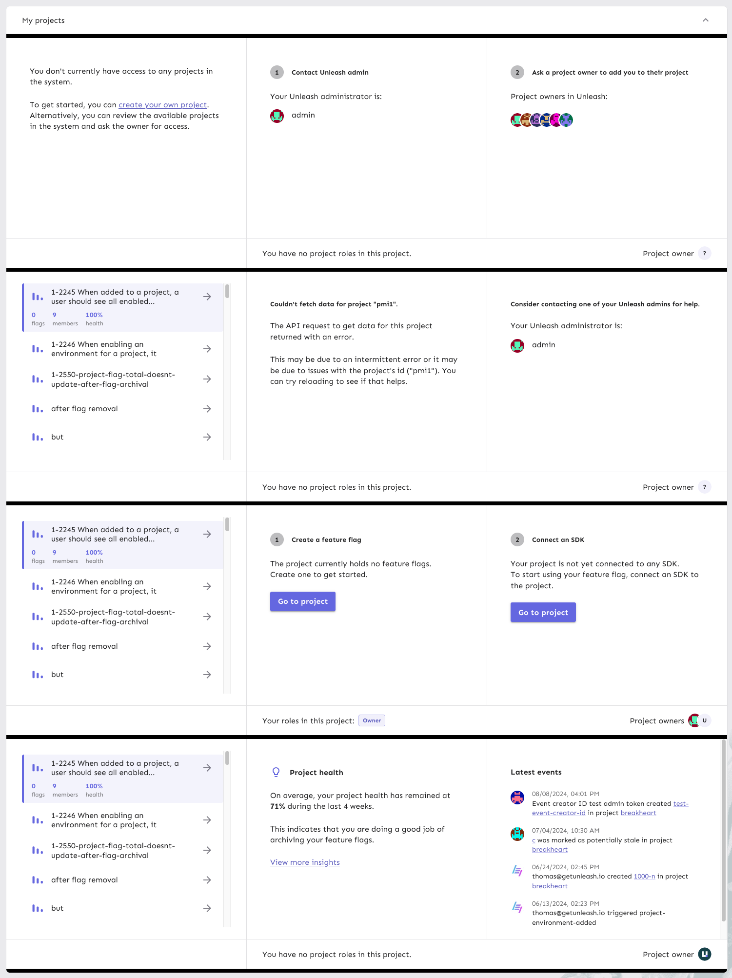
Here's all the states side by side:
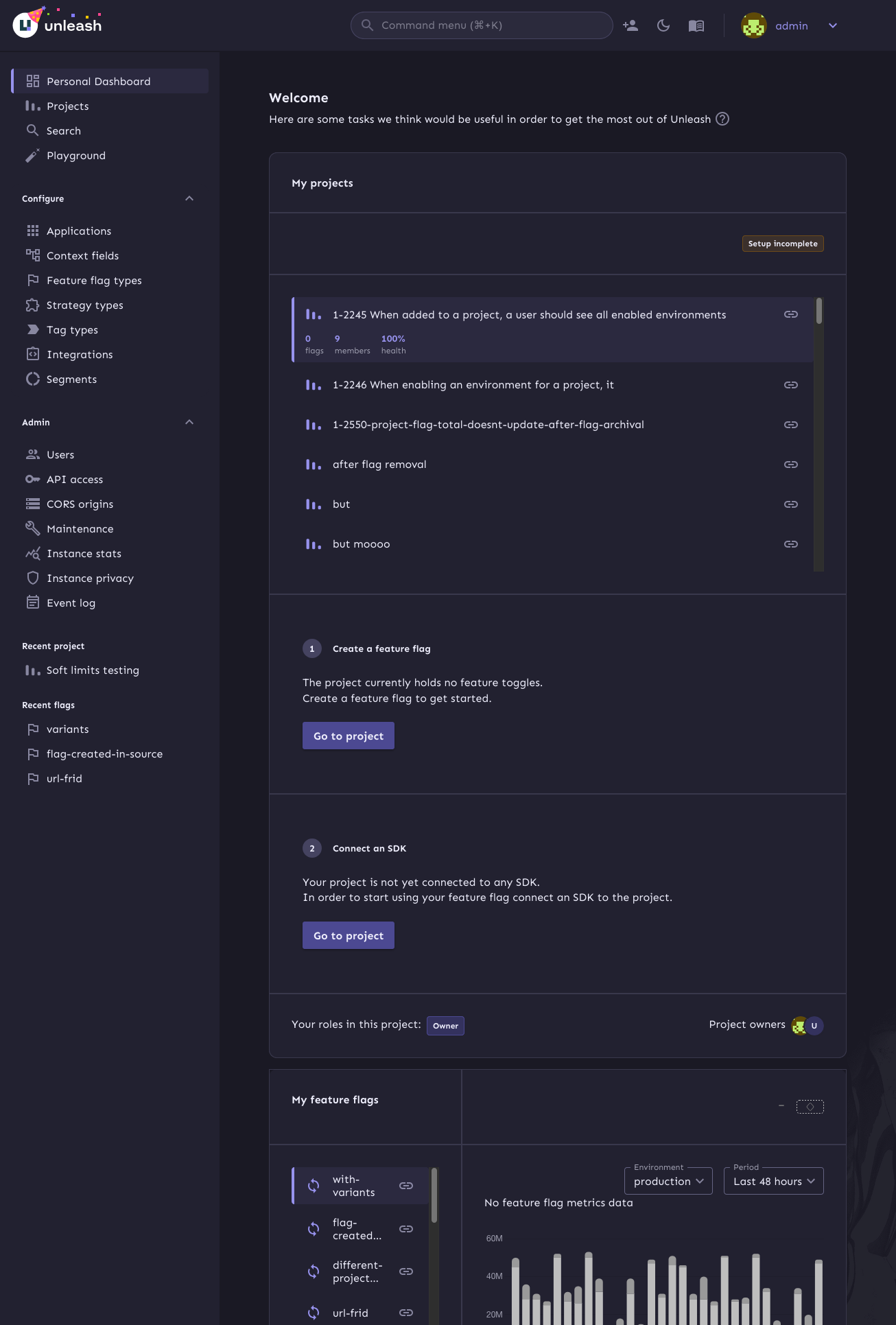
This is the first step in refactoring the front end code for personal
dashboards.

At this point:
- extract `useDashboardState` to its own file
- extract my flags to its own file
- Rename `Grid.tsx` to `SharedComponents.tsx` as it contains more than
just the grid.
This PR fixes issues with section sizes including:
- Jank when they change suddenly
- Overflowing list of admins / events
- Short lists that should stretch to the height of their container.
This PR adds plausible tracking for navigating to items from the
personal dashboard.

It tracks:

- Navigating to projects from the list
- Navigating to projects from the onboarding screen
- Navigating to flags from the list
- Opening the key concepts dialog
This PR stores the dashboard state (selected project and flag) in
localstorage so that you get taken back to the same project and flag
when you refresh the page or navigate away and back.

It also handles scrolling the selected items into view in case they're
below the fold.
The main goals of this are:
1. Make it so that the layout grid doesn't break on small screens
2. Fix an issue where the border of the box didn't fit the outline
3. (Bonus): make the layout of the info box depend on the **box's**
size, not the screen size.
To achieve those goals, this PR:
1. Switches to using a native CSS grid instead of MUI's grid component.
This gives us more power over the layout in various different sizes.
2. Switches from putting borders on the boxes inside the grid, instead
makes the grid container the color of the border and uses gaps to create
borders.
3. If your browser supports it, it will use container queries to
determine whether we should display the layout as a multi-column grid or
in a single column.
Container query demo (both with the same screen sizes):
Sidebar closed:
Sidebar open:
This commit uses the now-included project owner and role information
to populate the owner/role section. If you have no roles, we'll tell
you that you don't instead of displaying an empty set of badges.