Extracts the shared strategy list and list item into the `common` folder
instead of living in the environment accordion body file.

Also takes the disabled strategy handling that we use for
`StrategySeparator` and moves it into the file itself. It might be
something we want to decorate manually in the future, but we don't for
now, so this was the most straight-forward way to make it work.
Gives a small update in how we deal with unevaluated and disabled
strategies in the new playground design:
- "Unevaluated" badges go from yellow warning to blue info and their
text changed to "Not evaluated"
- Don't show "Not evaluated" badges on strategies that are disabled.
To avoid this change affecting the current playground setup, I
duplicated the old resultschip into a legacy file and changed the
existing impl. To avoid updating all other files that use that chip
(it's all over the playground) and checking flags or creating duplicates
there, I decided to do a quick check at the top of the legacy file and
use the new file if the flag is on.
In doing so, I've also simplified the actual chip file and have more or
less cut the total line count in it in two 😄

Flattens the list of strategies when you have both release plans and
strategies. If you had both, you'd have this setup before:
```
- ol
- li // release plan
- ol // release plan strategies
- li // regular strategies
- ol // strategy list
```
Now we drop the extra nesting:
```
- ol
- li // release plan
- ol // release plan strategies
- li // the rest of the strategies
```
Semantically, I think this is just as valid and it simplifies a lot of
styling that no longer needs to look for other lists etc.
As part of doing this, I have also moved the "many strategies" warnings
and pagination labels to outside the list instead of inside the smaller
list.
Otherwise, the list looks just the same as before and drag-n-drop works
just fine.
(side note: these strategies shouldn't have drag handles 🤔 )

As a bonus, this PR also:
- Uses the disabled style separator for disabled strats in playground
and deletes some unused components I found.
Playground disabled strats (we probably don't want double orange badges;
I'll talk to UX):

Handle cases where flags have no strategies in the playground.
As part of this, also changes how we deal with the padding/margins in
the playground: instead of making all but one items in the playground
have to explicitly add padding, now we instead say that the only item
that needs to do something is the list, which uses negative inline
margins.
This also has the added benefit of adding all the top-level elements
(that is: that's not part of the strategy lists) inside the same
container, so we can control gaps between them with flex's gaps.
When you have no strategies (before):

When you have no strategies (after):

Implements playground results for strategies.
Old design:

New design:

Still left: segments.
I also discovered during this that some of the new hooks (and also some
of the new components) accept deprecated types
(`IFeatureStrategyPayload` in this case). If that should indeed be
deprecated, then we also shouldn't use it in the new hooks / components
if we can avoid it. I'll make a task for it.
---------
Co-authored-by: Tymoteusz Czech <2625371+Tymek@users.noreply.github.com>
Implements the new design for playground constraints. They're not in use
in segments yet, and strategy parameters have not been touched. This PR
establishes a pattern that we can follow for strategies and parameters
later.
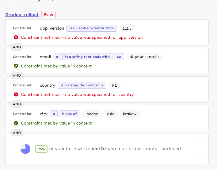
The PR also includes a change in how the constraint item organizes its
children: it now takes care adding padding and spacing itself, instead
of the children doing that. It looks right most places, but segments
aren't quite right anymore. However, as this is behind a flag, I'd
rather fix that in a separate PR.
---------
Co-authored-by: Tymoteusz Czech <2625371+Tymek@users.noreply.github.com>
Initial rough work on adapting the playground strategies to the new
designs. This PR primarily splits components into Legacy files and adds
new replacements. There are *some* updates (including spacing and text
color), but nothing juicy yet. However, I wanted to get this in now,
before this PR grows even bigger.
Updates the strategy list based on the new designs and moves the current
versions of the touched components into `Legacy...` files (the vast
majority of changes are that and updating imports). The relevant changes
to the components are listed in their original files.
Flag on:

Flag off:

## Next steps
There's two items to review for improving these current comments (also
noted inline):
- Whether to aria-hide the "or" separator or not (I need to read up a
bit and think whether it makes sense to show that or not)
- Changing the list of strategies into an actual ordered list (`ol`).
That'd reflect the semantics better.
Next would be checking the other places we use strategy lists and then
updating those too. In doing so, I might find that some things need to
be updated, but I'll handle those when I get there.
There's also handling release plans.
Fixes a small number of accessibility issues that Firefox was
complaining about (and some that I noticed myself):
1. In `CommandBar.tsx`, use a `Label` element instead of aria-label. We
can hide it with the `ScreenReaderOnly` component.
2. Add an `aria-label` to the icon button in the sidebar. (side note:
should we do any fancy detection on whether it's cmd + b or ctrl+b
there? I think we do that in the command bar)
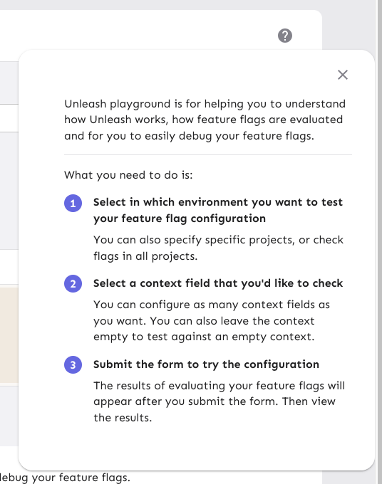
3. Update the playground guidance popper;
i. Add an aria-label to the icon button
ii. Make the popper a `Popover` instead. This fixes a few issues: It
wasn't possible to focus or close just using the keyboard before.
Because it didn't steal focus, it also meant that it'd cover other parts
of the page. Now it traps focus so you can navigate to the close button,
and escape will also close it for you.
iii. Remove aria-describedby. Using aria-describedby on the button would
mean that the **button** is described by its content, which seems wrong.
aria-describedby should also only be used for plain strings. Complex
markups isn't supported. For that aria-details is the right way to go.
But because the popover is only rendered when it's open, the details or
describedby link will point to nothing most of the time.
iv. In doing this, there is a slight change in the popover shadow (I
couldn't find onef of our shadows that did the same thing as before),
but it matches other popovers we have, such as on the data usage tab.
Before:
After:

As of PR #8935, we no longer support both text and title, and confetti
has been removed.

This PR:
- removes `confetti` from the toast interface
- merges `text` and `title` into `text` and updates its uses across the
codebase.
- readjusts the text where necessary.
This commit fixes invalid prop spreading warnings in all the table rows
I could find through a quick search in the code base.

The issue is that you can't spread the "key" prop into a component. It
*must* be an explicit prop.

The process is the same everywhere:
1. Instead of spreading `row.getRowProps()` into the component, we
extract and split it: `const {key, ...rowProps} = row.getRowProps()`.
2. Do the same thing for cellProps.
Fixes all warnings about the "key" prop. The majority of the fixes fall
into one of the following categories:

- Extracting "key" props in tables (you're not allowed to just spread
them in)
- Adding "key" props to autocomplete options and chips
- fixing test data that didn't contain ids
**Upgrade to React v18 for Unleash v6. Here's why I think it's a good
time to do it:**
- Command Bar project: We've begun work on the command bar project, and
there's a fantastic library we want to use. However, it requires React
v18 support.
- Straightforward Upgrade: I took a look at the upgrade guide
https://react.dev/blog/2022/03/08/react-18-upgrade-guide and it seems
fairly straightforward. In fact, I was able to get React v18 running
with minimal changes in just 10 minutes!
- Dropping IE Support: React v18 no longer supports Internet Explorer
(IE), which is no longer supported by Microsoft as of June 15, 2022.
Upgrading to v18 in v6 would be a good way to align with this change.

TS updates:
* FC children has to be explicit:
https://stackoverflow.com/questions/71788254/react-18-typescript-children-fc
* forcing version 18 types in resolutions:
https://sentry.io/answers/type-is-not-assignable-to-type-reactnode/

Test updates:
* fixing SWR issue that we have always had but it manifests more in new
React (https://github.com/vercel/swr/issues/2373)

---------

Co-authored-by: kwasniew <kwasniewski.mateusz@gmail.com>
Lots of work here, mostly because I didn't want to turn off the
`noImplicitAnyLet` lint. This PR tries its best to type all the untyped
lets biome complained about (Don't ask me how many hours that took or
how many lints that was >200...), which in the future will force test
authors to actually type their global variables setup in `beforeAll`.

---------

Co-authored-by: Gastón Fournier <gaston@getunleash.io>