1
0
mirror of https://github.com/Unleash/unleash.git synced 2025-10-27 11:02:16 +01:00
Commit Graph

234 Commits

Author SHA1 Message Date
Jaanus Sellin
7356453c0c
feat: view for recently used constraints (#9860) 2025-04-29 13:36:17 +03:00
Thomas Heartman
20a259fc4a
Chore/constraint value styling (#9853)
Fixes a few small styling issues with the constraint value chips:
- Background color was wrong
- They shouldn't have a border when they're not focused
 
Different styles: 
1. Keyboard focus
2. Mouse hover
3. No focus
4. No focus
5. Add values button for reference.
<img width="405" alt="image"
src="https://github.com/user-attachments/assets/ded98393-a7a8-4d4a-81ff-63a3f4d32184"
/>
2025-04-28 14:52:08 +02:00
Jaanus Sellin
1b031c9caf
feat: recently used constraints hook (#9850) 2025-04-28 15:51:50 +03:00
Thomas Heartman
b8c50e6ed2
1 3634/new icons 2 (#9851)
Adds new icons for the constraint operator buttons (equals and case
sensitive).
<img width="398" alt="image"
src="https://github.com/user-attachments/assets/2bd2a20f-700b-489a-b7d3-e6e26d80c316"
/>
<img width="442" alt="image"
src="https://github.com/user-attachments/assets/e5cca824-d8c0-4ea4-b137-c7c1eae642cc"
/>


The icons are all 24x24, so using them for buttons is pretty easy.

There is one caveat: The heights are very subtly off (~1.25 px) when the
buttons wrap and end up on a line without the input field, but it's
really not noticeable. In this screenie, the Aa button has is a tiny bit
smaller than the items on the row above:

<img width="328" alt="image"
src="https://github.com/user-attachments/assets/d89e2a01-9274-4d6f-b203-1fc3d487543f"
/>
2025-04-28 14:35:55 +02:00
sjaanus
5c894c78be
fix: remove pushed files 2025-04-28 15:02:59 +03:00
sjaanus
19cb225623
feat: recently used constraints hook 2025-04-28 15:01:46 +03:00
Jaanus Sellin
5c483c7d8d
feat: split and clean up constraint lists (#9839) 2025-04-28 13:46:22 +03:00
Thomas Heartman
44082b24a1
chore: second design pass for editable constraints (#9843)
Fix a number of visual issues with the main editable constraint
component.

I've introduced a few more layers of container nesting to make the
layout break the right ways:
- Put everything on the same line when on wide.
- At 700px place selected values on the row below
- From 700px down, when necessary, also wrap operator options


Support super long context names without breaking layout
<img width="399" alt="image"
src="https://github.com/user-attachments/assets/07555e9c-d875-417f-ae6b-d4600731d5eb"
/>

Wrap values at 700px width container:
<img width="703" alt="image"
src="https://github.com/user-attachments/assets/deb6e059-57d4-4e47-88da-3ec5d6bce751"
/>

Wrap operator options when necessary
<img width="359" alt="image"
src="https://github.com/user-attachments/assets/ff96db40-f47d-4ddf-bed7-dfced4d69973"
/>

Absolutely position delete button to allow to not push it out of the
container on narrow screens:
<img width="330" alt="image"
src="https://github.com/user-attachments/assets/c7b8f88d-538a-46a1-ae3f-e5a761b50289"
/>

Remove extra focus styling from MUI (darken select background):
Before:
<img width="348" alt="image"
src="https://github.com/user-attachments/assets/99aff08d-c1af-46c0-8a75-40c1ea3c103f"
/>

<img width="357" alt="image"
src="https://github.com/user-attachments/assets/b7a0edac-2716-48a7-b50c-b3437e5f5be8"
/>

After:
<img width="379" alt="image"
src="https://github.com/user-attachments/assets/74da884c-7b1a-4b9a-8383-31592326a71b"
/>
<img width="350" alt="image"
src="https://github.com/user-attachments/assets/0ebea696-5f7d-4d4e-b91c-b087a8fc56a3"
/>
2025-04-25 10:37:04 +00:00
Thomas Heartman
44e9023fb3
Don't show extra input component if we have "add values" button (#9842)
Makes it so that the InputContainer is only rendered if we don't have
the add values button up top. We might need to adjust this later (as we
get more sketches for other input types, such as single numbers, single
semvers etc), but it works for now.

With legal values  (no add values button)
<img width="765" alt="image"
src="https://github.com/user-attachments/assets/032cc848-584e-4c3f-83ed-be1fb1cdc0f8"
/>

Without legal values (but add values button)
<img width="763" alt="image"
src="https://github.com/user-attachments/assets/1a8fa68e-a73b-42fc-a1b8-e8f5997f3c5d"
/>

Because we don't handle single value cases yet, some of those inputs are
still stuck in an in-between state:
<img width="775" alt="image"
src="https://github.com/user-attachments/assets/25b6ae89-9267-4f06-a32d-3460abe4a847"
/>
2025-04-25 12:23:18 +02:00
Thomas Heartman
799fc1f518
1-3658/fix legal values selector issues (#9838)
Fixes an issue with the new legal values selector where selecting an
item from filtering or changing the checkbox state would move your focus
to the top of the page. I think it's because we'd re-render the whole
tree because of it, and this would clear your focus selection. To get
around it, I've used the existing ResolveInput component. We might want
to change this later as we get around to more input components (single
values, etc), but for now, I think this is good enough.

As a bonus, I get to delete the most annoying part of the
EditableConstraints file 😄

The constraint still opens in edit mode for now, but I expect that to
get resolved once we properly implement the split between editable and
non-editable constraints that was started yesterday.
2025-04-25 09:41:23 +02:00
Thomas Heartman
3bb54c5a9d
feat: 1-3652/legal value selector visual update (#9829)
Handles the visual changes for the legal value selector widget.

Before:
<img width="792" alt="image"
src="https://github.com/user-attachments/assets/0965d577-c4cf-4c1d-9fe7-f8f90d683988"
/>

After:
<img width="769" alt="image"
src="https://github.com/user-attachments/assets/33bdf40c-8bbb-4650-a6ba-c4b9e62f8cbd"
/>

I'm still working on improving the functionality of selecting from the
search input and not losing focus when you select/deselect an item (both
of these work (mostly) as expected on hosted, so we've introduced a
regression somewhere).
2025-04-24 12:17:05 +02:00
Thomas Heartman
08d0907d89
Always show the value list + hide "add values" on non-free text entries (#9817)
Removes the condition to hide the value list if we use legal values. 

In doing so, I also realized that focus handling when you delete the
last item in the constraint values list doesn't work if the add values
button isn't there (which it shouldn't be for legal values and more). So
I've hidden the add values button when it doesn't do anythnig helpful
(or for cases where we don't have designs yet). In cases where you don't
have the add values button and you delete the last constraint value,
we'll move the focus to the "delete constraint" button (that was easier
than making sure we pass refs all the way down into the operator select,
but we can change that later).

To facilitate this (refs coming from the parent component), I refactored
the value list component to accept the add values widget as a child (and
extracted it to its own file).
2025-04-23 10:59:10 +02:00
Thomas Heartman
77d72ce5a1
Stop "add values" from closing on adding a value (#9815)
Instead of closing the "add values" popover when you add a value, we now
keep it open to facilitate rapid entry of multiple values. It already
clears successfully and adds the new value to the list, so it's actually
quite smooth to use from just the keyboard now!

Additionally, I propose using a `form` element for the add values
popover, because it really is just a tiny form. This also allows us to
use regular form handling instead for submission instead of checking
what key the user pressed. It also means we don't need to specify the
action in the button, because the form handles it.

There's a few more things fixed: 
- I've added a label (only visible to screen readers) to the input label
(as per standard a11y guidelines).
- When you add a value by pressing the "add" button, your focus returns
to the input field, so that you can just start typing out the next one.
this is handy if you submit by mouse click or by tabbing to the button
instead of just hitting enter inside the input field.
2025-04-23 09:32:37 +02:00
Thomas Heartman
150a044207
Use svg icons for case sensitivity button and give it better textual representation (#9808)
Light mode:
<img width="110" alt="image"
src="https://github.com/user-attachments/assets/dba5dd69-685c-4259-ba07-f50ad7c66833"
/>
<img width="265" alt="image"
src="https://github.com/user-attachments/assets/1ac2e71b-36f7-4a90-b96c-38f9aee4cb51"
/>

Dark mode:
<img width="311" alt="image"
src="https://github.com/user-attachments/assets/780c2110-2871-4634-b755-e3e0e3681826"
/>
<img width="285" alt="image"
src="https://github.com/user-attachments/assets/fdf0d790-eee6-4640-823a-758570c53b2f"
/>
2025-04-22 12:25:05 +02:00
Tymoteusz Czech
5ef33b56d6
fix: import path for formatOperatorDescription (#9791)
Fixing build on main
2025-04-17 09:43:45 +00:00
Tymoteusz Czech
9d2174534f
refactor: deprecate old ConstraintAccordion and point to new version (#9613)
Code for constraint accordion was copy-pasted before previous
improvement. Old version is still in use for Segments. When we get to
improving constraint editing we should rebuild segments editing, without
use of this code.
2025-04-17 11:16:32 +02:00
Jaanus Sellin
923578c9ea
feat: add values chip styling (#9789)
Made chips coloring and paddings correct.


![image](https://github.com/user-attachments/assets/734072cf-b053-492a-ae27-134b1a530345)
2025-04-17 11:54:19 +03:00
Jaanus Sellin
9678054116
feat: styling of new add values (#9788)
1. Moved add values to the left.
2. Popover has new styling, as in designs


![image](https://github.com/user-attachments/assets/311670e1-7cb3-46ee-a6d7-fbbef9ac21f2)
2025-04-17 11:30:36 +03:00
Jaanus Sellin
187f265680
feat: add values button now actually adds value (#9768) 2025-04-16 11:52:36 +03:00
Jaanus Sellin
e9c50a551f
feat: remove add values for legal values (#9767)
This removes the add values nicely.


![image](https://github.com/user-attachments/assets/8fb84b51-c842-4a56-af21-ff5b66772538)
2025-04-16 11:06:46 +03:00
Thomas Heartman
c1bb905146
Fix type issues (#9745) 2025-04-16 10:36:29 +03:00
Jaanus Sellin
01c1ec5c29
feat: strategy status as checkbox (#9760) 2025-04-15 13:11:11 +03:00
Thomas Heartman
e9ec1db3b7
chore(1-3611): inline values list v1 (#9743)
Adds the easy parts of the inline values list: a list of chips that
shows you which values you have and that you can delete. You either
delete them by clicking the "clear" icon or by using del/backspace on
your keyboard.

If you use your keyboard we also handle switching your focus to the
appropriate element. By default, your browser may shift the focus to the
top of the window (which isn't very helpful). Instead, we handle it like
this:
- If you delete an item and there are more elements in the list: 
  - move the element to the next item if exists
  - if your element is the last item, move focus to the previous item
- if there are no more items in the list, move the focus to the Add
Values button

We still need to add the "add values" popover functionality. That's next
on the agenda.

Additionally, this switches how the containing flex container positions
its items along the cross axis (vertically) to "flex-start" instead of
"center". Because the values list can grow to multiple lines, it would
shift the "delete constraint" button and the constraint picker to the
middle of the expanded constraint. Now, instead they stay aligned to the
top. This causes a slight alignment issue with the button (due to the
invisible padding), but I don't want to look at that before the rest of
this is complete and we know how it all fits together. You'll notice
that the spacing between elements in that top row is also off anyway
(look at the value list being smushed up against the case sensitive
icon), so there's more work to do.

<img width="716" alt="image"
src="https://github.com/user-attachments/assets/225fcab8-03e4-46e3-92d4-82912eb40d46"
/>

Focus styles:

<img width="190" alt="image"
src="https://github.com/user-attachments/assets/6b07ab25-0a67-493c-9cac-839932b0d654"
/>

<img width="195" alt="image"
src="https://github.com/user-attachments/assets/9d5b323e-bf65-4eca-9008-a45ce0139a2b"
/>


Hover styles:
<img width="96" alt="image"
src="https://github.com/user-attachments/assets/f19e1945-d2be-4e87-8005-76cb6beb1f50"
/>
2025-04-10 15:50:51 +02:00
Jaanus Sellin
67c0ffa1ab
feat: segment chip recoloring (#9742) 2025-04-10 12:51:09 +03:00
Jaanus Sellin
49a1dac2c9
feat: targeting info box new styling (#9740)
Updated styling of info box


![image](https://github.com/user-attachments/assets/983339b7-102d-440e-a937-4972d04496c9)
2025-04-10 11:20:02 +03:00
Jaanus Sellin
8da5fe6811
feat: strategy menu interaction between two dialogues. (#9732) 2025-04-09 15:14:45 +03:00
Thomas Heartman
48b9be709e
Chore(1-3598): new constraint edit design iteration 1 (#9727)
Implements the first step towards implementing the new design for
constraint editing. All the edit functionalities work as and when you do
them now, but there is no validation of the values you put in that's
happening.

The inverted / not inverted button and the case sensitivity button are
placeholders. They should use icons and have proper descriptions of what
they do. I'll do that in a follow-up.

The way to enter values is currently always in the section below the
main controls. Again, more work on this is coming.

Current look:

With case sensitive options:
<img width="769" alt="image"
src="https://github.com/user-attachments/assets/bfdfbac1-cc95-4f26-bf83-277bae839518"
/>

With legal values:
<img width="772" alt="image"
src="https://github.com/user-attachments/assets/14f566cc-d02a-46dd-b433-f8b13ee55bcc"
/>
2025-04-09 14:08:04 +02:00
Jaanus Sellin
02aadfe1bb
feat: update strategy window styles, extract old and new components (#9730) 2025-04-09 13:41:18 +03:00
Jaanus Sellin
a92c79e2dd
feat: styling of AND operator in strategies (#9726) 2025-04-09 11:00:05 +03:00
Jaanus Sellin
827b8f274a
chore: make popover center of screen (#9725) 2025-04-09 09:41:30 +03:00
Jaanus Sellin
45a0ddd2a5
fix: fix hover on release template card (#9721)
For some reason, using template literals do not work after its in
enterprise repo. I will try something that matches more over codebase
style.
2025-04-08 15:55:07 +03:00
Jaanus Sellin
84dbae20e8
feat: remove + from the segment dropdown (#9714) 2025-04-08 14:18:01 +03:00
Jaanus Sellin
6c74c994aa
feat: release plan review dialogue (#9712) 2025-04-08 12:24:09 +03:00
Thomas Heartman
5e35a0fa22
chore: Set up the basis of the new constraint editing component. (#9701)
This PR creates/steals the logic and basic components that we need for
the new constraint editing design and shows it instead of the old one if
the flag is on.

The interface needs a lot of work, but this essentially wires everything
up so that it works with the API on direct editing:

<img width="781" alt="image"
src="https://github.com/user-attachments/assets/97489a08-5f12-47ee-98b3-aefc0b840a2b"
/>

Additionally the code here will need a lot of refactoring. This is a
first draft where I've yanked all the constraint editing logic out of a
nested hierarchy of components that handle validation and lots more. I
expect to clean this up significantly before finishing it up, so please
excuse the mess it's currently in. It turns out to have been lots and
lots more logic than I had anticipated.

This is just a PR to get started, so that the next one will be easier to
work on.
2025-04-07 14:50:42 +02:00
Jaanus Sellin
58d123e998
feat: release plan hover buttons (#9703) 2025-04-07 11:32:31 +03:00
Jaanus Sellin
9a4eb059e6
feat: strategy selector screen updates (#9692) 2025-04-03 14:51:00 +03:00
Jaanus Sellin
89724209cd
feat: new styling for strategy selector (#9683) 2025-04-02 14:55:36 +03:00
Jaanus Sellin
b44ac069ae
feat: new feature strategy menu (#9678) 2025-04-02 09:00:34 +00:00
Tymoteusz Czech
db1ec7ffa6
fix: feedback button (#9644)
Fix alignment of "add strategy" & "add template" buttons

---------

Co-authored-by: Simon Hornby <sighphyre@users.noreply.github.com>
2025-03-28 11:48:24 +00:00
Simon Hornby
7f98709730
fix: fixes an issue where the new feedback button on the config strategy pane (#9638) 2025-03-27 16:43:14 +01:00
Simon Hornby
e53e2ca0c7
chore: ux feedback on release templates (#9634)
Makes two small changes to the release template UI based on walkthrough
feedback with UX

1) The how-to descriptions for creating release plans won't get hidden
when the user has created release plans. We think too much is better
than too little. At a later point we'll push users to documentation more
aggressively
2) The warning for when the user taps the "Use template" button now has
a line break to give it some breathing room and will render anchored to
the bottom left of the originating button rather than covering it
2025-03-27 16:31:47 +02:00
Simon Hornby
b5e52a6160
chore: feedback link on feature strategy (#9633)
Adds a new link on the feature strategy that points to the feedback link
(pops out new window, only renders if release plans are enabled)

![image](https://github.com/user-attachments/assets/bd965b88-4d95-4e75-a931-af365fe777dc)

---------

Co-authored-by: Gastón Fournier <gaston@getunleash.io>
2025-03-27 15:19:14 +02:00
Simon Hornby
6aae9be19c
chore: add a message stating no templates when there aren't any (#9624) 2025-03-27 11:34:45 +02:00
Simon Hornby
9106fbf721
feat: add use template button to strategies selector on flag config pane (#9605) 2025-03-25 14:18:20 +02:00
Simon Hornby
dbc953b222
chore: consolidate release plan flags (#9606)
Removes the `releasePlanChangeRequests` flag and swaps existing references to it to the `releasePlans` flag instead
2025-03-25 13:36:23 +02:00
Thomas Heartman
51c9617da8
Fix: weird strategy spacing on envs without release plans (#9466)
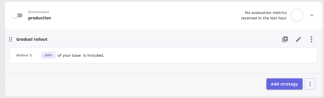
Fixes a visual bug where envs without release plans would get too much
spacing on the top of their first strategy.

It does this flattening the list of strategies if there are no release
plans. In doing so, I have extracted the strategy list rendering into a
separate component (to make things more legible and re-usable) and have
also removed the FeatureStrategyEmpty component and marked it as
deprecated. In the new designs, you can't expand envs without
strategies, so the component is no longer needed.

Before (what looks like a shadow is actually the extra list being
rendered with a bit of padding):

![image](https://github.com/user-attachments/assets/5ba06ac9-046c-4fbd-8b46-b077b8a0570b)

After:

![image](https://github.com/user-attachments/assets/64270582-1221-4bdf-a85b-c24ce23bd4a3)
2025-03-10 14:49:26 +01:00
Tymoteusz Czech
1b67b288ee
Segment view for strategy evaluation (#9399)
Refactored "segments" part of strategy evaluation. This shows a lot of places, that use "Legacy" component.
2025-02-28 15:15:25 +01:00
Nuno Góis
da91ae6afe
chore: new add release plan dialog (#9389)
https://linear.app/unleash/issue/2-3249/adding-a-release-plan-to-a-non-cr-environment-feels-too-immediate

This adds a new confirmation / preview dialog when adding a release
plan.

What's cool about it is that it will describe what will happen before
you confirm. It also acts as the "add to CR" dialog, so we now only have
1 dialog instead of 2 separate ones.

This also refactors quite a bit of our code here, hopefully simplifying
it.

### Simple (env disabled)

![image](https://github.com/user-attachments/assets/579697a8-5b21-4400-a48b-96d2df3931f6)

### CR protected (env enabled)

![image](https://github.com/user-attachments/assets/35398bc9-faed-4ce1-8c78-52e89fe21f4a)
2025-02-28 10:57:20 +00:00
Tymoteusz Czech
4e7ce65567
chore: remove uiGlobalFontSize flag (#9331)
1-3383
2025-02-26 12:39:53 +01:00
Tymoteusz Czech
42a05ef418
feat: new environment box (#9342)
Co-authored-by: Thomas Heartman <thomas@getunleash.io>
2025-02-25 10:34:36 +00:00