Adds focus styles to the env accordion header only when the focus is on
the header itself (not on the env toggle inside the header). The focus
style is consistent with what we do for other accordions (dashboard,
milestones).
Middle one is focused:

Focus is on the toggle inside the top one (yeh, we should have better
focus styles for toggles; but that's not for now):

Open and focused:

Getting the consistent background for the header when it's open is a
little tricky because the accordion container and summary are split into
different files. ~~This first iteration used a class name for the
specific header (because envs can have multiple accordion headers inside
them, e.g. release plans) and setting a CSS variable in the summary, so
that the background matches.~~ I found out that I only need to set it in
the parent anyway 😄
Without it, you get this (notice that there is a little white outside
the lower corners):

Extracts the shared strategy list and list item into the `common` folder
instead of living in the environment accordion body file.

Also takes the disabled strategy handling that we use for
`StrategySeparator` and moves it into the file itself. It might be
something we want to decorate manually in the future, but we don't for
now, so this was the most straight-forward way to make it work.
Moves strategy titles and names onto the same line, as per the new
designs.
In doing so, I've also updated the component to use a more semantic
hgroup with the header being the strategy title if it exists or the
strategy name if not.
The downside of being more semantically correct here is that we need to
know what header level we want the strategy to use. In most cases,
that's 3 (e.g. flag name > environment > strategy, release plan >
milestone > strategy), but for plans on flag envs, it's 4 (flag name >
env > milestone name > strategy).
I've also taken the opportunity to fix a little mistake I made earlier.
`ol`s can only have `li` children, and I'd forgotten to wrap a nested
`ol` inside an `li`. The changes in `EnvironmentAccordionBody` all
relate to that change. Because we now have several layers of lists
nested within each other, dealing with styling and padding gets a little
tricky, but CSS has the power do help us out here.
Rendered:

Use new design for release plans in flag environments.
- Move old ReleasePlanMilestone into Legacy file and update imports
- In the new version, use the same strategy list and item as in the
general strategy list and milestone template creation (components to be
extracted in the future)
- Fix an issue with the border being obscured by overflow by hiding
overflow

Adjusts styling of the env dropdown now that we have both release plans
and strategies.
Key points:
- simplifies strategy separator, removes inherent height. Also: extracts
it from the draggable component (it has no business knowing whether to
add that or not)
- Puts release plans and strategies in the same list so that it becomes:
```markdown
- Release plan
- strategy 1
- strategy 2
- (OR) Strategy A
- (OR) Strategy B
```
- Adjusts some padding around to make it line up properly
- Swaps a couple conditional renders for ternaries
Rendered:

## Still todo:
Handle cases where you have >50 strats and we show the warning etc. It's
a little trickier because of how it interacts with release plans, so I
wanna leave that for later.
I'm also unsure about how we handle spacing today. All the little items
have their own different spacing and I'm not sure it won't get out of
sync, but I'm also not sure how else to handle it. We should look at it
later.
Splits the release plan component into a Legacy component and a new one
with the initial changes for the new strategy list view.
Here's what it looks like:
Notice that the background color stops a little early (before the OR
token). I'll handle that in a follow-up because the changes also impact
how the rest of the env accordion body is rendered.
Updates the strategy list based on the new designs and moves the current
versions of the touched components into `Legacy...` files (the vast
majority of changes are that and updating imports). The relevant changes
to the components are listed in their original files.
Flag on:

Flag off:

## Next steps
There's two items to review for improving these current comments (also
noted inline):
- Whether to aria-hide the "or" separator or not (I need to read up a
bit and think whether it makes sense to show that or not)
- Changing the list of strategies into an actual ordered list (`ol`).
That'd reflect the semantics better.
Next would be checking the other places we use strategy lists and then
updating those too. In doing so, I might find that some things need to
be updated, but I'll handle those when I get there.
There's also handling release plans.
https://linear.app/unleash/issue/2-2834/plausible

Adds the following Plausible events to the Release management feature:
 - Add plan
 - Start milestone
 - Remove plan
 - Create template
 - Edit template
 - Delete template
As of PR #8935, we no longer support both text and title, and confetti
has been removed.

This PR:
- removes `confetti` from the toast interface
- merges `text` and `title` into `text` and updates its uses across the
codebase.
- readjusts the text where necessary.
https://linear.app/unleash/issue/2-3038/release-plans-misc-ux-improvements
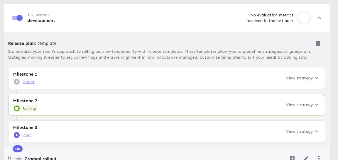
Includes various UX improvements focused on release plans:
- **New milestone status:** Introduced a "Paused" status for milestones.
A milestone is marked as "Paused" when it is active but the associated
environment is disabled.
- **Status display:** Paused milestones are labeled as "Paused (disabled
in environment)" for clarity.
- **Styling cleanup:** Removed unused disabled styling in the release
plan component.
- **Accordion stability:** Fixed visual shifting in milestone accordions
when toggling.
- **Strategy count:** Updated the "View Strategies" label to reflect the
total number of strategies in the milestone.
- **Edge case handling:** Improved rendering for milestones without
strategies.
- **Component extraction:** Refactored milestone status into a
standalone component.
- **Component organization:** Grouped milestone-specific components
under a `ReleasePlanMilestone` parent folder.
- **Template card cursor enhancement:** Set the cursor on the template
card to "pointer", so we better reflect the interactivity of the
element.
- **Template card created by enhancement:** Added an avatar for the
"Created by" field in release plan template cards, replacing the
creator's ID.
- **Navigation improvement:** After creating or editing a release plan
template, users are now redirected back to the release management page.

