Fixes a small number of accessibility issues that Firefox was
complaining about (and some that I noticed myself):
1. In `CommandBar.tsx`, use a `Label` element instead of aria-label. We
can hide it with the `ScreenReaderOnly` component.
2. Add an `aria-label` to the icon button in the sidebar. (side note:
should we do any fancy detection on whether it's cmd + b or ctrl+b
there? I think we do that in the command bar)
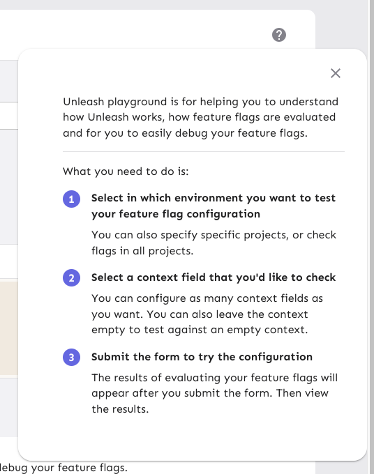
3. Update the playground guidance popper;
i. Add an aria-label to the icon button
ii. Make the popper a `Popover` instead. This fixes a few issues: It
wasn't possible to focus or close just using the keyboard before.
Because it didn't steal focus, it also meant that it'd cover other parts
of the page. Now it traps focus so you can navigate to the close button,
and escape will also close it for you.
iii. Remove aria-describedby. Using aria-describedby on the button would
mean that the **button** is described by its content, which seems wrong.
aria-describedby should also only be used for plain strings. Complex
markups isn't supported. For that aria-details is the right way to go.
But because the popover is only rendered when it's open, the details or
describedby link will point to nothing most of the time.
iv. In doing this, there is a slight change in the popover shadow (I
couldn't find onef of our shadows that did the same thing as before),
but it matches other popovers we have, such as on the data usage tab.
Before:
After:

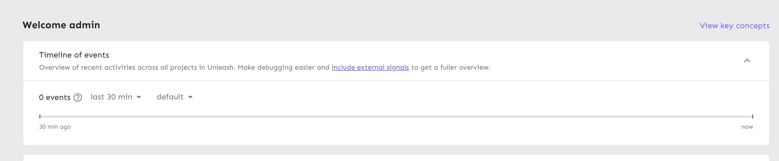
Moves the event timeline to the personal dashboard from the header when
the `frontendHeaderRedesign` flag is active.
When the flag is active, it also:
- hides the event timeline and corresponding button in the header
- renders the environment selector next to the time selector instead of
at the other end of the header
---------
Co-authored-by: Nuno Góis <github@nunogois.com>
Fixes the issue where the skip link wouldn't take you to the main
content of the page anymore.
Also includes a few related minor semantic and a11y improvements:
1. The `main` element now only surrounds the actual main content of the
page. The sidebar is nav content and shouldn't be within it. The easiest
way to do this was to change the element that was previously a `main` to
a `div` and make the main content wrapper a `main` instead.
2. Makes the skip link target visible when focused. But invisible
otherwise. This has two benefits:
1. It's immediately obvious that using the skip link has worked. It
tells you that it's at the start of the main content.
2. Because the link now has text, it can be targeted by link search
(e.g. in Firefox, press `'` to search for links (I use this **a lot**)),
making it super easy to move your focus to the main content directly.
(Yes, landmark navigation should also work here, though, especially with
the `main` change).
The implementation of UI considerations of the skip link are based on
the CSS-tricks article [a deep dive on skipping to
content](https://css-tricks.com/a-deep-dive-on-skipping-to-content/)
from 2021.
Here's what it looks like when you skip to content:

When it doesn't have focus, it's invisible.
Follow-up to: https://github.com/Unleash/unleash/pull/8642

Introduces a reusable `Highlight` component that leverages the Context
API pattern, enabling highlight effects to be triggered from anywhere in
the application.

This update refactors the existing highlight effect in the event
timeline to use the new Highlight component and extends the
functionality to include the Unleash AI experiment, triggered by its
entry in the "New in Unleash" section.
https://linear.app/unleash/issue/2-2729/add-event-timeline-to-new-in-unleash

Adds the new event timeline to the "New in Unleash" section.

Unlike Signals & Actions, the Event timeline doesn’t have a dedicated
page to link to, as it's a global component within the layout. To
address this, we extend the "check it out" action in the New in Unleash
component by supporting a callback instead of a link. When the user
clicks "check it out" for this new item, the page smoothly scrolls to
the top, ~~the timeline opens (if it's not already)~~, and a temporary
highlight effect is triggered on the timeline header button.

Also includes some scouting / slight UX adjustments.


https://github.com/user-attachments/assets/fe49f21b-5986-46b2-8fc6-acb4daef9d08
https://linear.app/unleash/issue/2-2723/add-signals-tip
Adds a tip to the event timeline regarding the usage of signals.
The conditions for it to show up are the following:
- `!signalsSuggestionSeen` - The current user has not closed the tip yet
- `isEnterprise()` - The Unleash instance is an Enterprise instance
(signals are currently Enterprise-only)
- `isAdmin` - The current user is an admin (signals are currently
admin-only)
- `signalsEnabled` - The signals feature flag is currently enabled
- `!loading` - Signal endpoints have not finished loading (prevents
flickering)
- `signalEndpoints.length === 0` - The Unleash instance currently has
zero configured signal endpoints (signals feature is not being used)

https://linear.app/unleash/issue/2-2703/align-with-ux
Timeline UI/UX improvements after sync with UX, including:
- Added some spacing between each event in the grouping tooltip
- Aligned the x events occurred header with filter dropdown
- Improved the strategy icon somewhat so it doesn't look as off center
- New timeline icon
- Improve icon position relative to timestamp on each event in the
grouping tooltip
- Changed text color in dropdowns to a lighter gray
- Removed bold formatting in tooltip
- Adjusted paddings and margins
- Added close button
- Added shadow
- Added left border
There are a few details missing, which will be tackled in separate PRs.

---------
Co-authored-by: Nuno Góis <github@nunogois.com>
Fixes 2 bugs:

- The initial state of the event timeline should have `open: false`, not
`true` - Closed by default, unless opened
- The event timeline should unmount when hidden - It should not emit
requests when closed
https://linear.app/unleash/issue/2-2700/persist-timeline-state-in-local-storage

Implements persistent state management for the event timeline using
local storage.

I believe this improves UX by persisting both the timeline toggle
(visibility) state and applied filters across page refreshes.

Includes some scouting/refactoring and some workarounds to prevent the
timeline from animating on page load (in most cases).
https://linear.app/unleash/issue/2-2662/make-the-event-timeline-available-globally-through-a-new-header-buttonhttps://github.com/user-attachments/assets/bde38ee8-cdd8-409d-a95e-0c06189e3d9b
(In the video, you’ll notice a slight delay before new events show up.
This happens because the timeline automatically refreshes every 10
seconds)
Removes the event timeline from the event log and integrates it into a
new header option.
I chose a middle-ground approach between options 1 and 2 from our Figma
sketches. This solution provides the best of both worlds IMO: the
timeline stands out as a global component, distinct from the current
page context, while sliding in rather than overlapping the content. This
way, users can view the timeline alongside the page content.