Extracts the Avatar Group component into a `common` component and adds a
standard tooltip to all avatars.
Relates to linear issue 1-2606
This is a suggestion / proof of concept for how we can solve it. While I
think we can merge this as is, I'd also be happy to take any discussions
on other ways to approach it etc.
## Why are these changes made together?
Because extracting the avatar group without adding the new tooltip data
made the existing tooltip misbehave (it'd show up in the top left of the
screen, not synced to the avatar in any way).
I probably could have (and still can if you think it's prudent) split it
out such that the avatar gets a standardized tooltip first (and disable
it for the group card avatars), and split out the avatars in a
follow-up. Happy to do that if you think it's better.
## What does this mean?
It used to be that we had no consistent way of dealing with avatars and
tooltips. Some places had them, some places didn't. This change makes it
so that all avatars that we can show tooltips for will get the same
tooltip.
Previously, we had at least 4 different ways of dealing with tooltips:
- The HTML tooltip (that would be standardized with this PR) in the
project flags table

- The "title" that you'd get on your user avatar
- The group card list tooltip

- And sometimes you'd get nothing at all

with this change, we'll always show the same kind of tooltip if we can:

## What goes in the tooltip?
We use the `UserAvatar` component for a fair few different things and I
didn't want to extract separate components for all the different use
cases. Instead, I wanted to get an overview over what we use it for and
what is relevant info to show.
I found all the places we used it and tried to form an opinion.
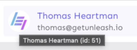
This tooltip will work with a user's email, name, username, and id. If
there is no user (such as for empty avatars and avatars displaying only
"+n" for remaining members), we show no tooltip.
Following the example set by the group card avatars, we'll try to use
email or username (in that order) as the main bit of text. If the user
has an email or a username and also a name, the name will be used as
secondary text.
If the user does not have an email or username, but has a name, we'll
use the name as the main text.
If the user does not have an email, a username, or a name, we'll try to
show "User ID: N" if they have an id.
If they do not have a username, a name, an email, or an ID, we bail out
and show nothing.
## Why can you disable the tooltip?
In some cases, you might want to disable the tooltip because you have
more information to feed into it. An example of that is in the project
flags table, where we want to show more information in cases where the
user is 'unknown':

## Additional fixes
This PR also adds a few lines of CSS to fix a minor avatar layout bug.
Before:
After:

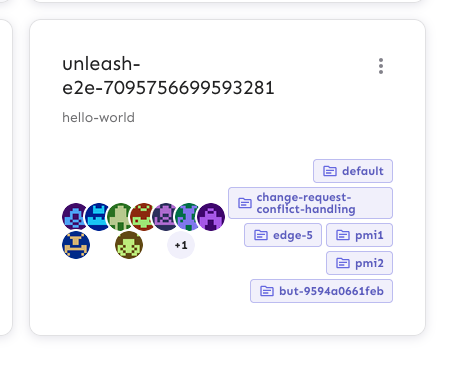
This PR adds the UI part of feature flag collaborators. Collaborators are hidden on windows smaller than size XL because we're not sure how to deal with them in those cases yet.
This PR disables the filtering capability in the front end for unknown
users.

Modifying the back end to support filtering for unknown users is not
something we want to do yet. It's possible, but it requires adding a lot
of special cases to the handling code (refer to [PR
#7359](https://github.com/Unleash/unleash/pull/7359)), which we'd like
to avoid if possible. To avoid annoying cases where the filtering
doesn't work as expected and breaks user expectations, we're disabling
the filtering capability for unknown users in the front end.

We can consider whether to enable back-end results for unknown in the future if we get
user feedback that it's important.

This PR works by changing the avatar cell component. When the user has
id 0 (and is therefore unknown), we:
- set aria-disabled to true. This alerts users with assistive tech that
the button is disabled, but it doesn't take it out of the tab order, so
it's not mysteriously missing.
- change the tooltip text, telling users that they can't filter by
unknown users.
- disable the avatar callback function, so clicking on the avatar
doesn't do anything.

The accompanying tests assert this functionality.

I considered also updating the screen reader text, but I think that
would add more confusion or be more information than the user needs.
According to MDN's article on the [aria-disabled
attribute](https://developer.mozilla.org/en-US/docs/Web/Accessibility/ARIA/Attributes/aria-disabled):

> [the aria-disabled] declaration will inform people using assistive
technologies, such as screen readers, that such elements are not meant
to be editable or otherwise operable.
This PR lets you filter by flag creator by interacting with the user's
avatar.
Additionally, I've switched the custom popover for the standard tooltip
that we use elsewhere in the table. This gives the table a more cohesive
feel. As such, I have also deleted the component created in a previous
PR, because it's no longer in use anywhere.
It now looks like this (when tabbed to; notice the focus ring):
