Makes the env selector on the flag page act the same way as the env
selector on the new project page or any of the filterable buttons in the
new project/flag dialogs.
Also slightly changes the styles of the existing dropdown lists to bring
them in line with the new env selector (more padding, full-width
highlights).
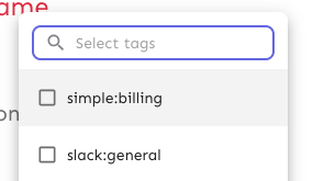
Selector:

Project/flag creation:
Before:

After:
## Technical notes
I was a little unsure how best to share the padding/spacing styles
between the search field and popover at first (as was requested by UX).
The easiest way (and most compliant with how we do it today) was to
define the spacing in a variable and move the relevant components into
the same file.
However, I actually think that using a CSS variable (e.g.
`--popover-spacing`) would be "better" here, but we don't really use
them much, so I've left that out for now. That said, if you agree, I'd
be more than happy to use that instead 🙋🏼
This change prevents long project names from blowing the form out of
proportion.
To do so, it:
1. sets `whitespace: no-wrap` on the button labels. Judging by the other
styles, this was the intention all along, but it didn't really come up
until now.
2. It also sets the label width for projects to 30ch,so that you'll get
to see quite a bit of the project name before it gets cut off.
It would be possible to set a dynamic width for this button based on the
longest project name, but I'm not sure it adds much value, so I'm
leaning towards keeping it simple.
Here's what the dynamic width would look like:
``` tsx
const projectButtonLabelWidth = useMemo(() => {
const longestProjectName = projects.reduce(
(prev: number, type: { name: string }) =>
prev >= type.name.length ? prev : type.name.length,
0,
);
return `${Math.min(longestProjectName, 30)}ch`;
}, [projects]);
```
What it looks like:

This PR makes the config dropdown list generic over its values, so that
you can pass stuff that isn't strings.

It also updates the existing impression data button to use booleans
instead.
This change makes it so that all form input labels start with a
capital letter, regardless of the data we use to generate them.

Also fixes a leftover toggle -> flag renaming.
This PR extracts the dialog form that we created for the new project
form into a shared component in the `common` folder.

Most of the code has been lifted and shifted, but there's been some
minor adjustments along the way. The main file is
`frontend/src/component/common/DialogFormTemplate/DialogFormTemplate.tsx`.
Everything else is just cleanup.