Hooks up the project status lifecycle data to the UI. Adds some minor
refactoring as part of that effort.

## Other files

There's been some small changes to
`frontend/src/component/feature/FeatureView/FeatureOverview/FeatureLifecycle/FeatureLifecycleStageIcon.tsx`
and `frontend/src/hooks/useLoading.ts` as well to accommodate their
usage here and to remove unused stuff. The inline comments mention the
same thing but for posterity (especially after this is merged), the
comments are:

For
`frontend/src/component/feature/FeatureView/FeatureOverview/FeatureLifecycle/FeatureLifecycleStageIcon.tsx`:

> The icon only needs the name to pick.
https://github.com/Unleash/unleash/pull/7049 deliberately changed the
logic so that the completed stage gets the same icon regardless of its
status. As such, to make the icon easier to use other places (such as in
the lifecycle widget), we'll only require the name.

For `frontend/src/hooks/useLoading.ts`:
> There's no reason we should only be able to put refs on divs, as far
as I'm aware. TS was complaining that that a `ul` couldn't hold a div
reference, so I gave it a type parameter that defaults to the old
version.
Fixes browser console warnings and errors related to the event timeline
and strategy form.

- **Event Timeline**: Addressed a warning where the environment filter
rendered with a default environment value (production) before
environments were fully loaded.
- **Strategy Form**: Resolved an error caused by forwarding the enabled
prop as a boolean.
Addressing some oversights that led to browser console errors.

This PR fixes console errors related to the recently introduced
highlight component (#8643) and tag row component in the new flag
metadata panel (#8663).
The two lints being turned off are new for 1.9.x and caused a massive
diff inside frontend if activated. To reduce impact, these were turned off for
the merge. We might want to look at turning them back on once we're
ready to have a semantic / a11y refactor of our frontend.
Fixes all warnings about the "key" prop. The majority of the fixes fall
into one of the following categories:

- Extracting "key" props in tables (you're not allowed to just spread
them in)
- Adding "key" props to autocomplete options and chips
- fixing test data that didn't contain ids
don't use `act` from `react-dom`. Instead, use act from `react`
directly, as advised by the deprecation notice.

This PR fixes all of the deprecated import warnings, updates some
testing libraries we use (and tests), and fixes one or two other
warnings.
Allow you to edit default strategies in the UI if you have the
update_project or project_default_strategy_write permissions. These are
the same permissions that we use in the API.

Previously, we used the update_feature_strategy permission here, but
that one is intended to be used for updating strategies belonging to
actual flags.

One of the trickier bits here is that we use the `StrategyVariants`
component, which previously had baked in the permission required
(update_feature_environment_variants). Because the permissions are
different for the default strategy, I updated the component to make it
configurable, but for the default to be the old permission (so that
other uses aren't affected).
After we implemented new feature flag creation flow, this are not used
anymore.

Creation is now handled by **CreateFeatureDialog**.

Also edit component can be minified, because it does not need so many
fields anymore.
`groupId` parameter because of the change in validation wasn't parsed
correctly. Intent was to fill it when it is empty, when the form is loaded.
By mistake the same logic applies when you manually remove all
characters from the text field.
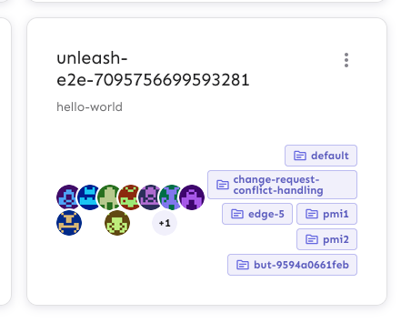
Fixes an issue where the collaborator component would be smooshed
together when you have too many collaborators and too many flag tab
items.
The primary things I have done are:
1. Limit the amount of collaborators we show to 6 instead of 8. I
believe the number 8 was arbitrary, so let's go with 6 for now.
2. Instead of using a fixed gap, use a separator element that grows up
to a certain limit. I've added a `Separator` component, which is an
empty div with flex-grow. It feels like you should be able to do that
with gap too, but I can't think of how right now.
3. Don't allow collaborator component text (or avatars) to wrap. We
don't have a lot of space in this header, so let's keep it tight.
Additionally, I've added the `className` prop to the AvatarGroup
component so that it can be styled externally. I also cleaned up some
naming that was left in while I was at it.
Before:

After:

Old versions of Unleash allow for creating "Gradual Rollout" strategies
without `groupId` or `stickiness`. UI will now populate those fields,
not getting stuck when editing strategies without said fields.
Extracts the Avatar Group component into a `common` component and adds a
standard tooltip to all avatars.
Relates to linear issue 1-2606
This is a suggestion / proof of concept for how we can solve it. While I
think we can merge this as is, I'd also be happy to take any discussions
on other ways to approach it etc.
## Why are these changes made together?
Because extracting the avatar group without adding the new tooltip data
made the existing tooltip misbehave (it'd show up in the top left of the
screen, not synced to the avatar in any way).
I probably could have (and still can if you think it's prudent) split it
out such that the avatar gets a standardized tooltip first (and disable
it for the group card avatars), and split out the avatars in a
follow-up. Happy to do that if you think it's better.
## What does this mean?
It used to be that we had no consistent way of dealing with avatars and
tooltips. Some places had them, some places didn't. This change makes it
so that all avatars that we can show tooltips for will get the same
tooltip.
Previously, we had at least 4 different ways of dealing with tooltips:
- The HTML tooltip (that would be standardized with this PR) in the
project flags table

- The "title" that you'd get on your user avatar
- The group card list tooltip

- And sometimes you'd get nothing at all

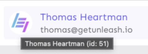
with this change, we'll always show the same kind of tooltip if we can:

## What goes in the tooltip?
We use the `UserAvatar` component for a fair few different things and I
didn't want to extract separate components for all the different use
cases. Instead, I wanted to get an overview over what we use it for and
what is relevant info to show.
I found all the places we used it and tried to form an opinion.
This tooltip will work with a user's email, name, username, and id. If
there is no user (such as for empty avatars and avatars displaying only
"+n" for remaining members), we show no tooltip.
Following the example set by the group card avatars, we'll try to use
email or username (in that order) as the main bit of text. If the user
has an email or a username and also a name, the name will be used as
secondary text.
If the user does not have an email or username, but has a name, we'll
use the name as the main text.
If the user does not have an email, a username, or a name, we'll try to
show "User ID: N" if they have an id.
If they do not have a username, a name, an email, or an ID, we bail out
and show nothing.
## Why can you disable the tooltip?
In some cases, you might want to disable the tooltip because you have
more information to feed into it. An example of that is in the project
flags table, where we want to show more information in cases where the
user is 'unknown':

## Additional fixes
This PR also adds a few lines of CSS to fix a minor avatar layout bug.
Before:
After:

This PR makes the config dropdown list generic over its values, so that
you can pass stuff that isn't strings.

It also updates the existing impression data button to use booleans
instead.
This change makes it so that all form input labels start with a
capital letter, regardless of the data we use to generate them.

Also fixes a leftover toggle -> flag renaming.
This PR adds the UI part of feature flag collaborators. Collaborators are hidden on windows smaller than size XL because we're not sure how to deal with them in those cases yet.
This PR disables the "create feature flag" button when you've reached
the limits.

This one is a little more complex than the other UI limits, because we
also have to take into account the project feature limit. I've tried to
touch as little as possible, but I _have_ extracted the calculation of
both limits into a single hook.
Now searching works in command bar
1. Currently piggybacking on the search hook, but I think it is not fast
enough, and also it is using the query params as the global search. This
causes some weird behaviour in UI. This probably means we will create
separate endpoint for this.

**Upgrade to React v18 for Unleash v6. Here's why I think it's a good
time to do it:**
- Command Bar project: We've begun work on the command bar project, and
there's a fantastic library we want to use. However, it requires React
v18 support.
- Straightforward Upgrade: I took a look at the upgrade guide
https://react.dev/blog/2022/03/08/react-18-upgrade-guide and it seems
fairly straightforward. In fact, I was able to get React v18 running
with minimal changes in just 10 minutes!
- Dropping IE Support: React v18 no longer supports Internet Explorer
(IE), which is no longer supported by Microsoft as of June 15, 2022.
Upgrading to v18 in v6 would be a good way to align with this change.

TS updates:
* FC children has to be explicit:
https://stackoverflow.com/questions/71788254/react-18-typescript-children-fc
* forcing version 18 types in resolutions:
https://sentry.io/answers/type-is-not-assignable-to-type-reactnode/

Test updates:
* fixing SWR issue that we have always had but it manifests more in new
React (https://github.com/vercel/swr/issues/2373)

---------

Co-authored-by: kwasniew <kwasniewski.mateusz@gmail.com>
1. Only suggest to create a tag value if the input is more than two
characters after trimming.
2. Ignore trailing and leading whitespace when considering which
autocomplete options to show
This PR is part of #4380 - Remove legacy `/api/feature` endpoint.

## About the changes

### Frontend
- Removes the useFeatures hook
- Removes the part of StrategyView that displays features using this
strategy (not been working since v4.4)
- Removes 2 unused features entries from routes

### Backend
- Removes the /api/admin/features endpoint
- Moves a couple of non-feature related tests (auth etc) to use
/admin/projects endpoint instead
- Removes a test that was directly related to the removed endpoint
- Moves a couple of tests to the projects/features endpoint
- Reworks some tests to fetch features from projects features endpoint
and strategies from project strategies
This fixes the case when a customer have thousands of strategies causing
the react UI to crash. We still consider it incorrect to use that amount
of strategies and this is more a workaround to help the customer out of
a crashing state.

We put it behind a flag called `manyStrategiesPagination` and plan to
only enable it for the customer in trouble.
This PR is a combination of two PRs:
This PR adds a functioning environment selection button to the new project creation form. Selected environments are added to the payload and to the API preview.
The implementation is mostly lifted from the existing FilterItem component we have for search filters. However, our need here is less complex, so I've removed some of the things we don't need. There is still more cleanup to be done, however, but I'd like to implement the rest of the submenus first, to see what we really do need in the end.
---
This PR adds support for stickiness and project mode in the new project
creation form.
Achieve this, it does a few things:
1. Moves `resolveStickinessOptions` from
`frontend/src/component/feature/StrategyTypes/FlexibleStrategy/StickinessSelect/StickinessSelect.tsx`
and into a separate hook. This component was used by the old project
creation form. Because the new form has a different input, but needs the
same option, moved that code into a reusable hook.
2. It adds functioning buttons for project stickiness and mode.
3. It adds labels to the search inputs for the dropdowns. Inputs *must*
have labels to meet a11y requirements. However, the designs don't have
labels, so we can hide them visually. Though that leads to another issue
(refer to the screen shot below).
4. It updates the `SelectionButton` component to handle both single- and
multiselect cases. It instead exports these two subcomponents. These are
currently in one file, but I'll split them out into their separate files
in a later PR.
As a side effect of working with the selection buttons, it also improves
how we handle keyboard interaction for these buttons.
Here's what it looks like for single-select lists. Notice the missing
part of the input's border around the top (where the label *would* be if
we showed it). We should figure out how best to handle it. I've done
like this for now, but we can sort it out later.

This adds replace: true to navigate on the create feature toggle screen
and create project screen. This will make it so you don't go back to the
form after you have created the resource, replacing the entry in the
history with the new url. We can do this in more places, but some of
them require a bit more thought. For example when creating a user, you
navigate from the admin screen to the user page, and then back to the
same screen. Adding `{ replace: true }` in this context makes it so that
when you press back you end up on the same screen, because it's recorded
twice in history.

Another discussion point:
* Would you expect the edit screens to also replace the history?
API returns both value and values fields. Empty values array causes ui
to think constraint doesnt have a value

This PR checks if value field exists and is empty before returning check
on values and length