Makes it so that strategies project env strategies that aren't draggable
don't get the drag icon. The reason it didn't work as expected was that
we used fallback functions instead of keeping them undefined.
I discovered that we applied two dragging boxes, so I removed the outer
layer one (specific to project envs) in favor of relying on the inner
one. Most of the lines changed are just indentation as a result of this
nesting going away.
Here's the diff. The top set of strategies aren't draggable; the lower
ones are.

Gives a small update in how we deal with unevaluated and disabled
strategies in the new playground design:
- "Unevaluated" badges go from yellow warning to blue info and their
text changed to "Not evaluated"
- Don't show "Not evaluated" badges on strategies that are disabled.
To avoid this change affecting the current playground setup, I
duplicated the old resultschip into a legacy file and changed the
existing impl. To avoid updating all other files that use that chip
(it's all over the playground) and checking flags or creating duplicates
there, I decided to do a quick check at the top of the legacy file and
use the new file if the flag is on.
In doing so, I've also simplified the actual chip file and have more or
less cut the total line count in it in two 😄

Flattens the list of strategies when you have both release plans and
strategies. If you had both, you'd have this setup before:
```
- ol
- li // release plan
- ol // release plan strategies
- li // regular strategies
- ol // strategy list
```
Now we drop the extra nesting:
```
- ol
- li // release plan
- ol // release plan strategies
- li // the rest of the strategies
```
Semantically, I think this is just as valid and it simplifies a lot of
styling that no longer needs to look for other lists etc.
As part of doing this, I have also moved the "many strategies" warnings
and pagination labels to outside the list instead of inside the smaller
list.
Otherwise, the list looks just the same as before and drag-n-drop works
just fine.
(side note: these strategies shouldn't have drag handles 🤔 )

As a bonus, this PR also:
- Uses the disabled style separator for disabled strats in playground
and deletes some unused components I found.
Playground disabled strats (we probably don't want double orange badges;
I'll talk to UX):

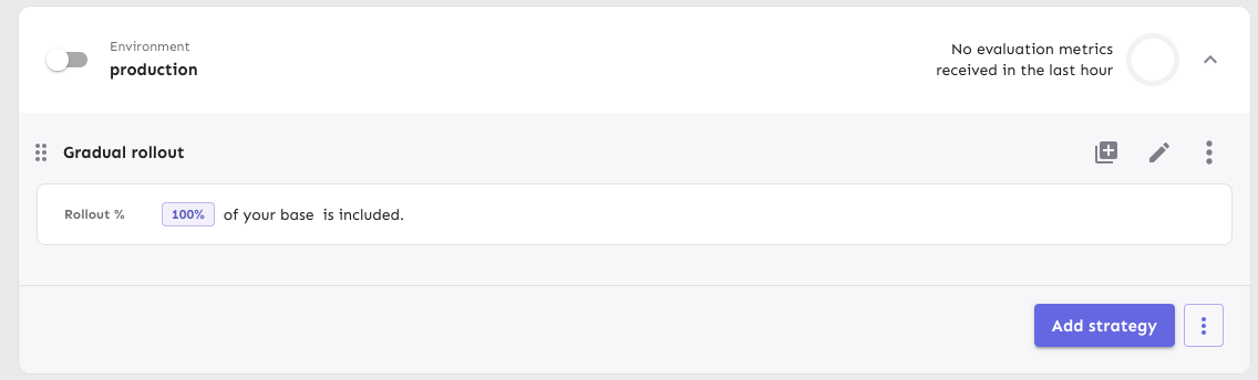
Handle cases where flags have no strategies in the playground.
As part of this, also changes how we deal with the padding/margins in
the playground: instead of making all but one items in the playground
have to explicitly add padding, now we instead say that the only item
that needs to do something is the list, which uses negative inline
margins.
This also has the added benefit of adding all the top-level elements
(that is: that's not part of the strategy lists) inside the same
container, so we can control gaps between them with flex's gaps.
When you have no strategies (before):

When you have no strategies (after):

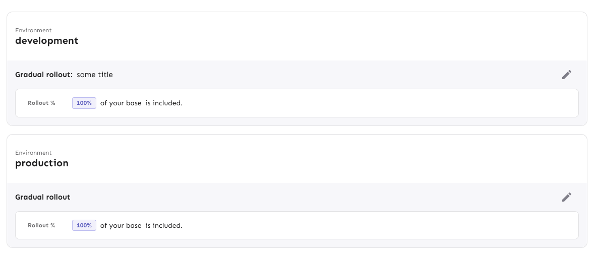
Implements playground results for strategies.
Old design:

New design:

Still left: segments.
I also discovered during this that some of the new hooks (and also some
of the new components) accept deprecated types
(`IFeatureStrategyPayload` in this case). If that should indeed be
deprecated, then we also shouldn't use it in the new hooks / components
if we can avoid it. I'll make a task for it.
---------
Co-authored-by: Tymoteusz Czech <2625371+Tymek@users.noreply.github.com>
Implements the new design for playground constraints. They're not in use
in segments yet, and strategy parameters have not been touched. This PR
establishes a pattern that we can follow for strategies and parameters
later.
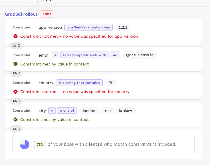
The PR also includes a change in how the constraint item organizes its
children: it now takes care adding padding and spacing itself, instead
of the children doing that. It looks right most places, but segments
aren't quite right anymore. However, as this is behind a flag, I'd
rather fix that in a separate PR.
---------
Co-authored-by: Tymoteusz Czech <2625371+Tymek@users.noreply.github.com>
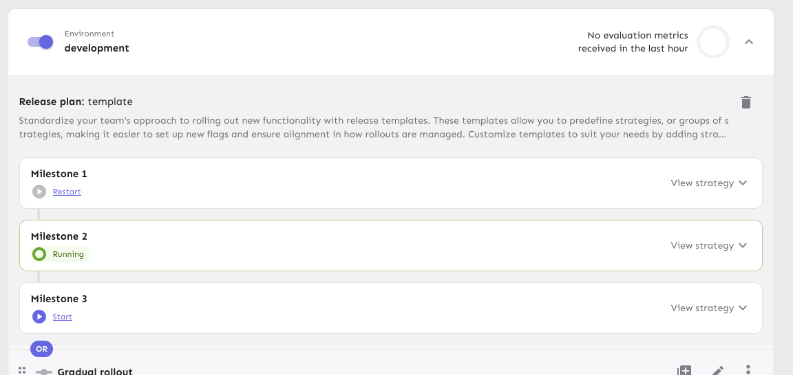
Previously, the entire card was draggable, which meant that you couldn't
select text inside the card or inside the milestone title when editing.
This makes it so that only the drag handle is draggable.
Fixes a number of issues that would surface in UTC-n (where n > 1)
timezones. I've not found a way to check this with tests (and it looks
like [we weren't able to last time
either](https://github.com/Unleash/unleash/pull/9110/files#r1919746328)),
so all the testing's been done manually by adjusting my system time and
zone. (From what I understand, you can't generate a Date with a specific
TZ offset in JS: it's only utc or local time)

Resolved:
- [x] Selecting "Jan" in the dropdown results in the selection being
"December" (off by one in the selector)

- [x] Selecting a month view only gives you one data point (and it's
probably empty). Wrong date parsing on the way out resulted in sending
`{ from: "2025-02-28", to: "2025-02-28"}` instead of `{ from:
"2025-03-01", to: "2025-03-31"}`

- [x] The dates we create when making "daysRec" need to be adjusted.
They showed the wrong month, so the dates were off.

- [x] Make sure the labels are correct when hovering over. Again: we
used the wrong month for generating these.

- [x] The available months are wrong. Incorrect month parsing again.

- [x] The request summary month is wrong. You guessed it: incorrect
month parsing
- new way of showing strategy variants
- fixed wrapping issue in strategy editing, for a lot of variants
defined (`SplitPreviewSlider.tsx` change)
- aligned difference between API and manually added types
Initial rough work on adapting the playground strategies to the new
designs. This PR primarily splits components into Legacy files and adds
new replacements. There are *some* updates (including spacing and text
color), but nothing juicy yet. However, I wanted to get this in now,
before this PR grows even bigger.
Implements the new strategy list design for default strategies. Moves
the old impl into a legacy file. Also: removes the description from the
strategy item. From my digging, we only showed this for default strategy
items and it didn't really provide any useful information. The only
other place you can add a description is for custom strategies (at least
that I could find), but these are deprecated and we never show the
description when you apply the strategy anyway.
Rendered:
Without the flag (nothing changes):

Fixes a visual bug where envs without release plans would get too much
spacing on the top of their first strategy.
It does this flattening the list of strategies if there are no release
plans. In doing so, I have extracted the strategy list rendering into a
separate component (to make things more legible and re-usable) and have
also removed the FeatureStrategyEmpty component and marked it as
deprecated. In the new designs, you can't expand envs without
strategies, so the component is no longer needed.
Before (what looks like a shadow is actually the extra list being
rendered with a bit of padding):

After:
Moves strategy titles and names onto the same line, as per the new
designs.
In doing so, I've also updated the component to use a more semantic
hgroup with the header being the strategy title if it exists or the
strategy name if not.
The downside of being more semantically correct here is that we need to
know what header level we want the strategy to use. In most cases,
that's 3 (e.g. flag name > environment > strategy, release plan >
milestone > strategy), but for plans on flag envs, it's 4 (flag name >
env > milestone name > strategy).
I've also taken the opportunity to fix a little mistake I made earlier.
`ol`s can only have `li` children, and I'd forgotten to wrap a nested
`ol` inside an `li`. The changes in `EnvironmentAccordionBody` all
relate to that change. Because we now have several layers of lists
nested within each other, dealing with styling and padding gets a little
tricky, but CSS has the power do help us out here.
Rendered:

Use new design for release plans in flag environments.
- Move old ReleasePlanMilestone into Legacy file and update imports
- In the new version, use the same strategy list and item as in the
general strategy list and milestone template creation (components to be
extracted in the future)
- Fix an issue with the border being obscured by overflow by hiding
overflow

For past months, customers can refer to their invoices instead. Hiding
it when the selection is not the current month avoids weird things such
as estimation errors due to to a month not having finished (vs what it
actually *was* when it finished), potential changes in traffic package
pricing, etc.
Fixes an issue where, when dragging large expanded milestone cards, the
position would revert from the current visual state to the previous one
when you drop the item.
Avoids absolutely positioning the drag handle by instead creating a two
column grid where column 1 is the drag handle, column two is the
milestone card. The grid has a negative margin based on the padding of
the form container. I wanted to avoid modifying the form container
component (because we use it in so many places), so I used css variables
to store the information and hook into that further down the line.
Rendered:
Wide:
Narrow:

## Known bugs and limitations
The current drag implementation has some issues if you try to drag
something over a large, expanded card. They'll trade places visually,
but when you let go, the revert back to where they were. We can avoid
that by modifying the onDrop function in the drag handler, but I don't
want to do that before checking all the other places where we do drag
and drop ([linear
ticket](https://linear.app/unleash/issue/1-3458/drag-and-drop-is-a-little-finicky)).
I also want to get UX to sign off on this before making those changes.
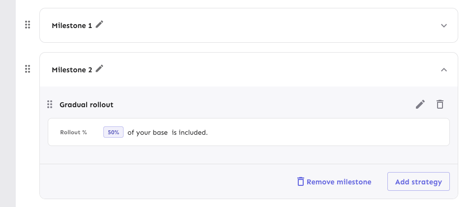
Here's an initial first pass of replacing the strategy lists in release
plan milestones.
The existing MilestoneCard has been moved to a Legacy file to avoid
conflicts.
This PR places the strategies in a list and changes the background color
of the list items (the strategies themselves still have a white
background, however).
It also re-orders the buttons in the footer and places the
milestone-level drag handle outside the milestone card.

## For later
Changing out the strategy list item itself hasn't been done yet. I want
to see if we can re-use the existing strategy draggable item instead of
making a copy. There's some dependencies on project path params etc that
need to be worked out first, though, so I'd prefer to do get these
initial changes through first.
Removes the `() => {} as any` args from the StrategyDraggableItem
invocation when you have paginated strats. Instead makes all the drag
params optional. It defaults to a no op if not provided.

Also, the reason it had to be typed as `any` before is probably because
it was missing a function. The correct empty param is `() => () => {}` 💁
Adjusts styling of the env dropdown now that we have both release plans
and strategies.
Key points:
- simplifies strategy separator, removes inherent height. Also: extracts
it from the draggable component (it has no business knowing whether to
add that or not)
- Puts release plans and strategies in the same list so that it becomes:
```markdown
- Release plan
- strategy 1
- strategy 2
- (OR) Strategy A
- (OR) Strategy B
```
- Adjusts some padding around to make it line up properly
- Swaps a couple conditional renders for ternaries
Rendered:

## Still todo:
Handle cases where you have >50 strats and we show the warning etc. It's
a little trickier because of how it interacts with release plans, so I
wanna leave that for later.
I'm also unsure about how we handle spacing today. All the little items
have their own different spacing and I'm not sure it won't get out of
sync, but I'm also not sure how else to handle it. We should look at it
later.
Splits the release plan component into a Legacy component and a new one
with the initial changes for the new strategy list view.
Here's what it looks like:
Notice that the background color stops a little early (before the OR
token). I'll handle that in a follow-up because the changes also impact
how the rest of the env accordion body is rendered.
Improves the semantic correctness of the strategy list by wrapping it
in an `ol` tag.

Strategy order matters (due to variant resolution etc), so the order
is important (hence the `ol` instead of a `ul`).

Dragging still works and it's visually the same.
Updates the strategy list based on the new designs and moves the current
versions of the touched components into `Legacy...` files (the vast
majority of changes are that and updating imports). The relevant changes
to the components are listed in their original files.
Flag on:

Flag off:

## Next steps
There's two items to review for improving these current comments (also
noted inline):
- Whether to aria-hide the "or" separator or not (I need to read up a
bit and think whether it makes sense to show that or not)
- Changing the list of strategies into an actual ordered list (`ol`).
That'd reflect the semantics better.
Next would be checking the other places we use strategy lists and then
updating those too. In doing so, I might find that some things need to
be updated, but I'll handle those when I get there.
There's also handling release plans.
Lets you navigate to the top of the list when you're at the bottom,
and vice versa.

Arrow down at the end of the list takes you to the search field and
arrow up from the search field takes you to the end of the list.
Makes the env selector on the flag page act the same way as the env
selector on the new project page or any of the filterable buttons in the
new project/flag dialogs.
Also slightly changes the styles of the existing dropdown lists to bring
them in line with the new env selector (more padding, full-width
highlights).
Selector:

Project/flag creation:
Before:

After:
## Technical notes
I was a little unsure how best to share the padding/spacing styles
between the search field and popover at first (as was requested by UX).
The easiest way (and most compliant with how we do it today) was to
define the spacing in a variable and move the relevant components into
the same file.
However, I actually think that using a CSS variable (e.g.
`--popover-spacing`) would be "better" here, but we don't really use
them much, so I've left that out for now. That said, if you agree, I'd
be more than happy to use that instead 🙋🏼