This change makes it so that the project status sidebar will close
when you follow a link within it. We do that by using JS event
bubbling and attaching a handler on the modal parent. We can listen
for events and check whether the target is an anchor and, if so, close
the modal.
This PR fixes a few small UI issues reported by UX. It:
- Adds hover colors to the lifecycle boxes
- Adjusts the font size for the health widget to match project resources
and lifecycle
- Makes the `view health over time tooltip` take you to the insights
page with the current project preselected

This pr adds tooltips to lifecycle boxes when they're hovered or
focused. There's also some small copy tweaks.
We decided to go with tooltips instead of buttons for this iteration
because it'd be an easier thing to implement, especially in regards to
keyboard navigation and avoiding overlapping other elements.
I've also not changed the background color of the tooltips just yet.
There's two reasons for this:
1. The practical reason is that our `HtmlTooltipComponent` doesn't allow
you to do that and I didn't wanna start messing about with that.
2. If all our other tooltips follow this color scheme, why not do the
same here? Especially because they're not buttons anymore, so using the
same color as other tooltips seems sensible.

This PR adds a header and a tooltip to the lifecycle widget. Most of the
changes in ProjectLifecycleSummary is indentation changes due to
wrapping the component in another row container.
Additionally, this PR touches the `HelpIcon` component because we'd like
the tooltip to be wider than what we currently set as the default for
the help icon. The help icon uses the html tooltip component, which has
a maxWidth prop, but it does not expose that. So I've adjusted it to let
you do that.
Header with tooltip:

Hooks up the project status lifecycle data to the UI. Adds some minor
refactoring as part of that effort.

## Other files

There's been some small changes to
`frontend/src/component/feature/FeatureView/FeatureOverview/FeatureLifecycle/FeatureLifecycleStageIcon.tsx`
and `frontend/src/hooks/useLoading.ts` as well to accommodate their
usage here and to remove unused stuff. The inline comments mention the
same thing but for posterity (especially after this is merged), the
comments are:

For
`frontend/src/component/feature/FeatureView/FeatureOverview/FeatureLifecycle/FeatureLifecycleStageIcon.tsx`:

> The icon only needs the name to pick.
https://github.com/Unleash/unleash/pull/7049 deliberately changed the
logic so that the completed stage gets the same icon regardless of its
status. As such, to make the icon easier to use other places (such as in
the lifecycle widget), we'll only require the name.

For `frontend/src/hooks/useLoading.ts`:
> There's no reason we should only be able to put refs on divs, as far
as I'm aware. TS was complaining that that a `ul` couldn't hold a div
reference, so I gave it a type parameter that defaults to the old
version.
Add rough implementation of the lifecycle summary components.
This PR adds components for all the different lifecycle stages. We don't
have any data yet, so they're all hardcoded for now, just to get the
visuals right. I'm expecting the lines of code to drop and to
refactor/extract some structures as development continues.
For now, this is what they look like:

Things to note:
- The lifecycle stage icon colors don't match up with the sketches, but
they match up with what we currently have in the app. If we change them,
we should change them together.
- This implementation does not contain the "Flag lifecycle" header or
the "view graphs" link.
This change opens up the project segments page to OSS users. They
could navigate to it explicitly before, but would be told it was a
premium feature (which it is not (since 5.5)).
After this, it'll show up in the settings sidebar as for
pro/enterprise, and you'll get the actual segments table instead of
"this is a premium feature" message.

This PR adds member, api token, and segment counts to the project status
payload. It updates the schemas and adds the necessary stores to get
this information. It also adds a new query to the segments store for
getting project segments.

I'll add tests in a follow-up.
We found an issue where we'd get a minified react error referencing the
LazyProjectExport component.

We suspect that the issue might be the conditional rendering of this
component, so the fix is to always render it, but to use the flag to
check whether we should show the count or not.
This PR wires up the connectedenvironments data from the API to the
resources widget.
Additionally, it adjusts the orval schema to add the new
connectedEnvironments property, and adds a loading state indicator for
the resource values based on the project status endpoint response.
As was discussed in a previous PR, I think this is a good time to update
the API to include all the information required for this view. This
would get rid of three hooks, lots of loading state indicators (because
we **can** do them individually; check out
0a334f9892)
and generally simplify this component a bit.
Here's the loading state:

This change adds a few small bits of styling to the status modal to
get us going. It:
- adds padding to the whole modal
- adds a row for the health and resources widgets
- add project health placeholder
It leaves the project activity widget alone for now.
it makes the modal look like this:

**Issue fix:** Resolves#8618, where environments were incorrectly
appended to the route.
**Change:** Introduces `ossPath` specifically for OSS users, as OSS
lacks the default `/settings` path, starting instead from `api-access`.
This PR begins to stub out the project resources widget. I still need
one more piece of data and then to work on the styling, but it's a
placeholder for now. I've also moved the project status modal to its own
folder so we can group the widgets etc. I'd like to get that merged
quickly to avoid any future conflicts, which is why I'm making the PR
ready now.
This PR hooks up the actionable change request data to the counter in
the UI. It:
- creates a getter for the data. It only exposes data. We don't really
care about error or loading for this (it's not an important piece of
data), so we don't expose that just yet.
- Adds orval-generated schema
- Uses the hook in the UI.

It also stwitches the previous "notification badge" for MUI's built-in
badge. We already use that badge component for the event timeline, so I
thought it would make sense to do it here too. Overall, the effect is
pretty good, but there's a few kinks we might wanna work out. I'll make
a follow-up for that (worked out in this PR after all)
Archived features can be searched now.
This is the backend and small parts of frontend preparing to add
filters, buttons etc in next PR.

---------

Co-authored-by: Thomas Heartman <thomas@getunleash.io>
This commit fixes invalid prop spreading warnings in all the table rows
I could find through a quick search in the code base.

The issue is that you can't spread the "key" prop into a component. It
*must* be an explicit prop.

The process is the same everywhere:
1. Instead of spreading `row.getRowProps()` into the component, we
extract and split it: `const {key, ...rowProps} = row.getRowProps()`.
2. Do the same thing for cellProps.
Fix this warning:

> MUI: You are providing a disabled button child to the Tooltip
component.
> A disabled element does not fire events.
> Tooltip needs to listen to the child element’s events to display the
title.
> Add a simple wrapper element, such as a span.
Fixes all warnings about the "key" prop. The majority of the fixes fall
into one of the following categories:

- Extracting "key" props in tables (you're not allowed to just spread
them in)
- Adding "key" props to autocomplete options and chips
- fixing test data that didn't contain ids
don't use `act` from `react-dom`. Instead, use act from `react`
directly, as advised by the deprecation notice.

This PR fixes all of the deprecated import warnings, updates some
testing libraries we use (and tests), and fixes one or two other
warnings.
Tracking events for

1. Onboarding started/project created
2. Onboarding finishes
3. API token generated
4. Sdk example clicked

Not tracking events that can happen multiple times and results are
skewed

1. Moving between onboarding steps
1. Now the dialog will not close when SDK got connected
2. It will start to show the suggested production code. ( this will be
attached in next PR)
3. Also, it has connected indicator on the right
4. Back button is removed in this stage.

---------
Co-authored-by: Tymoteusz Czech <2625371+Tymek@users.noreply.github.com>
Allow you to edit default strategies in the UI if you have the
update_project or project_default_strategy_write permissions. These are
the same permissions that we use in the API.

Previously, we used the update_feature_strategy permission here, but
that one is intended to be used for updating strategies belonging to
actual flags.

One of the trickier bits here is that we use the `StrategyVariants`
component, which previously had baked in the permission required
(update_feature_environment_variants). Because the permissions are
different for the default strategy, I updated the component to make it
configurable, but for the default to be the old permission (so that
other uses aren't affected).
Previously, you needed read access specifically to see default
strategies. So even if you could write default strategies, you
couldn't access them in the UI without the read permission too.

This changes it so that you can see default strategies if you have
write permission.
After we implemented new feature flag creation flow, this are not used
anymore.

Creation is now handled by **CreateFeatureDialog**.

Also edit component can be minified, because it does not need so many
fields anymore.
There's a bug where the UI will fetch all features every time you load a
project screen (including every time you filter the project results).

The reason is that the create flag dialog was rendered (just not open)
every time. To solve it, we instead wrap it in an extra component that
prevents all the fetching and setup from running when the dialog isn't
open.

Additionally, we'll lower the page size for the global fetch limit to 1,
so that we send less data.
Fixes a bug in the navigation when you create a project. It used to be
that we'd replace the current entry in the browser history when we
took you to a separate form for it. However, now that we instead
use a dialog, we don't want to replace the history.

Before: if you created a project and navigated back, you'd be taken to
the page you were at BEFORE you went to the projects page, whether
that was in Unleash or otherwise.

Now you'll be taken back to the projects page.
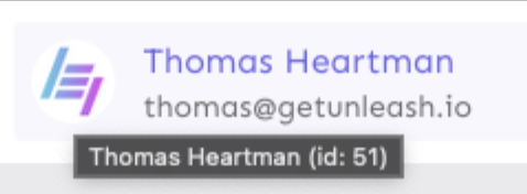
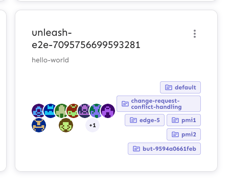
Extracts the Avatar Group component into a `common` component and adds a
standard tooltip to all avatars.
Relates to linear issue 1-2606
This is a suggestion / proof of concept for how we can solve it. While I
think we can merge this as is, I'd also be happy to take any discussions
on other ways to approach it etc.
## Why are these changes made together?
Because extracting the avatar group without adding the new tooltip data
made the existing tooltip misbehave (it'd show up in the top left of the
screen, not synced to the avatar in any way).
I probably could have (and still can if you think it's prudent) split it
out such that the avatar gets a standardized tooltip first (and disable
it for the group card avatars), and split out the avatars in a
follow-up. Happy to do that if you think it's better.
## What does this mean?
It used to be that we had no consistent way of dealing with avatars and
tooltips. Some places had them, some places didn't. This change makes it
so that all avatars that we can show tooltips for will get the same
tooltip.
Previously, we had at least 4 different ways of dealing with tooltips:
- The HTML tooltip (that would be standardized with this PR) in the
project flags table

- The "title" that you'd get on your user avatar
- The group card list tooltip

- And sometimes you'd get nothing at all

with this change, we'll always show the same kind of tooltip if we can:

## What goes in the tooltip?
We use the `UserAvatar` component for a fair few different things and I
didn't want to extract separate components for all the different use
cases. Instead, I wanted to get an overview over what we use it for and
what is relevant info to show.
I found all the places we used it and tried to form an opinion.
This tooltip will work with a user's email, name, username, and id. If
there is no user (such as for empty avatars and avatars displaying only
"+n" for remaining members), we show no tooltip.
Following the example set by the group card avatars, we'll try to use
email or username (in that order) as the main bit of text. If the user
has an email or a username and also a name, the name will be used as
secondary text.
If the user does not have an email or username, but has a name, we'll
use the name as the main text.
If the user does not have an email, a username, or a name, we'll try to
show "User ID: N" if they have an id.
If they do not have a username, a name, an email, or an ID, we bail out
and show nothing.
## Why can you disable the tooltip?
In some cases, you might want to disable the tooltip because you have
more information to feed into it. An example of that is in the project
flags table, where we want to show more information in cases where the
user is 'unknown':

## Additional fixes
This PR also adds a few lines of CSS to fix a minor avatar layout bug.
Before:
After:

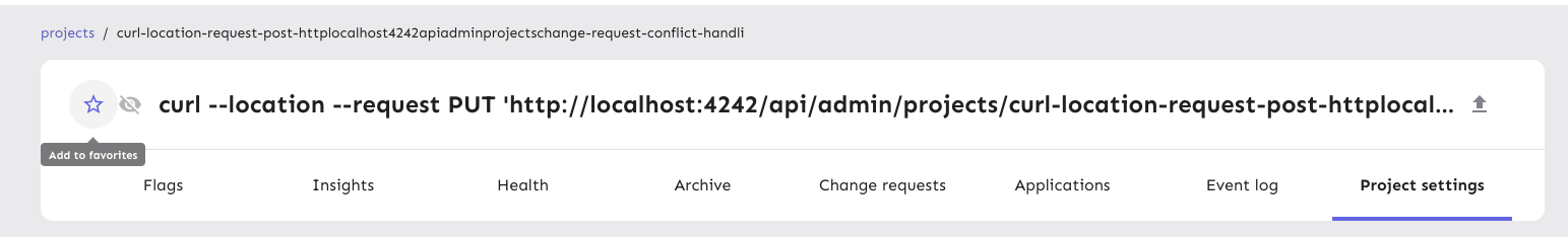
This PR fixes a minor visual issue where the "favorite project" button's
hover outline would get cut off due to its container having `overflow:
hidden`.
The overflow value was introduced in
[#7575](https://github.com/Unleash/unleash/pull/7575) as way to handle
long project names. We didn't discover the hover issue back then because
it's not apparent unless you hover the fav star.
I found the solution in the CSS-tricks post [Preventing a Grid
Blowout](https://css-tricks.com/preventing-a-grid-blowout/). To quote
the article, the reason this works is that:
> the minimum width of a grid column is auto. (The same is true for flex
items, by the way.)
>
> And since auto is entirely based on content, we can say it is
“indefinitely” sized, its dimensions flex. If we were to put an explicit
width on the column, like 50% or 400px, then we would say it is
“definitely” sized.
>
> To apply our fix, we need to make sure that there is the column has a
definite minimum width instead of auto.
Before:

After:
Additionally, I've removed a duplicate declaration of font size,
removing the deprecated version.