As of PR #8935, we no longer support both text and title, and confetti
has been removed.

This PR:
- removes `confetti` from the toast interface
- merges `text` and `title` into `text` and updates its uses across the
codebase.
- readjusts the text where necessary.
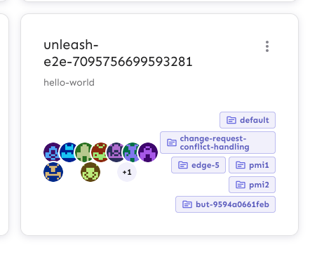
This PR updates the styling of the group cards to better handle edge
cases where you have a lot of assigned projects, long project names,
lots of members, etc.
In particular, it does the following things:
- aligns the avatars along the bottom of the card, so that even if
there's a lot of projects, the avatars stay close to the bottom edge
- adds word breaks for the project names, so that long names can break
when they need to
- adds some spacing between the two columns in the bottom row, so that
even when you they get close, they never quite touch.
Note: there is one more thing I'd like to address in a follow up: as
shown in the top row of the after image, there's some extra wrapping of
the first "This group has no users", even though it has the room to
grow. I'll keep looking into this and make a follow-up.
Before:

After:

Extracts the Avatar Group component into a `common` component and adds a
standard tooltip to all avatars.
Relates to linear issue 1-2606
This is a suggestion / proof of concept for how we can solve it. While I
think we can merge this as is, I'd also be happy to take any discussions
on other ways to approach it etc.
## Why are these changes made together?
Because extracting the avatar group without adding the new tooltip data
made the existing tooltip misbehave (it'd show up in the top left of the
screen, not synced to the avatar in any way).
I probably could have (and still can if you think it's prudent) split it
out such that the avatar gets a standardized tooltip first (and disable
it for the group card avatars), and split out the avatars in a
follow-up. Happy to do that if you think it's better.
## What does this mean?
It used to be that we had no consistent way of dealing with avatars and
tooltips. Some places had them, some places didn't. This change makes it
so that all avatars that we can show tooltips for will get the same
tooltip.
Previously, we had at least 4 different ways of dealing with tooltips:
- The HTML tooltip (that would be standardized with this PR) in the
project flags table

- The "title" that you'd get on your user avatar
- The group card list tooltip

- And sometimes you'd get nothing at all

with this change, we'll always show the same kind of tooltip if we can:

## What goes in the tooltip?
We use the `UserAvatar` component for a fair few different things and I
didn't want to extract separate components for all the different use
cases. Instead, I wanted to get an overview over what we use it for and
what is relevant info to show.
I found all the places we used it and tried to form an opinion.
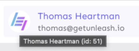
This tooltip will work with a user's email, name, username, and id. If
there is no user (such as for empty avatars and avatars displaying only
"+n" for remaining members), we show no tooltip.
Following the example set by the group card avatars, we'll try to use
email or username (in that order) as the main bit of text. If the user
has an email or a username and also a name, the name will be used as
secondary text.
If the user does not have an email or username, but has a name, we'll
use the name as the main text.
If the user does not have an email, a username, or a name, we'll try to
show "User ID: N" if they have an id.
If they do not have a username, a name, an email, or an ID, we bail out
and show nothing.
## Why can you disable the tooltip?
In some cases, you might want to disable the tooltip because you have
more information to feed into it. An example of that is in the project
flags table, where we want to show more information in cases where the
user is 'unknown':

## Additional fixes
This PR also adds a few lines of CSS to fix a minor avatar layout bug.
Before:
After:

This PR adds the UI part of feature flag collaborators. Collaborators are hidden on windows smaller than size XL because we're not sure how to deal with them in those cases yet.
**Upgrade to React v18 for Unleash v6. Here's why I think it's a good
time to do it:**
- Command Bar project: We've begun work on the command bar project, and
there's a fantastic library we want to use. However, it requires React
v18 support.
- Straightforward Upgrade: I took a look at the upgrade guide
https://react.dev/blog/2022/03/08/react-18-upgrade-guide and it seems
fairly straightforward. In fact, I was able to get React v18 running
with minimal changes in just 10 minutes!
- Dropping IE Support: React v18 no longer supports Internet Explorer
(IE), which is no longer supported by Microsoft as of June 15, 2022.
Upgrading to v18 in v6 would be a good way to align with this change.

TS updates:
* FC children has to be explicit:
https://stackoverflow.com/questions/71788254/react-18-typescript-children-fc
* forcing version 18 types in resolutions:
https://sentry.io/answers/type-is-not-assignable-to-type-reactnode/

Test updates:
* fixing SWR issue that we have always had but it manifests more in new
React (https://github.com/vercel/swr/issues/2373)

---------

Co-authored-by: kwasniew <kwasniewski.mateusz@gmail.com>
This PR fixes a bug where if you navigated to the projects page via the
menu, scrolled down, and hovered over a project's avatars, you'd be
scrolled to the top of the page when you moused off the avatar.

Turns out this issue was also in the group cards. It seems to be that
the popover attempts to restore focus back to where you where, which, if
you navigated via the menu, is at the top of the page. Because these
popovers don't have any focusable content, we can disable that
functionality.

Additionally, I've disabled the scroll lock when the popover is open.
The scroll lock made it impossible to scroll when one of the popovers is
open, which is confusing as a user.
This PR removes the flag for the new project card design, making it GA.

It also removes deprecated components and updates one reference (in the
groups card) to the new components instead.
https://linear.app/unleash/issue/2-1171/refactor-custom-root-roles-with-correct-plan-assumptions

This cleans up the hotfix `RoleSelect2` component and makes `RoleSelect`
take in a `roles` prop from the parent component.

This also simplifies the role hooks again to assume Enterprise plan by
default. This means, however, that we must ensure that we only call
these hooks in Enterprise features or, if we do call them in other
plans, that we provide a graceful fallback for non-Enterprise.
Non-Enterprise instances do not have this endpoint, and so they are
currently grabbing role information from e.g. `useUsers` and
`useServiceAccounts`.

I'm not sure how I feel about this. Roles are an overarching concept of
Unleash. To me, having to be extremely conscious about the exact
scenario in which you're using such a hook feels like a trap, instead of
"I need roles, so I'll grab the `useRoles` hook and not think much about
it". I also don't like the way `roles` are currently tied to the users,
service accounts, project access, (...) instead of being its own thing.

This could be solved by a `RoleController` exposing the GET endpoints in
OSS, since all of the logic we need for this use-case lives there
anyways. This would then be overridden with the Enterprise-specific
controller when wrapped. This way we could assume the endpoint is always
there, no matter the plan.
This is just an idea and not something I explored in the PR. For now I'm
just focusing on leaving this feature in a sane state.

Tested this manually on `Pro` and `Enterprise` and I believe everything
is acting the way we intend, but would love some extra eyes.
## About the changes
Implements custom root roles, encompassing a lot of different areas of
the project, and slightly refactoring the current roles logic. It
includes quite a clean up.
This feature itself is behind a flag: `customRootRoles`
This feature covers root roles in:
- Users;
- Service Accounts;
- Groups;
Apologies in advance. I may have gotten a bit carried away 🙈
### Roles
We now have a new admin tab called "Roles" where we can see all root
roles and manage custom ones. We are not allowed to edit or remove
*predefined* roles.

This meant slightly pushing away the existing roles to `project-roles`
instead. One idea we want to explore in the future is to unify both
types of roles in the UI instead of having 2 separate tabs. This
includes modernizing project roles to fit more into our current design
and decisions.
Hovering the permissions cell expands detailed information about the
role:

### Create and edit role
Here's how the role form looks like (create / edit):

Here I categorized permissions so it's easier to visualize and manage
from a UX perspective.
I'm using the same endpoint as before. I tried to unify the logic and
get rid of the `projectRole` specific hooks. What distinguishes custom
root roles from custom project roles is the extra `root-custom` type we
see on the payload. By default we assume `custom` (custom project role)
instead, which should help in terms of backwards compatibility.
### Delete role
When we delete a custom role we try to help the end user make an
informed decision by listing all the entities which currently use this
custom root role:

~~As mentioned in the screenshot, when deleting a custom role, we demote
all entities associated with it to the predefined `Viewer` role.~~
**EDIT**: Apparently we currently block this from the API
(access-service deleteRole) with a message:

What should the correct behavior be?
### Role selector
I added a new easy-to-use role selector component that is present in:
- Users

- Service Accounts

- Groups

### Role description
I also added a new role description component that you can see below the
dropdown in the selector component, but it's also used to better
describe each role in the respective tables:

I'm not listing all the permissions of predefined roles. Those simply
show the description in the tooltip:

### Role badge
Groups is a bit different, since it uses a list of cards, so I added yet
another component - Role badge:

I'm using this same component on the profile tab:

## Discussion points
- Are we being defensive enough with the use of the flag? Should we
cover more?
- Are we breaking backwards compatibility in any way?
- What should we do when removing a role? Block or demote?
- Maybe some existing permission-related issues will surface with this
change: Are we being specific enough with our permissions? A lot of
places are simply checking for `ADMIN`;
- We may want to get rid of the API roles coupling we have with the
users and SAs and instead use the new hooks (e.g. `useRoles`)
explicitly;
- We should update the docs;
- Maybe we could allow the user to add a custom role directly from the
role selector component;
---------
Co-authored-by: Gastón Fournier <gaston@getunleash.io>
feat: adds a way to specify a root role on a group, which will cause any user entering into that group to take on the permissions of that root role

Co-authored-by: Nuno Góis <github@nunogois.com>
## About the changes

Creating the first version of the Dark theme

Refactor: colors variables
Refactor: use theme variable instead
- this change will help us to use MuiCssBaseline, and we can use classes
directly for easy customization when we can't identify MUI classes

Refactor: adjusting some files components
- i’ve touched also the structure of some files, not only the colors
variables (but only to adjust the style, not functionality)

Fix: dark mode persistence on refresh (by Nuno)

Feat: dark mode sees light logos, and light mode sees dark logos (by
Nuno)

---------

Co-authored-by: Nuno Góis <github@nunogois.com>
This PR fixes an issue that would manifest when you navigated directly
to the groups and tried to edit the group from the group card. When you
were redirected to the edit groups view, the data fields would be empty.
The root cause of this issue is that the data has not arrived over the
wire before we load the UI, resulting in the UI showing an empty
dataset.

Normally, if this data came directly from useSWR, the app would
re-render and display the data correctly. However, in this instance we
are passing the data to an intermediary hook (useGroupForm) which does
not have the same re-render logic. Therefore we are effectively working
from stale data. We solve this issue by adding a container that resolves
the group before the edit form is rendered, and that invokes the
intermediary hook only when the data is available.
## About the changes
Refactoring the colors for the light theme to be much easier to continue
with dark mode

This is the first step to finish dark mode

https://linear.app/unleash/project/[low][s][alpha]-dark-mode-in-unleash-admin-ui-31b407d13c4b/1

This PR uses `main-theme` as a placeholder for `dark-theme` for now due
to the new changes. Still need to set the correct values here.

---------

Co-authored-by: Nuno Góis <github@nunogois.com>
This PR fixes an error where useSWR would throw a TypeError: `subs[i] is
not a function`: https://github.com/vercel/swr/issues/2357

I can't be totally sure why this is happening but we had a design flaw
in our setup that caused our group overview to first fetch all groups,
and then subsequently fetch each individual group after the groups were
rendered. This was happening because GroupCard was rendering the
EditGroupUsers component which used the `useGroup(groupId)` getter.

The flow in the old version looked like this:

1. Fetch all the groups
2. Use the groups data to render all the `GroupCard` elements
3. Once the GroupCard was rendered the EditGroupComponent would be
mounted and set up a recurring GET on the individual group, causing each
group to be fetched recurringly in the Group overview.

The useSWR error seems to be connected to setting up these
subscriptions, and then removing the element from the DOM. We were able
to trigger this error by removing the group.

## How did we fix it?

We refactored the components concerned with editing group users and
removing groups to exist outside of the `GroupCard` and have the group
card supply the base data through a state setter. This pattern is also
better for the remove functionality because the remove functionality in
its current state could trigger a react update on a component removed
from the DOM if you awaited the refetching of the data. This is because
the groups data is controlling the rendering of the `GroupCard` and when
the `RemoveGroup` modal is nested underneath the `GroupCard` a refetch
would trigger an update, re-render the overview and remove the entire
`GroupCard` and the associated `RemoveGroup` component.

I'm still not sure if this is a bug with SWR or a side-effect of how we
architected the functionality, but this change seems to remove the
problem.
https://linear.app/unleash/issue/2-563/fix-issue-with-useconditionallyhiddencolumns-and-react-table
It seems like we should add `autoResetHiddenColumns: false` to
`useTable` whenever we use `useConditionallyHiddenColumns`.
Basically the thought is that, if we're controlling column visibility in
our own way, we should not want other things to change that state
unpredictably, otherwise this may make React go _brrrrrr_. And it can be
very hard to pinpoint what exactly may be causing React to go _brrrrrr_.
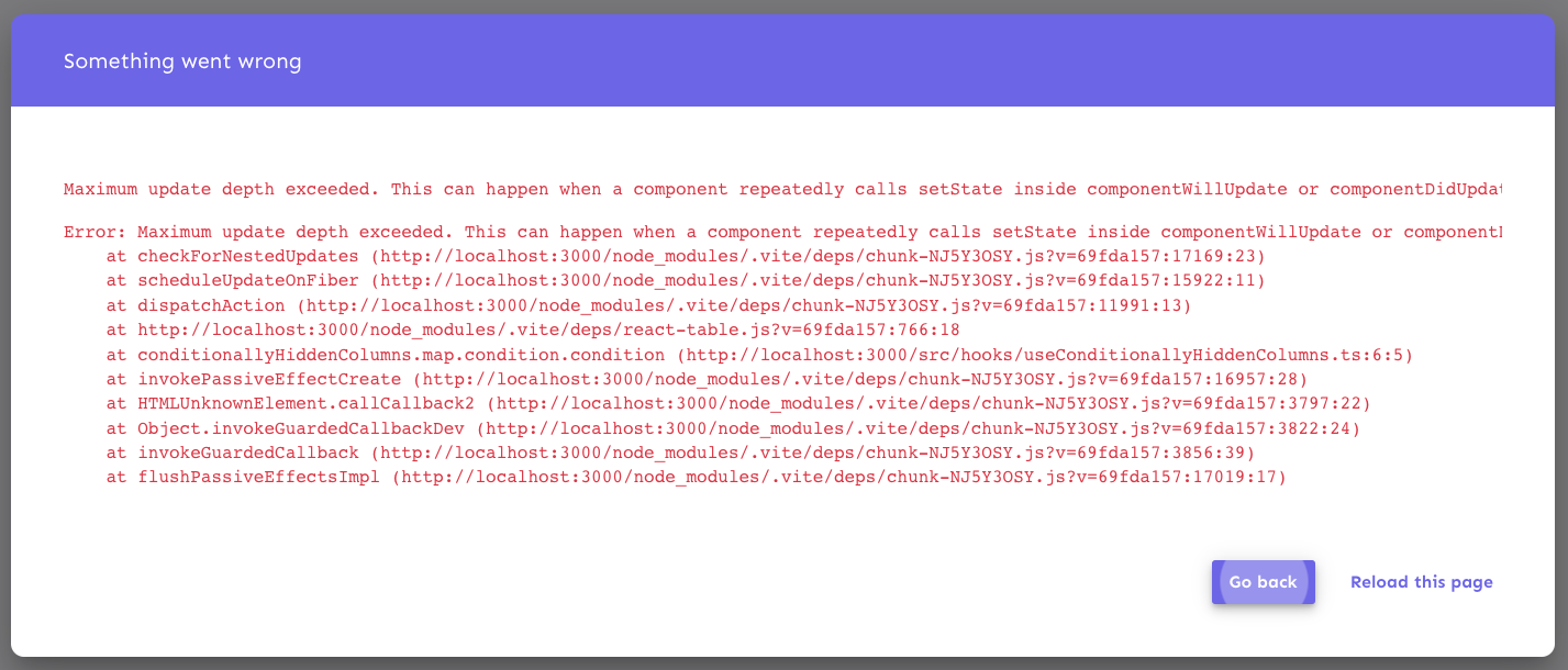
First detected this issue apparently randomly while developing the new
SA table. Around 10-20 page refreshes would eventually trigger it. Was
not easy to find, but hopefully this fixes it permanently. At least I
haven't been able to reproduce it since. Maybe someone has a better idea
of where the issue could be or if this is a pretty good guess. Doesn't
seem like this change hurts us anyways.
I love React, `useEffect` and these very to-the-point error messages.
Very fun and productive.
Reference: https://react-table-v7.tanstack.com/docs/api/useTable
https://linear.app/unleash/issue/2-514/fix-issues-with-conditionally-hidden-table-columns

This upgrades the old `useHiddenColumns` to a new
`useConditionallyHiddenColumns`. This implementation covers some issues
and edge cases, and should hopefully be the standard way of achieving
responsive visibility for table columns from now on.

Some of these issues included incorrectly showing/hiding table columns,
whether when resizing the window or at page load, even when the proper
conditions were met to toggle their visibility.

This PR adapts the tables that were already using `useHiddenColumns` to
use the new approach.
I'll create a new PR after this one to adapt our other existing tables
to use this new approach as well.
Removes feature flags for syncing sso groups and clone environment.
These features are being made generally available for all who have
access to environments and sso groups
* add clone environment modal base skeleton (WIP)

* refactor HelpIcon common component, fix group form

* add more fields to clone env modal, multi project selector

* implement initial payload signature

* reflect latest design decisions

* misc ui fixes

* update UI to the new designs, change back clone option to use flag

* set env limit to 15

* Update frontend/src/component/environments/EnvironmentTable/EnvironmentActionCell/EnvironmentCloneModal/EnvironmentCloneModal.tsx

Co-authored-by: Simon Hornby <liquidwicked64@gmail.com>

* Update frontend/src/component/environments/EnvironmentTable/EnvironmentActionCell/EnvironmentCloneModal/EnvironmentCloneModal.tsx

Co-authored-by: Simon Hornby <liquidwicked64@gmail.com>

* Update frontend/src/component/environments/EnvironmentTable/EnvironmentActionCell/EnvironmentCloneModal/EnvironmentCloneModal.tsx

Co-authored-by: Simon Hornby <liquidwicked64@gmail.com>

* Update frontend/src/component/environments/EnvironmentTable/EnvironmentActionCell/EnvironmentCloneModal/EnvironmentCloneModal.tsx

Co-authored-by: Simon Hornby <liquidwicked64@gmail.com>

* address PR comments

Co-authored-by: Simon Hornby <liquidwicked64@gmail.com>