Adds caching via localstorage to the flag creation form, so that if you
(accidentally) close the form before submitting it, you'll retain (most)
of the same data when you reopen it.

Specifically, we'll store:
- name
- description
- type
- tags
- impression data

We can't store the project as it is now, because it gets overridden by
whatever is in the URL. However, this is probably a good thing. It means
that if you navigate to a different project and open the feature
creation form there, it'll retain everything from the last one, but
it'll use the current project.

The stored data is cleared when you successfully create a feature, so
that you don't get dangling data.

The data is also stored in a shared cache for all projects, so that you
don't have different caches per project.

The behavior of seeding the form is hidden behind a flag (that doesn't
exist yet). We'll still read and write to the cache if the flag is off,
but we won't use it to populate the feature form, so it has no
discernible impact on the user.

## Bug detected 🐛  ... and squashed

Working on this, I came to realize that there was a bug in how the
config button and use feature form hooks interacted. We (in this case
probably me) have assumed that it's fine to use a set for any option
checking in the config buttons. Also, we're using a set to store tags in
the feature form. But objects aren't compared by value in JS, so the set
will happily accept multiple instances of the same tag. Likewise, these
tags won't show up as selected in the dropdown because when the dropdown
checks if the set `has` the value, it's using reference equality.

To get around this, I have normalized the values of the Tags set to
strings (`<type>:<value>`), which are easily comparable.

We can iterate on this later if we need to.

## `useLocalStorageState`

In doing this, I have also made a change to the useLocalStorageState
hook:
the exposed "setState" function now writes to the localstorage
immediately. This is because the useEffect method might not have time to
save the data if the component unmounts (this was the case with the flag
dialog).

However, I have kept the useEffect because it gets run on component
mount and then only when it changes. This means that we will get double
saves to localstorage, but it'll be with the same data, so it's benign.


I've tried out two other uses of the hook (event timeline props and
environment columns in the project flags table) and see no discernible
difference in behavior.

## `useFeatureForm`

I have also made a change to the useFeatureForm hook and removed a
`useEffect` that would reset the name to whatever you passed in as the
initial name if you cleared it out. This essentially meant that you
couldn't clear the name completely, because it would just refill with
the initial name.

As far as I can tell, there is no need to have this sticking around
anymore. The hook is only used in two places: the flag creation dialog
and the flag edit page. The flag edit page doesn't allow you to change
the name anyway and it was causing issues in the dialog. It's likely a
holdover from the way something worked 3 years ago. Both the dialog and
the edit screen seem to work just fine with this change.

I have also changed the function parameters from ordered parameters to
an object. There's so many of them that even you don't think it's a good
idea to use objects when you have multiple params with the same type,
it's just nigh-impossible to remember the order by now.

## Minor changes

Additionally, I came across three issues that were causing react errors,
and have fixed them.
1. we'd forgotten to interpolate a variable and just used the variable
name in a string instead
2. an html attribute that doesn't exist (`aria-role` instead of `role`)
3. Providing a disabled button inside a tooltip. I've seen this one
around for ages and it prevented tooltips from working on disabled
buttons. The solution was wrapping it in a span.
We're migrating to ESM, which will allow us to import the latest
versions of our dependencies.

Co-Authored-By: Christopher Kolstad <chriswk@getunleash.io>
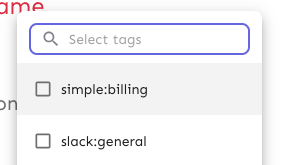
Makes the env selector on the flag page act the same way as the env
selector on the new project page or any of the filterable buttons in the
new project/flag dialogs.
Also slightly changes the styles of the existing dropdown lists to bring
them in line with the new env selector (more padding, full-width
highlights).
Selector:

Project/flag creation:
Before:

After:
## Technical notes
I was a little unsure how best to share the padding/spacing styles
between the search field and popover at first (as was requested by UX).
The easiest way (and most compliant with how we do it today) was to
define the spacing in a variable and move the relevant components into
the same file.
However, I actually think that using a CSS variable (e.g.
`--popover-spacing`) would be "better" here, but we don't really use
them much, so I've left that out for now. That said, if you agree, I'd
be more than happy to use that instead 🙋🏼
This change prevents long project names from blowing the form out of
proportion.
To do so, it:
1. sets `whitespace: no-wrap` on the button labels. Judging by the other
styles, this was the intention all along, but it didn't really come up
until now.
2. It also sets the label width for projects to 30ch,so that you'll get
to see quite a bit of the project name before it gets cut off.
It would be possible to set a dynamic width for this button based on the
longest project name, but I'm not sure it adds much value, so I'm
leaning towards keeping it simple.
Here's what the dynamic width would look like:
``` tsx
const projectButtonLabelWidth = useMemo(() => {
const longestProjectName = projects.reduce(
(prev: number, type: { name: string }) =>
prev >= type.name.length ? prev : type.name.length,
0,
);
return `${Math.min(longestProjectName, 30)}ch`;
}, [projects]);
```
What it looks like:

This PR makes the config dropdown list generic over its values, so that
you can pass stuff that isn't strings.

It also updates the existing impression data button to use booleans
instead.
This change makes it so that all form input labels start with a
capital letter, regardless of the data we use to generate them.

Also fixes a leftover toggle -> flag renaming.
This PR extracts the dialog form that we created for the new project
form into a shared component in the `common` folder.

Most of the code has been lifted and shifted, but there's been some
minor adjustments along the way. The main file is
`frontend/src/component/common/DialogFormTemplate/DialogFormTemplate.tsx`.
Everything else is just cleanup.