Implements the drag-n-drop tooltip the first time the user sees a
strategy drag handle on the feature env overview. It uses React Joyride,
which is the same system we use for the demo.
The design is a little different from the sketches because I couldn't
find a quick way to move the content (and the arrow) to be shifted
correctly.
If the demo is also active the first time a user visits a strategy page,
it'll render both the demo steps and this, but this tooltip doesn't
prevent the user from finishing the tour. It might be possible to avoid
that through checking state in localstorage, but I'd like to get this
approved first.
The tooltip uses the auth splash system to decide whether to show the
tooltip, meaning it's stored per user in the DB. To avoid it
re-rendering before you refetch from the back end, we also use a
temporary variable to check whether the user has closed it.
Rendered:

If the tour is also active:

Adds a new dialog option for whats in new in Unleash items. This can be
tiggerred by setting `popout` to true when configuring the items.
To do this without setting fire to the code, I've also needed to
refactor the NewInUnleash components:
- NewInUnleashItem becomes a dumb item that decides if a dialog or
tooltip should be rendered and controls that render state
- The child item in NewInUnleashItem has been moved out into
NewInUnleashSideBarItem, which feels a bit better since that is a
distinct UI element from the popup
- NewInUnleashDialog now exists, which is a dialog version of the popup.
Meaningfully different to ask for a new component
## Screenshots

Fixes janky drag and drop behavior and updates the styling of the drag
handle focus.
The solution uses the same method to prevent oscillation as we do for
strategies. To get access to the same context, I've added some extra
parameters to the OnMoveItem function and passed along the extra data
from the `useDragItem` hook. No new information, just making more of it
available, and turning it into an object so that you can declare the
properties you need (and get rid of potential wrong ordering of
drag/drop indices).
For the drag and drop behavior: If the dragged element is the same size
or smaller than the element you're dragging over, they will swap places
as soon as you enter that space. If the target element is larger,
however, they won't swap until you reach the drag/drop handle, even if
they could theoretically switch somewhere in the middle. This appears to
be a limitation of how the drag/drop event system works. New drag events
are only fired when you "dragenter" a new element, so it never fires
anywhere in the middle. Technically, we could insert more empty spans
inside the drag handle to trigger more events, but I wanna hold off on
that because it doesn't sound great.
When dragging, only the handle is visible; the rest of the card stays in
place. For strategies, we show a "ghost" version of the config you're
dragging. However, if you apply the drag handle to the card itself, all
of it becomes draggable, but you can no longer select the text inside
it, which is unfortunate. Strategies do solev this, though, but I
haven't been able to figure out why. If you know, please share!
Before:

After:

Extracts the shared strategy list and list item into the `common` folder
instead of living in the environment accordion body file.

Also takes the disabled strategy handling that we use for
`StrategySeparator` and moves it into the file itself. It might be
something we want to decorate manually in the future, but we don't for
now, so this was the most straight-forward way to make it work.
Makes it so that strategies project env strategies that aren't draggable
don't get the drag icon. The reason it didn't work as expected was that
we used fallback functions instead of keeping them undefined.
I discovered that we applied two dragging boxes, so I removed the outer
layer one (specific to project envs) in favor of relying on the inner
one. Most of the lines changed are just indentation as a result of this
nesting going away.
Here's the diff. The top set of strategies aren't draggable; the lower
ones are.

Gives a small update in how we deal with unevaluated and disabled
strategies in the new playground design:
- "Unevaluated" badges go from yellow warning to blue info and their
text changed to "Not evaluated"
- Don't show "Not evaluated" badges on strategies that are disabled.
To avoid this change affecting the current playground setup, I
duplicated the old resultschip into a legacy file and changed the
existing impl. To avoid updating all other files that use that chip
(it's all over the playground) and checking flags or creating duplicates
there, I decided to do a quick check at the top of the legacy file and
use the new file if the flag is on.
In doing so, I've also simplified the actual chip file and have more or
less cut the total line count in it in two 😄

Flattens the list of strategies when you have both release plans and
strategies. If you had both, you'd have this setup before:
```
- ol
- li // release plan
- ol // release plan strategies
- li // regular strategies
- ol // strategy list
```
Now we drop the extra nesting:
```
- ol
- li // release plan
- ol // release plan strategies
- li // the rest of the strategies
```
Semantically, I think this is just as valid and it simplifies a lot of
styling that no longer needs to look for other lists etc.
As part of doing this, I have also moved the "many strategies" warnings
and pagination labels to outside the list instead of inside the smaller
list.
Otherwise, the list looks just the same as before and drag-n-drop works
just fine.
(side note: these strategies shouldn't have drag handles 🤔 )

As a bonus, this PR also:
- Uses the disabled style separator for disabled strats in playground
and deletes some unused components I found.
Playground disabled strats (we probably don't want double orange badges;
I'll talk to UX):

Handle cases where flags have no strategies in the playground.
As part of this, also changes how we deal with the padding/margins in
the playground: instead of making all but one items in the playground
have to explicitly add padding, now we instead say that the only item
that needs to do something is the list, which uses negative inline
margins.
This also has the added benefit of adding all the top-level elements
(that is: that's not part of the strategy lists) inside the same
container, so we can control gaps between them with flex's gaps.
When you have no strategies (before):

When you have no strategies (after):

Implements playground results for strategies.
Old design:

New design:

Still left: segments.
I also discovered during this that some of the new hooks (and also some
of the new components) accept deprecated types
(`IFeatureStrategyPayload` in this case). If that should indeed be
deprecated, then we also shouldn't use it in the new hooks / components
if we can avoid it. I'll make a task for it.
---------
Co-authored-by: Tymoteusz Czech <2625371+Tymek@users.noreply.github.com>
Implements the new design for playground constraints. They're not in use
in segments yet, and strategy parameters have not been touched. This PR
establishes a pattern that we can follow for strategies and parameters
later.
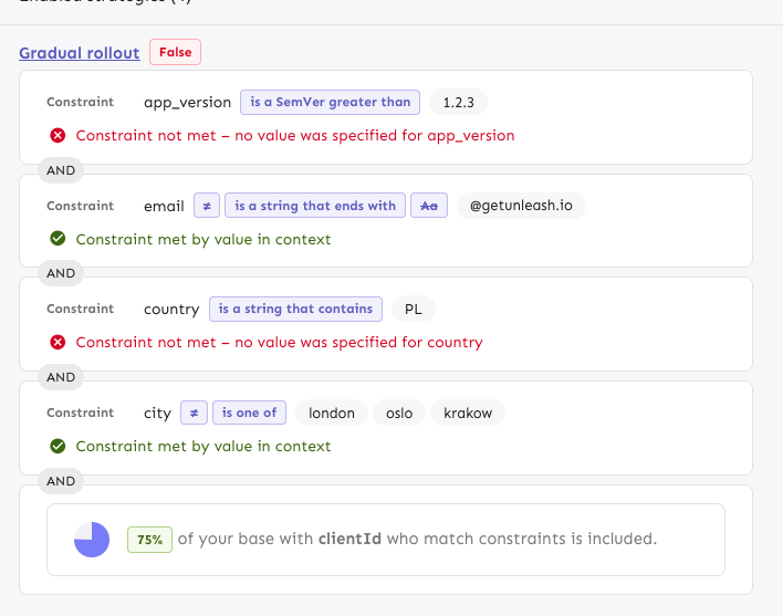
The PR also includes a change in how the constraint item organizes its
children: it now takes care adding padding and spacing itself, instead
of the children doing that. It looks right most places, but segments
aren't quite right anymore. However, as this is behind a flag, I'd
rather fix that in a separate PR.
---------
Co-authored-by: Tymoteusz Czech <2625371+Tymek@users.noreply.github.com>
Previously, the entire card was draggable, which meant that you couldn't
select text inside the card or inside the milestone title when editing.
This makes it so that only the drag handle is draggable.