mirror of
https://github.com/Unleash/unleash.git
synced 2025-02-23 00:22:19 +01:00
 01b2a15b8a
This commit adjusts the height of the flag section in the personal dashboard, so that the chart doesn't cause scrolling on the widest version. Before: 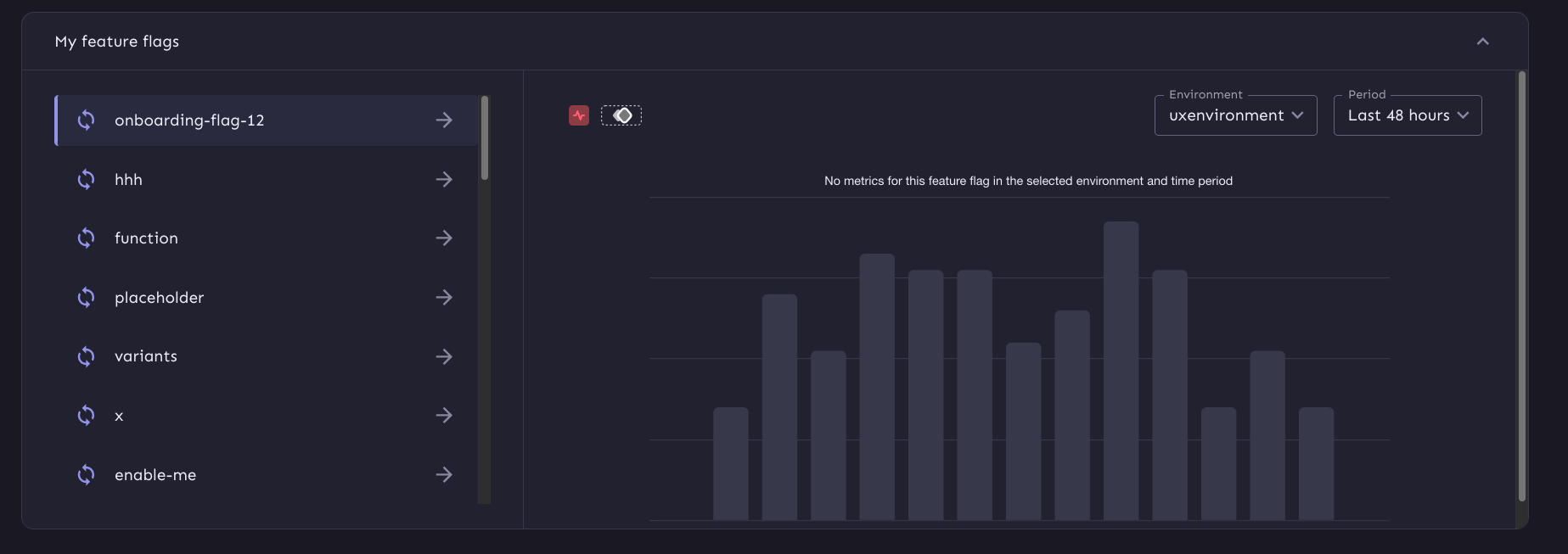 After:  Also fixes some issues in regards to super big lists when it goes into flex mode and makes the chart more responsive
475 lines
16 KiB
TypeScript
475 lines
16 KiB
TypeScript
import { useAuthUser } from 'hooks/api/getters/useAuth/useAuthUser';
|
|
import {
|
|
Accordion,
|
|
AccordionDetails,
|
|
AccordionSummary,
|
|
Alert,
|
|
Button,
|
|
IconButton,
|
|
Link,
|
|
ListItem,
|
|
ListItemButton,
|
|
styled,
|
|
Typography,
|
|
} from '@mui/material';
|
|
import React, { type FC, useEffect, useRef } from 'react';
|
|
import LinkIcon from '@mui/icons-material/ArrowForward';
|
|
import { WelcomeDialog } from './WelcomeDialog';
|
|
import { useLocalStorageState } from 'hooks/useLocalStorageState';
|
|
import { usePersonalDashboard } from 'hooks/api/getters/usePersonalDashboard/usePersonalDashboard';
|
|
import { getFeatureTypeIcons } from 'utils/getFeatureTypeIcons';
|
|
import type {
|
|
PersonalDashboardSchemaFlagsItem,
|
|
PersonalDashboardSchemaProjectsItem,
|
|
} from '../../openapi';
|
|
import { usePersonalDashboardProjectDetails } from 'hooks/api/getters/usePersonalDashboard/usePersonalDashboardProjectDetails';
|
|
import useLoading from '../../hooks/useLoading';
|
|
import { MyProjects } from './MyProjects';
|
|
import {
|
|
ContentGridContainer,
|
|
FlagGrid,
|
|
ListItemBox,
|
|
listItemStyle,
|
|
SpacedGridItem,
|
|
StyledList,
|
|
} from './Grid';
|
|
import { ContentGridNoProjects } from './ContentGridNoProjects';
|
|
import ExpandMore from '@mui/icons-material/ExpandMore';
|
|
import { usePlausibleTracker } from 'hooks/usePlausibleTracker';
|
|
import useSplashApi from 'hooks/api/actions/useSplashApi/useSplashApi';
|
|
import { useAuthSplash } from 'hooks/api/getters/useAuth/useAuthSplash';
|
|
|
|
export const StyledCardTitle = styled('div')<{ lines?: number }>(
|
|
({ theme, lines = 2 }) => ({
|
|
fontWeight: theme.typography.fontWeightRegular,
|
|
fontSize: theme.typography.body1.fontSize,
|
|
lineClamp: `${lines}`,
|
|
WebkitLineClamp: lines,
|
|
lineHeight: '1.2',
|
|
display: '-webkit-box',
|
|
boxOrient: 'vertical',
|
|
textOverflow: 'ellipsis',
|
|
overflow: 'hidden',
|
|
alignItems: 'flex-start',
|
|
WebkitBoxOrient: 'vertical',
|
|
wordBreak: 'break-word',
|
|
}),
|
|
);
|
|
const FlagListItem: FC<{
|
|
flag: { name: string; project: string; type: string };
|
|
selected: boolean;
|
|
onClick: () => void;
|
|
}> = ({ flag, selected, onClick }) => {
|
|
const activeFlagRef = useRef<HTMLLIElement>(null);
|
|
const { trackEvent } = usePlausibleTracker();
|
|
|
|
useEffect(() => {
|
|
if (activeFlagRef.current) {
|
|
activeFlagRef.current.scrollIntoView({
|
|
block: 'nearest',
|
|
inline: 'start',
|
|
});
|
|
}
|
|
}, []);
|
|
const IconComponent = getFeatureTypeIcons(flag.type);
|
|
const flagLink = `projects/${flag.project}/features/${flag.name}`;
|
|
return (
|
|
<ListItem
|
|
key={flag.name}
|
|
disablePadding={true}
|
|
sx={{ mb: 1 }}
|
|
ref={selected ? activeFlagRef : null}
|
|
>
|
|
<ListItemButton
|
|
sx={listItemStyle}
|
|
selected={selected}
|
|
onClick={onClick}
|
|
>
|
|
<ListItemBox>
|
|
<IconComponent color='primary' />
|
|
<StyledCardTitle>{flag.name}</StyledCardTitle>
|
|
<IconButton
|
|
component={Link}
|
|
href={flagLink}
|
|
onClick={() => {
|
|
trackEvent('personal-dashboard', {
|
|
props: {
|
|
eventType: `Go to flag from list`,
|
|
},
|
|
});
|
|
}}
|
|
size='small'
|
|
sx={{ ml: 'auto' }}
|
|
>
|
|
<LinkIcon titleAccess={flagLink} />
|
|
</IconButton>
|
|
</ListItemBox>
|
|
</ListItemButton>
|
|
</ListItem>
|
|
);
|
|
};
|
|
|
|
// todo: move into own file
|
|
const useDashboardState = (
|
|
projects: PersonalDashboardSchemaProjectsItem[],
|
|
flags: PersonalDashboardSchemaFlagsItem[],
|
|
) => {
|
|
type State = {
|
|
activeProject: string | undefined;
|
|
activeFlag: PersonalDashboardSchemaFlagsItem | undefined;
|
|
expandProjects: boolean;
|
|
expandFlags: boolean;
|
|
};
|
|
|
|
const defaultState: State = {
|
|
activeProject: undefined,
|
|
activeFlag: undefined,
|
|
expandProjects: true,
|
|
expandFlags: true,
|
|
};
|
|
|
|
const [state, setState] = useLocalStorageState<State>(
|
|
'personal-dashboard:v1',
|
|
defaultState,
|
|
);
|
|
|
|
const updateState = (newState: Partial<State>) =>
|
|
setState({ ...defaultState, ...state, ...newState });
|
|
|
|
useEffect(() => {
|
|
const updates: Partial<State> = {};
|
|
const setDefaultFlag =
|
|
flags.length &&
|
|
(!state.activeFlag ||
|
|
!flags.some((flag) => flag.name === state.activeFlag?.name));
|
|
|
|
if (setDefaultFlag) {
|
|
updates.activeFlag = flags[0];
|
|
}
|
|
|
|
const setDefaultProject =
|
|
projects.length &&
|
|
(!state.activeProject ||
|
|
!projects.some(
|
|
(project) => project.id === state.activeProject,
|
|
));
|
|
|
|
if (setDefaultProject) {
|
|
updates.activeProject = projects[0].id;
|
|
}
|
|
|
|
if (Object.keys(updates).length) {
|
|
updateState(updates);
|
|
}
|
|
}, [
|
|
JSON.stringify(projects, null, 2),
|
|
JSON.stringify(flags, null, 2),
|
|
JSON.stringify(state, null, 2),
|
|
]);
|
|
|
|
const { activeFlag, activeProject } = state;
|
|
|
|
const setActiveFlag = (flag: PersonalDashboardSchemaFlagsItem) => {
|
|
updateState({
|
|
activeFlag: flag,
|
|
});
|
|
};
|
|
|
|
const setActiveProject = (projectId: string) => {
|
|
updateState({
|
|
activeProject: projectId,
|
|
});
|
|
};
|
|
|
|
const toggleSectionState = (section: 'flags' | 'projects') => {
|
|
const property = section === 'flags' ? 'expandFlags' : 'expandProjects';
|
|
updateState({
|
|
[property]: !(state[property] ?? true),
|
|
});
|
|
};
|
|
|
|
return {
|
|
activeFlag,
|
|
setActiveFlag,
|
|
activeProject,
|
|
setActiveProject,
|
|
expandFlags: state.expandFlags ?? true,
|
|
expandProjects: state.expandProjects ?? true,
|
|
toggleSectionState,
|
|
};
|
|
};
|
|
|
|
const WelcomeSection = styled('div')(({ theme }) => ({
|
|
display: 'flex',
|
|
justifyContent: 'space-between',
|
|
gap: theme.spacing(1),
|
|
flexFlow: 'row wrap',
|
|
alignItems: 'baseline',
|
|
}));
|
|
|
|
const ViewKeyConceptsButton = styled(Button)({
|
|
fontWeight: 'normal',
|
|
padding: 0,
|
|
margin: 0,
|
|
});
|
|
|
|
const SectionAccordion = styled(Accordion)(({ theme }) => ({
|
|
border: `1px solid ${theme.palette.divider}`,
|
|
borderRadius: theme.shape.borderRadiusMedium,
|
|
backgroundColor: theme.palette.background.paper,
|
|
boxShadow: 'none',
|
|
'& .expanded': {
|
|
'&:before': {
|
|
opacity: '0 !important',
|
|
},
|
|
},
|
|
|
|
// add a top border to the region when the accordion is collapsed.
|
|
// This retains the border between the summary and the region
|
|
// during the collapsing animation
|
|
"[aria-expanded='false']+.MuiCollapse-root .MuiAccordion-region": {
|
|
borderTop: `1px solid ${theme.palette.divider}`,
|
|
},
|
|
|
|
overflow: 'hidden',
|
|
}));
|
|
|
|
const StyledAccordionSummary = styled(AccordionSummary)(({ theme }) => ({
|
|
border: 'none',
|
|
padding: theme.spacing(2, 4),
|
|
margin: 0,
|
|
// increase specificity to override the default margin
|
|
'&>.MuiAccordionSummary-content.MuiAccordionSummary-content': {
|
|
margin: '0',
|
|
},
|
|
"&[aria-expanded='true']": {
|
|
// only add the border when it's open
|
|
borderBottom: `1px solid ${theme.palette.divider}`,
|
|
},
|
|
}));
|
|
|
|
const StyledAccordionDetails = styled(AccordionDetails)({
|
|
padding: 0,
|
|
});
|
|
|
|
const MainContent = styled('div')(({ theme }) => ({
|
|
display: 'flex',
|
|
flexDirection: 'column',
|
|
gap: theme.spacing(2),
|
|
}));
|
|
|
|
const NoActiveFlagsInfo = styled('div')(({ theme }) => ({
|
|
display: 'flex',
|
|
flexFlow: 'column',
|
|
gap: theme.spacing(2),
|
|
}));
|
|
|
|
export const PersonalDashboard = () => {
|
|
const { user } = useAuthUser();
|
|
const { trackEvent } = usePlausibleTracker();
|
|
const { setSplashSeen } = useSplashApi();
|
|
const { splash } = useAuthSplash();
|
|
|
|
const name = user?.name;
|
|
|
|
const { personalDashboard, refetch: refetchDashboard } =
|
|
usePersonalDashboard();
|
|
|
|
const projects = personalDashboard?.projects || [];
|
|
|
|
const {
|
|
activeProject,
|
|
setActiveProject,
|
|
activeFlag,
|
|
setActiveFlag,
|
|
toggleSectionState,
|
|
expandFlags,
|
|
expandProjects,
|
|
} = useDashboardState(projects, personalDashboard?.flags ?? []);
|
|
|
|
const [welcomeDialog, setWelcomeDialog] = useLocalStorageState<
|
|
'open' | 'closed'
|
|
>(
|
|
'welcome-dialog:v1',
|
|
splash?.personalDashboardKeyConcepts ? 'closed' : 'open',
|
|
);
|
|
|
|
const { personalDashboardProjectDetails, error: detailsError } =
|
|
usePersonalDashboardProjectDetails(activeProject);
|
|
|
|
const activeProjectStage =
|
|
personalDashboardProjectDetails?.onboardingStatus.status ?? 'loading';
|
|
|
|
const noProjects = projects.length === 0;
|
|
|
|
const projectStageRef = useLoading(
|
|
!detailsError && activeProjectStage === 'loading',
|
|
);
|
|
|
|
return (
|
|
<MainContent>
|
|
<WelcomeSection>
|
|
<Typography component='h2' variant='h2'>
|
|
Welcome {name}
|
|
</Typography>
|
|
|
|
<ViewKeyConceptsButton
|
|
sx={{
|
|
fontWeight: 'normal',
|
|
}}
|
|
size={'small'}
|
|
variant='text'
|
|
onClick={() => {
|
|
trackEvent('personal-dashboard', {
|
|
props: {
|
|
eventType: 'open key concepts',
|
|
},
|
|
});
|
|
setWelcomeDialog('open');
|
|
}}
|
|
>
|
|
View key concepts
|
|
</ViewKeyConceptsButton>
|
|
</WelcomeSection>
|
|
|
|
<SectionAccordion
|
|
disableGutters
|
|
expanded={expandProjects ?? true}
|
|
onChange={() => toggleSectionState('projects')}
|
|
>
|
|
<StyledAccordionSummary
|
|
expandIcon={
|
|
<ExpandMore titleAccess='Toggle projects section' />
|
|
}
|
|
id='projects-panel-header'
|
|
aria-controls='projects-panel-content'
|
|
>
|
|
<Typography variant='body1' component='h3'>
|
|
My projects
|
|
</Typography>
|
|
</StyledAccordionSummary>
|
|
<StyledAccordionDetails>
|
|
{noProjects && personalDashboard ? (
|
|
<ContentGridNoProjects
|
|
owners={personalDashboard.projectOwners}
|
|
admins={personalDashboard.admins}
|
|
/>
|
|
) : (
|
|
<MyProjects
|
|
admins={personalDashboard?.admins ?? []}
|
|
ref={projectStageRef}
|
|
projects={projects}
|
|
activeProject={activeProject || ''}
|
|
setActiveProject={setActiveProject}
|
|
personalDashboardProjectDetails={
|
|
personalDashboardProjectDetails
|
|
}
|
|
/>
|
|
)}
|
|
</StyledAccordionDetails>
|
|
</SectionAccordion>
|
|
|
|
<SectionAccordion
|
|
expanded={expandFlags ?? true}
|
|
onChange={() => toggleSectionState('flags')}
|
|
>
|
|
<StyledAccordionSummary
|
|
expandIcon={
|
|
<ExpandMore titleAccess='Toggle flags section' />
|
|
}
|
|
id='flags-panel-header'
|
|
aria-controls='flags-panel-content'
|
|
>
|
|
<Typography variant='body1' component='h3'>
|
|
My feature flags
|
|
</Typography>
|
|
</StyledAccordionSummary>
|
|
<StyledAccordionDetails>
|
|
<ContentGridContainer>
|
|
<FlagGrid>
|
|
<SpacedGridItem gridArea='flags'>
|
|
{personalDashboard &&
|
|
personalDashboard.flags.length > 0 ? (
|
|
<StyledList
|
|
disablePadding={true}
|
|
sx={{
|
|
height: '100%',
|
|
overflow: 'auto',
|
|
}}
|
|
>
|
|
{personalDashboard.flags.map((flag) => (
|
|
<FlagListItem
|
|
key={flag.name}
|
|
flag={flag}
|
|
selected={
|
|
flag.name ===
|
|
activeFlag?.name
|
|
}
|
|
onClick={() =>
|
|
setActiveFlag(flag)
|
|
}
|
|
/>
|
|
))}
|
|
</StyledList>
|
|
) : activeProject ? (
|
|
<NoActiveFlagsInfo>
|
|
<Typography>
|
|
You have not created or favorited
|
|
any feature flags. Once you do, they
|
|
will show up here.
|
|
</Typography>
|
|
<Typography>
|
|
To create a new flag, go to one of
|
|
your projects.
|
|
</Typography>
|
|
</NoActiveFlagsInfo>
|
|
) : (
|
|
<Alert severity='info'>
|
|
You need to create or join a project to
|
|
be able to add a flag, or you must be
|
|
given the rights by your admin to add
|
|
feature flags.
|
|
</Alert>
|
|
)}
|
|
</SpacedGridItem>
|
|
|
|
<SpacedGridItem gridArea='chart'>
|
|
{activeFlag ? (
|
|
<FlagMetricsChart
|
|
flag={activeFlag}
|
|
onArchive={refetchDashboard}
|
|
/>
|
|
) : (
|
|
<PlaceholderFlagMetricsChart
|
|
label={
|
|
'Metrics for your feature flags will be shown here'
|
|
}
|
|
/>
|
|
)}
|
|
</SpacedGridItem>
|
|
</FlagGrid>
|
|
</ContentGridContainer>
|
|
</StyledAccordionDetails>
|
|
</SectionAccordion>
|
|
<WelcomeDialog
|
|
open={welcomeDialog === 'open'}
|
|
onClose={() => {
|
|
setSplashSeen('personalDashboardKeyConcepts');
|
|
setWelcomeDialog('closed');
|
|
}}
|
|
/>
|
|
</MainContent>
|
|
);
|
|
};
|
|
|
|
const FlagMetricsChart = React.lazy(() =>
|
|
import('./FlagMetricsChart').then((module) => ({
|
|
default: module.FlagMetricsChart,
|
|
})),
|
|
);
|
|
const PlaceholderFlagMetricsChart = React.lazy(() =>
|
|
import('./FlagMetricsChart').then((module) => ({
|
|
default: module.PlaceholderFlagMetricsChart,
|
|
})),
|
|
);
|