mirror of
https://github.com/Unleash/unleash.git
synced 2025-09-15 17:50:48 +02:00
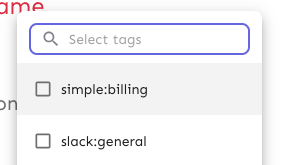
Makes the env selector on the flag page act the same way as the env selector on the new project page or any of the filterable buttons in the new project/flag dialogs. Also slightly changes the styles of the existing dropdown lists to bring them in line with the new env selector (more padding, full-width highlights). Selector:  Project/flag creation: Before:  After:  ## Technical notes I was a little unsure how best to share the padding/spacing styles between the search field and popover at first (as was requested by UX). The easiest way (and most compliant with how we do it today) was to define the spacing in a variable and move the relevant components into the same file. However, I actually think that using a CSS variable (e.g. `--popover-spacing`) would be "better" here, but we don't really use them much, so I've left that out for now. That said, if you agree, I'd be more than happy to use that instead 🙋🏼
51 lines
1.3 KiB
TypeScript
51 lines
1.3 KiB
TypeScript
import { Popover, TextField, styled } from '@mui/material';
|
|
|
|
const visuallyHiddenStyles = {
|
|
border: 0,
|
|
clip: 'rect(0 0 0 0)',
|
|
height: 'auto',
|
|
margin: 0,
|
|
overflow: 'hidden',
|
|
padding: 0,
|
|
position: 'absolute',
|
|
width: '1px',
|
|
whiteSpace: 'nowrap',
|
|
};
|
|
|
|
const dropdownPadding = 1.5;
|
|
|
|
export const StyledPopover = styled(Popover)(({ theme }) => ({
|
|
'& .MuiPaper-root': {
|
|
borderRadius: `${theme.shape.borderRadiusMedium}px`,
|
|
paddingInline: 0,
|
|
paddingTop: theme.spacing(dropdownPadding),
|
|
display: 'flex',
|
|
flexDirection: 'column',
|
|
|
|
gap: theme.spacing(1),
|
|
maxHeight: '70vh',
|
|
},
|
|
}));
|
|
|
|
export const StyledDropdownSearch = styled(TextField, {
|
|
shouldForwardProp: (prop) => prop !== 'hideLabel',
|
|
})<{ hideLabel?: boolean }>(({ theme, hideLabel }) => ({
|
|
paddingInline: theme.spacing(dropdownPadding),
|
|
'& .MuiInputBase-root': {
|
|
paddingInline: theme.spacing(1.5),
|
|
borderRadius: `${theme.shape.borderRadiusMedium}px`,
|
|
},
|
|
'& .MuiInputBase-input': {
|
|
padding: theme.spacing(0.75, 0),
|
|
fontSize: theme.typography.body2.fontSize,
|
|
},
|
|
|
|
...(hideLabel
|
|
? {
|
|
label: visuallyHiddenStyles,
|
|
|
|
'fieldset > legend > span': visuallyHiddenStyles,
|
|
}
|
|
: {}),
|
|
}));
|