mirror of
https://github.com/Unleash/unleash.git
synced 2025-10-18 11:14:57 +02:00
 e4cfb29adc
This PR continues the refactoring of the front end code for dashboards. The main points are: - Extracts the `ActionBox` component that we used in a lot of places. There were some minor differences between the various incarnations, so this also better aligns them. - Extract other components (`AskOwnerToAddYouToTheirProject`, `YourAdmins`) - Move the `NeutralCircleContainer` into `SharedComponents` - Delete the separate no content grid (this is now handled in projects instead) - extract my projects grid contents into a single function so that it's easier to understand what content you get for what states Here's all the states side by side: 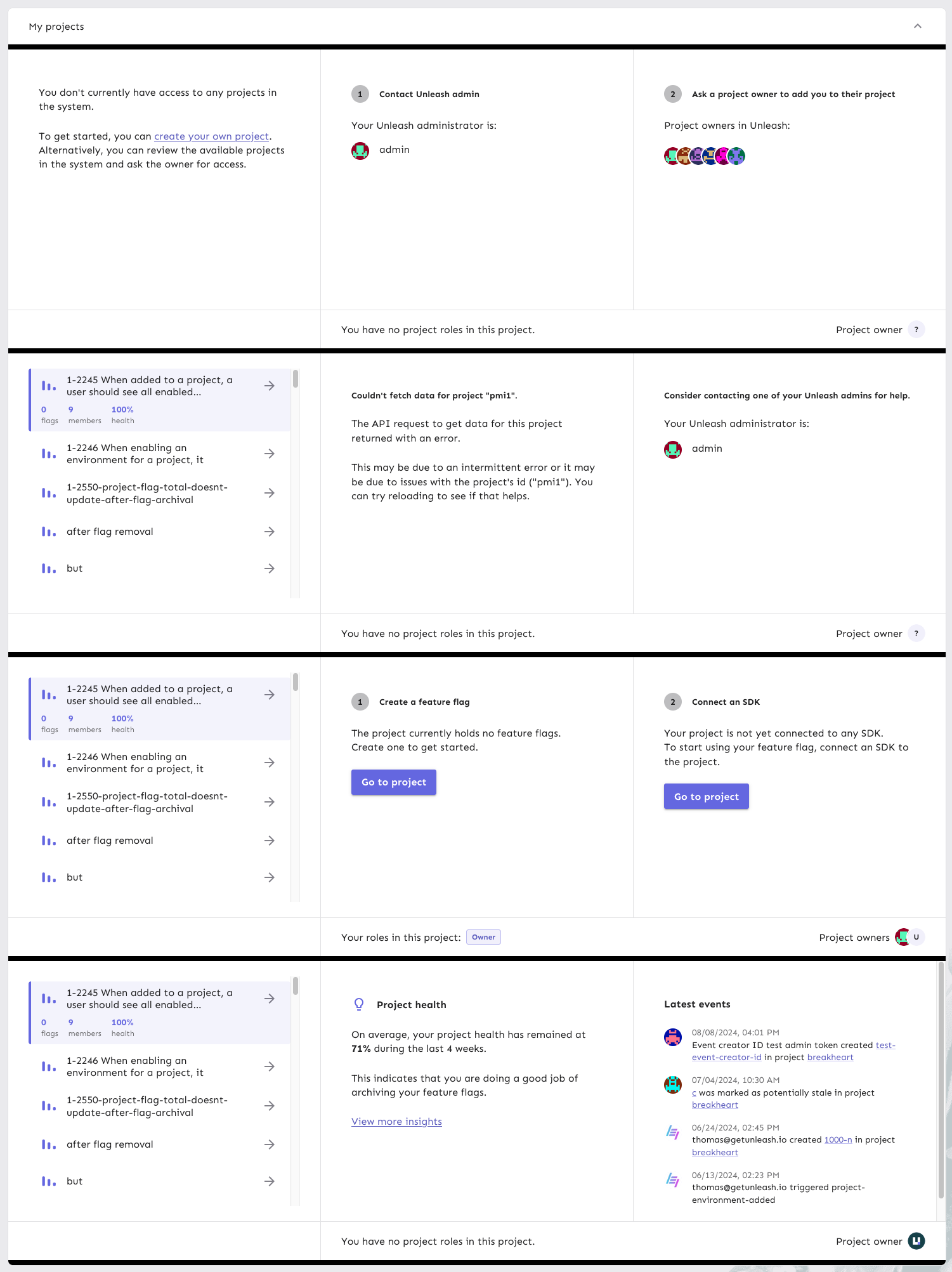
120 lines
3.6 KiB
TypeScript
120 lines
3.6 KiB
TypeScript
import { Button, styled, Typography } from '@mui/material';
|
|
import { usePlausibleTracker } from 'hooks/usePlausibleTracker';
|
|
import type { FC } from 'react';
|
|
import { ActionBox } from './ActionBox';
|
|
import { Link } from 'react-router-dom';
|
|
import { NeutralCircleContainer } from './SharedComponents';
|
|
|
|
const MainCircleContainer = styled(NeutralCircleContainer)(({ theme }) => ({
|
|
backgroundColor: theme.palette.primary.main,
|
|
color: theme.palette.background.paper,
|
|
}));
|
|
|
|
const SuccessContainer = styled('div')(({ theme }) => ({
|
|
display: 'flex',
|
|
flexDirection: 'column',
|
|
|
|
fontSize: theme.spacing(1.75),
|
|
fontWeight: 'bold',
|
|
backgroundColor: theme.palette.success.light,
|
|
borderRadius: theme.shape.borderRadiusLarge,
|
|
padding: theme.spacing(2, 2, 2, 2),
|
|
}));
|
|
|
|
export const CreateFlag: FC<{ project: string }> = ({ project }) => {
|
|
const { trackEvent } = usePlausibleTracker();
|
|
return (
|
|
<ActionBox
|
|
data-loading
|
|
title={
|
|
<>
|
|
<NeutralCircleContainer>1</NeutralCircleContainer>
|
|
Create a feature flag
|
|
</>
|
|
}
|
|
>
|
|
<div>
|
|
<p>The project currently holds no feature flags.</p>
|
|
<p>Create one to get started.</p>
|
|
</div>
|
|
<div>
|
|
<Button
|
|
href={`projects/${project}`}
|
|
onClick={() => {
|
|
trackEvent('personal-dashboard', {
|
|
props: {
|
|
eventType: `Go to project from onboarding`,
|
|
},
|
|
});
|
|
}}
|
|
variant='contained'
|
|
>
|
|
Go to project
|
|
</Button>
|
|
</div>
|
|
</ActionBox>
|
|
);
|
|
};
|
|
|
|
export const ExistingFlag: FC<{ project: string }> = ({ project }) => {
|
|
return (
|
|
<ActionBox
|
|
title={
|
|
<>
|
|
<MainCircleContainer>1</MainCircleContainer>
|
|
Create a feature flag
|
|
</>
|
|
}
|
|
>
|
|
<SuccessContainer>
|
|
<Typography fontWeight='bold' variant='body2'>
|
|
You have created your first flag
|
|
</Typography>
|
|
<Typography variant='body2'>
|
|
Go to the project to customize the flag further.
|
|
</Typography>
|
|
</SuccessContainer>
|
|
<div>
|
|
<Button
|
|
component={Link}
|
|
to={`/projects/${project}`}
|
|
variant='contained'
|
|
>
|
|
Go to project
|
|
</Button>
|
|
</div>
|
|
</ActionBox>
|
|
);
|
|
};
|
|
|
|
export const ConnectSDK: FC<{ project: string }> = ({ project }) => {
|
|
return (
|
|
<ActionBox
|
|
data-loading
|
|
title={
|
|
<>
|
|
<NeutralCircleContainer>2</NeutralCircleContainer>
|
|
Connect an SDK
|
|
</>
|
|
}
|
|
>
|
|
<div>
|
|
<p>Your project is not yet connected to any SDK.</p>
|
|
<p>
|
|
To start using your feature flag, connect an SDK to the
|
|
project.
|
|
</p>
|
|
</div>
|
|
<div>
|
|
<Button
|
|
component={Link}
|
|
to={`/projects/${project}`}
|
|
variant='contained'
|
|
>
|
|
Go to project
|
|
</Button>
|
|
</div>
|
|
</ActionBox>
|
|
);
|
|
};
|