mirror of
https://github.com/Unleash/unleash.git
synced 2025-12-09 20:04:11 +01:00
 2cf6e689ee
https://linear.app/unleash/issue/2-923/add-initial-getting-started-dialog Adds the welcome dialog with the static QR code pointing to our demo website. Also changes how the run logic works a bit, so that we have better control over it (only start demo steps once we click the start button, etc). Relates to [roadmap](https://github.com/orgs/Unleash/projects/10) item: #3537 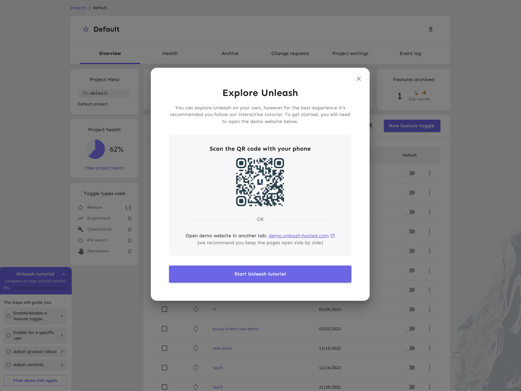
41 lines
1.1 KiB
TypeScript
41 lines
1.1 KiB
TypeScript
import { Dialog, IconButton, Typography, styled } from '@mui/material';
|
|
import CloseIcon from '@mui/icons-material/Close';
|
|
|
|
const StyledDialog = styled(Dialog)(({ theme }) => ({
|
|
'& .MuiDialog-paper': {
|
|
borderRadius: theme.shape.borderRadiusExtraLarge,
|
|
maxWidth: theme.spacing(90),
|
|
padding: theme.spacing(7.5),
|
|
textAlign: 'center',
|
|
},
|
|
}));
|
|
|
|
const StyledCloseButton = styled(IconButton)(({ theme }) => ({
|
|
position: 'absolute',
|
|
right: theme.spacing(2),
|
|
top: theme.spacing(2),
|
|
color: theme.palette.neutral.main,
|
|
}));
|
|
|
|
const StyledHeader = styled(Typography)(({ theme }) => ({
|
|
fontSize: theme.fontSizes.largeHeader,
|
|
fontWeight: theme.fontWeight.bold,
|
|
}));
|
|
|
|
interface IDemoDialogProps {
|
|
open: boolean;
|
|
onClose: () => void;
|
|
children: React.ReactNode;
|
|
}
|
|
|
|
export const DemoDialog = ({ open, onClose, children }: IDemoDialogProps) => (
|
|
<StyledDialog open={open} onClose={onClose}>
|
|
<StyledCloseButton aria-label="close" onClick={onClose}>
|
|
<CloseIcon />
|
|
</StyledCloseButton>
|
|
{children}
|
|
</StyledDialog>
|
|
);
|
|
|
|
DemoDialog.Header = StyledHeader;
|