mirror of
https://github.com/Unleash/unleash.git
synced 2025-10-04 11:17:02 +02:00
 2f7beceb21
This PR makes toasts smaller and less intrusive, and gives them a new color scheme. Changes include: - new color scheme - no description, only title - new padding - removes confetti code (even when rendered, they're invisible; UX also says to cut it) - use warning triangle for error messages I've also set a max height on the container and made it scrollable if it's too tall to deal with super long messages. I'll remove the description and confetti props in a separate PR to keep this one cleaner. Light mode:   Dark mode:  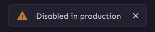 With line break (min-width):  With line break (max-width):  With very long message on phone in landscape mode: 
61 lines
1.5 KiB
TypeScript
61 lines
1.5 KiB
TypeScript
import { makeStyles } from 'tss-react/mui';
|
|
|
|
export const useStyles = makeStyles()((theme) => ({
|
|
container: {
|
|
alignItems: 'center',
|
|
background:
|
|
// the background color for this doesn't exist in the theme yet and it's not synchronized across dark/light modes yet.
|
|
theme.mode === 'light' ? '#201E42' : theme.palette.background.paper,
|
|
|
|
borderRadius: theme.shape.borderRadiusMedium,
|
|
boxShadow: theme.boxShadows.popup,
|
|
display: 'flex',
|
|
flexDirection: 'row',
|
|
gap: theme.spacing(2),
|
|
margin: '0 0.8rem',
|
|
maxWidth: '450px',
|
|
padding: theme.spacing(1),
|
|
paddingLeft: theme.spacing(2),
|
|
zIndex: theme.zIndex.snackbar,
|
|
color: theme.palette.common.white,
|
|
},
|
|
starting: {
|
|
opacity: 0,
|
|
},
|
|
headerStyles: {
|
|
fontSize: theme.typography.body1.fontSize,
|
|
fontWeight: 'normal',
|
|
margin: 0,
|
|
maxHeight: '75vh',
|
|
overflowY: 'auto',
|
|
'&::first-letter': {
|
|
textTransform: 'uppercase',
|
|
},
|
|
},
|
|
anim: {
|
|
animation: `$drop 10s 3s`,
|
|
},
|
|
checkMark: {
|
|
marginLeft: theme.spacing(1),
|
|
},
|
|
buttonStyle: {
|
|
color: theme.palette.common.white,
|
|
svg: {
|
|
fontSize: '1em',
|
|
},
|
|
},
|
|
|
|
'@keyframes drop': {
|
|
'0%': {
|
|
opacity: '0%',
|
|
top: '0%',
|
|
},
|
|
'10%': {
|
|
opacity: '100%',
|
|
},
|
|
'100%': {
|
|
top: '100%',
|
|
},
|
|
},
|
|
}));
|