mirror of
https://github.com/Unleash/unleash.git
synced 2025-12-09 20:04:11 +01:00
 ababe9fe75
https://linear.app/unleash/issue/2-2870/ux-adjustments-following-the-breakathon-placement-on-demo-bot-icon-and Post-breakathon UX adjustments, including: - Properly positions the Unleash AI chat option to the left of the demo steps, when the demo steps are visible. - Replaces the bot icon with a friendlier, more upbeat version. - Switches the chat purple color in the light theme to `primary.main` for better accessibility. Additionally, I’ve added the mode property to our themes for easier future maintenance. This makes it simple to check the currently active theme. 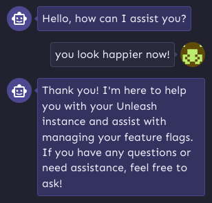
572 lines
18 KiB
TypeScript
572 lines
18 KiB
TypeScript
import { createTheme } from '@mui/material/styles';
|
|
import { colors } from './colors';
|
|
import { alpha } from '@mui/material';
|
|
import { focusable } from 'themes/themeStyles';
|
|
|
|
export const theme = {
|
|
mode: 'light',
|
|
breakpoints: {
|
|
values: {
|
|
xs: 0,
|
|
sm: 600,
|
|
md: 960,
|
|
lg: 1280,
|
|
xl: 1536,
|
|
},
|
|
},
|
|
boxShadows: {
|
|
main: '0px 2px 4px rgba(129, 122, 254, 0.2)',
|
|
card: '0px 2px 10px rgba(28, 25, 78, 0.12)',
|
|
elevated: '0px 1px 20px rgba(45, 42, 89, 0.1)',
|
|
popup: '0px 2px 6px rgba(0, 0, 0, 0.25)',
|
|
primaryHeader: '0px 8px 24px rgba(97, 91, 194, 0.2)',
|
|
separator: '0px 2px 4px rgba(32, 32, 33, 0.12)', // Notifications header
|
|
accordionFooter: 'inset 0px 2px 4px rgba(32, 32, 33, 0.05)',
|
|
reverseFooter: 'inset 0px -2px 4px rgba(32, 32, 33, 0.05)',
|
|
},
|
|
typography: {
|
|
fontFamily: 'Sen, Roboto, sans-serif',
|
|
fontWeightBold: '700',
|
|
fontWeightMedium: '700',
|
|
allVariants: { lineHeight: 1.4 },
|
|
button: { lineHeight: 1.75 },
|
|
h1: {
|
|
fontSize: '1.5rem',
|
|
lineHeight: 1.875,
|
|
},
|
|
h2: {
|
|
fontSize: `${20 / 16}rem`,
|
|
fontWeight: '700',
|
|
},
|
|
h3: {
|
|
fontSize: '1rem',
|
|
fontWeight: '700',
|
|
},
|
|
h4: {
|
|
fontSize: '1rem',
|
|
fontWeight: '400',
|
|
},
|
|
caption: {
|
|
fontSize: `${12 / 16}rem`,
|
|
},
|
|
},
|
|
fontSizes: {
|
|
extraLargeHeader: '2.5rem',
|
|
largeHeader: '2rem',
|
|
mediumHeader: '1.5rem',
|
|
mainHeader: '1.25rem',
|
|
bodySize: '1rem',
|
|
smallBody: `${14 / 16}rem`,
|
|
smallerBody: `${12 / 16}rem`,
|
|
},
|
|
fontWeight: {
|
|
thin: 300,
|
|
medium: 400,
|
|
semi: 700,
|
|
bold: 700,
|
|
},
|
|
shape: {
|
|
borderRadius: 4,
|
|
borderRadiusMedium: 8,
|
|
borderRadiusLarge: 12,
|
|
borderRadiusExtraLarge: 20,
|
|
tableRowHeight: 64,
|
|
tableRowHeightCompact: 56,
|
|
tableRowHeightDense: 48,
|
|
},
|
|
zIndex: {
|
|
sticky: 1400,
|
|
},
|
|
|
|
palette: {
|
|
common: {
|
|
white: colors.grey[50], // Tooltips text color // Switch base (OFF) // Text color
|
|
black: colors.grey[900], // Switch track (OFF)
|
|
},
|
|
text: {
|
|
primary: colors.grey[900],
|
|
secondary: colors.grey[800],
|
|
disabled: colors.grey[600],
|
|
},
|
|
primary: {
|
|
main: colors.purple[800],
|
|
light: colors.purple[700],
|
|
dark: colors.purple[900],
|
|
contrastText: colors.grey[50], // Color used for content when primary.main is used as a background
|
|
},
|
|
secondary: {
|
|
// Used for purple badges and purple light elements
|
|
main: colors.purple[800],
|
|
light: colors.purple[50],
|
|
dark: colors.purple[900], // Color used for text
|
|
border: colors.purple[300],
|
|
contrastText: colors.purple[900], // Color used for text inside badge
|
|
},
|
|
info: {
|
|
main: colors.blue[500],
|
|
light: colors.blue[50],
|
|
dark: colors.blue[800], // Color used for text
|
|
border: colors.blue[200],
|
|
contrastText: colors.blue[800], // Color used for text inside alert
|
|
},
|
|
success: {
|
|
main: colors.green[600],
|
|
light: colors.green[50],
|
|
dark: colors.green[800], // Color used for text
|
|
border: colors.green[300],
|
|
contrastText: colors.green[800], // Color used for text inside alert
|
|
},
|
|
warning: {
|
|
main: colors.orange[800],
|
|
light: colors.orange[100],
|
|
dark: colors.orange[900], // Color used for text
|
|
border: colors.orange[500],
|
|
contrastText: colors.orange[900], // Color used for text inside alert
|
|
},
|
|
error: {
|
|
main: colors.red[700], // used on error buttons // used on icons on these elements
|
|
light: colors.red[50],
|
|
dark: colors.red[800], // Color used for text
|
|
border: colors.red[300],
|
|
contrastText: colors.red[800], // Color used for text inside alert
|
|
},
|
|
web: {
|
|
main: '#1A4049', // used on sales-related elements
|
|
contrastText: colors.grey[50], // Color used for inner text
|
|
},
|
|
|
|
/**
|
|
* Used for grey badges, hover elements, and grey light elements
|
|
*/
|
|
neutral: {
|
|
main: colors.grey[700],
|
|
light: colors.grey[100],
|
|
dark: colors.grey[800],
|
|
border: colors.grey[500],
|
|
contrastText: colors.grey[800], // Color used for text inside badge
|
|
},
|
|
|
|
background: {
|
|
paper: colors.grey[50],
|
|
default: colors.grey[50],
|
|
application: colors.grey[300],
|
|
sidebar: colors.purple[800],
|
|
alternative: colors.purple[800], // used on the dark theme to switch primary main to a darker shade
|
|
elevation1: colors.grey[100],
|
|
elevation2: colors.grey[200],
|
|
},
|
|
|
|
action: {
|
|
// Colors used for Icons and Buttons -> this comes from MUI and we overwriting it with our colors
|
|
active: colors.action[0.54],
|
|
hover: colors.action[0.05],
|
|
hoverOpacity: 0.05,
|
|
selected: colors.action[0.08],
|
|
selectedOpacity: 0.08,
|
|
disabled: colors.action[0.32],
|
|
disabledBackground: colors.action[0.12],
|
|
disabledOpacity: 0.38,
|
|
focus: colors.action[0.12],
|
|
focusOpacity: 0.12,
|
|
activatedOpacity: 0.12,
|
|
alternative: colors.purple[900],
|
|
},
|
|
|
|
/**
|
|
* General divider
|
|
*/
|
|
divider: colors.grey[400],
|
|
|
|
/**
|
|
* Table colors.
|
|
*/
|
|
table: {
|
|
headerBackground: colors.grey[200],
|
|
headerHover: colors.grey[300],
|
|
divider: colors.grey[300],
|
|
rowHover: colors.grey[100],
|
|
},
|
|
|
|
/**
|
|
* Text highlight effect color. Used when filtering/searching over content
|
|
*/
|
|
highlight: colors.orange[200],
|
|
|
|
/**
|
|
* Used for the interactive guide spotlight
|
|
*/
|
|
spotlight: {
|
|
border: '#463cfb',
|
|
outline: '#6058f5',
|
|
pulse: '#463cfb',
|
|
},
|
|
|
|
/**
|
|
* Background color used for the API command in the sidebar
|
|
*/
|
|
codebox: colors.action[0.12],
|
|
|
|
/**
|
|
* Links color
|
|
*/
|
|
links: colors.purple[900],
|
|
|
|
/**
|
|
* Gradient for the login page
|
|
*/
|
|
loginGradient: {
|
|
from: colors.purple[800],
|
|
to: colors.purple[950],
|
|
},
|
|
|
|
/**
|
|
* Colors for event log output
|
|
*/
|
|
eventLog: {
|
|
diffAdd: colors.green[800],
|
|
diffSub: colors.red[800],
|
|
edited: colors.grey[900],
|
|
},
|
|
|
|
/**
|
|
* For 'Seen' column on feature flags list and other
|
|
*/
|
|
seen: {
|
|
unknown: colors.grey[100],
|
|
recent: colors.green[100],
|
|
inactive: colors.orange[200],
|
|
abandoned: colors.red[200],
|
|
primary: colors.purple[100],
|
|
},
|
|
|
|
/**
|
|
* For Environment Accordion.
|
|
*/
|
|
envAccordion: {
|
|
disabled: colors.grey[100],
|
|
expanded: colors.grey[200],
|
|
},
|
|
|
|
/**
|
|
* MUI grey colors
|
|
*/
|
|
grey: {
|
|
// This was to see were these colors are used from MUI
|
|
// 50: '#A6000E',
|
|
100: colors.grey[100], // Disabled Switch base (OFF)
|
|
// 200: '#A6000E',
|
|
// 300: '#A6000E',
|
|
// 400: '#A6000E',
|
|
// 500: '#A6000E',
|
|
600: colors.grey[800], // slider tooltip background
|
|
700: colors.grey[800], // Dark tooltip background
|
|
// 800: '#A6000E',
|
|
// 900: '#A6000E',
|
|
// A100: '#A6000E',
|
|
// A200: '#A6000E',
|
|
// A400: '#A6000E',
|
|
// A700: '#A6000E',
|
|
},
|
|
variants: colors.variants,
|
|
|
|
/**
|
|
* Dashboard and charts
|
|
*/
|
|
charts: {
|
|
gauge: {
|
|
gradientStart: colors.purple[100],
|
|
gradientEnd: colors.purple[700],
|
|
background: colors.purple[50],
|
|
sectionLine: colors.purple[500],
|
|
text: colors.grey[600],
|
|
},
|
|
health: {
|
|
mainCircleBackground: colors.purple[800],
|
|
orbit: colors.grey[300],
|
|
circles: colors.grey[50],
|
|
text: colors.grey[900],
|
|
title: colors.grey[50],
|
|
healthy: colors.purple[800],
|
|
stale: colors.red[800],
|
|
potentiallyStale: colors.orange[900],
|
|
gradientStale: colors.red[300],
|
|
gradientPotentiallyStale: colors.orange[500],
|
|
},
|
|
series: colors.chartSeries,
|
|
},
|
|
},
|
|
} as const;
|
|
|
|
export default createTheme({
|
|
...theme,
|
|
components: {
|
|
// Skeleton
|
|
MuiCssBaseline: {
|
|
styleOverrides: {
|
|
'#react-joyride-portal ~ .MuiDialog-root': {
|
|
zIndex: 1399,
|
|
},
|
|
|
|
'.skeleton': {
|
|
'&::before': {
|
|
backgroundColor: theme.palette.background.elevation1,
|
|
},
|
|
'&::after': {
|
|
background:
|
|
'linear-gradient(90deg, rgba(255, 255, 255, 0) 0, rgba(255, 255, 255, 0.2) 100%, rgba(255, 255, 255, 0.5) 100%, rgba(255, 255, 255, 0))',
|
|
},
|
|
},
|
|
|
|
a: {
|
|
color: theme.palette.links,
|
|
},
|
|
},
|
|
},
|
|
|
|
// Links
|
|
MuiLink: {
|
|
styleOverrides: {
|
|
root: ({ theme }) => ({
|
|
...focusable(theme),
|
|
color: theme.palette.links,
|
|
'&:hover': {
|
|
textDecoration: 'none',
|
|
},
|
|
}),
|
|
},
|
|
},
|
|
|
|
// Breadcrumb
|
|
MuiBreadcrumbs: {
|
|
styleOverrides: {
|
|
root: ({ theme }) => ({
|
|
color: theme.palette.text.primary,
|
|
fontSize: '0.875rem',
|
|
'& a': {
|
|
color: theme.palette.links,
|
|
textDecoration: 'none',
|
|
'&:hover': {
|
|
textDecoration: 'underline',
|
|
},
|
|
},
|
|
}),
|
|
},
|
|
},
|
|
|
|
// Tables
|
|
MuiTableHead: {
|
|
styleOverrides: {
|
|
root: ({ theme }) => ({
|
|
'& th': {
|
|
height: theme.shape.tableRowHeightCompact,
|
|
backgroundColor: theme.palette.table.headerBackground,
|
|
border: 0,
|
|
'&:first-of-type': {
|
|
borderTopLeftRadius: theme.shape.borderRadiusMedium,
|
|
borderBottomLeftRadius:
|
|
theme.shape.borderRadiusMedium,
|
|
},
|
|
'&:last-of-type': {
|
|
borderTopRightRadius:
|
|
theme.shape.borderRadiusMedium,
|
|
borderBottomRightRadius:
|
|
theme.shape.borderRadiusMedium,
|
|
},
|
|
},
|
|
}),
|
|
},
|
|
},
|
|
MuiTableRow: {
|
|
styleOverrides: {
|
|
root: ({ theme }) => ({
|
|
'&.MuiTableRow-root:hover': {
|
|
//Not all the tables have row hover background. This will add background color on row hover for all the tables
|
|
background: theme.palette.table.rowHover, //overwrite action.hover
|
|
},
|
|
}),
|
|
},
|
|
},
|
|
MuiTableCell: {
|
|
styleOverrides: {
|
|
root: ({ theme }) => ({
|
|
borderBottomColor: theme.palette.table.divider,
|
|
}),
|
|
},
|
|
},
|
|
|
|
// Alerts
|
|
MuiAlert: {
|
|
styleOverrides: {
|
|
root: ({ theme }) => ({
|
|
padding: theme.spacing(2, 3),
|
|
borderRadius: theme.shape.borderRadiusMedium,
|
|
a: {
|
|
color: 'inherit',
|
|
},
|
|
'> .MuiAlert-icon': {
|
|
padding: 0,
|
|
opacity: 1,
|
|
fontSize: '24px',
|
|
},
|
|
'> .MuiAlert-message': {
|
|
padding: '3px 0 0 0',
|
|
},
|
|
'&.MuiAlert-standardInfo': {
|
|
backgroundColor: theme.palette.info.light,
|
|
color: theme.palette.info.dark,
|
|
border: `1px solid ${theme.palette.info.border}`,
|
|
'& .MuiAlert-icon': {
|
|
color: theme.palette.info.main,
|
|
},
|
|
},
|
|
'&.MuiAlert-standardSuccess': {
|
|
backgroundColor: theme.palette.success.light,
|
|
color: theme.palette.success.dark,
|
|
border: `1px solid ${theme.palette.success.border}`,
|
|
'& .MuiAlert-icon': {
|
|
color: theme.palette.success.main,
|
|
},
|
|
},
|
|
'&.MuiAlert-standardWarning': {
|
|
backgroundColor: theme.palette.warning.light,
|
|
color: theme.palette.warning.dark,
|
|
border: `1px solid ${theme.palette.warning.border}`,
|
|
'& .MuiAlert-icon': {
|
|
color: theme.palette.warning.main,
|
|
},
|
|
},
|
|
'&.MuiAlert-standardError': {
|
|
backgroundColor: theme.palette.error.light,
|
|
color: theme.palette.error.dark,
|
|
border: `1px solid ${theme.palette.error.border}`,
|
|
'& .MuiAlert-icon': {
|
|
color: theme.palette.error.main,
|
|
},
|
|
},
|
|
}),
|
|
},
|
|
},
|
|
|
|
// Horizontal menu tabs
|
|
MuiTabs: {
|
|
styleOverrides: {
|
|
root: ({ theme }) => ({
|
|
'& .MuiTabs-indicator': {
|
|
height: '4px',
|
|
},
|
|
'& .MuiTabs-flexContainer': {
|
|
minHeight: '70px',
|
|
maxHeight: '70px',
|
|
},
|
|
}),
|
|
},
|
|
},
|
|
MuiTab: {
|
|
styleOverrides: {
|
|
root: ({ theme }) => ({
|
|
color: theme.palette.text.primary,
|
|
fontSize: '1rem',
|
|
textTransform: 'none',
|
|
fontWeight: 400,
|
|
lineHeight: '1',
|
|
minHeight: '62px',
|
|
'&:hover': {
|
|
backgroundColor: theme.palette.action.hover,
|
|
},
|
|
'&.Mui-selected': {
|
|
color: theme.palette.text.primary,
|
|
fontWeight: 700,
|
|
},
|
|
'& > span': {
|
|
color: theme.palette.primary.main, //Based on this color is created the focus color/effect
|
|
},
|
|
[theme.breakpoints.down('md')]: {
|
|
padding: '12px 0px',
|
|
},
|
|
}),
|
|
},
|
|
},
|
|
|
|
// Environment accordion
|
|
MuiAccordion: {
|
|
styleOverrides: {
|
|
root: ({ theme }) => ({
|
|
'&:first-of-type, &:last-of-type': {
|
|
borderRadius: theme.shape.borderRadiusLarge,
|
|
},
|
|
'&.environment-accordion.Mui-expanded': {
|
|
outline: `2px solid ${alpha(
|
|
theme.palette.background.alternative,
|
|
0.6,
|
|
)}`,
|
|
boxShadow: `0px 2px 8px ${alpha(
|
|
theme.palette.primary.main,
|
|
0.2,
|
|
)}`,
|
|
},
|
|
}),
|
|
},
|
|
},
|
|
MuiAccordionSummary: {
|
|
styleOverrides: {
|
|
root: {
|
|
'& > .MuiAccordionSummary-content.Mui-expanded': {
|
|
margin: '12px 0',
|
|
},
|
|
'&.Mui-expanded': {
|
|
minHeight: '0',
|
|
},
|
|
},
|
|
},
|
|
},
|
|
|
|
// Project overview, improve switch (OFF - state) focus effect color
|
|
MuiSwitch: {
|
|
styleOverrides: {
|
|
root: ({ theme }) => ({
|
|
zIndex: 1,
|
|
'.MuiSwitch-switchBase:not(.Mui-checked) .MuiTouchRipple-child':
|
|
{
|
|
color: theme.palette.action.disabled,
|
|
},
|
|
}),
|
|
},
|
|
},
|
|
|
|
// Overwiteing the action.disabledOpacity from MUI
|
|
MuiMenuItem: {
|
|
styleOverrides: {
|
|
root: {
|
|
'&.Mui-disabled': {
|
|
opacity: 0.66,
|
|
},
|
|
},
|
|
},
|
|
},
|
|
|
|
// Inputs background - This is used when we have inputs on a grey background (e.g. edit contstraints, playground)
|
|
MuiInputBase: {
|
|
styleOverrides: {
|
|
root: ({ theme }) => ({
|
|
backgroundColor: theme.palette.background.paper,
|
|
}),
|
|
},
|
|
},
|
|
|
|
// Top menu text color
|
|
MuiAppBar: {
|
|
styleOverrides: {
|
|
root: ({ theme }) => ({
|
|
color: theme.palette.text.primary,
|
|
}),
|
|
},
|
|
},
|
|
|
|
MuiIcon: {
|
|
defaultProps: {
|
|
baseClassName: 'material-symbols-outlined',
|
|
},
|
|
},
|
|
},
|
|
});
|