mirror of
https://github.com/Unleash/unleash.git
synced 2026-01-05 20:06:22 +01:00
 fa96ff1450
Updates the dialog form template to include a `namingPattern` prop that can be used to display the naming pattern of whatever the form is used for. Also updates the create feature dialog to display the naming pattern in the current project. The naming pattern component re-uses the pattern that we have in place for feature naming patterns, but puts it in an expandable dialog instead. Screenies: Naming pattern closed: 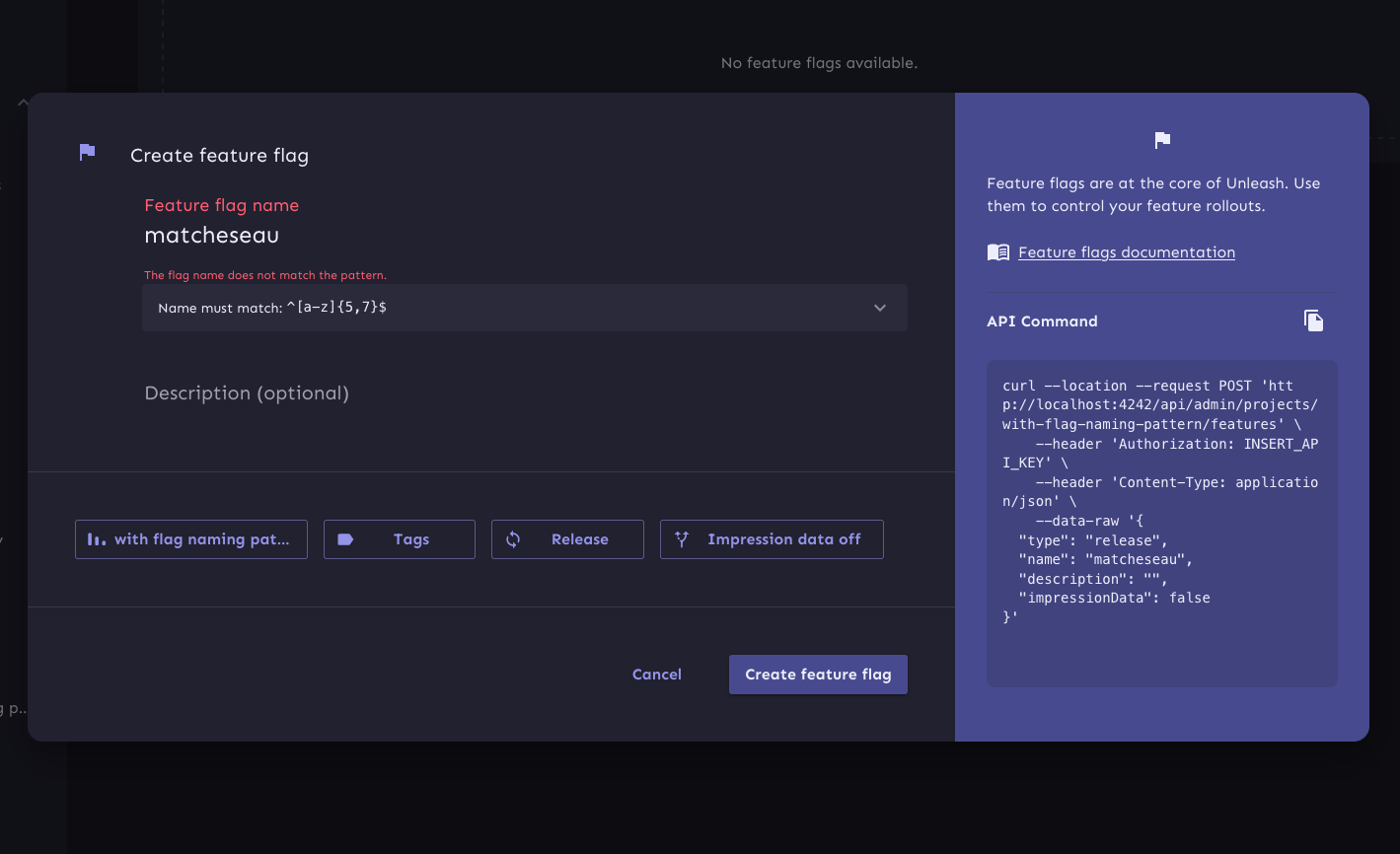 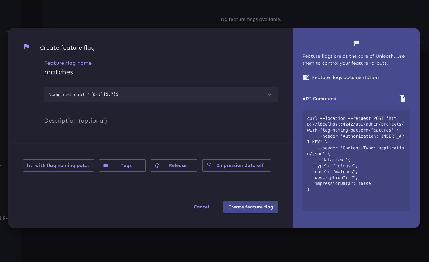 Naming pattern open: 
373 lines
16 KiB
TypeScript
373 lines
16 KiB
TypeScript
import { formatUnknownError } from 'utils/formatUnknownError';
|
|
import useToast from 'hooks/useToast';
|
|
import FormTemplate from 'component/common/FormTemplate/FormTemplate';
|
|
import { CREATE_FEATURE } from 'component/providers/AccessProvider/permissions';
|
|
import {
|
|
type ReactNode,
|
|
useState,
|
|
useContext,
|
|
type FormEvent,
|
|
useMemo,
|
|
} from 'react';
|
|
import useUiConfig from 'hooks/api/getters/useUiConfig/useUiConfig';
|
|
import { useNavigate } from 'react-router-dom';
|
|
import { Dialog, styled } from '@mui/material';
|
|
import { useUiFlag } from 'hooks/useUiFlag';
|
|
import useProjects from 'hooks/api/getters/useProjects/useProjects';
|
|
import { Limit } from 'component/common/Limit/Limit';
|
|
import { ConditionallyRender } from 'component/common/ConditionallyRender/ConditionallyRender';
|
|
import UIContext from 'contexts/UIContext';
|
|
import useFeatureForm from 'component/feature/hooks/useFeatureForm';
|
|
import useFeatureApi from 'hooks/api/actions/useFeatureApi/useFeatureApi';
|
|
import FlagIcon from '@mui/icons-material/Flag';
|
|
import ImpressionDataIcon from '@mui/icons-material/AltRoute';
|
|
import { useFlagLimits } from 'component/feature/CreateFeature/CreateFeature';
|
|
import { useGlobalFeatureSearch } from 'component/feature/FeatureToggleList/useGlobalFeatureSearch';
|
|
import useProjectOverview, {
|
|
featuresCount,
|
|
} from 'hooks/api/getters/useProjectOverview/useProjectOverview';
|
|
import type { FeatureTypeSchema } from 'openapi';
|
|
import { getFeatureTypeIcons } from 'utils/getFeatureTypeIcons';
|
|
import useFeatureTypes from 'hooks/api/getters/useFeatureTypes/useFeatureTypes';
|
|
import { DialogFormTemplate } from 'component/common/DialogFormTemplate/DialogFormTemplate';
|
|
import { SingleSelectConfigButton } from 'component/common/DialogFormTemplate/ConfigButtons/SingleSelectConfigButton';
|
|
import useAllTags from 'hooks/api/getters/useAllTags/useAllTags';
|
|
import Label from '@mui/icons-material/Label';
|
|
import { ProjectIcon } from 'component/common/ProjectIcon/ProjectIcon';
|
|
import { MultiSelectConfigButton } from 'component/common/DialogFormTemplate/ConfigButtons/MultiSelectConfigButton';
|
|
import type { ITag } from 'interfaces/tags';
|
|
import { ToggleConfigButton } from 'component/common/DialogFormTemplate/ConfigButtons/ToggleConfigButton';
|
|
|
|
interface ICreateFeatureDialogProps {
|
|
open: boolean;
|
|
onClose: () => void;
|
|
}
|
|
|
|
const StyledDialog = styled(Dialog)(({ theme }) => ({
|
|
'& .MuiDialog-paper': {
|
|
borderRadius: theme.shape.borderRadiusLarge,
|
|
maxWidth: theme.spacing(170),
|
|
width: '100%',
|
|
backgroundColor: 'transparent',
|
|
},
|
|
padding: 0,
|
|
'& .MuiPaper-root > section': {
|
|
overflowX: 'hidden',
|
|
},
|
|
}));
|
|
|
|
const configButtonData = {
|
|
project: {
|
|
icon: <ProjectIcon />,
|
|
text: 'Projects allow you to group feature flags together in the Unleash admin UI and in SDK payloads.',
|
|
},
|
|
tags: {
|
|
icon: <Label />,
|
|
text: 'Tags are used to label flags in Unleash. They can be used when filtering flags in the UI. Additionally, they are used by some integrations.',
|
|
},
|
|
type: {
|
|
icon: <FlagIcon />,
|
|
text: "A flag's type conveys its purpose. All types have the same capabilities, but choosing the right type signals what kind of flag it is. You can change this at any time.",
|
|
},
|
|
|
|
impressionData: {
|
|
icon: <ImpressionDataIcon />,
|
|
text: `Impression data is used to track how your flag is performing. When enabled, you can subscribe to 'impression events' in the SDK and process them according to your needs.`,
|
|
},
|
|
};
|
|
|
|
export const CreateFeatureDialog = ({
|
|
open,
|
|
onClose,
|
|
}: ICreateFeatureDialogProps) => {
|
|
if (open) {
|
|
// wrap the inner component so that we only fetch data etc
|
|
// when the dialog is actually open.
|
|
return <CreateFeatureDialogContent open={open} onClose={onClose} />;
|
|
}
|
|
};
|
|
|
|
const CreateFeatureDialogContent = ({
|
|
open,
|
|
onClose,
|
|
}: ICreateFeatureDialogProps) => {
|
|
const { setToastData, setToastApiError } = useToast();
|
|
const { setShowFeedback } = useContext(UIContext);
|
|
const { uiConfig, isOss } = useUiConfig();
|
|
const navigate = useNavigate();
|
|
|
|
const {
|
|
type,
|
|
setType,
|
|
tags,
|
|
setTags,
|
|
name,
|
|
setName,
|
|
project,
|
|
setProject,
|
|
description,
|
|
setDescription,
|
|
validateToggleName,
|
|
impressionData,
|
|
setImpressionData,
|
|
getTogglePayload,
|
|
clearErrors,
|
|
errors,
|
|
} = useFeatureForm();
|
|
const { createFeatureToggle, loading } = useFeatureApi();
|
|
|
|
const generalDocumentation: {
|
|
icon: ReactNode;
|
|
text: string;
|
|
link?: { url: string; label: string };
|
|
} = {
|
|
icon: <FlagIcon />,
|
|
text: 'Feature flags are at the core of Unleash. Use them to control your feature rollouts.',
|
|
link: {
|
|
url: 'https://docs.getunleash.io/reference/feature-toggles',
|
|
label: 'Feature flags documentation',
|
|
},
|
|
};
|
|
|
|
const [documentation, setDocumentation] = useState(generalDocumentation);
|
|
|
|
const clearDocumentationOverride = () =>
|
|
setDocumentation(generalDocumentation);
|
|
|
|
const flagPayload = getTogglePayload();
|
|
|
|
const formatApiCode = () => {
|
|
return `curl --location --request POST '${
|
|
uiConfig.unleashUrl
|
|
}/api/admin/projects/${project}/features' \\
|
|
--header 'Authorization: INSERT_API_KEY' \\
|
|
--header 'Content-Type: application/json' \\
|
|
--data-raw '${JSON.stringify(flagPayload, undefined, 2)}'`;
|
|
};
|
|
|
|
const handleSubmit = async (e: FormEvent<HTMLFormElement>) => {
|
|
e.preventDefault();
|
|
clearErrors();
|
|
const validToggleName = await validateToggleName();
|
|
|
|
if (validToggleName) {
|
|
const payload = getTogglePayload();
|
|
try {
|
|
await createFeatureToggle(project, payload);
|
|
navigate(`/projects/${project}/features/${name}`);
|
|
setToastData({
|
|
title: 'Flag created successfully',
|
|
text: 'Now you can start using your flag.',
|
|
confetti: true,
|
|
type: 'success',
|
|
});
|
|
setShowFeedback(true);
|
|
} catch (error: unknown) {
|
|
setToastApiError(formatUnknownError(error));
|
|
}
|
|
}
|
|
};
|
|
|
|
const { total: totalFlags, loading: loadingTotalFlagCount } =
|
|
useGlobalFeatureSearch(1);
|
|
|
|
const { project: projectInfo } = useProjectOverview(project);
|
|
const { tags: allTags } = useAllTags();
|
|
|
|
const resourceLimitsEnabled = useUiFlag('resourceLimits');
|
|
|
|
const { globalFlagLimitReached, projectFlagLimitReached, limitMessage } =
|
|
useFlagLimits({
|
|
global: {
|
|
limit: uiConfig.resourceLimits.featureFlags,
|
|
count: totalFlags ?? 0,
|
|
},
|
|
project: {
|
|
limit: projectInfo.featureLimit,
|
|
count: featuresCount(projectInfo),
|
|
},
|
|
});
|
|
|
|
const { projects } = useProjects();
|
|
const { featureTypes } = useFeatureTypes();
|
|
const FeatureTypeIcon = getFeatureTypeIcons(type);
|
|
|
|
const longestFeatureTypeName = featureTypes.reduce(
|
|
(prev: number, type: { name: string }) =>
|
|
prev >= type.name.length ? prev : type.name.length,
|
|
0,
|
|
);
|
|
|
|
const currentProjectName = useMemo(() => {
|
|
const projectObject = projects.find((p) => p.id === project);
|
|
return projectObject?.name;
|
|
}, [project, projects]);
|
|
|
|
return (
|
|
<StyledDialog open={open} onClose={onClose}>
|
|
<FormTemplate
|
|
compact
|
|
disablePadding
|
|
description={documentation.text}
|
|
documentationIcon={documentation.icon}
|
|
documentationLink={documentation.link?.url}
|
|
documentationLinkLabel={documentation.link?.label}
|
|
formatApiCode={formatApiCode}
|
|
useFixedSidebar
|
|
>
|
|
<DialogFormTemplate
|
|
createButtonProps={{
|
|
projectId: project,
|
|
disabled:
|
|
loading ||
|
|
loadingTotalFlagCount ||
|
|
globalFlagLimitReached ||
|
|
projectFlagLimitReached,
|
|
permission: CREATE_FEATURE,
|
|
tooltipProps: { title: limitMessage, arrow: true },
|
|
}}
|
|
description={description}
|
|
namingPattern={projectInfo.featureNaming}
|
|
errors={errors}
|
|
handleSubmit={handleSubmit}
|
|
Icon={<FlagIcon />}
|
|
validateName={validateToggleName}
|
|
Limit={
|
|
<ConditionallyRender
|
|
condition={resourceLimitsEnabled}
|
|
show={
|
|
<Limit
|
|
name='feature flags'
|
|
limit={uiConfig.resourceLimits.featureFlags}
|
|
currentValue={totalFlags ?? 0}
|
|
/>
|
|
}
|
|
/>
|
|
}
|
|
name={name}
|
|
onClose={onClose}
|
|
resource={'feature flag'}
|
|
setDescription={setDescription}
|
|
setName={setName}
|
|
configButtons={
|
|
<>
|
|
<ConditionallyRender
|
|
condition={!isOss()}
|
|
show={
|
|
<SingleSelectConfigButton
|
|
tooltip={{
|
|
header: 'Select a project for the flag',
|
|
}}
|
|
description={
|
|
configButtonData.project.text
|
|
}
|
|
options={projects.map((project) => ({
|
|
label: project.name,
|
|
value: project.id,
|
|
}))}
|
|
onChange={(value: any) => {
|
|
setProject(value);
|
|
}}
|
|
button={{
|
|
label:
|
|
currentProjectName ?? project,
|
|
icon: configButtonData.project.icon,
|
|
labelWidth: '20ch',
|
|
}}
|
|
search={{
|
|
label: 'Filter projects',
|
|
placeholder: 'Select project',
|
|
}}
|
|
onOpen={() =>
|
|
setDocumentation(
|
|
configButtonData.project,
|
|
)
|
|
}
|
|
onClose={clearDocumentationOverride}
|
|
/>
|
|
}
|
|
/>
|
|
<MultiSelectConfigButton<ITag>
|
|
tooltip={{
|
|
header: 'Select tags',
|
|
}}
|
|
description={configButtonData.tags.text}
|
|
selectedOptions={tags}
|
|
options={allTags.map((tag) => ({
|
|
label: `${tag.type}:${tag.value}`,
|
|
value: tag,
|
|
}))}
|
|
onChange={setTags}
|
|
button={{
|
|
label:
|
|
tags.size > 0
|
|
? `${tags.size} selected`
|
|
: 'Tags',
|
|
labelWidth: `${'nn selected'.length}ch`,
|
|
icon: <Label />,
|
|
}}
|
|
search={{
|
|
label: 'Filter tags',
|
|
placeholder: 'Select tags',
|
|
}}
|
|
onOpen={() =>
|
|
setDocumentation(configButtonData.tags)
|
|
}
|
|
onClose={clearDocumentationOverride}
|
|
/>
|
|
<SingleSelectConfigButton
|
|
tooltip={{
|
|
header: 'Select a flag type',
|
|
}}
|
|
description={configButtonData.type.text}
|
|
options={featureTypes.map(
|
|
(type: FeatureTypeSchema) => ({
|
|
label: type.name,
|
|
value: type.id,
|
|
}),
|
|
)}
|
|
onChange={(value: any) => {
|
|
setType(value);
|
|
}}
|
|
button={{
|
|
label:
|
|
featureTypes.find((t) => t.id === type)
|
|
?.name || 'Select flag type',
|
|
icon: <FeatureTypeIcon />,
|
|
labelWidth: `${longestFeatureTypeName}ch`,
|
|
}}
|
|
search={{
|
|
label: 'Filter flag types',
|
|
placeholder: 'Select flag type',
|
|
}}
|
|
onOpen={() =>
|
|
setDocumentation({
|
|
text: configButtonData.type.text,
|
|
icon: <FeatureTypeIcon />,
|
|
})
|
|
}
|
|
onClose={clearDocumentationOverride}
|
|
/>
|
|
|
|
<ToggleConfigButton
|
|
tooltip={{
|
|
header: 'Enable or disable impression data',
|
|
description:
|
|
configButtonData.impressionData.text,
|
|
}}
|
|
currentValue={impressionData}
|
|
onClick={() =>
|
|
setImpressionData(!impressionData)
|
|
}
|
|
label={`Impression data ${impressionData ? 'on' : 'off'}`}
|
|
icon={<ImpressionDataIcon />}
|
|
labelWidth={`${'impression data off'.length}ch`}
|
|
/>
|
|
</>
|
|
}
|
|
/>
|
|
</FormTemplate>
|
|
</StyledDialog>
|
|
);
|
|
};
|