Lets you navigate to the top of the list when you're at the bottom,
and vice versa.

Arrow down at the end of the list takes you to the search field and
arrow up from the search field takes you to the end of the list.
Fixes a small number of accessibility issues that Firefox was
complaining about (and some that I noticed myself):
1. In `CommandBar.tsx`, use a `Label` element instead of aria-label. We
can hide it with the `ScreenReaderOnly` component.
2. Add an `aria-label` to the icon button in the sidebar. (side note:
should we do any fancy detection on whether it's cmd + b or ctrl+b
there? I think we do that in the command bar)
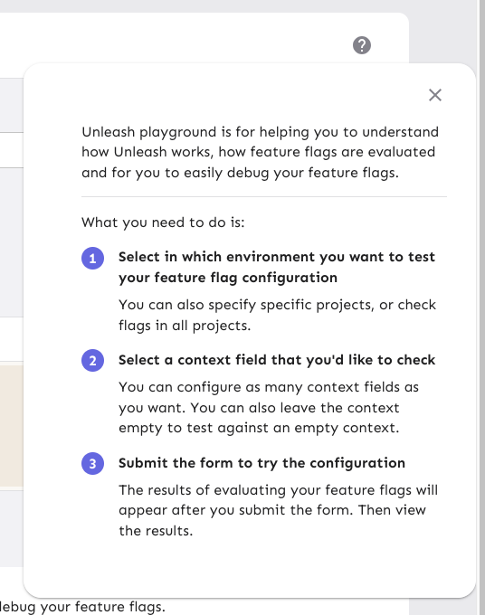
3. Update the playground guidance popper;
i. Add an aria-label to the icon button
ii. Make the popper a `Popover` instead. This fixes a few issues: It
wasn't possible to focus or close just using the keyboard before.
Because it didn't steal focus, it also meant that it'd cover other parts
of the page. Now it traps focus so you can navigate to the close button,
and escape will also close it for you.
iii. Remove aria-describedby. Using aria-describedby on the button would
mean that the **button** is described by its content, which seems wrong.
aria-describedby should also only be used for plain strings. Complex
markups isn't supported. For that aria-details is the right way to go.
But because the popover is only rendered when it's open, the details or
describedby link will point to nothing most of the time.
iv. In doing this, there is a slight change in the popover shadow (I
couldn't find onef of our shadows that did the same thing as before),
but it matches other popovers we have, such as on the data usage tab.
Before:
After:

Prevents tab from navigating you through the list of results. Instead
makes it so that the tab key always takes you to the next item in the
same hierarchy.

As a bonus: also automatically closes the menu when you navigate
away (the previous implementation has a bug where it wouldn't if you
shift-tab).

The behavior of not letting you navigate the list with tab is
consistent with native HTML select elements as well as MUI select
elements. You typically navigate them with the arrow keys.
Also rebranded command bar to command menu, because that seems more
suitable.
Command bar is more like a horizontal/vertical list/bar of icons, like
sidebar. Command menu is more of a dropdown.


https://unleash-docs-git-command-docs-unleash-team.vercel.app/reference/command-menu

---------

Co-authored-by: melindafekete <melinda.fekete@getunleash.io>
Previously, when the result box was loading, it returned projects and
menu items first. After the feature search response came back, it also
showed the features, but this made the component jump around too much.
Now, everything is shown when the feature result comes back, reducing
the jumping around.
Start tracking plausible events

1. Log the search keywords that returned 0 results
2. Track all clicks, based on source(search/recents/pages), type etc.
Now the search hook is inside another component, so we do not get
searches without search query.
Also we had 2 state variable handing the search query. Removed one of
them.
Previously since query params were changing by global search, and
menubar was also altering them, they were conflicting. Menubar does not
need query params as state. So using search hook directly.
Now searching works in command bar
1. Currently piggybacking on the search hook, but I think it is not fast
enough, and also it is using the query params as the global search. This
causes some weird behaviour in UI. This probably means we will create
separate endpoint for this.
