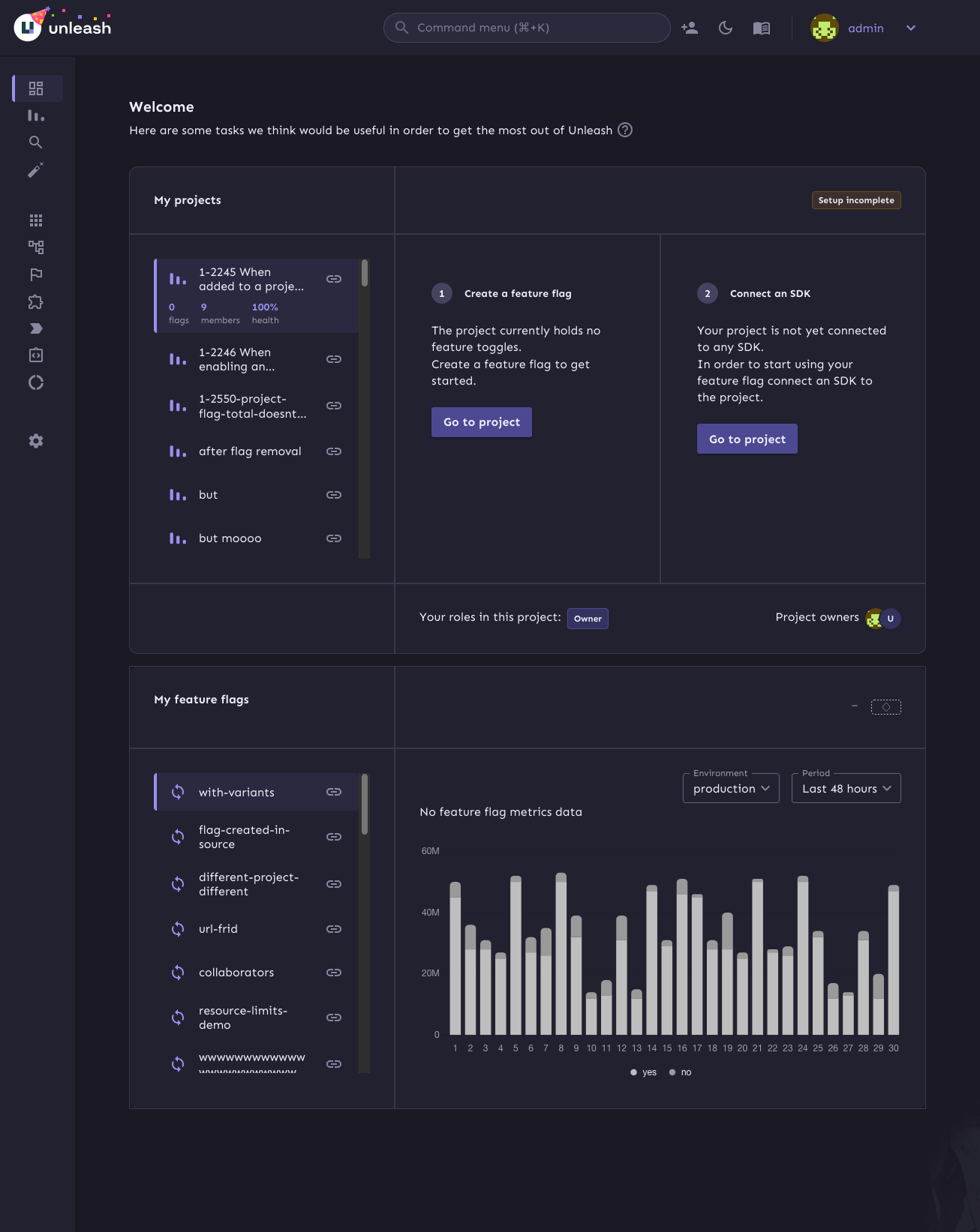
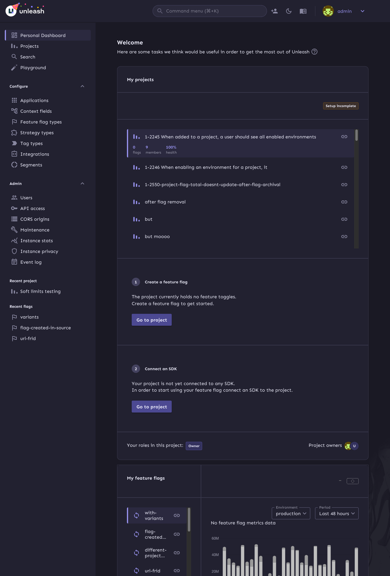
The main goals of this are:
1. Make it so that the layout grid doesn't break on small screens
2. Fix an issue where the border of the box didn't fit the outline
3. (Bonus): make the layout of the info box depend on the **box's**
size, not the screen size.
To achieve those goals, this PR:
1. Switches to using a native CSS grid instead of MUI's grid component.
This gives us more power over the layout in various different sizes.
2. Switches from putting borders on the boxes inside the grid, instead
makes the grid container the color of the border and uses gaps to create
borders.
3. If your browser supports it, it will use container queries to
determine whether we should display the layout as a multi-column grid or
in a single column.
Container query demo (both with the same screen sizes):
Sidebar closed:

Sidebar open:

https://linear.app/unleash/issue/2-2723/add-signals-tip
Adds a tip to the event timeline regarding the usage of signals.
The conditions for it to show up are the following:
- `!signalsSuggestionSeen` - The current user has not closed the tip yet
- `isEnterprise()` - The Unleash instance is an Enterprise instance
(signals are currently Enterprise-only)
- `isAdmin` - The current user is an admin (signals are currently
admin-only)
- `signalsEnabled` - The signals feature flag is currently enabled
- `!loading` - Signal endpoints have not finished loading (prevents
flickering)
- `signalEndpoints.length === 0` - The Unleash instance currently has
zero configured signal endpoints (signals feature is not being used)

This commit uses the now-included project owner and role information
to populate the owner/role section. If you have no roles, we'll tell
you that you don't instead of displaying an empty set of badges.
https://linear.app/unleash/issue/2-2703/align-with-ux
Timeline UI/UX improvements after sync with UX, including:
- Added some spacing between each event in the grouping tooltip
- Aligned the x events occurred header with filter dropdown
- Improved the strategy icon somewhat so it doesn't look as off center
- New timeline icon
- Improve icon position relative to timestamp on each event in the
grouping tooltip
- Changed text color in dropdowns to a lighter gray
- Removed bold formatting in tooltip
- Adjusted paddings and margins
- Added close button
- Added shadow
- Added left border
There are a few details missing, which will be tackled in separate PRs.

---------
Co-authored-by: Nuno Góis <github@nunogois.com>
https://linear.app/unleash/issue/2-2665/show-signals-in-the-event-timeline
Implements signals in the event timeline.
This merges events and signals into a unified `TimelineEvent`
abstraction, streamlining the data structure to only include properties
relevant to the timeline.
Key changes:
- Refactors the timeline logic to handle both events and signals through
the new abstraction.
- Introduces the `useSignalQuery` hook, modeled after `useEventSearch`,
as both serve similar purposes, albeit for different resource types.
Note: The signals suggestion alert is not included and will be addressed
in a future task.

This PR hooks up the owners and admins of Unleash to the UI. They'll
only be visible in cases where you have no projects.

In addition, it adds Orval schemas for the new payload properties and
updates the generating schemas to fix some minor typing issues.
Fixes 2 bugs:

- The initial state of the event timeline should have `open: false`, not
`true` - Closed by default, unless opened
- The event timeline should unmount when hidden - It should not emit
requests when closed
Joined all examples into one copyable example.
Did not do following ones, because they are using templates and probably
will not work as joined.
1. React
2. Svelte
3. Vue
Also skipped, because those examples are not final yet.
1. .NET
2. Android

This fixes a bug where you can input just whitespace for
name/description. It also means that you can no longer have both "my
role" and "my role    " as separate roles.

API fix will follow.
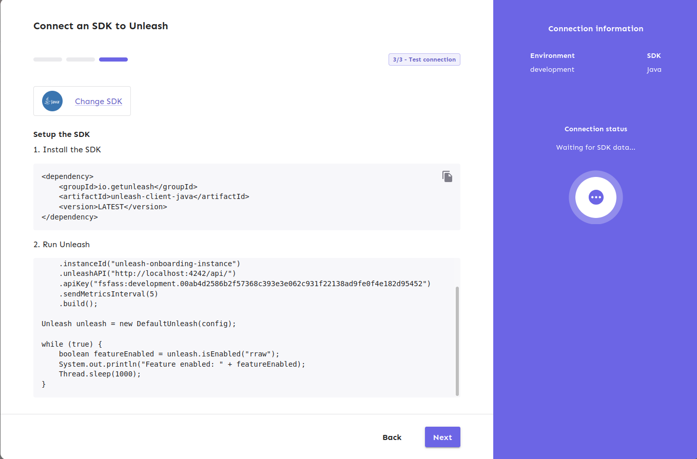
1. Now the dialog will not close when SDK got connected
2. It will start to show the suggested production code. ( this will be
attached in next PR)
3. Also, it has connected indicator on the right
4. Back button is removed in this stage.

---------
Co-authored-by: Tymoteusz Czech <2625371+Tymek@users.noreply.github.com>
https://linear.app/unleash/issue/2-2700/persist-timeline-state-in-local-storage

Implements persistent state management for the event timeline using
local storage.

I believe this improves UX by persisting both the timeline toggle
(visibility) state and applied filters across page refreshes.

Includes some scouting/refactoring and some workarounds to prevent the
timeline from animating on page load (in most cases).
https://linear.app/unleash/issue/2-2662/make-the-event-timeline-available-globally-through-a-new-header-buttonhttps://github.com/user-attachments/assets/bde38ee8-cdd8-409d-a95e-0c06189e3d9b
(In the video, you’ll notice a slight delay before new events show up.
This happens because the timeline automatically refreshes every 10
seconds)
Removes the event timeline from the event log and integrates it into a
new header option.
I chose a middle-ground approach between options 1 and 2 from our Figma
sketches. This solution provides the best of both worlds IMO: the
timeline stands out as a global component, distinct from the current
page context, while sliding in rather than overlapping the content. This
way, users can view the timeline alongside the page content.
https://linear.app/unleash/issue/2-2664/implement-event-tooltips
Implements event tooltips in the new event timeline.
This leverages our current `feature-event-formatter-md` to provide both
a label and a summary of the event. Whenever our new `eventTimeline`
flag is enabled, we enrich our events in our event search endpoint with
this information. We've discussed different options here and reached the
conclusion that this is the best path forward for now. This way we are
being consistent, DRY, relatively performant and it also gives us a
happy path forward if we decide to scope in the event log revamp, since
this data will already be present there.
We also added a new `label` property to each of our event types
currently in our event formatter. This way we can have a concise,
human-readable name for each event type, instead of exposing the
internal event type string.
~~We also fixed the way the event formatter handled bold text (as in,
**bold**). Before, it was wrapping them in *single asterisks*, but now
we're using **double asterisks**. We also abstracted this away into a
helper method aptly named `bold`. Of course, this change meant that a
bunch of snapshots and tests needed to be updated.~~
~~This new `bold` method also makes it super easy to revert this
decision if we choose to, for any reason. However I believe we should
stick with markdown formatting, since it is the most commonly supported
formatting syntax, so I see this as an important fix. It's also in the
name of the formatter (`md`). I also believe bold was the original
intent. If we want italic formatting we should implement it separately
at a later point.~~
Edit: It was _bold_ of me to assume this would work out of the box on
Slack. It does when you manually try it on the app, but not when using
the Slack client. See: https://github.com/Unleash/unleash/pull/8222


This PR adds the new `ProjectSetupComplete` component (the name can be
changed) that we display when a project has been set up with a flag and
a connected SDK.
It uses the project overview to check the project's onboarding status.

The EEA flag is present in enterprise instances which currently is
blocking enterprise customers from accessing this button. This PR
inverts the logic that was changed in #7796.
Allow you to edit default strategies in the UI if you have the
update_project or project_default_strategy_write permissions. These are
the same permissions that we use in the API.

Previously, we used the update_feature_strategy permission here, but
that one is intended to be used for updating strategies belonging to
actual flags.

One of the trickier bits here is that we use the `StrategyVariants`
component, which previously had baked in the permission required
(update_feature_environment_variants). Because the permissions are
different for the default strategy, I updated the component to make it
configurable, but for the default to be the old permission (so that
other uses aren't affected).
Previously, you needed read access specifically to see default
strategies. So even if you could write default strategies, you
couldn't access them in the UI without the read permission too.

This changes it so that you can see default strategies if you have
write permission.