This PR fixes the isOss check for the licensed users component. It also
addresses two things in the UI:
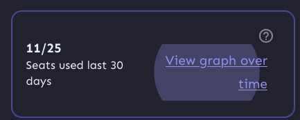
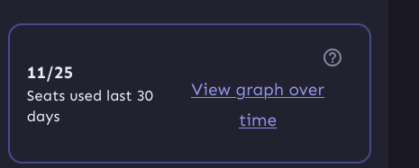
1. It right-aligns the text on the button so that when we get narrower,
the text doesn't slide to the center. There's a few more things that we
can fix later, though. When you press it, it'll still show the entire
button layout:

And when you focus it with a keyboard it still looks like a button.
We can get around that by using a regular button and just styling it a
bit, but making the text align will take some extra jimmying around (not
done in this pr, but got stashed changes for it)

But this is what it'd look like now with centered text:

2. It wraps the entire left column in a `p` tag, because they belong
together. They're not two logical paragraphs. So instead, we wrap them
in spans and surround them in a
p. `Display: contents` makes the p "invisible", so its children act as
if
they're children of the container above it instead.
This PR improves handling of very narrow screens for the project status
header:
- Add a right margin so that it won't overlap with the close button.
- Make it so the icon in the header doesn't shrink.
https://linear.app/unleash/issue/2-2989/unleash-payg-auto-traffic-billing

Integrates auto traffic bundle billing with PAYG.

Currently assumes the PAYG traffic bundle will have the same
`$5/1_000_000` cost as the existing Pro traffic bundle, with the same
`53_000_000` included requests. However some adjustments are included so
it's easier to change this in the future.
This PR fixes an issue where the personal dashboard would fail to render
if the flag was called `.` (Curiously, it was not an issue with `..`;
probably because they end up accessing different URLs).
I've taken the very pragmatic approach here of saying "right, we know
that `.` and `..` cause issues, let's just not even try to fetch data
for them".
The option, of course, is to bake in more error handling in the
components, but due to how we've got hooks depending on each other, it's
a bit of a rabbit hole to go down. I think this is a good compromise for
now.
So now, you'll get this instead:

I've also gone and updated the text for when we get a metrics fetching
error, because this probably isn't due to the flag name anymore. If it
is, we want to know.
This PR updates the project status service (and schemas and UI) to use
the project's current health instead of the 4-week average.

I nabbed the `calculateHealthRating` from
`src/lib/services/project-health-service.ts` instead of relying on the
service itself, because that service relies on the project service,
which relies on pretty much everything in the entire system.

However, I think we can split the health service into a service that
*does* need the project service (which is used for 1 of 3 methods) and a
service (or read model) that doesn't. We could then rely on the second
one for this service without too much overhead. Or we could extract the
`calculateHealthRating` into a shared function that takes its stores as
arguments. ... but I suggest doing that in a follow-up PR.

Because the calculation has been tested other places (especially if we
rely on a service / shared function for it), I've simplified the tests
to just verify that it's present.

I've changed the schema's `averageHealth` into an object in case we want
to include average health etc. in the future, but this is up for debate.
This change updates the "view unhealthy flags" link in the project
status sidebar to use the correct filter. The previous link was put in
before we had a filter for potentially stale, so this updates the link
to use that filter.
This PR adds the option to select potentially stale flags from the UI.

It also updates the name we use for parsing from the API: instead of
`potentiallyStale` we use `potentially-stale`. This follows the
precedent set by "kill switch" (which we send as 'kill-switch'), the
only other multi-word option that I could find in our filters.
Remove everything related to the connected environment count for project
status. We decided that because we don't have anywhere to link it to at
the moment, we don't want to show it yet.
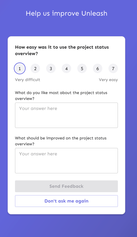
This PR fixes a number of keyboard accessibility issues with the
feedback sidebar. They are (in no particular order):
1. The radio inputs don't have a focus style for `focus-visible` (when
keyboard focused).
2. There's two close buttons there for some reason? One is invisible,
but you can tab to it?
3. The sidebar doesn't trap focus, so you can tab out of the modal and
continue tabbing through the main page (with the modal still open)
4. The sidebar doesn't steal focus. When you open it, your focus remains
on the button you used to open it. So if you want to navigate to it, you
have to go through the entire page (behind the modal) to get to it.
5. The sidebar can't be closed by 'escape'.
The fixes are:
1. Apply the same styles when focus visible as when hover
2. Wrap the component in the `BaseModal` component
3. Wrap the component in the `BaseModal` component
4. Wrap the component in the `BaseModal` component
5. Wrap the component in the `BaseModal` component
(see a theme here?)
Additionally, because the base modal has its own `open` state, I removed
the wrapping conditionally render, reducing nesting by one stop. Most of
the changes in the file are just whitespace changes.

I considered also applying an auto-focus to the first input in the
sidebar, but our linter doesn't like it. Additionally MDN lists the
following [accessibility
concerns](https://developer.mozilla.org/en-US/docs/Web/HTML/Global_attributes/autofocus#accessibility_concerns)
> Automatically focusing a form control can confuse visually-impaired
people using screen-reading technology and people with cognitive
impairments. When autofocus is assigned, screen-readers "teleport" their
user to the form control without warning them beforehand.
>
> Use careful consideration for accessibility when applying the
autofocus attribute. Automatically focusing on a control can cause the
page to scroll on load. The focus can also cause dynamic keyboards to
display on some touch devices. While a screen reader will announce the
label of the form control receiving focus, the screen reader will not
announce anything before the label, and the sighted user on a small
device will equally miss the context created by the preceding content.
So I'll leave it off.