This change opens up the project segments page to OSS users. They
could navigate to it explicitly before, but would be told it was a
premium feature (which it is not (since 5.5)).
After this, it'll show up in the settings sidebar as for
pro/enterprise, and you'll get the actual segments table instead of
"this is a premium feature" message.

This PR adds member, api token, and segment counts to the project status
payload. It updates the schemas and adds the necessary stores to get
this information. It also adds a new query to the segments store for
getting project segments.

I'll add tests in a follow-up.
We found an issue where we'd get a minified react error referencing the
LazyProjectExport component.

We suspect that the issue might be the conditional rendering of this
component, so the fix is to always render it, but to use the flag to
check whether we should show the count or not.
Addressing some oversights that led to browser console errors.

This PR fixes console errors related to the recently introduced
highlight component (#8643) and tag row component in the new flag
metadata panel (#8663).
This PR wires up the connectedenvironments data from the API to the
resources widget.
Additionally, it adjusts the orval schema to add the new
connectedEnvironments property, and adds a loading state indicator for
the resource values based on the project status endpoint response.
As was discussed in a previous PR, I think this is a good time to update
the API to include all the information required for this view. This
would get rid of three hooks, lots of loading state indicators (because
we **can** do them individually; check out
0a334f9892)
and generally simplify this component a bit.
Here's the loading state:

This change adds a few small bits of styling to the status modal to
get us going. It:
- adds padding to the whole modal
- adds a row for the health and resources widgets
- add project health placeholder
It leaves the project activity widget alone for now.
it makes the modal look like this:

**Issue fix:** Resolves#8618, where environments were incorrectly
appended to the route.
**Change:** Introduces `ossPath` specifically for OSS users, as OSS
lacks the default `/settings` path, starting instead from `api-access`.
Follow-up to: https://github.com/Unleash/unleash/pull/8642

Introduces a reusable `Highlight` component that leverages the Context
API pattern, enabling highlight effects to be triggered from anywhere in
the application.

This update refactors the existing highlight effect in the event
timeline to use the new Highlight component and extends the
functionality to include the Unleash AI experiment, triggered by its
entry in the "New in Unleash" section.
This PR begins to stub out the project resources widget. I still need
one more piece of data and then to work on the styling, but it's a
placeholder for now. I've also moved the project status modal to its own
folder so we can group the widgets etc. I'd like to get that merged
quickly to avoid any future conflicts, which is why I'm making the PR
ready now.
This PR hooks up the actionable change request data to the counter in
the UI. It:
- creates a getter for the data. It only exposes data. We don't really
care about error or loading for this (it's not an important piece of
data), so we don't expose that just yet.
- Adds orval-generated schema
- Uses the hook in the UI.

It also stwitches the previous "notification badge" for MUI's built-in
badge. We already use that badge component for the event timeline, so I
thought it would make sense to do it here too. Overall, the effect is
pretty good, but there's a few kinks we might wanna work out. I'll make
a follow-up for that (worked out in this PR after all)
The two lints being turned off are new for 1.9.x and caused a massive
diff inside frontend if activated. To reduce impact, these were turned off for
the merge. We might want to look at turning them back on once we're
ready to have a semantic / a11y refactor of our frontend.
Archived features can be searched now.
This is the backend and small parts of frontend preparing to add
filters, buttons etc in next PR.

---------

Co-authored-by: Thomas Heartman <thomas@getunleash.io>
This commit fixes invalid prop spreading warnings in all the table rows
I could find through a quick search in the code base.

The issue is that you can't spread the "key" prop into a component. It
*must* be an explicit prop.

The process is the same everywhere:
1. Instead of spreading `row.getRowProps()` into the component, we
extract and split it: `const {key, ...rowProps} = row.getRowProps()`.
2. Do the same thing for cellProps.
This fixes a bug where we didn't allow spaces in role descriptions.
The bug came about because we wanted to disallow empty descriptions,
but that means we need to trim them before validating, not necessarily
before setting it.

However, that does mean that you can have descriptions with leading
and trailing spaces now, but that's probably fine.

To fix this, we'd have to do the trimming of the description only at
submission time, I think.
This silences front end test warnings, errors, and logs that we don't
care about. The
reason we don't care is that:
- we won't fix
- it's test-specific, doesn't appear to happen in real life

And it clogs the test logs.
This changes the warning on adding group root roles to cover all roles
rather than just Editor or Admin. This got opened to Viewers in a 2K
line monster PR that was mostly refactor so I'm assuming this was an
accident but it's not a dangerous accident

## Discussion

Okay so why change the warning rather than change the code?

Two reasons.
1) This has been like this for a year and a half. It was changed before
the feature entered GA, so users are probably used to it by now. Seems
rude to take things away and it's harmless to keep it
2) It's consistent with everything else to have all 3 roles displayed
and removes an edge case in the code
<!-- Thanks for creating a PR! To make it easier for reviewers and
everyone else to understand what your changes relate to, please add some
relevant content to the headings below. Feel free to ignore or delete
sections that you don't think are relevant. Thank you! ❤️ -->

## About the changes
<!-- Describe the changes introduced. What are they and why are they
being introduced? Feel free to also add screenshots or steps to view the
changes if they're visual. -->

<!-- Does it close an issue? Multiple? -->
Closes #

<!-- (For internal contributors): Does it relate to an issue on public
roadmap? -->
<!--
Relates to [roadmap](https://github.com/orgs/Unleash/projects/10) item:
#
-->

### Important files
<!-- PRs can contain a lot of changes, but not all changes are equally
important. Where should a reviewer start looking to get an overview of
the changes? Are any files particularly important? -->


## Discussion points
<!-- Anything about the PR you'd like to discuss before it gets merged?
Got any questions or doubts? -->
Fix this warning:

> MUI: You are providing a disabled button child to the Tooltip
component.
> A disabled element does not fire events.
> Tooltip needs to listen to the child element’s events to display the
title.
> Add a simple wrapper element, such as a span.
Fixes all warnings about the "key" prop. The majority of the fixes fall
into one of the following categories:

- Extracting "key" props in tables (you're not allowed to just spread
them in)
- Adding "key" props to autocomplete options and chips
- fixing test data that didn't contain ids
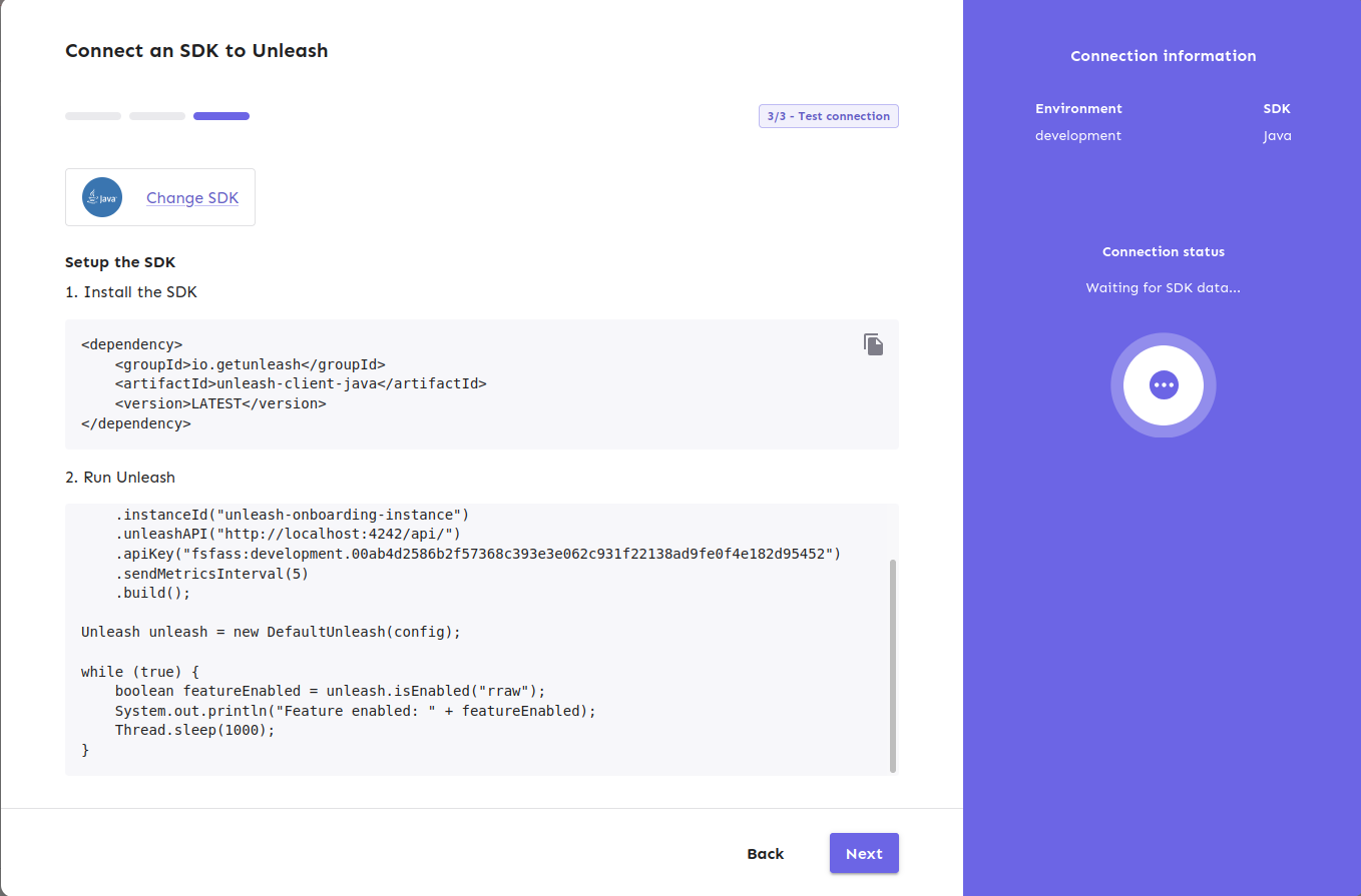
https://linear.app/unleash/issue/2-2840/make-the-unleash-ai-chat-window-resizable

This PR makes the Unleash AI chat resizable, providing users with a
flexible way to adjust the chat window's size.

Implements a reusable `Resizable` wrapper component that allows
configuration of:
 - Minimum, maximum, and default sizes.
- Customizable resize handlers for each edge and corner of the
container.
 - Optional resize event callbacks.

Double-clicking any resize handler maximizes the container along that
axis (or both, if it's a corner). If the container is already maximized,
double-clicking again will revert it to the default size.
This PR fixes all `invalidDomNesting` errors we're getting in our tests.
The culprit was the `Badge` icon we use, which wrapped its children in a
div. When that's used as a child of a `p` tag, that'd cause this to
trigger.

What I've done is to change the wrapping element to a span instead. The
Badge itself uses an `display: inline-flex`, so divs and spans should be
treated the same, meaning there's no visual change for this.
don't use `act` from `react-dom`. Instead, use act from `react`
directly, as advised by the deprecation notice.

This PR fixes all of the deprecated import warnings, updates some
testing libraries we use (and tests), and fixes one or two other
warnings.
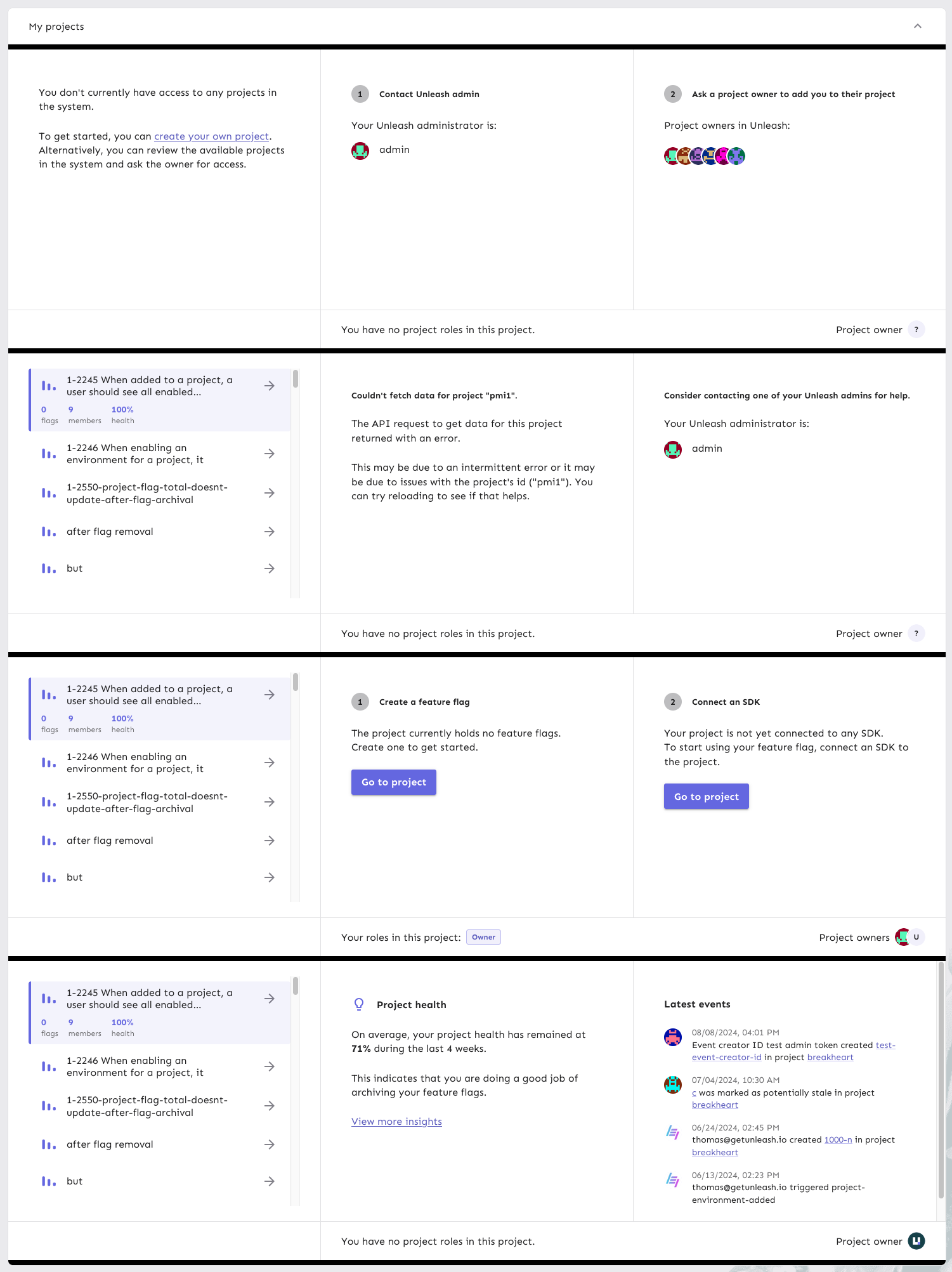
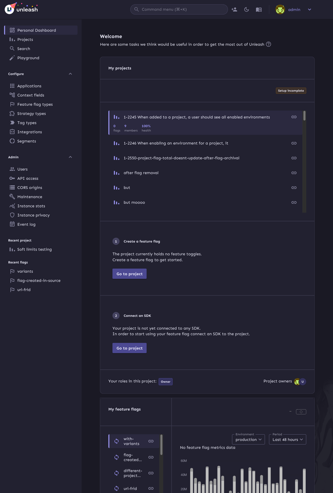
This PR continues the refactoring of the front end code for dashboards.
The main points are:
- Extracts the `ActionBox` component that we used in a lot of places.
There were some minor differences between the various incarnations, so
this also better aligns them.
- Extract other components (`AskOwnerToAddYouToTheirProject`,
`YourAdmins`)
- Move the `NeutralCircleContainer` into `SharedComponents`
- Delete the separate no content grid (this is now handled in projects
instead)
- extract my projects grid contents into a single function so that it's
easier to understand what content you get for what states
Here's all the states side by side:
https://linear.app/unleash/issue/2-2791/create-a-useaiapi-react-hook

Implements a basic Unleash AI API React hook that fits our initial needs
for interacting with this API through our frontend.

Also adds a new nice-to-have script to run the frontend set to the
`demo` base path, which matches our Cloud defaults. This way you can run
the latest local cloud with the latest local frontend in an easy way.
This is the first step in refactoring the front end code for personal
dashboards.

At this point:
- extract `useDashboardState` to its own file
- extract my flags to its own file
- Rename `Grid.tsx` to `SharedComponents.tsx` as it contains more than
just the grid.
This PR improves handling of narrow screens. It:
- makes the owner/roles row wrap when it needs to
- makes the lifecycle + metric selectors wrap when necessary
- makes the text for the empty chart wrap (and makes it text, not label)
To avoid showing the key concepts screen to users every time they log
back in to Unleash (after logging out), store the state in the DB splash
table.

The reason we need to do this is that we clear localstorage on logging
out, so things like splash screens and certain other settings don't get
stored.
This PR fixes issues with section sizes including:
- Jank when they change suddenly
- Overflowing list of admins / events
- Short lists that should stretch to the height of their container.
This PR makes it so that we show an empty chart when we're loading flag
metrics, instead of showing the placeholder chart.
It uses a very simple version that may not be the same size as the
standard chart (because it has no labels), but we can change that at a
later date.

This PR adds plausible tracking for navigating to items from the
personal dashboard.

It tracks:

- Navigating to projects from the list
- Navigating to projects from the onboarding screen
- Navigating to flags from the list
- Opening the key concepts dialog
https://linear.app/unleash/issue/2-2787/add-openai-api-key-to-our-configuration

Adds the OpenAI API key to our configuration and exposes a new
`unleashAIAvailable` boolean in our UI config to let our frontend know
that we have configured this. This can be used together with our flag to
decide whether we should enable our experiment for our users.
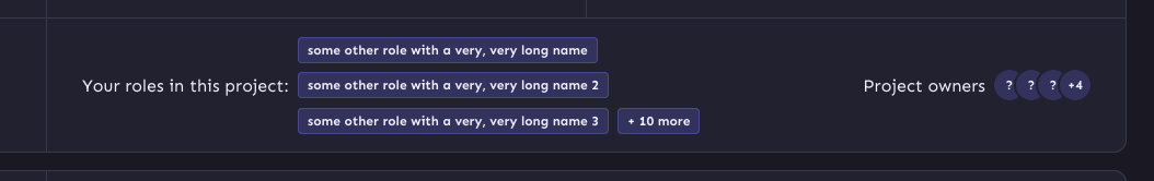
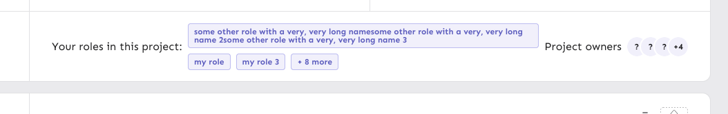
This PR improves how we handle cases where you have lots of roles or roles with very long names.
It puts project roles into it's own little area (and turns it into a list!). We'll show three roles by default. If they all have super long names, we'll split them up onto multiple lines.
Additionally, the headers and avatar group will no longer wrap.
So in edge case territory, it'll look like this:
And what if one role has an even longer name? It'll wrap inside the badge:
This PR stores the dashboard state (selected project and flag) in
localstorage so that you get taken back to the same project and flag
when you refresh the page or navigate away and back.

It also handles scrolling the selected items into view in case they're
below the fold.
This PR fixes a bug where the default project would have no listed
owners. The issue was that the default project has no user owners by
default, so we didn't get a result back when looking for user owners.
Now we check whether we have any owners for that project, and if we
don't, then we return the system user as an owner instead.

This also fixes an issue for the default project where you have no roles
(because by default, you don't) by updating the schema to allow an empty
list.
https://linear.app/unleash/issue/2-2743/open-the-signal-query-endpoint-to-everyone-not-only-admins

The new signal query endpoint is now open for every Unleash user, not
only admins.

This PR allows non-admins to view signals in the event timeline. It also
updates the signals tooltip to be shown to all users, not just admins,
under the following assumptions:

- `!signalsSuggestionSeen` - Current user has not dismissed the signals
tip
- `isEnterprise()` - Enterprise instance
- `signalsEnabled` - The signals feature flag is enabled
- `!signalsLoading` - Signals have finished loading (avoids flickering)
- `signals.length === 0` - We can't find any signals in the selected
timespan
https://linear.app/unleash/issue/2-2729/add-event-timeline-to-new-in-unleash

Adds the new event timeline to the "New in Unleash" section.

Unlike Signals & Actions, the Event timeline doesn’t have a dedicated
page to link to, as it's a global component within the layout. To
address this, we extend the "check it out" action in the New in Unleash
component by supporting a callback instead of a link. When the user
clicks "check it out" for this new item, the page smoothly scrolls to
the top, ~~the timeline opens (if it's not already)~~, and a temporary
highlight effect is triggered on the timeline header button.

Also includes some scouting / slight UX adjustments.


https://github.com/user-attachments/assets/fe49f21b-5986-46b2-8fc6-acb4daef9d08
Tracking events for

1. Onboarding started/project created
2. Onboarding finishes
3. API token generated
4. Sdk example clicked

Not tracking events that can happen multiple times and results are
skewed

1. Moving between onboarding steps
The main goals of this are:
1. Make it so that the layout grid doesn't break on small screens
2. Fix an issue where the border of the box didn't fit the outline
3. (Bonus): make the layout of the info box depend on the **box's**
size, not the screen size.
To achieve those goals, this PR:
1. Switches to using a native CSS grid instead of MUI's grid component.
This gives us more power over the layout in various different sizes.
2. Switches from putting borders on the boxes inside the grid, instead
makes the grid container the color of the border and uses gaps to create
borders.
3. If your browser supports it, it will use container queries to
determine whether we should display the layout as a multi-column grid or
in a single column.
Container query demo (both with the same screen sizes):
Sidebar closed:
Sidebar open:
https://linear.app/unleash/issue/2-2723/add-signals-tip
Adds a tip to the event timeline regarding the usage of signals.
The conditions for it to show up are the following:
- `!signalsSuggestionSeen` - The current user has not closed the tip yet
- `isEnterprise()` - The Unleash instance is an Enterprise instance
(signals are currently Enterprise-only)
- `isAdmin` - The current user is an admin (signals are currently
admin-only)
- `signalsEnabled` - The signals feature flag is currently enabled
- `!loading` - Signal endpoints have not finished loading (prevents
flickering)
- `signalEndpoints.length === 0` - The Unleash instance currently has
zero configured signal endpoints (signals feature is not being used)

This switches to using conditional SWR to fetch project details only
when you provide a project. This fixes an issue where we'd make
requests for `api/admin/personal-dashboard/undefined` (which will be a
404 in the future).
This commit uses the now-included project owner and role information
to populate the owner/role section. If you have no roles, we'll tell
you that you don't instead of displaying an empty set of badges.
https://linear.app/unleash/issue/2-2703/align-with-ux
Timeline UI/UX improvements after sync with UX, including:
- Added some spacing between each event in the grouping tooltip
- Aligned the x events occurred header with filter dropdown
- Improved the strategy icon somewhat so it doesn't look as off center
- New timeline icon
- Improve icon position relative to timestamp on each event in the
grouping tooltip
- Changed text color in dropdowns to a lighter gray
- Removed bold formatting in tooltip
- Adjusted paddings and margins
- Added close button
- Added shadow
- Added left border
There are a few details missing, which will be tackled in separate PRs.

---------
Co-authored-by: Nuno Góis <github@nunogois.com>
https://linear.app/unleash/issue/2-2665/show-signals-in-the-event-timeline
Implements signals in the event timeline.
This merges events and signals into a unified `TimelineEvent`
abstraction, streamlining the data structure to only include properties
relevant to the timeline.
Key changes:
- Refactors the timeline logic to handle both events and signals through
the new abstraction.
- Introduces the `useSignalQuery` hook, modeled after `useEventSearch`,
as both serve similar purposes, albeit for different resource types.
Note: The signals suggestion alert is not included and will be addressed
in a future task.

This PR hooks up the owners and admins of Unleash to the UI. They'll
only be visible in cases where you have no projects.

In addition, it adds Orval schemas for the new payload properties and
updates the generating schemas to fix some minor typing issues.
Fixes 2 bugs:

- The initial state of the event timeline should have `open: false`, not
`true` - Closed by default, unless opened
- The event timeline should unmount when hidden - It should not emit
requests when closed
Joined all examples into one copyable example.
Did not do following ones, because they are using templates and probably
will not work as joined.
1. React
2. Svelte
3. Vue
Also skipped, because those examples are not final yet.
1. .NET
2. Android
This fixes a bug where you can input just whitespace for
name/description. It also means that you can no longer have both "my
role" and "my role    " as separate roles.

API fix will follow.