Removes the `() => {} as any` args from the StrategyDraggableItem
invocation when you have paginated strats. Instead makes all the drag
params optional. It defaults to a no op if not provided.

Also, the reason it had to be typed as `any` before is probably because
it was missing a function. The correct empty param is `() => () => {}` 💁
Adjusts styling of the env dropdown now that we have both release plans
and strategies.
Key points:
- simplifies strategy separator, removes inherent height. Also: extracts
it from the draggable component (it has no business knowing whether to
add that or not)
- Puts release plans and strategies in the same list so that it becomes:
```markdown
- Release plan
- strategy 1
- strategy 2
- (OR) Strategy A
- (OR) Strategy B
```
- Adjusts some padding around to make it line up properly
- Swaps a couple conditional renders for ternaries
Rendered:

## Still todo:
Handle cases where you have >50 strats and we show the warning etc. It's
a little trickier because of how it interacts with release plans, so I
wanna leave that for later.
I'm also unsure about how we handle spacing today. All the little items
have their own different spacing and I'm not sure it won't get out of
sync, but I'm also not sure how else to handle it. We should look at it
later.
Splits the release plan component into a Legacy component and a new one
with the initial changes for the new strategy list view.
Here's what it looks like:
Notice that the background color stops a little early (before the OR
token). I'll handle that in a follow-up because the changes also impact
how the rest of the env accordion body is rendered.
Improves the semantic correctness of the strategy list by wrapping it
in an `ol` tag.

Strategy order matters (due to variant resolution etc), so the order
is important (hence the `ol` instead of a `ul`).

Dragging still works and it's visually the same.
Updates the strategy list based on the new designs and moves the current
versions of the touched components into `Legacy...` files (the vast
majority of changes are that and updating imports). The relevant changes
to the components are listed in their original files.
Flag on:

Flag off:

## Next steps
There's two items to review for improving these current comments (also
noted inline):
- Whether to aria-hide the "or" separator or not (I need to read up a
bit and think whether it makes sense to show that or not)
- Changing the list of strategies into an actual ordered list (`ol`).
That'd reflect the semantics better.
Next would be checking the other places we use strategy lists and then
updating those too. In doing so, I might find that some things need to
be updated, but I'll handle those when I get there.
There's also handling release plans.
Makes the env selector on the flag page act the same way as the env
selector on the new project page or any of the filterable buttons in the
new project/flag dialogs.
Also slightly changes the styles of the existing dropdown lists to bring
them in line with the new env selector (more padding, full-width
highlights).
Selector:

Project/flag creation:
Before:

After:
## Technical notes
I was a little unsure how best to share the padding/spacing styles
between the search field and popover at first (as was requested by UX).
The easiest way (and most compliant with how we do it today) was to
define the spacing in a variable and move the relevant components into
the same file.
However, I actually think that using a CSS variable (e.g.
`--popover-spacing`) would be "better" here, but we don't really use
them much, so I've left that out for now. That said, if you agree, I'd
be more than happy to use that instead 🙋🏼
- Button to show and hide environments
- Refactored hook storing state of hidden environments
- Changed the way flag is triggered for feature overview
- Visual updates for new page look

---------

Co-authored-by: Thomas Heartman <thomas@getunleash.io>
https://linear.app/unleash/issue/2-2834/plausible

Adds the following Plausible events to the Release management feature:
 - Add plan
 - Start milestone
 - Remove plan
 - Create template
 - Edit template
 - Delete template
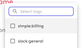
This PR fixes a bug wherein the list of tags to remove from a group of
tags wouldn't be correctly updated.

## Repro steps
- Add a console log line to
`frontend/src/component/feature/FeatureView/FeatureOverview/ManageTagsDialog/ManageBulkTagsDialog.tsx`'s
`ManagebulkTagsDialog`. Log the value of the`payload` variable.
- Pick a flag with no tags.
- Add tag A -> before submitting, you should have one added tag and zero
removed flags. After submitting, both should be empty.
- Now remove tag A -> before submitting, you should have one removed tag
and zero added tag. After submitting, both should be empty
- Notice that removed flags hasn't been emptied, but still contains tag
A.
- Now add tab B -> before submitting, you should have tag B in added and
nothing in removed. Notice that tag A is still in removed.


## Discussion points

This gives us both a `clear` and a `reset` event, which is unfortunate
because they sound like they do the same thing. I'd suggest renaming the
`clear` event (because it doesn't really clear the state completely),
but I'm not sure to what. Happy to do that if you have a suggestion.

I have not tested that submission of the form actually resets the state.
I spent about 45 minutes looking at it, but couldn't find a way that was
sensible and worked (considered spying: couldn't make it work;
considered refactoring and extracting components: think that's too much
of a change). I think this is benign enough that it can go without a
test for that thing actually being called.

I did, however, test the different reducer commands.
As of PR #8935, we no longer support both text and title, and confetti
has been removed.

This PR:
- removes `confetti` from the toast interface
- merges `text` and `title` into `text` and updates its uses across the
codebase.
- readjusts the text where necessary.
https://linear.app/unleash/issue/2-3038/release-plans-misc-ux-improvements
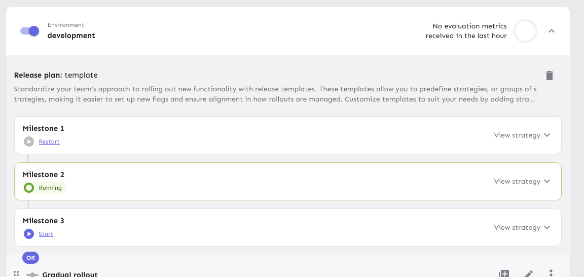
Includes various UX improvements focused on release plans:
- **New milestone status:** Introduced a "Paused" status for milestones.
A milestone is marked as "Paused" when it is active but the associated
environment is disabled.
- **Status display:** Paused milestones are labeled as "Paused (disabled
in environment)" for clarity.
- **Styling cleanup:** Removed unused disabled styling in the release
plan component.
- **Accordion stability:** Fixed visual shifting in milestone accordions
when toggling.
- **Strategy count:** Updated the "View Strategies" label to reflect the
total number of strategies in the milestone.
- **Edge case handling:** Improved rendering for milestones without
strategies.
- **Component extraction:** Refactored milestone status into a
standalone component.
- **Component organization:** Grouped milestone-specific components
under a `ReleasePlanMilestone` parent folder.
- **Template card cursor enhancement:** Set the cursor on the template
card to "pointer", so we better reflect the interactivity of the
element.
- **Template card created by enhancement:** Added an avatar for the
"Created by" field in release plan template cards, replacing the
creator's ID.
- **Navigation improvement:** After creating or editing a release plan
template, users are now redirected back to the release management page.


Hooks up the project status lifecycle data to the UI. Adds some minor
refactoring as part of that effort.

## Other files

There's been some small changes to
`frontend/src/component/feature/FeatureView/FeatureOverview/FeatureLifecycle/FeatureLifecycleStageIcon.tsx`
and `frontend/src/hooks/useLoading.ts` as well to accommodate their
usage here and to remove unused stuff. The inline comments mention the
same thing but for posterity (especially after this is merged), the
comments are:

For
`frontend/src/component/feature/FeatureView/FeatureOverview/FeatureLifecycle/FeatureLifecycleStageIcon.tsx`:

> The icon only needs the name to pick.
https://github.com/Unleash/unleash/pull/7049 deliberately changed the
logic so that the completed stage gets the same icon regardless of its
status. As such, to make the icon easier to use other places (such as in
the lifecycle widget), we'll only require the name.

For `frontend/src/hooks/useLoading.ts`:
> There's no reason we should only be able to put refs on divs, as far
as I'm aware. TS was complaining that that a `ul` couldn't hold a div
reference, so I gave it a type parameter that defaults to the old
version.
Addressing some oversights that led to browser console errors.

This PR fixes console errors related to the recently introduced
highlight component (#8643) and tag row component in the new flag
metadata panel (#8663).
Fixes all warnings about the "key" prop. The majority of the fixes fall
into one of the following categories:

- Extracting "key" props in tables (you're not allowed to just spread
them in)
- Adding "key" props to autocomplete options and chips
- fixing test data that didn't contain ids