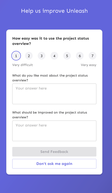
This PR fixes a number of keyboard accessibility issues with the
feedback sidebar. They are (in no particular order):
1. The radio inputs don't have a focus style for `focus-visible` (when
keyboard focused).
2. There's two close buttons there for some reason? One is invisible,
but you can tab to it?
3. The sidebar doesn't trap focus, so you can tab out of the modal and
continue tabbing through the main page (with the modal still open)
4. The sidebar doesn't steal focus. When you open it, your focus remains
on the button you used to open it. So if you want to navigate to it, you
have to go through the entire page (behind the modal) to get to it.
5. The sidebar can't be closed by 'escape'.
The fixes are:
1. Apply the same styles when focus visible as when hover
2. Wrap the component in the `BaseModal` component
3. Wrap the component in the `BaseModal` component
4. Wrap the component in the `BaseModal` component
5. Wrap the component in the `BaseModal` component
(see a theme here?)
Additionally, because the base modal has its own `open` state, I removed
the wrapping conditionally render, reducing nesting by one stop. Most of
the changes in the file are just whitespace changes.
I considered also applying an auto-focus to the first input in the
sidebar, but our linter doesn't like it. Additionally MDN lists the
following [accessibility
concerns](https://developer.mozilla.org/en-US/docs/Web/HTML/Global_attributes/autofocus#accessibility_concerns)
> Automatically focusing a form control can confuse visually-impaired
people using screen-reading technology and people with cognitive
impairments. When autofocus is assigned, screen-readers "teleport" their
user to the form control without warning them beforehand.
>
> Use careful consideration for accessibility when applying the
autofocus attribute. Automatically focusing on a control can cause the
page to scroll on load. The focus can also cause dynamic keyboards to
display on some touch devices. While a screen reader will announce the
label of the form control receiving focus, the screen reader will not
announce anything before the label, and the sighted user on a small
device will equally miss the context created by the preceding content.
So I'll leave it off.
**Upgrade to React v18 for Unleash v6. Here's why I think it's a good
time to do it:**
- Command Bar project: We've begun work on the command bar project, and
there's a fantastic library we want to use. However, it requires React
v18 support.
- Straightforward Upgrade: I took a look at the upgrade guide
https://react.dev/blog/2022/03/08/react-18-upgrade-guide and it seems
fairly straightforward. In fact, I was able to get React v18 running
with minimal changes in just 10 minutes!
- Dropping IE Support: React v18 no longer supports Internet Explorer
(IE), which is no longer supported by Microsoft as of June 15, 2022.
Upgrading to v18 in v6 would be a good way to align with this change.

TS updates:
* FC children has to be explicit:
https://stackoverflow.com/questions/71788254/react-18-typescript-children-fc
* forcing version 18 types in resolutions:
https://sentry.io/answers/type-is-not-assignable-to-type-reactnode/

Test updates:
* fixing SWR issue that we have always had but it manifests more in new
React (https://github.com/vercel/swr/issues/2373)

---------

Co-authored-by: kwasniew <kwasniewski.mateusz@gmail.com>
This PR will allow us to use a feature flag with variants to control
whether or not we should show the comments field of the feedback form.
This will allow us to see whether we can increase feedback collection if
we reduce the load on the customer.