Archived features can be searched now.
This is the backend and small parts of frontend preparing to add
filters, buttons etc in next PR.

---------

Co-authored-by: Thomas Heartman <thomas@getunleash.io>
This commit fixes invalid prop spreading warnings in all the table rows
I could find through a quick search in the code base.

The issue is that you can't spread the "key" prop into a component. It
*must* be an explicit prop.

The process is the same everywhere:
1. Instead of spreading `row.getRowProps()` into the component, we
extract and split it: `const {key, ...rowProps} = row.getRowProps()`.
2. Do the same thing for cellProps.
This fixes a bug where we didn't allow spaces in role descriptions.
The bug came about because we wanted to disallow empty descriptions,
but that means we need to trim them before validating, not necessarily
before setting it.

However, that does mean that you can have descriptions with leading
and trailing spaces now, but that's probably fine.

To fix this, we'd have to do the trimming of the description only at
submission time, I think.
This changes the warning on adding group root roles to cover all roles
rather than just Editor or Admin. This got opened to Viewers in a 2K
line monster PR that was mostly refactor so I'm assuming this was an
accident but it's not a dangerous accident

## Discussion

Okay so why change the warning rather than change the code?

Two reasons.
1) This has been like this for a year and a half. It was changed before
the feature entered GA, so users are probably used to it by now. Seems
rude to take things away and it's harmless to keep it
2) It's consistent with everything else to have all 3 roles displayed
and removes an edge case in the code
Fix this warning:

> MUI: You are providing a disabled button child to the Tooltip
component.
> A disabled element does not fire events.
> Tooltip needs to listen to the child element’s events to display the
title.
> Add a simple wrapper element, such as a span.
Fixes all warnings about the "key" prop. The majority of the fixes fall
into one of the following categories:

- Extracting "key" props in tables (you're not allowed to just spread
them in)
- Adding "key" props to autocomplete options and chips
- fixing test data that didn't contain ids
https://linear.app/unleash/issue/2-2840/make-the-unleash-ai-chat-window-resizable

This PR makes the Unleash AI chat resizable, providing users with a
flexible way to adjust the chat window's size.

Implements a reusable `Resizable` wrapper component that allows
configuration of:
 - Minimum, maximum, and default sizes.
- Customizable resize handlers for each edge and corner of the
container.
 - Optional resize event callbacks.

Double-clicking any resize handler maximizes the container along that
axis (or both, if it's a corner). If the container is already maximized,
double-clicking again will revert it to the default size.
This PR fixes all `invalidDomNesting` errors we're getting in our tests.
The culprit was the `Badge` icon we use, which wrapped its children in a
div. When that's used as a child of a `p` tag, that'd cause this to
trigger.

What I've done is to change the wrapping element to a span instead. The
Badge itself uses an `display: inline-flex`, so divs and spans should be
treated the same, meaning there's no visual change for this.
don't use `act` from `react-dom`. Instead, use act from `react`
directly, as advised by the deprecation notice.

This PR fixes all of the deprecated import warnings, updates some
testing libraries we use (and tests), and fixes one or two other
warnings.
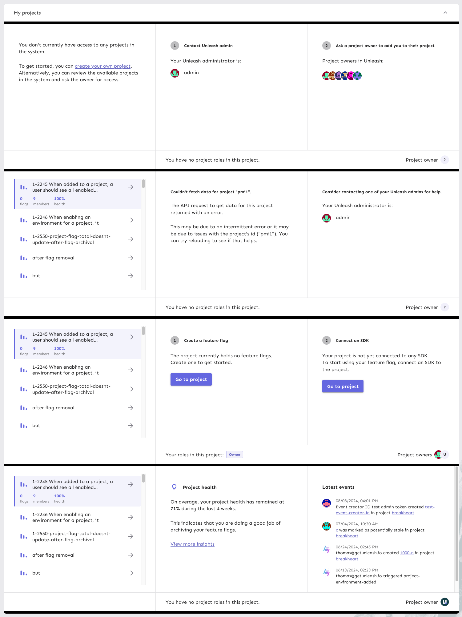
This PR continues the refactoring of the front end code for dashboards.
The main points are:
- Extracts the `ActionBox` component that we used in a lot of places.
There were some minor differences between the various incarnations, so
this also better aligns them.
- Extract other components (`AskOwnerToAddYouToTheirProject`,
`YourAdmins`)
- Move the `NeutralCircleContainer` into `SharedComponents`
- Delete the separate no content grid (this is now handled in projects
instead)
- extract my projects grid contents into a single function so that it's
easier to understand what content you get for what states
Here's all the states side by side:

This is the first step in refactoring the front end code for personal
dashboards.

At this point:
- extract `useDashboardState` to its own file
- extract my flags to its own file
- Rename `Grid.tsx` to `SharedComponents.tsx` as it contains more than
just the grid.