1
0
mirror of https://github.com/Unleash/unleash.git synced 2025-01-20 00:08:02 +01:00
Commit Graph

3101 Commits

Author SHA1 Message Date
Thomas Heartman
ca35ca1b24
chore[demo]: update handling of strategy deletion for demo walkthrough (#7719)
This PR makes some small changes to how we handle strategy deletion in
the demo environment, which has become extra important with the recent
soft limits.

The changes are:
- lower the strategy limit from 30 to 25. The standard limit is 30, so
we want to make sure we're below that.
- when checking whether we should delete a strategy, check whether we're
**at or above** the limit. It used to only check if we were above, but
if soft limits would prevent you from adding more, then you'd never be
able to go above the limit.
- Also delete strategies for step3.
2024-08-02 11:13:42 +02:00
Tymoteusz Czech
a676b1bc20
fix: strategy parameters UI (#7713)
Old versions of Unleash allow for creating "Gradual Rollout" strategies
without `groupId` or `stickiness`. UI will now populate those fields,
not getting stuck when editing strategies without said fields.
2024-08-02 11:11:58 +02:00
Thomas Heartman
2d0fb765f0
fix: align event log filter buttons (#7726)
Fixes an issue where the filter buttons were both too far down and too
far to the right.

The issue was that the wrapper body imposed a pretty substantial bit
of padding. However, the filter buttons already came with their own
bit of padding. The result of this was alignment issues.

To fix it I have:
- opened the `Filters` component up to be styled with styled components

And conditionally (when isEnterprise and the flag is on):
- set the page body to have no padding.
- added a wrapper with padding around the event search results for 

This feels a little messy to me, but I also think that because it's
still in heavy development, it might change later. I'd be happy to have
suggestions forbetter implementations.

What makes this extra tricky is that the top padding differs depending
on whether you have the filters there or not, so I couldn't find a way
to just remove that component and be done with it. I may very well have
missed somehing, though.

Before:

![image](https://github.com/user-attachments/assets/1552d1ec-2c14-450f-9ce8-8e74389f11a1)

After: 

![image](https://github.com/user-attachments/assets/d58b6fe5-437f-4488-bf01-cabfef669e2e)
2024-08-02 11:09:55 +02:00
Thomas Heartman
643cfeb5bb
chore: use EventSchema instead of IEvent (#7732)
Changes the type used by the useEventSearch hook to be `EventSchema`
from OpenAPI instead. This is more accurate with what we're actually
getting. And crucially for the event log search, it contains the
`createdByUserId` property that we need to filter out events.

It's mostly a straightforward find and replace except for one instance
where we need to do some extra fiddling. There's an inline comment
explaining that.
2024-08-02 11:05:42 +02:00
Thomas Heartman
6458d461b9
feat: add event types to filter button (#7733)
Add event types to the event log filter button.

The event types are taken from the OpenAPI definition.
2024-08-02 10:25:25 +02:00
Mateusz Kwasniewski
5cd657065f
feat: copy strategy to current environment (#7730) 2024-08-02 09:46:57 +02:00
Tymoteusz Czech
8aa812e0f5
feat: Orphaned tokens - new API tokens list icon (#7693)
Moving warning icon from "projects" column, to left icon.
2024-08-01 14:31:42 +00:00
Mateusz Kwasniewski
5668bfb7d4
feat: preview changes button (#7722) 2024-08-01 11:59:35 +02:00
Tymoteusz Czech
4aa3a64530
feat: UI for playground of change requests (#7721)
## About the changes
UI draft
2024-08-01 11:16:35 +02:00
Thomas Heartman
f1e95108d1
Wip: split out avatar group; use same tooltip for all avatars (#7681)
Extracts the Avatar Group component into a `common` component and adds a
standard tooltip to all avatars.

Relates to linear issue 1-2606

This is a suggestion / proof of concept for how we can solve it. While I
think we can merge this as is, I'd also be happy to take any discussions
on other ways to approach it etc.

## Why are these changes made together?

Because extracting the avatar group without adding the new tooltip data
made the existing tooltip misbehave (it'd show up in the top left of the
screen, not synced to the avatar in any way).

I probably could have (and still can if you think it's prudent) split it
out such that the avatar gets a standardized tooltip first (and disable
it for the group card avatars), and split out the avatars in a
follow-up. Happy to do that if you think it's better.

## What does this mean? 

It used to be that we had no consistent way of dealing with avatars and
tooltips. Some places had them, some places didn't. This change makes it
so that all avatars that we can show tooltips for will get the same
tooltip.

Previously, we had at least 4 different ways of dealing with tooltips:
- The HTML tooltip (that would be standardized with this PR) in the
project flags table

![image](https://github.com/user-attachments/assets/91098d31-a5e3-4091-9125-332fe5d106fd)
- The "title" that you'd get on your user avatar
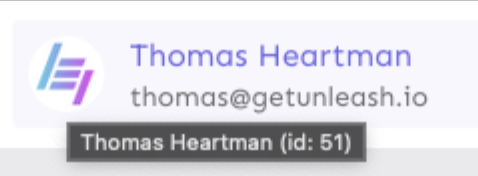
![image](https://github.com/user-attachments/assets/39062b61-db8c-4bd5-9fa3-3ecc9bc192ee)
- The group card list tooltip

![image](https://github.com/user-attachments/assets/0d4a696a-e944-446c-8bff-4dcec02d8afb)
- And sometimes you'd get nothing at all

![image](https://github.com/user-attachments/assets/8975afaf-9ca1-4eb6-b443-9ab94b52bbd8)

with this change, we'll always show the same kind of tooltip if we can:


![image](https://github.com/user-attachments/assets/974c592c-c844-4b65-8a55-05e84d3df130)

## What goes in the tooltip? 

We use the `UserAvatar` component for a fair few different things and I
didn't want to extract separate components for all the different use
cases. Instead, I wanted to get an overview over what we use it for and
what is relevant info to show.

I found all the places we used it and tried to form an opinion. 

This tooltip will work with a user's email, name, username, and id. If
there is no user (such as for empty avatars and avatars displaying only
"+n" for remaining members), we show no tooltip.

Following the example set by the group card avatars, we'll try to use
email or username (in that order) as the main bit of text. If the user
has an email or a username and also a name, the name will be used as
secondary text.

If the user does not have an email or username, but has a name, we'll
use the name as the main text.

If the user does not have an email, a username, or a name, we'll try to
show "User ID: N" if they have an id.

If they do not have a username, a name, an email, or an ID, we bail out
and show nothing.

## Why can you disable the tooltip?

In some cases, you might want to disable the tooltip because you have
more information to feed into it. An example of that is in the project
flags table, where we want to show more information in cases where the
user is 'unknown':


![image](https://github.com/user-attachments/assets/758b4e86-e934-47e3-91ce-ce900f76bc54)


## Additional fixes

This PR also adds a few lines of CSS to fix a minor avatar layout bug.

Before:
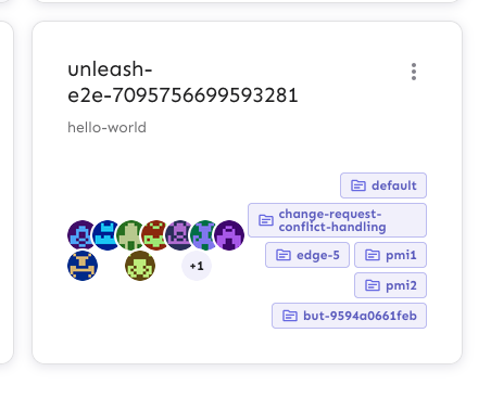
![image](https://github.com/user-attachments/assets/0150efbf-c51a-40bb-898f-7ddd3565ce21)


After:

![image](https://github.com/user-attachments/assets/f337cf68-c572-4610-b1de-a27749325da8)
2024-08-01 10:45:24 +02:00
Thomas Heartman
7db42453b1
feat: add filter dropdowns to event log pages (#7711)
Adds placeholder filter buttons (that don't work at all) yet to the
three event logs.

Flag logs get to choose to and from dates, created by, and event type.

Project logs get all that flag logs get + a filter for flag.

The global log gets all project log filters + a project filter.

There's still work to be done to add data to createdBy, eventType, to
hook it up to the API, and to finalize the layout, but I wanted to get a
rough outline in to iterate on later. The eventType icon will also need
to be decided on.


![image](https://github.com/user-attachments/assets/06a65301-9cc5-45ed-b753-2b9235d64ea6)
2024-08-01 08:23:22 +02:00
Thomas Heartman
2822746fc1
refactor: Make event log look and act like other pages (#7704)
Updates the way the event log works. Previously, we'd use the
`displayInline` parameter to disable padding and border. However,
recent pages (including project overview etc) have moved away from
this look.

By bringing the event log into line with how those other pages look,
it'll be easier to make designs for the new filtering capability align
with other Unleash filters.

## Changes

The eventlog is used in three places. In two of them, it used to not
have a separating border. However, when we look at other screens that
have seen recent work (such as feature flags), we see that they *do*
have a separator, so bringing the event log in line seems like a
reasonable change.

Project flags list (notice the separator):

![image](https://github.com/user-attachments/assets/9b56a53d-38ef-4492-b1f8-f40ad5f3b6eb)


Here's what they look like before and after the change:

### Global event log
Before: 

![image](https://github.com/user-attachments/assets/ccf428f6-3491-4c60-a853-13c50ae771f0)

After (no change):

![image](https://github.com/user-attachments/assets/cfc74538-285c-4565-bd38-dfb5e421e966)


### Project event log

Before:

![image](https://github.com/user-attachments/assets/80ef1a36-3b13-4e76-8d59-534d63f0e6bd)


After:

![image](https://github.com/user-attachments/assets/7380518c-f6dc-4d4f-b085-48ed3761bb20)


### Flag event log

Before:

![image](https://github.com/user-attachments/assets/345a5d72-d358-49fd-967c-f6cb0706a4f6)


After:

![image](https://github.com/user-attachments/assets/b4e0d8e9-e79c-477e-8fc4-181c366207fc)
2024-07-31 09:46:47 +02:00
Tymoteusz Czech
b585ead6df
fix: avoid react key warnings in tables (#7694)
Refactoring to get rid of `A props object containing a "key" prop is being spread into JSX` warning
2024-07-30 13:09:12 +02:00
Thomas Heartman
08aba91832
fix: flex layout used the wrong axes for layout. (#7696)
This change fixes an issue where the flex layouts for collaborator
info used the wrong axes for layout (row instead of column and vice
versa), causing the component to look wonky.

Before:

![image](https://github.com/user-attachments/assets/695a9f67-ef07-4b3c-936f-69b2f2d62a28)

After:

![image](https://github.com/user-attachments/assets/a0a2c73a-2787-4985-807b-012bb4db94a4)
2024-07-30 09:17:02 +02:00
Thomas Heartman
344e599b09
fix: don't cut off hover-color of favorite button (#7691)
This PR fixes a minor visual issue where the "favorite project" button's
hover outline would get cut off due to its container having `overflow:
hidden`.

The overflow value was introduced in
[#7575](https://github.com/Unleash/unleash/pull/7575) as way to handle
long project names. We didn't discover the hover issue back then because
it's not apparent unless you hover the fav star.

I found the solution in the CSS-tricks post [Preventing a Grid
Blowout](https://css-tricks.com/preventing-a-grid-blowout/). To quote
the article, the reason this works is that:

> the minimum width of a grid column is auto. (The same is true for flex
items, by the way.)
>
> And since auto is entirely based on content, we can say it is
“indefinitely” sized, its dimensions flex. If we were to put an explicit
width on the column, like 50% or 400px, then we would say it is
“definitely” sized.
>
> To apply our fix, we need to make sure that there is the column has a
definite minimum width instead of auto.

Before:

![image](https://github.com/user-attachments/assets/d9296afd-326e-4712-a389-f1bc3a1f821e)


After:

![image](https://github.com/user-attachments/assets/2fd88a51-08be-4bc4-8969-cd6ebbaf255c)

Additionally, I've removed a duplicate declaration of font size,
removing the deprecated version.
2024-07-29 17:03:47 +02:00
Mateusz Kwasniewski
21ab80b753
feat: health stats insights explanation (#7690) 2024-07-29 15:19:20 +02:00
Thomas Heartman
0fe0079053
fix: use nested flexboxes instead of grid area (#7654)
This change removes the use of grid area from the collaborators
component, replacing it with a nested flexbox setup.
2024-07-29 12:55:52 +02:00
Tymoteusz Czech
d825b49f43
fix: health stats number (#7688)
Prevent showing "undefined%" in new Health statistics.
2024-07-29 12:49:03 +02:00
Tymoteusz Czech
5c4bc6f7a0
fix: FeatureForm - not jsx comment (#7689) 2024-07-29 11:32:14 +01:00
Mateusz Kwasniewski
94588c12d4
feat: human readable project names in insight charts (#7686) 2024-07-29 11:52:14 +02:00
Thomas Heartman
1cd1f982ee
fix: allow editors to submit flag form (#7687)
This change is a follow-up to
https://github.com/Unleash/unleash/pull/7685 and fixes another
instance of the same issue.

It wasn't caught previously, because the permissions are passed as
props here, and not used directly.


![image](https://github.com/user-attachments/assets/e8c4cb90-92e3-42ca-9c15-458b5b9d37c2)
2024-07-29 09:45:52 +00:00
Thomas Heartman
80cff0a5fa
fix: allow editors to create flags again (#7685)
This change fixes a bug where editors were suddenly unable to create
flags. The issue is that the new project creation dialog used a
permission button, but didn't supply the project ID.
2024-07-29 09:24:32 +00:00
Thomas Heartman
f24f8a896c
fix: break long project/flag names in the event log to prevent overflow (#7684)
This change sets the `overflow-wrap` property for the definition list
values in the event log. This is to prevent long project/flag names
from making the left-hand side of the card suuuper wide, causing
overflow of the whole container.

Before: 

![image](https://github.com/user-attachments/assets/4f813d71-731d-4bb8-86b0-89ff235b2244)

After:

![image](https://github.com/user-attachments/assets/6739d3f0-552b-47c7-8dca-4235a737367e)
2024-07-29 08:54:43 +00:00
Thomas Heartman
a42970a153
fix: Avoid weird spacing between title and collab mode icon (#7683)
This change fixes an issue where the title of the project would be
pushed all the way to the right when the project was set to "private".

The cause was that the container with the project mode and the title
was a flex box with `justifyContent` set to `space-between`.

Removing that line fixes the issue, and the contents align to the
start of the box. There are no other elements in that container, so it
does not affect anything else.

Before:

![image](https://github.com/user-attachments/assets/e8024e3f-8c68-4ed8-b135-ae49f24664b4)


After:

![image](https://github.com/user-attachments/assets/c5039e59-4ea4-49bb-b391-89864e7520d0)
2024-07-29 08:18:52 +00:00
Thomas Heartman
3a3aaad37d
feat: Use a toggling button for impression data on/off (#7682)
Instead of using a dropdown list for impression data, this PR introduces
a new config button that is a switch type button. It will be filled
(contained) when impression data is on and will be outlined when
impression data is off.

Off:

![image](https://github.com/user-attachments/assets/4710c8aa-a853-43c3-bf3b-86dbbf1a2779)


On:

![image](https://github.com/user-attachments/assets/08316155-83d1-45a2-941f-1c49c254a02b)
2024-07-29 08:05:35 +00:00
Jaanus Sellin
4df8fd3810
feat: redirect to new feature flag creation (#7679)
Currently found only one instance that is using `create-toggle`. So
changed behaviour for that.
2024-07-26 14:27:02 +03:00
Thomas Heartman
9b2c0bf55b
fix: shorten max project name width in feature toggles creation form (#7678)
This change sets the max project name label width to 20ch instead of
30ch.

At 30ch, the button is wide enough that it causes the buttons always
to overflow. At 20, it's about as wide as the impression data button,
and it renders on one line.


Before:

![image](https://github.com/user-attachments/assets/8d28a948-dfa1-4f75-bc8d-473ceb322631)

After:

![image](https://github.com/user-attachments/assets/c73ccc58-13ab-4b33-a82e-275130494c3d)
2024-07-26 12:08:58 +02:00
Thomas Heartman
39cda30dab
chore: update description/docs for the new feature creation dialog fields (#7677)
This PR updates the text used to describe the different fields used in
the new creation dialog.

It also removes a redundant aria attribute (that MUI already handles).
2024-07-26 09:57:22 +00:00
Thomas Heartman
c7bb6c5179
fix: prevent long project names from blowing out the form (#7673)
This change prevents long project names from blowing the form out of
proportion.

To do so, it:
1. sets `whitespace: no-wrap` on the button labels. Judging by the other
styles, this was the intention all along, but it didn't really come up
until now.

2. It also sets the label width for projects to 30ch,so that you'll get
to see quite a bit of the project name before it gets cut off.

It would be possible to set a dynamic width for this button based on the
longest project name, but I'm not sure it adds much value, so I'm
leaning towards keeping it simple.

Here's what the dynamic width would look like:

``` tsx
    const projectButtonLabelWidth = useMemo(() => {
        const longestProjectName = projects.reduce(
            (prev: number, type: { name: string }) =>
                prev >= type.name.length ? prev : type.name.length,
            0,
        );
        return `${Math.min(longestProjectName, 30)}ch`;
    }, [projects]);
```

What it looks like:

![image](https://github.com/user-attachments/assets/51bca3f6-aeb3-4a41-b57e-5ebd9baa3ef6)
2024-07-26 11:39:43 +02:00
Thomas Heartman
c0d7be040d
fix: make config dropdown list generic over values (#7676)
This PR makes the config dropdown list generic over its values, so that
you can pass stuff that isn't strings.

It also updates the existing impression data button to use booleans
instead.
2024-07-26 11:38:29 +02:00
Jaanus Sellin
b55d6f46d0
feat: add tags selection to feature creation (#7674)
![image](https://github.com/user-attachments/assets/539bd2a0-d036-4a8d-9752-fd60c7e4bf24)
2024-07-26 12:13:56 +03:00
Thomas Heartman
6e34ae4ada
fix: project icon sizing and color (#7672)
This PR fixes the project icon sizing and color in the create feature
form. However, it includes a little more cleanup work.

1. I've switched out the previous project icon with a new one. The
difference? The old one had lots of whitespace around it, which made
sizing it awkward.
2. I've added a wrapping Icon component to common. The idea was taken
from this thread on the MUI GitHub about how to make imported icons
behave consistently with MUI icons.
3. Because I've switched the icon and added a new component, I've also
gone and updated the other places we used the old icon, so that we're
consistent about the usage.

In create dialog form:

![image](https://github.com/user-attachments/assets/9b5caed7-cd50-437b-82bb-1d7ccbfaac3f)

Updated icon in:
Project card component

![image](https://github.com/user-attachments/assets/4ce809f4-4083-4554-ac4c-3597d9bf42df)


Project creation form

![image](https://github.com/user-attachments/assets/4227416f-a56d-41ed-96a4-99b71a11dbf7)


Sidebar and command bar (it's actually larger here, but maybe that's
okay? Previous project was kinda small):

![image](https://github.com/user-attachments/assets/72b8aa2e-6970-4c11-9a4d-250648b44ad9)

(Previous sidebar and command bar):

![image](https://github.com/user-attachments/assets/bcef9208-9819-4742-87a1-3a20d50d741c)


I'd be willing to leave the sidebar and command bar for now if we think
it's better to leave them using the same size as previously, but we can
talk about that. I think it's better in the sidebar; undecided about the
command bar.

Bonus changes: I fixed some typos
2024-07-26 10:26:16 +02:00
Thomas Heartman
d96da453a4
fix: show the selected project's name on the button, not its ID (#7671)
This change makes it so that we show the name of the project that is
selected on the selection button instead of the ID. There is a chance
that the name is not unique, but I'm willing to take that risk (plus
it's how we do it today).

I've used a useMemo for this, because we have to scan through a list
to find the right project. Sure, it's always a small list (less than
500 items, I should think), but still nice to avoid doing it every
render. Happy to remove it if you think it obfuscates something.

We *could* also use a `useState` hook and initialize it with the right
value, update when it changes, but I actually think this is a better
option (requires less code and less "remember to update this when that
changes").
2024-07-26 09:27:25 +02:00
Thomas Heartman
464568dace
fix: Hide project selection option in CreateFeatureDialog when OSS (#7669)
This change wraps the project selection option in the
CreateFeatureDialog in a conditional that hides it when Unleash is
OSS.

OSS doesn't have access to the project creation API, so there's no
point in showing this.
2024-07-25 17:59:47 +02:00
Thomas Heartman
2c41cbbd3c
fix: validate project names on blur (#7668)
This fix validates the project name when you blur the field in the new
project form. The only instances where it'll be wrong is if you have
just whitespace or an empty string, but you'll be notified immediately.

Also removes some unused variables and parameters that I found.
2024-07-25 12:43:38 +00:00
Thomas Heartman
dc37503b7d
fix: Capitalize input labels (#7667)
This change makes it so that all form input labels start with a
capital letter, regardless of the data we use to generate them.

Also fixes a leftover toggle -> flag renaming.
2024-07-25 12:27:46 +00:00
Jaanus Sellin
10489c7534
feat: added PoC for the new feature creation dialog (#7666)
![image](https://github.com/user-attachments/assets/82412746-34b3-48f2-95b1-1cdfdeb1ea72)
2024-07-25 15:12:48 +03:00
Thomas Heartman
eb7208025f
chore: create shared dialog form template (#7663)
This PR extracts the dialog form that we created for the new project
form into a shared component in the `common` folder.

Most of the code has been lifted and shifted, but there's been some
minor adjustments along the way. The main file is
`frontend/src/component/common/DialogFormTemplate/DialogFormTemplate.tsx`.
Everything else is just cleanup.
2024-07-25 13:41:09 +02:00
Tymoteusz Czech
369518cd7d
Feat: webhook markdown (#7658)
Add ability to format format event as Markdown in generic webhooks,
similar to Datadog integration.
Closes https://github.com/Unleash/unleash/issues/7646

Co-authored-by: Nuno Góis <github@nunogois.com>
2024-07-25 09:45:20 +00:00
Nuno Góis
d8c5466099
chore: show latest integration event on card (#7656)
https://linear.app/unleash/issue/2-2443/show-the-latest-integration-event-result-on-that-integrations-card

Shows the latest event on the integration card.

Also renames one of the folders to make its contents clearer.

<img width="1184" alt="image"
src="https://github.com/user-attachments/assets/2465d68b-d580-4fc9-9376-c6d55d0f19e0">
2024-07-24 14:23:29 +01:00
Nuno Góis
8a20ae999f
chore: keep latest integration events for each integration configuration (#7652)
https://linear.app/unleash/issue/2-2469/keep-the-latest-event-for-each-integration-configuration

This makes it so we keep the latest event for each integration
configuration, along with the previous logic of keeping the latest 100
events of the last 2 hours.

This should be a cheap nice-to-have, since now we can always know what
the latest integration event looked like for each integration
configuration. This will tie-in nicely with the next task of making the
latest integration event state visible in the integration card.

Also improved the clarity of the auto-deletion explanation in the modal.
2024-07-24 13:52:57 +01:00
Jaanus Sellin
3f76882465
fix: recently visit should only use main paths (#7655)
Recently visited should only be main paths, so look like this
**/segments** **/projects** and not have multiple slashes inside.
2024-07-24 15:04:33 +03:00
Jaanus Sellin
647ba7b9cb
feat: separate command bar and search hotkeys (#7651)
Currently, the command bar and search hotkeys are conflicting. I am now
separating them and assigning search an extra modifier key: Shift.
2024-07-24 12:46:03 +03:00
Thomas Heartman
e2b90ae91d
fix: add workaround for tooltip (#7649)
This PR adds the UI part of feature flag collaborators. Collaborators are hidden on windows smaller than size XL because we're not sure how to deal with them in those cases yet.
2024-07-24 09:33:29 +00:00
Nuno Góis
e63503e832
chore: add integration events modal (#7648)
https://linear.app/unleash/issue/2-2441/create-integration-events-modal

Adds the integration events modal to the UI, allowing us to visualize
them. This is the core of the UI work for this feature.

<img width="587" alt="image"
src="https://github.com/user-attachments/assets/f64cbb8c-1c01-4638-a661-5943ad7a890c">

### Example: Success

<img width="1277" alt="image"
src="https://github.com/user-attachments/assets/578bc7dc-d37d-4c0a-b74a-4bd33e859b51">

### Example: Success with errors

<img width="1255" alt="image"
src="https://github.com/user-attachments/assets/f784104d-7f11-4146-829d-6b3a3808815b">

### Example: Failed

<img width="1254" alt="image"
src="https://github.com/user-attachments/assets/543f857d-3877-4c17-92eb-58e6f038b8ac">
2024-07-24 08:14:16 +01:00
Thomas Heartman
0f0a680af3
chore: don't ask OSS users to reach out to CS (#7633)
The limit card says to contact cs@getunleash if you're at the limits,
but we probably don't want to show that to OSS customers (it's not
terrible, just not very helpful), so let's hide it for OSS.

Instead, we'll ask them to try the community slack.

Screenie:


![image](https://github.com/user-attachments/assets/5a5dc292-3878-4181-98ac-f1ce4583d8a3)
2024-07-22 11:03:10 +02:00
Tymoteusz Czech
242f59ba4e
New health stats component (#7620)
New style for widget
2024-07-18 15:48:47 +02:00
Mateusz Kwasniewski
d1959dd0e2
feat: filter project flags by state (#7618) 2024-07-18 14:52:27 +02:00
Thomas Heartman
41203340fd
fix: use a fullscreen loader for the initial redirect load (#7619)
This PR fixes a minor visual glitch where the initial Unleash load might
display a jumping loading icon. The reason was that the initial
redirect's loader wasn't marked as a fullscreen loader.
2024-07-18 14:50:59 +02:00
Tymoteusz Czech
19121f234e
Insights layout (#7610)
Refactored insights page - stats and charts relevant to the same metric
are now combined into a single widget.
2024-07-18 12:43:52 +02:00