https://linear.app/unleash/issue/2-3512/bug-flow-2-enable-for-a-specific-user-doesnt-workhttps://linear.app/unleash/issue/2-3513/bug-flow-4-adjust-variants-doesnt-work
Fixes our demo topics by making them work with the new flag page design.
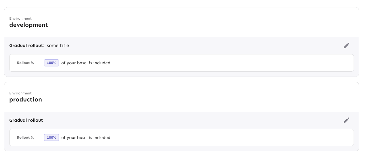
We achieve this by adding 2 new interactive steps in `demoApp.step2` and
`demoApp.step4` to expand the respective environment accordions. We mark
them as optional so they are not strictly required and will be skipped
if not found. This means the demo will be resilient to rolling back the
`flagOverviewRedesign` flag, for example.
We also mark 2 steps as optional: saving constraints in `demoApp.step2`
and `demoApp.step4`. It seems like we no longer have an extra button to
save the constraints after adding them, so by marking these steps as
optional the demo flow is able to proceed without breaking.
Adds the easy parts of the inline values list: a list of chips that
shows you which values you have and that you can delete. You either
delete them by clicking the "clear" icon or by using del/backspace on
your keyboard.

If you use your keyboard we also handle switching your focus to the
appropriate element. By default, your browser may shift the focus to the
top of the window (which isn't very helpful). Instead, we handle it like
this:
- If you delete an item and there are more elements in the list:
  - move the element to the next item if exists
  - if your element is the last item, move focus to the previous item
- if there are no more items in the list, move the focus to the Add
Values button

We still need to add the "add values" popover functionality. That's next
on the agenda.

Additionally, this switches how the containing flex container positions
its items along the cross axis (vertically) to "flex-start" instead of
"center". Because the values list can grow to multiple lines, it would
shift the "delete constraint" button and the constraint picker to the
middle of the expanded constraint. Now, instead they stay aligned to the
top. This causes a slight alignment issue with the button (due to the
invisible padding), but I don't want to look at that before the rest of
this is complete and we know how it all fits together. You'll notice
that the spacing between elements in that top row is also off anyway
(look at the value list being smushed up against the case sensitive
icon), so there's more work to do.

<img width="716" alt="image"
src="https://github.com/user-attachments/assets/225fcab8-03e4-46e3-92d4-82912eb40d46"
/>

Focus styles:

<img width="190" alt="image"
src="https://github.com/user-attachments/assets/6b07ab25-0a67-493c-9cac-839932b0d654"
/>

<img width="195" alt="image"
src="https://github.com/user-attachments/assets/9d5b323e-bf65-4eca-9008-a45ce0139a2b"
/>


Hover styles:
<img width="96" alt="image"
src="https://github.com/user-attachments/assets/f19e1945-d2be-4e87-8005-76cb6beb1f50"
/>
In this PR I integrate the Unleash React SDK with the Admin UI.

We also take advantage of Unleash Hosted Edge behind the scenes with
multiple regions to get the evaluations close to the end user.
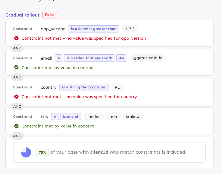
Implements the first step towards implementing the new design for
constraint editing. All the edit functionalities work as and when you do
them now, but there is no validation of the values you put in that's
happening.

The inverted / not inverted button and the case sensitivity button are
placeholders. They should use icons and have proper descriptions of what
they do. I'll do that in a follow-up.

The way to enter values is currently always in the section below the
main controls. Again, more work on this is coming.

Current look:

With case sensitive options:
<img width="769" alt="image"
src="https://github.com/user-attachments/assets/bfdfbac1-cc95-4f26-bf83-277bae839518"
/>

With legal values:
<img width="772" alt="image"
src="https://github.com/user-attachments/assets/14f566cc-d02a-46dd-b433-f8b13ee55bcc"
/>
If you try to visit an archived flag, you're told you can find it on the
project archive page, but that page isn't visible by default anymore.
This is an update to take you to the project overview with a filter for
archived flags instead.
This PR creates/steals the logic and basic components that we need for
the new constraint editing design and shows it instead of the old one if
the flag is on.

The interface needs a lot of work, but this essentially wires everything
up so that it works with the API on direct editing:

<img width="781" alt="image"
src="https://github.com/user-attachments/assets/97489a08-5f12-47ee-98b3-aefc0b840a2b"
/>

Additionally the code here will need a lot of refactoring. This is a
first draft where I've yanked all the constraint editing logic out of a
nested hierarchy of components that handle validation and lots more. I
expect to clean this up significantly before finishing it up, so please
excuse the mess it's currently in. It turns out to have been lots and
lots more logic than I had anticipated.

This is just a PR to get started, so that the next one will be easier to
work on.
Removes the "disableRipple" prop from the FeatureToggleSwitch component,
thereby restoring its focus styles, so that keyboard users can see where
their focus is at.

I don't know the reason this was added originally (the PR doesn't say
anything about it), but the prop changes nothing when hovering with the
mouse, but it does remove focus styles for keyboard navigation.

By removing it, we can bring the focus style back. As far as I can tell,
there's no other difference between the two states.

Both of these screenies have focus on the toggle, but in the first
screenie there's no way to tell.

With the prop:
<img width="397" alt="image"
src="https://github.com/user-attachments/assets/b9a5d764-ec5a-4d3b-b79d-0b52d7bd6891"
/>


Without the prop:
<img width="445" alt="image"
src="https://github.com/user-attachments/assets/3c95c7a6-91de-4ed2-9942-e9fc794e9d40"
/>

Because the component is used in multiple places, this also fixes this
issue in the project flag list (and maybe elsewhere too):
<img width="336" alt="image"
src="https://github.com/user-attachments/assets/6582c58b-fabe-40ce-a141-06b22189a462"
/>
So this PR removes the purchased dt point, as well as the total
available. Using the same check our overageCalculation does (it also
only works on current month)
Fixes a bug where project status modal links wouldn't work.

The reason they didn't work is because we modified the query params on
modal close, and because we manually close the modal when you click a
link (because otherwise it'd stay open when you navigated to other
project pages), we inadverdently reset the URL.

I'm not entirely sure why setting the search params would modify the URL
itself, but I'm guessing that's related to the implementation.

One way to solve this is to indicate whether we're closing the modal
because a link was clicked or not, and only modify the query params if
that is not the case.
Hides owner avatars in cases where the owner type is "system". Touches
dashboard and project card owners.

Back when all projects required owners, we introduced the new project
cards that have the owner listed in the footer. Because, theoretically,
you weren’t allowed to create projects without owners, the only project
that should ever be without an owner was the default project. So we
thought it made sense to say that it was owned by the system.

But now that owners are optional, that doesn't necessarily make sense
anymore. As such, we'll just hide their avatars to begin with.

<img width="726" alt="image"
src="https://github.com/user-attachments/assets/950cd909-c891-48f1-9ef7-fd74922a5990"
/>

<img width="1497" alt="image"
src="https://github.com/user-attachments/assets/f4d213f5-febb-46f8-89f0-899e77652e07"
/>

Because the components expected the avatars to be there, we now need to
set an explicit min-height on them, so that they don't collapse.
Luckily, we can use the default avatar height (and also force that so
that they change in tandem) and use that in both places.
Updates the link from the project dashboard page to take you to the
project status modal instead of the old insights page.

We didn't have a way to auto-open the modal before, so I added a query
param to control it.
This PR refactors the color picker so we stick to one set of colors
instead of changing available colors when theme changes. Colors picked
also work in dark theme and is aligned with UX.
This is exposing information we already have about permissions in a UI
that should help users have an overview of the permissions of a user
with regards to projects and environments
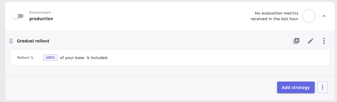
Adds focus styles to the env accordion header only when the focus is on
the header itself (not on the env toggle inside the header). The focus
style is consistent with what we do for other accordions (dashboard,
milestones).
Middle one is focused:

Focus is on the toggle inside the top one (yeh, we should have better
focus styles for toggles; but that's not for now):

Open and focused:

Getting the consistent background for the header when it's open is a
little tricky because the accordion container and summary are split into
different files. ~~This first iteration used a class name for the
specific header (because envs can have multiple accordion headers inside
them, e.g. release plans) and setting a CSS variable in the summary, so
that the background matches.~~ I found out that I only need to set it in
the parent anyway 😄
Without it, you get this (notice that there is a little white outside
the lower corners):

Makes two small changes to the release template UI based on walkthrough
feedback with UX

1) The how-to descriptions for creating release plans won't get hidden
when the user has created release plans. We think too much is better
than too little. At a later point we'll push users to documentation more
aggressively
2) The warning for when the user taps the "Use template" button now has
a line break to give it some breathing room and will render anchored to
the bottom left of the originating button rather than covering it
Implements the drag-n-drop tooltip the first time the user sees a
strategy drag handle on the feature env overview. It uses React Joyride,
which is the same system we use for the demo.
The design is a little different from the sketches because I couldn't
find a quick way to move the content (and the arrow) to be shifted
correctly.
If the demo is also active the first time a user visits a strategy page,
it'll render both the demo steps and this, but this tooltip doesn't
prevent the user from finishing the tour. It might be possible to avoid
that through checking state in localstorage, but I'd like to get this
approved first.
The tooltip uses the auth splash system to decide whether to show the
tooltip, meaning it's stored per user in the DB. To avoid it
re-rendering before you refetch from the back end, we also use a
temporary variable to check whether the user has closed it.
Rendered:

If the tour is also active:

Adds a new dialog option for whats in new in Unleash items. This can be
tiggerred by setting `popout` to true when configuring the items.
To do this without setting fire to the code, I've also needed to
refactor the NewInUnleash components:
- NewInUnleashItem becomes a dumb item that decides if a dialog or
tooltip should be rendered and controls that render state
- The child item in NewInUnleashItem has been moved out into
NewInUnleashSideBarItem, which feels a bit better since that is a
distinct UI element from the popup
- NewInUnleashDialog now exists, which is a dialog version of the popup.
Meaningfully different to ask for a new component
## Screenshots

Fixes janky drag and drop behavior and updates the styling of the drag
handle focus.
The solution uses the same method to prevent oscillation as we do for
strategies. To get access to the same context, I've added some extra
parameters to the OnMoveItem function and passed along the extra data
from the `useDragItem` hook. No new information, just making more of it
available, and turning it into an object so that you can declare the
properties you need (and get rid of potential wrong ordering of
drag/drop indices).
For the drag and drop behavior: If the dragged element is the same size
or smaller than the element you're dragging over, they will swap places
as soon as you enter that space. If the target element is larger,
however, they won't swap until you reach the drag/drop handle, even if
they could theoretically switch somewhere in the middle. This appears to
be a limitation of how the drag/drop event system works. New drag events
are only fired when you "dragenter" a new element, so it never fires
anywhere in the middle. Technically, we could insert more empty spans
inside the drag handle to trigger more events, but I wanna hold off on
that because it doesn't sound great.
When dragging, only the handle is visible; the rest of the card stays in
place. For strategies, we show a "ghost" version of the config you're
dragging. However, if you apply the drag handle to the card itself, all
of it becomes draggable, but you can no longer select the text inside
it, which is unfortunate. Strategies do solev this, though, but I
haven't been able to figure out why. If you know, please share!
Before:

After:

Extracts the shared strategy list and list item into the `common` folder
instead of living in the environment accordion body file.

Also takes the disabled strategy handling that we use for
`StrategySeparator` and moves it into the file itself. It might be
something we want to decorate manually in the future, but we don't for
now, so this was the most straight-forward way to make it work.
Makes it so that strategies project env strategies that aren't draggable
don't get the drag icon. The reason it didn't work as expected was that
we used fallback functions instead of keeping them undefined.
I discovered that we applied two dragging boxes, so I removed the outer
layer one (specific to project envs) in favor of relying on the inner
one. Most of the lines changed are just indentation as a result of this
nesting going away.
Here's the diff. The top set of strategies aren't draggable; the lower
ones are.

Gives a small update in how we deal with unevaluated and disabled
strategies in the new playground design:
- "Unevaluated" badges go from yellow warning to blue info and their
text changed to "Not evaluated"
- Don't show "Not evaluated" badges on strategies that are disabled.
To avoid this change affecting the current playground setup, I
duplicated the old resultschip into a legacy file and changed the
existing impl. To avoid updating all other files that use that chip
(it's all over the playground) and checking flags or creating duplicates
there, I decided to do a quick check at the top of the legacy file and
use the new file if the flag is on.
In doing so, I've also simplified the actual chip file and have more or
less cut the total line count in it in two 😄

Flattens the list of strategies when you have both release plans and
strategies. If you had both, you'd have this setup before:
```
- ol
- li // release plan
- ol // release plan strategies
- li // regular strategies
- ol // strategy list
```
Now we drop the extra nesting:
```
- ol
- li // release plan
- ol // release plan strategies
- li // the rest of the strategies
```
Semantically, I think this is just as valid and it simplifies a lot of
styling that no longer needs to look for other lists etc.
As part of doing this, I have also moved the "many strategies" warnings
and pagination labels to outside the list instead of inside the smaller
list.
Otherwise, the list looks just the same as before and drag-n-drop works
just fine.
(side note: these strategies shouldn't have drag handles 🤔 )

As a bonus, this PR also:
- Uses the disabled style separator for disabled strats in playground
and deletes some unused components I found.
Playground disabled strats (we probably don't want double orange badges;
I'll talk to UX):

Handle cases where flags have no strategies in the playground.
As part of this, also changes how we deal with the padding/margins in
the playground: instead of making all but one items in the playground
have to explicitly add padding, now we instead say that the only item
that needs to do something is the list, which uses negative inline
margins.
This also has the added benefit of adding all the top-level elements
(that is: that's not part of the strategy lists) inside the same
container, so we can control gaps between them with flex's gaps.
When you have no strategies (before):

When you have no strategies (after):

Implements playground results for strategies.
Old design:

New design:

Still left: segments.
I also discovered during this that some of the new hooks (and also some
of the new components) accept deprecated types
(`IFeatureStrategyPayload` in this case). If that should indeed be
deprecated, then we also shouldn't use it in the new hooks / components
if we can avoid it. I'll make a task for it.
---------
Co-authored-by: Tymoteusz Czech <2625371+Tymek@users.noreply.github.com>
Implements the new design for playground constraints. They're not in use
in segments yet, and strategy parameters have not been touched. This PR
establishes a pattern that we can follow for strategies and parameters
later.
The PR also includes a change in how the constraint item organizes its
children: it now takes care adding padding and spacing itself, instead
of the children doing that. It looks right most places, but segments
aren't quite right anymore. However, as this is behind a flag, I'd
rather fix that in a separate PR.
---------
Co-authored-by: Tymoteusz Czech <2625371+Tymek@users.noreply.github.com>
Previously, the entire card was draggable, which meant that you couldn't
select text inside the card or inside the milestone title when editing.
This makes it so that only the drag handle is draggable.
Fixes a number of issues that would surface in UTC-n (where n > 1)
timezones. I've not found a way to check this with tests (and it looks
like [we weren't able to last time
either](https://github.com/Unleash/unleash/pull/9110/files#r1919746328)),
so all the testing's been done manually by adjusting my system time and
zone. (From what I understand, you can't generate a Date with a specific
TZ offset in JS: it's only utc or local time)

Resolved:
- [x] Selecting "Jan" in the dropdown results in the selection being
"December" (off by one in the selector)

- [x] Selecting a month view only gives you one data point (and it's
probably empty). Wrong date parsing on the way out resulted in sending
`{ from: "2025-02-28", to: "2025-02-28"}` instead of `{ from:
"2025-03-01", to: "2025-03-31"}`

- [x] The dates we create when making "daysRec" need to be adjusted.
They showed the wrong month, so the dates were off.

- [x] Make sure the labels are correct when hovering over. Again: we
used the wrong month for generating these.

- [x] The available months are wrong. Incorrect month parsing again.

- [x] The request summary month is wrong. You guessed it: incorrect
month parsing
- new way of showing strategy variants
- fixed wrapping issue in strategy editing, for a lot of variants
defined (`SplitPreviewSlider.tsx` change)
- aligned difference between API and manually added types
Initial rough work on adapting the playground strategies to the new
designs. This PR primarily splits components into Legacy files and adds
new replacements. There are *some* updates (including spacing and text
color), but nothing juicy yet. However, I wanted to get this in now,
before this PR grows even bigger.
Implements the new strategy list design for default strategies. Moves
the old impl into a legacy file. Also: removes the description from the
strategy item. From my digging, we only showed this for default strategy
items and it didn't really provide any useful information. The only
other place you can add a description is for custom strategies (at least
that I could find), but these are deprecated and we never show the
description when you apply the strategy anyway.
Rendered:
Without the flag (nothing changes):

Fixes a visual bug where envs without release plans would get too much
spacing on the top of their first strategy.
It does this flattening the list of strategies if there are no release
plans. In doing so, I have extracted the strategy list rendering into a
separate component (to make things more legible and re-usable) and have
also removed the FeatureStrategyEmpty component and marked it as
deprecated. In the new designs, you can't expand envs without
strategies, so the component is no longer needed.
Before (what looks like a shadow is actually the extra list being
rendered with a bit of padding):

After:
Moves strategy titles and names onto the same line, as per the new
designs.
In doing so, I've also updated the component to use a more semantic
hgroup with the header being the strategy title if it exists or the
strategy name if not.
The downside of being more semantically correct here is that we need to
know what header level we want the strategy to use. In most cases,
that's 3 (e.g. flag name > environment > strategy, release plan >
milestone > strategy), but for plans on flag envs, it's 4 (flag name >
env > milestone name > strategy).
I've also taken the opportunity to fix a little mistake I made earlier.
`ol`s can only have `li` children, and I'd forgotten to wrap a nested
`ol` inside an `li`. The changes in `EnvironmentAccordionBody` all
relate to that change. Because we now have several layers of lists
nested within each other, dealing with styling and padding gets a little
tricky, but CSS has the power do help us out here.
Rendered:

Use new design for release plans in flag environments.
- Move old ReleasePlanMilestone into Legacy file and update imports
- In the new version, use the same strategy list and item as in the
general strategy list and milestone template creation (components to be
extracted in the future)
- Fix an issue with the border being obscured by overflow by hiding
overflow

For past months, customers can refer to their invoices instead. Hiding
it when the selection is not the current month avoids weird things such
as estimation errors due to to a month not having finished (vs what it
actually *was* when it finished), potential changes in traffic package
pricing, etc.
Fixes an issue where, when dragging large expanded milestone cards, the
position would revert from the current visual state to the previous one
when you drop the item.
Avoids absolutely positioning the drag handle by instead creating a two
column grid where column 1 is the drag handle, column two is the
milestone card. The grid has a negative margin based on the padding of
the form container. I wanted to avoid modifying the form container
component (because we use it in so many places), so I used css variables
to store the information and hook into that further down the line.
Rendered:
Wide:
Narrow:

## Known bugs and limitations
The current drag implementation has some issues if you try to drag
something over a large, expanded card. They'll trade places visually,
but when you let go, the revert back to where they were. We can avoid
that by modifying the onDrop function in the drag handler, but I don't
want to do that before checking all the other places where we do drag
and drop ([linear
ticket](https://linear.app/unleash/issue/1-3458/drag-and-drop-is-a-little-finicky)).
I also want to get UX to sign off on this before making those changes.
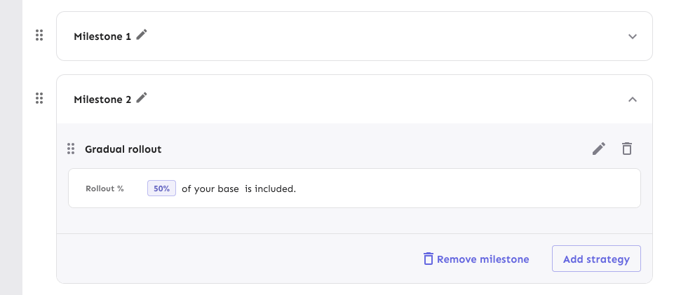
Here's an initial first pass of replacing the strategy lists in release
plan milestones.
The existing MilestoneCard has been moved to a Legacy file to avoid
conflicts.
This PR places the strategies in a list and changes the background color
of the list items (the strategies themselves still have a white
background, however).
It also re-orders the buttons in the footer and places the
milestone-level drag handle outside the milestone card.

## For later
Changing out the strategy list item itself hasn't been done yet. I want
to see if we can re-use the existing strategy draggable item instead of
making a copy. There's some dependencies on project path params etc that
need to be worked out first, though, so I'd prefer to do get these
initial changes through first.
Removes the `() => {} as any` args from the StrategyDraggableItem
invocation when you have paginated strats. Instead makes all the drag
params optional. It defaults to a no op if not provided.

Also, the reason it had to be typed as `any` before is probably because
it was missing a function. The correct empty param is `() => () => {}` 💁
Adjusts styling of the env dropdown now that we have both release plans
and strategies.
Key points:
- simplifies strategy separator, removes inherent height. Also: extracts
it from the draggable component (it has no business knowing whether to
add that or not)
- Puts release plans and strategies in the same list so that it becomes:
```markdown
- Release plan
- strategy 1
- strategy 2
- (OR) Strategy A
- (OR) Strategy B
```
- Adjusts some padding around to make it line up properly
- Swaps a couple conditional renders for ternaries
Rendered:

## Still todo:
Handle cases where you have >50 strats and we show the warning etc. It's
a little trickier because of how it interacts with release plans, so I
wanna leave that for later.
I'm also unsure about how we handle spacing today. All the little items
have their own different spacing and I'm not sure it won't get out of
sync, but I'm also not sure how else to handle it. We should look at it
later.