mirror of
https://github.com/Unleash/unleash.git
synced 2025-07-17 13:46:47 +02:00
 5d36862ddb
This PR adds the feedback component to the project status page. When you open the feedback modal, we close the status sidebar. Exiting the feedback modal takes you back to the project page. As a bonus: fixes the background color of the health grid, which was a little bit off.  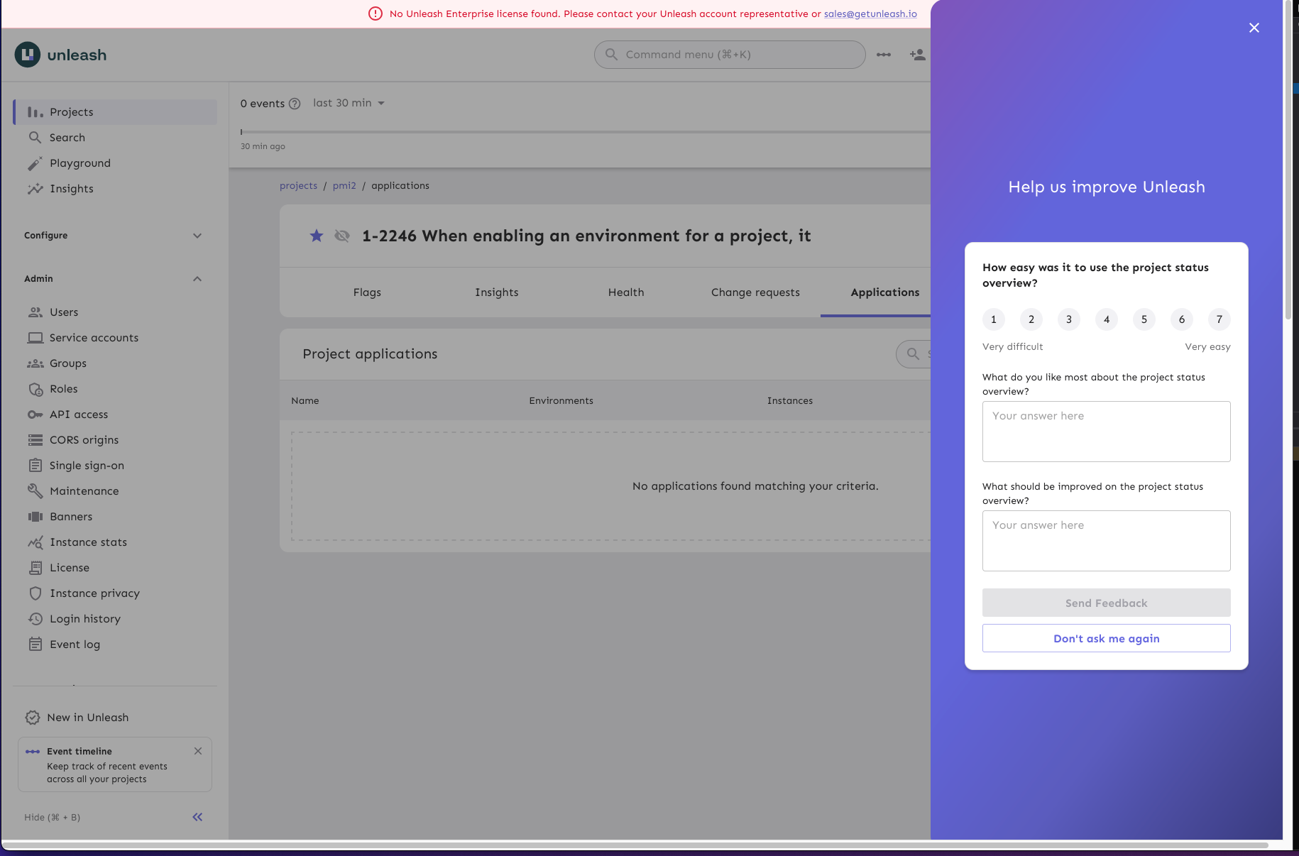
201 lines
6.3 KiB
TypeScript
201 lines
6.3 KiB
TypeScript
import { Button, styled } from '@mui/material';
|
|
import { DynamicSidebarModal } from 'component/common/SidebarModal/SidebarModal';
|
|
import { ReactComponent as ProjectStatusSvg } from 'assets/icons/projectStatus.svg';
|
|
import { ProjectActivity } from './ProjectActivity';
|
|
import { ProjectLifecycleSummary } from './ProjectLifecycleSummary';
|
|
import type { FC } from 'react';
|
|
import { HelpIcon } from 'component/common/HelpIcon/HelpIcon';
|
|
import { ProjectHealthGrid } from './ProjectHealthGrid';
|
|
import { useFeedback } from 'component/feedbackNew/useFeedback';
|
|
import FeedbackIcon from '@mui/icons-material/ChatOutlined';
|
|
|
|
const ModalContentContainer = styled('section')(({ theme }) => ({
|
|
minHeight: '100vh',
|
|
maxWidth: 1100,
|
|
width: '95vw',
|
|
backgroundColor: theme.palette.background.default,
|
|
display: 'flex',
|
|
flexFlow: 'column',
|
|
gap: theme.spacing(4),
|
|
paddingInline: theme.spacing(4),
|
|
paddingBlock: theme.spacing(10),
|
|
}));
|
|
|
|
const WidgetContainer = styled('div')(({ theme }) => ({
|
|
display: 'flex',
|
|
flexDirection: 'column',
|
|
gap: theme.spacing(9),
|
|
}));
|
|
|
|
const LifecycleHeaderRow = styled('div')(({ theme }) => ({
|
|
display: 'flex',
|
|
alignItems: 'end',
|
|
}));
|
|
|
|
const HeaderRow = styled('div')(({ theme }) => ({
|
|
display: 'flex',
|
|
alignItems: 'center',
|
|
gap: theme.spacing(1.5),
|
|
}));
|
|
|
|
const StyledProjectStatusSvg = styled(ProjectStatusSvg)(({ theme }) => ({
|
|
fill: theme.palette.primary.main,
|
|
}));
|
|
|
|
const ModalHeader = styled('h3')(({ theme }) => ({
|
|
fontSize: theme.typography.h2.fontSize,
|
|
margin: 0,
|
|
}));
|
|
|
|
const RowHeader = styled('h4')(({ theme }) => ({
|
|
margin: 0,
|
|
fontWeight: 'normal',
|
|
}));
|
|
|
|
const Row = styled('div')(({ theme }) => ({
|
|
display: 'flex',
|
|
flexDirection: 'column',
|
|
gap: theme.spacing(2),
|
|
}));
|
|
|
|
const TooltipContent = styled('div')(({ theme }) => ({
|
|
padding: theme.spacing(0.5),
|
|
}));
|
|
|
|
const TooltipText = styled('p')(({ theme }) => ({
|
|
fontSize: theme.typography.body1.fontSize,
|
|
'& + p': {
|
|
marginTop: theme.spacing(1),
|
|
},
|
|
}));
|
|
|
|
const LifecycleTooltip: FC = () => {
|
|
return (
|
|
<HelpIcon
|
|
htmlTooltip
|
|
htmlTooltipMaxWidth='550px'
|
|
tooltip={
|
|
<TooltipContent>
|
|
<TooltipText>
|
|
Based on usage metrics and interactions with Unleash,
|
|
feature flags can go through five distinct lifecycle
|
|
stages. These stages mirror the typical software
|
|
development process and allow you to identify
|
|
bottlenecks at any stage of the lifecycle.
|
|
</TooltipText>
|
|
|
|
<TooltipText>
|
|
<a href='https://docs.getunleash.io/reference/feature-toggles#feature-flag-lifecycle'>
|
|
Read more in our documentation
|
|
</a>
|
|
</TooltipText>
|
|
</TooltipContent>
|
|
}
|
|
/>
|
|
);
|
|
};
|
|
|
|
const CloseRow = styled('div')(({ theme }) => ({
|
|
display: 'flex',
|
|
justifyContent: 'flex-end',
|
|
marginBlockStart: 'auto',
|
|
gap: theme.spacing(4),
|
|
}));
|
|
|
|
const FeedbackContainer = styled('div')(({ theme }) => ({
|
|
backgroundColor: theme.palette.neutral.light,
|
|
display: 'flex',
|
|
alignItems: 'center',
|
|
gap: theme.spacing(1),
|
|
padding: theme.spacing(1, 2.5),
|
|
borderRadius: theme.shape.borderRadiusLarge,
|
|
}));
|
|
|
|
const FeedbackButton = styled(Button)(({ theme }) => ({
|
|
color: theme.palette.primary.main,
|
|
fontWeight: 'normal',
|
|
padding: 0,
|
|
textDecoration: 'underline',
|
|
verticalAlign: 'baseline',
|
|
}));
|
|
|
|
type Props = {
|
|
open: boolean;
|
|
close: () => void;
|
|
};
|
|
|
|
export const ProjectStatusModal = ({ open, close }: Props) => {
|
|
const { openFeedback } = useFeedback('projectStatus', 'manual');
|
|
const createFeedbackContext = () => {
|
|
openFeedback({
|
|
title: 'How easy was it to use the project status overview?',
|
|
positiveLabel:
|
|
'What do you like most about the project status overview?',
|
|
areasForImprovementsLabel:
|
|
'What should be improved on the project status overview?',
|
|
});
|
|
};
|
|
|
|
return (
|
|
<DynamicSidebarModal
|
|
open={open}
|
|
onClose={close}
|
|
label='Project status'
|
|
onClick={(e: React.SyntheticEvent) => {
|
|
if (e.target instanceof HTMLAnchorElement) {
|
|
close();
|
|
}
|
|
}}
|
|
>
|
|
<ModalContentContainer>
|
|
<HeaderRow>
|
|
<StyledProjectStatusSvg aria-hidden='true' />
|
|
<ModalHeader>Project status</ModalHeader>
|
|
</HeaderRow>
|
|
<WidgetContainer>
|
|
<Row>
|
|
<RowHeader>Health</RowHeader>
|
|
<ProjectHealthGrid />
|
|
</Row>
|
|
|
|
<Row>
|
|
<RowHeader>Activity in project</RowHeader>
|
|
<ProjectActivity />
|
|
</Row>
|
|
|
|
<Row>
|
|
<LifecycleHeaderRow>
|
|
<RowHeader>Flag lifecycle</RowHeader>
|
|
<LifecycleTooltip />
|
|
</LifecycleHeaderRow>
|
|
<ProjectLifecycleSummary />
|
|
</Row>
|
|
</WidgetContainer>
|
|
<CloseRow>
|
|
<FeedbackContainer>
|
|
<FeedbackIcon color='primary' />
|
|
<p>
|
|
Help us improve the project status overview; give us
|
|
your{' '}
|
|
<FeedbackButton
|
|
variant='text'
|
|
onClick={() => {
|
|
createFeedbackContext();
|
|
close();
|
|
}}
|
|
size='small'
|
|
>
|
|
feedback
|
|
</FeedbackButton>
|
|
</p>
|
|
</FeedbackContainer>
|
|
|
|
<Button variant='outlined' onClick={close}>
|
|
Close
|
|
</Button>
|
|
</CloseRow>
|
|
</ModalContentContainer>
|
|
</DynamicSidebarModal>
|
|
);
|
|
};
|