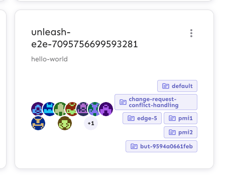
Fixes an issue where the collaborator component would be smooshed
together when you have too many collaborators and too many flag tab
items.
The primary things I have done are:
1. Limit the amount of collaborators we show to 6 instead of 8. I
believe the number 8 was arbitrary, so let's go with 6 for now.
2. Instead of using a fixed gap, use a separator element that grows up
to a certain limit. I've added a `Separator` component, which is an
empty div with flex-grow. It feels like you should be able to do that
with gap too, but I can't think of how right now.
3. Don't allow collaborator component text (or avatars) to wrap. We
don't have a lot of space in this header, so let's keep it tight.
Additionally, I've added the `className` prop to the AvatarGroup
component so that it can be styled externally. I also cleaned up some
naming that was left in while I was at it.
Before:

After:

Fixes a bug introduced with the new tooltips where the system user was
shown as "User ID n" instead of "System". The "n" in this case is
actually the user's index number in the list of project owners
(including duplicates).
There's a few things happening:
1. Change the object for system owners: use `name` instead of
`description`. At the same time, remove the `description` property
completely because it's not used at the moment.
2. Remove the assignnment of `id: objectId(user)` to the user sent to
the User Avatar component. This was a leftover from when we split out
the AvatarGroup component, and is not something we use anymore.
Before:

After:

Extracts the Avatar Group component into a `common` component and adds a
standard tooltip to all avatars.
Relates to linear issue 1-2606
This is a suggestion / proof of concept for how we can solve it. While I
think we can merge this as is, I'd also be happy to take any discussions
on other ways to approach it etc.
## Why are these changes made together?
Because extracting the avatar group without adding the new tooltip data
made the existing tooltip misbehave (it'd show up in the top left of the
screen, not synced to the avatar in any way).
I probably could have (and still can if you think it's prudent) split it
out such that the avatar gets a standardized tooltip first (and disable
it for the group card avatars), and split out the avatars in a
follow-up. Happy to do that if you think it's better.
## What does this mean?
It used to be that we had no consistent way of dealing with avatars and
tooltips. Some places had them, some places didn't. This change makes it
so that all avatars that we can show tooltips for will get the same
tooltip.
Previously, we had at least 4 different ways of dealing with tooltips:
- The HTML tooltip (that would be standardized with this PR) in the
project flags table

- The "title" that you'd get on your user avatar

- The group card list tooltip

- And sometimes you'd get nothing at all

with this change, we'll always show the same kind of tooltip if we can:

## What goes in the tooltip?
We use the `UserAvatar` component for a fair few different things and I
didn't want to extract separate components for all the different use
cases. Instead, I wanted to get an overview over what we use it for and
what is relevant info to show.
I found all the places we used it and tried to form an opinion.
This tooltip will work with a user's email, name, username, and id. If
there is no user (such as for empty avatars and avatars displaying only
"+n" for remaining members), we show no tooltip.
Following the example set by the group card avatars, we'll try to use
email or username (in that order) as the main bit of text. If the user
has an email or a username and also a name, the name will be used as
secondary text.
If the user does not have an email or username, but has a name, we'll
use the name as the main text.
If the user does not have an email, a username, or a name, we'll try to
show "User ID: N" if they have an id.
If they do not have a username, a name, an email, or an ID, we bail out
and show nothing.
## Why can you disable the tooltip?
In some cases, you might want to disable the tooltip because you have
more information to feed into it. An example of that is in the project
flags table, where we want to show more information in cases where the
user is 'unknown':

## Additional fixes
This PR also adds a few lines of CSS to fix a minor avatar layout bug.
Before:

After:

This change prevents long project names from blowing the form out of
proportion.
To do so, it:
1. sets `whitespace: no-wrap` on the button labels. Judging by the other
styles, this was the intention all along, but it didn't really come up
until now.
2. It also sets the label width for projects to 30ch,so that you'll get
to see quite a bit of the project name before it gets cut off.
It would be possible to set a dynamic width for this button based on the
longest project name, but I'm not sure it adds much value, so I'm
leaning towards keeping it simple.
Here's what the dynamic width would look like:
``` tsx
const projectButtonLabelWidth = useMemo(() => {
const longestProjectName = projects.reduce(
(prev: number, type: { name: string }) =>
prev >= type.name.length ? prev : type.name.length,
0,
);
return `${Math.min(longestProjectName, 30)}ch`;
}, [projects]);
```
What it looks like:

This PR makes the config dropdown list generic over its values, so that
you can pass stuff that isn't strings.

It also updates the existing impression data button to use booleans
instead.
This change makes it so that all form input labels start with a
capital letter, regardless of the data we use to generate them.

Also fixes a leftover toggle -> flag renaming.
This PR extracts the dialog form that we created for the new project
form into a shared component in the `common` folder.

Most of the code has been lifted and shifted, but there's been some
minor adjustments along the way. The main file is
`frontend/src/component/common/DialogFormTemplate/DialogFormTemplate.tsx`.
Everything else is just cleanup.
This PR adds the UI part of feature flag collaborators. Collaborators are hidden on windows smaller than size XL because we're not sure how to deal with them in those cases yet.
The limit card says to contact cs@getunleash if you're at the limits,
but we probably don't want to show that to OSS customers (it's not
terrible, just not very helpful), so let's hide it for OSS.
Instead, we'll ask them to try the community slack.
Screenie:

This PR adds the first version of the resource limit documentation. It
also corrects the link in the `Limit` component.
In addition to the new limits from the soft limits project, I've also
added the limits from the signals project.
## Discussion points
I've set the Pro resource limits to projects and envs to the same value
as on the [plans & pricing](https://www.getunleash.io/pricing) page
instead of the actual hard soft limit. I think that makes messaging
easier and more consistent.
However, this does present us with a bit of a problem. Because we've
been pretty consistent at saying "no, you can't have more projects" for
Pro. But we're saying it's easy to change (when in actuality the limit
isn't enforced 💁🏼 )
## Screenie
It looks a little bit like this (but check the files or preview for the
actual text content)

This PR activates the limit for API token creation in both the global
API token window and in the project-level API token tab.

Because the same button is used in two places, I encapsulated the
fetching of flags and resource limits within the button. I can be
convinced to pass the current API token count and the limit as
arguments, but I think this is the right solution for this case.
**Upgrade to React v18 for Unleash v6. Here's why I think it's a good
time to do it:**
- Command Bar project: We've begun work on the command bar project, and
there's a fantastic library we want to use. However, it requires React
v18 support.
- Straightforward Upgrade: I took a look at the upgrade guide
https://react.dev/blog/2022/03/08/react-18-upgrade-guide and it seems
fairly straightforward. In fact, I was able to get React v18 running
with minimal changes in just 10 minutes!
- Dropping IE Support: React v18 no longer supports Internet Explorer
(IE), which is no longer supported by Microsoft as of June 15, 2022.
Upgrading to v18 in v6 would be a good way to align with this change.

TS updates:
* FC children has to be explicit:
https://stackoverflow.com/questions/71788254/react-18-typescript-children-fc
* forcing version 18 types in resolutions:
https://sentry.io/answers/type-is-not-assignable-to-type-reactnode/

Test updates:
* fixing SWR issue that we have always had but it manifests more in new
React (https://github.com/vercel/swr/issues/2373)

---------

Co-authored-by: kwasniew <kwasniewski.mateusz@gmail.com>
This PR lets you filter by flag creator by interacting with the user's
avatar.
Additionally, I've switched the custom popover for the standard tooltip
that we use elsewhere in the table. This gives the table a more cohesive
feel. As such, I have also deleted the component created in a previous
PR, because it's no longer in use anywhere.
It now looks like this (when tabbed to; notice the focus ring):
