1
0
mirror of https://github.com/Unleash/unleash.git synced 2025-10-09 11:14:29 +02:00
Commit Graph

843 Commits

Author SHA1 Message Date
Jaanus Sellin
b6e22d6178
feat: new onboarding welcome screen logic (#8110)
1. We will not show grid until 2 flags exist
2. Now new feature creation button will be always displayed on top with
different style
3. Moved some text around


![image](https://github.com/user-attachments/assets/6cfc2152-b52d-479c-8a2e-988c9e8b79ad)
2024-09-06 13:15:28 +03:00
Jaanus Sellin
01fb748c01
feat: connection status bubble (#8099)
Fully working cycle


![image](https://github.com/user-attachments/assets/cf20788b-29fa-4489-91e7-7db9f592da9b)
2024-09-05 13:56:25 +03:00
Jaanus Sellin
29af716952
chore: remove operator upgrade alert (#8053)
This was introduced in v4.9 and most likely people have upgraded
already. Removing.
2024-09-03 12:18:19 +03:00
Tymoteusz Czech
79fccbd8f3
refactor: ts checking conditionallyrender props (#7840)
Fix issues found by TS checking after removing ConditionallyRender
2024-08-30 13:39:11 +02:00
Tymoteusz Czech
a918590d1e
fix: boolean logic for feature last seen toolbar (#8016) 2024-08-30 13:23:08 +02:00
gitar-bot[bot]
031a2e805a
[Gitar] Cleaning up stale flag: timeAgoRefactor with value true (#7997)
Co-authored-by: Gitar <noreply@gitar.co>
Co-authored-by: Tymoteusz Czech <2625371+Tymek@users.noreply.github.com>
2024-08-28 11:12:27 +00:00
Tymoteusz Czech
742504793c
refactor: make avatar group more customizable (#7989) 2024-08-27 14:37:45 +02:00
gitar-bot[bot]
4615ff40ce
[Gitar] Cleaning up stale flag: resourceLimits with value true (#7964)
[![Gitar](https://raw.githubusercontent.com/gitarcode/.github/main/assets/gitar-banner.svg)](https://gitar.co)
  
  ---
This automated PR was generated by [Gitar](https://gitar.co). View
[docs](https://gitar.co/docs).

---------

Co-authored-by: Gitar <noreply@gitar.co>
Co-authored-by: Thomas Heartman <thomas@getunleash.io>
2024-08-22 13:20:53 +02:00
Jaanus Sellin
4a4dafcc3f
chore: remove create feature component (#7959)
After we implemented new feature flag creation flow, this are not used
anymore.

Creation is now handled by **CreateFeatureDialog**.

Also edit component can be minified, because it does not need so many
fields anymore.
2024-08-22 11:30:41 +03:00
Tymoteusz Czech
6c5ce52470
Refactor: Remove react-timeago (#7943)
Remove dependency 🫡
2024-08-21 12:03:03 +02:00
Tymoteusz Czech
0d97f8b7c1
fix: react-timeago issue (#7936) 2024-08-20 14:03:05 +02:00
Thomas Heartman
8e2ae6c6c7
fix: update the customer success email for limits (#7933)
The previously used email address doesn't actually exist 😳 It was taken
from the sketches and we just never verified it.
2024-08-20 11:58:25 +02:00
Tymoteusz Czech
b9ea24be8d
fix: orphaned token label only for items without projects (#7901)
Orphaned token label was incorrectly assigned.
Co-authored-by: Thomas Heartman <thomas@getunleash.io>
2024-08-16 10:58:44 +02:00
Tymoteusz Czech
f2e2952c31
fix: projects archive search (#7898)
Filter projects when searching
2024-08-15 16:19:29 +02:00
Thomas Heartman
dad30a08f0
fix: cap number of collaborators displayed (#7879)
Caps the number of collaborators to display to a constant (currently
set to 99).

Above that, it'll always show "+99".

However, we also add a tooltip that shows you a prettified version of
the extra collaborators (using the `millify` package that we already use
for metrics)

Screenies:

< 1000 collaborators:

![image](https://github.com/user-attachments/assets/b030e77e-e23d-4cac-a1d1-7841a4ba86e7)


1000 - 1M collaborators:

![image](https://github.com/user-attachments/assets/b72ca22e-513d-4d69-b78d-c675951c894a)

1M+ collaborators:

![image](https://github.com/user-attachments/assets/6341e87d-17da-4359-bce3-e31df637cd5c)

Update, it now shows the total number of collaborators instead of the
overflow:

![image](https://github.com/user-attachments/assets/67a459c5-91b8-475d-b0e3-c5c19aaf62d7)
2024-08-14 13:27:05 +00:00
Tymoteusz Czech
f2b7e0278d
Projects archive UI (#7842)
Closes
[issue/1-2666](https://linear.app/unleash/issue/1-2666/archived-projects-view)
2024-08-13 14:33:11 +02:00
Thomas Heartman
245bdeae1e
chore: generate orval for event creators (#7823)
Updates our orval config to include event creator data
2024-08-12 15:07:26 +02:00
Thomas Heartman
fa96ff1450
fix: display feature naming patterns in dialog (#7837)
Updates the dialog form template to include a `namingPattern` prop that
can be used to display the naming pattern of whatever the form is used
for.

Also updates the create feature dialog to display the naming pattern in
the current project.

The naming pattern component re-uses the pattern that we have in place
for feature naming patterns, but puts it in an expandable dialog
instead.

Screenies:

Naming pattern closed:

![image](https://github.com/user-attachments/assets/145e4268-1aa0-4c1b-8f08-97857447e2f5)


![image](https://github.com/user-attachments/assets/1613c846-e7d4-41c8-a1c8-a66ab87b6e5f)


Naming pattern open:

![image](https://github.com/user-attachments/assets/1aa37162-500b-4b83-926f-07aa777e8017)
2024-08-12 13:56:07 +02:00
Tymoteusz Czech
cb4e447d69
fix: show environments page as enterprise feature (#7796)
Not available with menu, URL only, and actions are not working with OSS
and Pro.
2024-08-08 10:03:02 +02:00
Thomas Heartman
0284daf2ba
fix: Avoid collaborators being smooshed together (#7741)
Fixes an issue where the collaborator component would be smooshed
together when you have too many collaborators and too many flag tab
items.

The primary things I have done are:
1. Limit the amount of collaborators we show to 6 instead of 8. I
believe the number 8 was arbitrary, so let's go with 6 for now.
2. Instead of using a fixed gap, use a separator element that grows up
to a certain limit. I've added a `Separator` component, which is an
empty div with flex-grow. It feels like you should be able to do that
with gap too, but I can't think of how right now.
3. Don't allow collaborator component text (or avatars) to wrap. We
don't have a lot of space in this header, so let's keep it tight.

Additionally, I've added the `className` prop to the AvatarGroup
component so that it can be styled externally. I also cleaned up some
naming that was left in while I was at it.

Before:

![image](https://github.com/user-attachments/assets/98525a23-c086-433a-8f60-3e281805409f)


After:

![image](https://github.com/user-attachments/assets/559f8975-9cbe-4260-ba5a-409a303375ed)
2024-08-05 10:33:10 +02:00
Thomas Heartman
993d87516d
fix: show "System" for system users, instead of "User ID n" where n is the project's number in the order. (#7734)
Fixes a bug introduced with the new tooltips where the system user was
shown as "User ID n" instead of "System". The "n" in this case is
actually the user's index number in the list of project owners
(including duplicates).

There's a few things happening: 
1. Change the object for system owners: use `name` instead of
`description`. At the same time, remove the `description` property
completely because it's not used at the moment.
2. Remove the assignnment of `id: objectId(user)` to the user sent to
the User Avatar component. This was a leftover from when we split out
the AvatarGroup component, and is not something we use anymore.

Before:

![image](https://github.com/user-attachments/assets/bd348daf-c81e-4ea9-b8a9-f10af71a0da7)

After:

![image](https://github.com/user-attachments/assets/d147f7c7-d683-43ac-9ee2-6116f155dad6)
2024-08-02 11:29:31 +00:00
Tymoteusz Czech
8aa812e0f5
feat: Orphaned tokens - new API tokens list icon (#7693)
Moving warning icon from "projects" column, to left icon.
2024-08-01 14:31:42 +00:00
Thomas Heartman
f1e95108d1
Wip: split out avatar group; use same tooltip for all avatars (#7681)
Extracts the Avatar Group component into a `common` component and adds a
standard tooltip to all avatars.

Relates to linear issue 1-2606

This is a suggestion / proof of concept for how we can solve it. While I
think we can merge this as is, I'd also be happy to take any discussions
on other ways to approach it etc.

## Why are these changes made together?

Because extracting the avatar group without adding the new tooltip data
made the existing tooltip misbehave (it'd show up in the top left of the
screen, not synced to the avatar in any way).

I probably could have (and still can if you think it's prudent) split it
out such that the avatar gets a standardized tooltip first (and disable
it for the group card avatars), and split out the avatars in a
follow-up. Happy to do that if you think it's better.

## What does this mean? 

It used to be that we had no consistent way of dealing with avatars and
tooltips. Some places had them, some places didn't. This change makes it
so that all avatars that we can show tooltips for will get the same
tooltip.

Previously, we had at least 4 different ways of dealing with tooltips:
- The HTML tooltip (that would be standardized with this PR) in the
project flags table

![image](https://github.com/user-attachments/assets/91098d31-a5e3-4091-9125-332fe5d106fd)
- The "title" that you'd get on your user avatar

![image](https://github.com/user-attachments/assets/39062b61-db8c-4bd5-9fa3-3ecc9bc192ee)
- The group card list tooltip

![image](https://github.com/user-attachments/assets/0d4a696a-e944-446c-8bff-4dcec02d8afb)
- And sometimes you'd get nothing at all

![image](https://github.com/user-attachments/assets/8975afaf-9ca1-4eb6-b443-9ab94b52bbd8)

with this change, we'll always show the same kind of tooltip if we can:


![image](https://github.com/user-attachments/assets/974c592c-c844-4b65-8a55-05e84d3df130)

## What goes in the tooltip? 

We use the `UserAvatar` component for a fair few different things and I
didn't want to extract separate components for all the different use
cases. Instead, I wanted to get an overview over what we use it for and
what is relevant info to show.

I found all the places we used it and tried to form an opinion. 

This tooltip will work with a user's email, name, username, and id. If
there is no user (such as for empty avatars and avatars displaying only
"+n" for remaining members), we show no tooltip.

Following the example set by the group card avatars, we'll try to use
email or username (in that order) as the main bit of text. If the user
has an email or a username and also a name, the name will be used as
secondary text.

If the user does not have an email or username, but has a name, we'll
use the name as the main text.

If the user does not have an email, a username, or a name, we'll try to
show "User ID: N" if they have an id.

If they do not have a username, a name, an email, or an ID, we bail out
and show nothing.

## Why can you disable the tooltip?

In some cases, you might want to disable the tooltip because you have
more information to feed into it. An example of that is in the project
flags table, where we want to show more information in cases where the
user is 'unknown':


![image](https://github.com/user-attachments/assets/758b4e86-e934-47e3-91ce-ce900f76bc54)


## Additional fixes

This PR also adds a few lines of CSS to fix a minor avatar layout bug.

Before:

![image](https://github.com/user-attachments/assets/0150efbf-c51a-40bb-898f-7ddd3565ce21)


After:

![image](https://github.com/user-attachments/assets/f337cf68-c572-4610-b1de-a27749325da8)
2024-08-01 10:45:24 +02:00
Tymoteusz Czech
b585ead6df
fix: avoid react key warnings in tables (#7694)
Refactoring to get rid of `A props object containing a "key" prop is being spread into JSX` warning
2024-07-30 13:09:12 +02:00
Thomas Heartman
3a3aaad37d
feat: Use a toggling button for impression data on/off (#7682)
Instead of using a dropdown list for impression data, this PR introduces
a new config button that is a switch type button. It will be filled
(contained) when impression data is on and will be outlined when
impression data is off.

Off:

![image](https://github.com/user-attachments/assets/4710c8aa-a853-43c3-bf3b-86dbbf1a2779)


On:

![image](https://github.com/user-attachments/assets/08316155-83d1-45a2-941f-1c49c254a02b)
2024-07-29 08:05:35 +00:00
Jaanus Sellin
4df8fd3810
feat: redirect to new feature flag creation (#7679)
Currently found only one instance that is using `create-toggle`. So
changed behaviour for that.
2024-07-26 14:27:02 +03:00
Thomas Heartman
c7bb6c5179
fix: prevent long project names from blowing out the form (#7673)
This change prevents long project names from blowing the form out of
proportion.

To do so, it:
1. sets `whitespace: no-wrap` on the button labels. Judging by the other
styles, this was the intention all along, but it didn't really come up
until now.

2. It also sets the label width for projects to 30ch,so that you'll get
to see quite a bit of the project name before it gets cut off.

It would be possible to set a dynamic width for this button based on the
longest project name, but I'm not sure it adds much value, so I'm
leaning towards keeping it simple.

Here's what the dynamic width would look like:

``` tsx
    const projectButtonLabelWidth = useMemo(() => {
        const longestProjectName = projects.reduce(
            (prev: number, type: { name: string }) =>
                prev >= type.name.length ? prev : type.name.length,
            0,
        );
        return `${Math.min(longestProjectName, 30)}ch`;
    }, [projects]);
```

What it looks like:

![image](https://github.com/user-attachments/assets/51bca3f6-aeb3-4a41-b57e-5ebd9baa3ef6)
2024-07-26 11:39:43 +02:00
Thomas Heartman
c0d7be040d
fix: make config dropdown list generic over values (#7676)
This PR makes the config dropdown list generic over its values, so that
you can pass stuff that isn't strings.

It also updates the existing impression data button to use booleans
instead.
2024-07-26 11:38:29 +02:00
Thomas Heartman
6e34ae4ada
fix: project icon sizing and color (#7672)
This PR fixes the project icon sizing and color in the create feature
form. However, it includes a little more cleanup work.

1. I've switched out the previous project icon with a new one. The
difference? The old one had lots of whitespace around it, which made
sizing it awkward.
2. I've added a wrapping Icon component to common. The idea was taken
from this thread on the MUI GitHub about how to make imported icons
behave consistently with MUI icons.
3. Because I've switched the icon and added a new component, I've also
gone and updated the other places we used the old icon, so that we're
consistent about the usage.

In create dialog form:

![image](https://github.com/user-attachments/assets/9b5caed7-cd50-437b-82bb-1d7ccbfaac3f)

Updated icon in:
Project card component

![image](https://github.com/user-attachments/assets/4ce809f4-4083-4554-ac4c-3597d9bf42df)


Project creation form

![image](https://github.com/user-attachments/assets/4227416f-a56d-41ed-96a4-99b71a11dbf7)


Sidebar and command bar (it's actually larger here, but maybe that's
okay? Previous project was kinda small):

![image](https://github.com/user-attachments/assets/72b8aa2e-6970-4c11-9a4d-250648b44ad9)

(Previous sidebar and command bar):

![image](https://github.com/user-attachments/assets/bcef9208-9819-4742-87a1-3a20d50d741c)


I'd be willing to leave the sidebar and command bar for now if we think
it's better to leave them using the same size as previously, but we can
talk about that. I think it's better in the sidebar; undecided about the
command bar.

Bonus changes: I fixed some typos
2024-07-26 10:26:16 +02:00
Thomas Heartman
dc37503b7d
fix: Capitalize input labels (#7667)
This change makes it so that all form input labels start with a
capital letter, regardless of the data we use to generate them.

Also fixes a leftover toggle -> flag renaming.
2024-07-25 12:27:46 +00:00
Thomas Heartman
eb7208025f
chore: create shared dialog form template (#7663)
This PR extracts the dialog form that we created for the new project
form into a shared component in the `common` folder.

Most of the code has been lifted and shifted, but there's been some
minor adjustments along the way. The main file is
`frontend/src/component/common/DialogFormTemplate/DialogFormTemplate.tsx`.
Everything else is just cleanup.
2024-07-25 13:41:09 +02:00
Jaanus Sellin
647ba7b9cb
feat: separate command bar and search hotkeys (#7651)
Currently, the command bar and search hotkeys are conflicting. I am now
separating them and assigning search an extra modifier key: Shift.
2024-07-24 12:46:03 +03:00
Thomas Heartman
e2b90ae91d
fix: add workaround for tooltip (#7649)
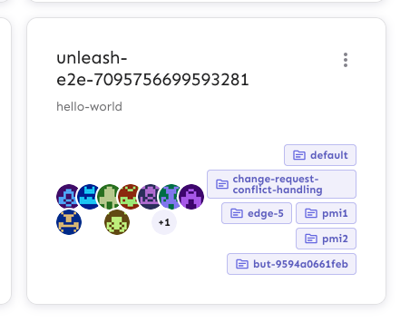
This PR adds the UI part of feature flag collaborators. Collaborators are hidden on windows smaller than size XL because we're not sure how to deal with them in those cases yet.
2024-07-24 09:33:29 +00:00
Thomas Heartman
0f0a680af3
chore: don't ask OSS users to reach out to CS (#7633)
The limit card says to contact cs@getunleash if you're at the limits,
but we probably don't want to show that to OSS customers (it's not
terrible, just not very helpful), so let's hide it for OSS.

Instead, we'll ask them to try the community slack.

Screenie:


![image](https://github.com/user-attachments/assets/5a5dc292-3878-4181-98ac-f1ce4583d8a3)
2024-07-22 11:03:10 +02:00
Tymoteusz Czech
19121f234e
Insights layout (#7610)
Refactored insights page - stats and charts relevant to the same metric
are now combined into a single widget.
2024-07-18 12:43:52 +02:00
Tymoteusz Czech
6e4e58aee8
fix: insights sticky header (#7607)
Insights header should show below banners in insights v2
2024-07-17 10:02:55 +00:00
Thomas Heartman
e43109a2cb
fix: prevent long names from breaking form layouts (#7591)
This PR fixes a couple instances where long resource names would break
form and input layouts.

I've added comments to the various files to explain what they're doing
and why.

## Discussion point:

I've now set the width of project selector to be as narrow as it can
with wrapped text. In the main interfaces, it's much better, but on the
page where you can move a flag, it is quite narrow. However, I still
think it's better (no chance of it being wider than the whole screen).
We might want to find another way, but regardless, it'll only show up
with real edge cases.

## Fixes (screenies)

### API token creation form

**Files**:
- `frontend/src/component/common/FormTemplate/FormTemplate.styles.ts`
- `frontend/src/component/common/FormTemplate/FormTemplate.tsx`

Before:

![image](https://github.com/user-attachments/assets/cef31208-2cce-479e-902e-ed7d3c3c9571)

After:

![image](https://github.com/user-attachments/assets/b0832193-11f5-427d-9df1-d9baca0a91e7)


### New feature flag form

**Files**:
- `frontend/src/component/common/GeneralSelect/GeneralSelect.tsx`

Before:

![image](https://github.com/user-attachments/assets/2ac6f791-af19-4f7e-a8ea-2fc356f18fb2)

After:

![image](https://github.com/user-attachments/assets/13b91812-c00a-49e8-9409-67fab4eaaf01)

### Project select popover

**Files**

- `frontend/src/component/common/GeneralSelect/GeneralSelect.tsx`
-
`frontend/src/component/feature/FeatureView/FeatureSettings/FeatureSettingsProject/FeatureProjectSelect/FeatureProjectSelect.tsx`

Before:

![image](https://github.com/user-attachments/assets/e81a4cef-1402-4b9c-b1a8-c22493c794bd)

After:

![image](https://github.com/user-attachments/assets/604dada9-6555-48e3-a81d-dda72bd9ccf0)

But also:

![image](https://github.com/user-attachments/assets/7e935fe5-b7f0-4674-8d94-a8c8a6176a3c)
2024-07-16 10:47:46 +02:00
Thomas Heartman
d32990ec4c
fix: make loader not exlpode to 100vh in unnecessary locations (#7589)
This change fixes an issue with the loader where it would explode its
parent component to 100vh even when that was not called for.

To do so, I've added the a new `type` prop to the component, to
distinguish between `fullscreen` and `inline` usage. The `fullscreen`
type sets the height to 100vh, while the `inline` type sets it to
100%.

Now, this doesn't directly make the loader fullscreen (it just makes
sure it's at least as tall as the screen), so maybe the prop name is
misleading. I'd be happy to change it (or to even extract this into
two separate components) if that's preferable. Other potential prop
names could be `height`, which is very direct, or `usage`, which I
think better describes what we do. Like with `type`, I'd like to
communicate the intended behavior more that the actual implementation,
so I'm leaning towards either `type` or `usage`.

## Screenies

I've gone through all the usages of the loader, and checked how each one
works. Here they are:

### Loader in environment variants

I wasn't able to trigger this manually, but it's apparently there

Old (ignore the banner placement; that's firefox's screenshot tool
acting up)

![image](https://github.com/user-attachments/assets/f5d0a709-6815-4838-9ad4-c8f79a54ad0e)

New:

![image](https://github.com/user-attachments/assets/c7538146-b8af-4253-89ed-55d1eb37d6a5)

### Project setting forms

Old:

![image](https://github.com/user-attachments/assets/f8b55899-4483-470a-8d3a-3d11761ec8c7)

New:

![image](https://github.com/user-attachments/assets/29157004-6662-494b-9939-2f34977a9c63)

### Rollout strategy

Old:

![image](https://github.com/user-attachments/assets/5c699a06-37bd-4b3b-a3e3-f613ca7c88d5)

New (no discernible change):

![image](https://github.com/user-attachments/assets/f52178fe-9d26-4ebb-bd48-8a1c4a7e2f04)

### Advanced playground

Old:

![image](https://github.com/user-attachments/assets/43f7183b-cefc-4e29-961e-5d7e18d29be9)

New:

![image](https://github.com/user-attachments/assets/082d94dc-36e0-483c-b7a9-bd75e727c0d5)

### Loading screen / initial redirect

Old:

![image](https://github.com/user-attachments/assets/dbb8b1af-d585-4d48-8431-5379afd4f653)

New (no new component props):

![image](https://github.com/user-attachments/assets/842e766f-0ea7-4396-9696-b88509e24d77)

New (with new props):

![image](https://github.com/user-attachments/assets/e6ffd303-f24e-478d-88d9-b4fa57f307e4)
2024-07-15 14:41:45 +02:00
Tymoteusz Czech
e7627becec
feat: API Tokens limit - UI (#7561)
When approaching limit or limit reached for the number of API tokens, we
show a corresponding message.
2024-07-12 14:44:46 +02:00
Thomas Heartman
f0b49db06a
docs: document resource limits (#7567)
This PR adds the first version of the resource limit documentation. It
also corrects the link in the `Limit` component.

In addition to the new limits from the soft limits project, I've also
added the limits from the signals project.

## Discussion points

I've set the Pro resource limits to projects and envs to the same value
as on the [plans & pricing](https://www.getunleash.io/pricing) page
instead of the actual hard soft limit. I think that makes messaging
easier and more consistent.

However, this does present us with a bit of a problem. Because we've
been pretty consistent at saying "no, you can't have more projects" for
Pro. But we're saying it's easy to change (when in actuality the limit
isn't enforced 💁🏼 )

## Screenie

It looks a little bit like this (but check the files or preview for the
actual text content)

![image](https://github.com/Unleash/unleash/assets/17786332/56cadc00-5a8e-4820-8b11-d059112934da)
2024-07-11 14:10:49 +02:00
Tymoteusz Czech
d440d3230a
feat: show orphaned API tokens (#7569)
Add a visual indication that a token was scoped to projects that have
been deleted.
2024-07-11 14:06:22 +02:00
Tymoteusz Czech
f6c05eb877
API tokens - virtualized table (#7531)
API tokens table in both main list and project API tokens list can now
support more items - it doesn't slow the browser down if there is >500
items.
2024-07-09 13:22:55 +02:00
Mateusz Kwasniewski
46b1eedcc7
feat: constraints values limit in a strategy UI (#7557) 2024-07-08 15:08:16 +02:00
Mateusz Kwasniewski
cad8a3c2df
feat: limit component used in strategies (#7542) 2024-07-05 09:09:28 +02:00
Mateusz Kwasniewski
c93bfafb7f
feat: limit component (#7538) 2024-07-04 09:49:31 +02:00
Thomas Heartman
c5fdaeabd9
feat: UI limit for API tokens (#7532)
This PR activates the limit for API token creation in both the global
API token window and in the project-level API token tab.

Because the same button is used in two places, I encapsulated the
fetching of flags and resource limits within the button. I can be
convinced to pass the current API token count and the limit as
arguments, but I think this is the right solution for this case.
2024-07-03 12:36:48 +00:00
Jaanus Sellin
57c1a6edd5
feat: track interaction with search (#7526)
Now we will start tracking how users interact with search box. Whether
they open it manually or use CTRL K
2024-07-03 12:27:20 +03:00
Tymoteusz Czech
e916deda74
fix: prevent project cell overflow on api keys table (#7472)
Preparations for virtualizing API tokens table - projects column for tokens with a list of projects assigned will not overflow the cell.
2024-07-02 12:10:02 +02:00
Mateusz Kwasniewski
57b253c050
feat: constraint values limit UI (#7501) 2024-07-01 15:05:44 +02:00
Tymoteusz Czech
083273b49b
fix: prevent strategy variant weight from going into negative numbers on Frontend (#7460)
Added validation if sum goes over 100%. Remaining split is never negative
2024-06-27 09:06:59 +00:00
Jaanus Sellin
e8511789fd
feat: command menu items can have description as tooltip now (#7455)
![image](https://github.com/Unleash/unleash/assets/964450/7a55a1a7-7aea-4f9c-96ac-46adf2edd36f)
2024-06-26 12:39:53 +03:00
Tymoteusz Czech
582b33e121
Feat: feature view created by field - frontend (#7382)
add "Created by:" to feature overview meta and align other items
2024-06-13 13:00:57 +02:00
Thomas Heartman
cfcf13980e
chore: use HTML (custom) tooltip for permission switches (#7355)
This PR changes the environment permission switch to use the HTML
tooltip instead of the default MUI tooltip. This aligns with how we've
been doing tooltips recently.

The main driver behind this change was that the project flag table used
two different tooltips. This makes it so that they all look the same,
but it also impacts other places that use the same switch.

In feature flag table:

![image](https://github.com/Unleash/unleash/assets/17786332/4d411285-c00e-41ec-95f9-9e6855d46661)

On flag page:

![image](https://github.com/Unleash/unleash/assets/17786332/11de1daf-7d0f-4214-8dc7-10b11631ce58)

In project env table:


![image](https://github.com/Unleash/unleash/assets/17786332/cc7a3a99-e48c-4989-9a14-2d5d4035a3cb)
2024-06-11 14:03:35 +02:00
Jaanus Sellin
3acb3ad2c2
feat: upgrade from react v17 to v18 (#7265)
**Upgrade to React v18 for Unleash v6. Here's why I think it's a good
time to do it:**
- Command Bar project: We've begun work on the command bar project, and
there's a fantastic library we want to use. However, it requires React
v18 support.
- Straightforward Upgrade: I took a look at the upgrade guide
https://react.dev/blog/2022/03/08/react-18-upgrade-guide and it seems
fairly straightforward. In fact, I was able to get React v18 running
with minimal changes in just 10 minutes!
- Dropping IE Support: React v18 no longer supports Internet Explorer
(IE), which is no longer supported by Microsoft as of June 15, 2022.
Upgrading to v18 in v6 would be a good way to align with this change.

TS updates:
* FC children has to be explicit:
https://stackoverflow.com/questions/71788254/react-18-typescript-children-fc
* forcing version 18 types in resolutions:
https://sentry.io/answers/type-is-not-assignable-to-type-reactnode/

Test updates:
* fixing SWR issue that we have always had but it manifests more in new
React (https://github.com/vercel/swr/issues/2373)

---------

Co-authored-by: kwasniew <kwasniewski.mateusz@gmail.com>
2024-06-11 13:59:52 +03:00
Thomas Heartman
3643016a0e
feat: filter by user when interacting with the avatar (#7347)
This PR lets you filter by flag creator by interacting with the user's
avatar.


Additionally, I've switched the custom popover for the standard tooltip
that we use elsewhere in the table. This gives the table a more cohesive
feel. As such, I have also deleted the component created in a previous
PR, because it's no longer in use anywhere.

It now looks like this (when tabbed to; notice the focus ring):


![image](https://github.com/Unleash/unleash/assets/17786332/d321d9df-0b17-49c3-bea7-89331df3f994)
2024-06-11 12:15:35 +02:00
Thomas Heartman
24c0976d56
feat: add popover to users in flags list (#7344)
This PR adds a popover to the user avatars in the flag list.

The popover is similar to the one used for projects and groups, but it
differs in a few ways:
- There's less padding. There's quite a lot of padding in the other
popovers, and it felt like too much for this table.
- It only shows one bit of text (the user's name/username/email). The
other popovers show email and name/username, but we don't have all that
information, so this is a stripped down version.

Flag list popover:

![image](https://github.com/Unleash/unleash/assets/17786332/6a86f638-ba6d-48e0-87e2-078b582697cf)

Group popover:

![image](https://github.com/Unleash/unleash/assets/17786332/d5fc7172-8fcb-4fac-87c4-05f211c0938c)

or if no email

![image](https://github.com/Unleash/unleash/assets/17786332/51955ead-849f-4bfc-81aa-e1852677647c)
2024-06-11 09:40:48 +02:00
Thomas Heartman
df3ca10a6d
chore: make the User Avatar size configurable (#7332)
This change makes the width of the user avatar configurable via a new
"avatarWidth" property.

It also sets the width to be `theme.spacing(3)` (currently 24px) for the
feature flag table.

It looks like this now:

![image](https://github.com/Unleash/unleash/assets/17786332/5e12ddad-234e-4e81-9eff-303b116991bb)

It used to look like this:


![image](https://github.com/Unleash/unleash/assets/17786332/357f7a52-7765-4f38-8700-c9884b6c49f0)
2024-06-10 12:43:27 +02:00
Mateusz Kwasniewski
c869ea35e4
fix: project settings table overflow (#7288) 2024-06-05 14:05:41 +02:00
Mateusz Kwasniewski
e621c7a2a5
feat: Preview dependency (#7284) 2024-06-05 10:05:41 +02:00
Mateusz Kwasniewski
fef77c1fde
feat: filter by feature type (#7273) 2024-06-05 08:17:54 +02:00
Christopher Kolstad
0db5bc193f
task: upgraded semver dependency (and biome) (#7272)
Sorry for the extra noise here, but this seems to be the biome upgrade
altering formatting slightly.
2024-06-04 15:01:43 +02:00
Mateusz Kwasniewski
75529f465d
feat: clickable tags in project overview (#7263) 2024-06-04 11:08:38 +02:00
Thomas Heartman
9a51f68f5f
chore: new create project dialog UI fixes (#7167)
This PR addresses several related fixes to the new project creation
dialog to prevent unnecessary growing and shifting:

- use a fixed width for the guidance sidebar
- use a fixed height for the guidance code snippet
- use a fixed height for the mobile guidance
- use a fixed width for the mode selector button
- cap description height

This is a little tricky because we don't want the changes for the dialog
to affect other forms. As such, I've added some new options you can use
when you create the guidance components / sidebar.
2024-05-28 07:10:34 +02:00
Thomas Heartman
78fcdbf132
feat: show docs with icons in sidebar (#7109)
Adds icons to sidebar documentation and removes the link when you can't
interact with it.

I'm a little concerned that this won't be very accessible at the moment,
because we don't announce that anything has changed (i.e. there's no way
to find out that the text has changed if you can't see it), and the text
isn't labeled as describing anything. (this is being addressed in #7110
)


![image](https://github.com/Unleash/unleash/assets/17786332/2f482aa1-b74d-4b0f-97aa-2dbc1d1f82f9)

There's a few caveats to this:
1. we don't set a min height at the moment. I've avoided this because we
use the sidebar a number of other places and I wanted to touch as little
as possible. This means we can still get height adjustments
2. The new project icon doesn't have the same proportions as the mui
icons. This adds some additional jank. We should probably look at this,
though.
2024-05-22 13:45:47 +02:00
Thomas Heartman
688bac9f87
chore: update input field text sizes (#7107)
Make sure that the main input fields have enough space between them and
that their size is correct in both light and dark modes.
2024-05-22 13:26:22 +02:00
Thomas Heartman
c47154b939
fix: make dialog the right height and make it scroll if it's smaller (#7103)
I've marked the project creation dialog as "compact", so that it's only
as tall as it needs to be.

However, by default, compact forms don't scroll because they have
overflow set to hidden. This is a problem on very short windows. To get
around this, I've set overflow to unset on compact forms.

I've also removed `min-height: 0` which has some weird side effects on
the centered dialog. Instead, I'm setting `min-height` to `unset` if
it's compact.


![image](https://github.com/Unleash/unleash/assets/17786332/e7d5db52-32d3-47d9-b31f-c73a5bb8e00f)

This task also uncovered some inconsistencies and some borders that only
show up sometimes, so I've removed them too.
2024-05-22 13:24:42 +02:00
Jaanus Sellin
8542cafc9f
chore: rename toggle to flag #2 (#7097) 2024-05-22 08:20:11 +03:00
Jaanus Sellin
8897f2ea75
chore: rename toggle to flag #1 (#7092)
Rename feature toggle to feature flag in the UI and code.
Starting with low hanging fruits.
Trying to keep these ~100 LoC.
2024-05-21 15:18:00 +03:00
Mateusz Kwasniewski
b2b8d94617
feat: lifecycle column extracted (#7049) 2024-05-14 09:24:54 +02:00
Thomas Heartman
40e4e355e3
Chore: visually hide labels in the create project form (#7015)
This PR visually hides the labels in the new create project form.
They're still rendered for screen readers, however.

It means it looks like this now:


![image](https://github.com/Unleash/unleash/assets/17786332/718772e7-4691-41d6-a70a-bbfc795d60ec)
2024-05-13 07:33:06 +02:00
Mateusz Kwasniewski
74b943721c
fix: center last seen column (#7035) 2024-05-10 14:52:24 +02:00
Jaanus Sellin
3f983d061a
feat: mark completed ui selector (#7025)
![image](https://github.com/Unleash/unleash/assets/964450/c6baa90b-5abb-4ba4-a3d9-36af6b426ed6)
2024-05-09 16:55:09 +03:00
Mateusz Kwasniewski
3fc7714e78
feat: Lifecycle in project overview (#7024) 2024-05-09 13:38:18 +02:00
Mateusz Kwasniewski
8ae78236d2
chore: remove project overview refactor flag (#6897) 2024-05-07 13:58:56 +02:00
Jaanus Sellin
d698eccb4a
fix: badge should render children 0 value (#6981)
When passing 0 in as child, the 0 was not rendred. Fixed the badge
component and added tests.


![image](https://github.com/Unleash/unleash/assets/964450/d681b70c-5d55-4818-86ea-7d05fa86c7b3)
2024-05-06 13:24:52 +03:00
Thomas Heartman
44e86fc068
chore: fix failing test; don't rely on a single item only (#6974)
This test is breaking right now because it tests a date picker, week 21
is approaching, and `findByText` only expects a single element. Checking
that we have *at least* one element fixes that breakage and I don't
think it should cause any issues.

Of course, that means that right now, this test would also pass even if
the expected button wasn't there, but it would stop passing in about
four weeks time.
2024-05-02 15:03:49 +02:00
Tymoteusz Czech
0bacd60caf
refactor: badge icon spacing (#6962)
Simplified after previous modifications
2024-04-30 14:14:04 +02:00
Tymoteusz Czech
b6865a5a9d
feat: Project owners UI (#6949)
---------

Co-authored-by: Thomas Heartman <thomas@getunleash.io>
2024-04-29 11:51:44 +02:00
Thomas Heartman
b6833d92aa
feat: split projects view into "my projects" and "other projects" (#6886)
This PR removes the previous "my projects" filter in favor always
splitting projects, but showing both on the main screen.

To make it a bit easier to work with, it also moves the project group
component into its own file, causing some extra lines of code change. My
apologies 🙇🏼
2024-04-22 13:16:53 +02:00
Simon Hornby
6b5cdc2d24
fix: archive toggle no longer respects change request (#6882) 2024-04-18 13:10:22 +02:00
Thomas Heartman
945e086f81
feat: add "my projects" filter to projects list (#6831)
This PR adds the buttons (only UI, no functionality) to show either "all
projects" or "my projects".

The buttons use a styled button group and are hidden behind the new
`projectListFilterMyProjects` flag.

The button placement breaks with the previously established page header
pattern of having all actions moved to the right. To accommodate this
new placement, I created a new flex container in the header called
`leftActions`, which is essentially just a mirror of the normal actions.
I went with `leftActions` instead of `inlineStartActions` or something
similar because I think it's clearer, and I don't see us adapting
Unleash for different writing directions right now. We can always change
it later.

I have also slightly increased the end margin of the page header to
accommodate the new designs and to adjust the spacing before the
buttons. I adjusted the margin of the text instead of the padding of the
left actions because this will keep the spacing to the page header the
same on every page. Without it, we could end up in situations where the
spacing changes from page to page based on whether it has left actions
or not, which is probably undesirable.


![image](https://github.com/Unleash/unleash/assets/17786332/7d6ba98c-a34b-45d4-85f4-2b1c2f3dc0c8)


## Still to do:

### Hover colors

~~Find out what the right hover color variable is. I'm using the light
mode hover color for now, which works well in both light and dark modes
(looks nice and is AAccessible), but it's not the same as the hover
color for other buttons in dark mode.~~

Fixed ☝🏼 

### Small windows

Also worth noting: at around 500px, the layout shift starts to cause
problems and we end up with overlapping elements. How do we want to deal
with narrower screens? Today, the UI is pretty functional until we reach
about 250px. It would be nice to not increase that size.

The new version breaking at about 500px:

![image](https://github.com/Unleash/unleash/assets/17786332/bf4f70d7-13b7-410a-9de4-30f4873a2ab8)

The old version breaking at about 250px:

![image](https://github.com/Unleash/unleash/assets/17786332/2d4e1e9c-8442-471c-91e4-67c024736234)

### Margins

We also need to figure out how much space we want on smaller windows:


![image](https://github.com/Unleash/unleash/assets/17786332/b12804b1-a2db-4547-88d5-0d9d49221fe2)
2024-04-12 12:35:47 +02:00
andreas-unleash
00d3490764
fix: Project select should not expand when selecting multiple projects (#6811)
Currently when you are selecting multiple projects, the autocomplete
expands indefinitely when focused.

This fixes that behaviour by limiting the project select to 1 visible
tag (even when focused) for Insights and 3 tags for Playground (same as
it was)

Closes
[1-2276](https://linear.app/unleash/issue/1-2276/limit-the-project-select-height-or-expand-its-length)


https://github.com/Unleash/unleash/assets/104830839/bf42a06e-8d30-49df-ac5b-a4a4f2685fa9

---------

Signed-off-by: andreas-unleash <andreas@getunleash.ai>
2024-04-10 12:34:11 +03:00
andreas-unleash
1d6634d5ae
fix: dark mode background (#6803)
Fixes a bug where the background of Legal values was white for dark mode


<img width="758" alt="Screenshot 2024-04-09 at 10 10 16"
src="https://github.com/Unleash/unleash/assets/104830839/6936be0f-fc60-49a3-b414-dbb32012f8be">

Signed-off-by: andreas-unleash <andreas@getunleash.ai>
2024-04-09 10:14:17 +03:00
andreas-unleash
d466f608c2
chore: convert newContextFieldUI to kill switch (#6752)
Converts `newContextFieldUI` release flag to
`disableShowContextFieldSelectionValues` kill switch.

The kill switch controls whether we show the value selection above the
search filed when > 100 values

---------

Signed-off-by: andreas-unleash <andreas@getunleash.ai>
2024-04-03 15:02:05 +02:00
andreas-unleash
e7970186d0
Chore: semver constraint context fields improvements (#6730)
Increases the label width to make the whole box selectable
Adds a small gap to match the style

Closes #
[1-2233](https://linear.app/unleash/issue/1-2233/semver-constraint)


before:
![Screenshot 2024-03-28 at 14 19
39](https://github.com/Unleash/unleash/assets/104830839/bb4a0db7-4054-4c77-aa7f-5dabaff95b94)


after:
![Screenshot 2024-03-28 at 14 19
16](https://github.com/Unleash/unleash/assets/104830839/0dd6e56e-80c7-4771-ba84-93ad68484c8e)

---------

Signed-off-by: andreas-unleash <andreas@getunleash.ai>
2024-04-02 09:35:11 +03:00
andreas-unleash
c868b5a868
Feat: context field search and filter improvements (#6732)
Adds highlighting to search values 
Search also looks in `description`

behind a flag - it could possibly degrade performance when too many
items. Tested with 200 and it's ok but anything above might degrade:
Adds a Select/Unselect all button
Shows the selected values above the search 

Closes #
[1-2232](https://linear.app/unleash/issue/1-2232/context-field-ui-filter-and-search)


https://github.com/Unleash/unleash/assets/104830839/ba2fe56f-c5db-4ce7-bc3c-1e7988682984

---------

Signed-off-by: andreas-unleash <andreas@getunleash.ai>
2024-03-29 15:44:34 +02:00
andreas-unleash
81aff26394
Chore: constraint context field legal values improvement (#6729)
Improves how we show context field legal values in the new strategy
configuration.

Refactored makeStyles to styled components 

Closes #
[1-2235](https://linear.app/unleash/issue/1-2235/context-field-ui-in-strategy-configuration)

Before: 

![Screenshot 2024-03-28 at 12 19
12](https://github.com/Unleash/unleash/assets/104830839/43c62cf4-f344-476f-9ef6-75e388fab000)

After:

![Screenshot 2024-03-28 at 13 03
46](https://github.com/Unleash/unleash/assets/104830839/16dd03e0-bc67-402b-ba54-56fa1af136a5)

Signed-off-by: andreas-unleash <andreas@getunleash.ai>
2024-03-28 14:15:14 +02:00
Jaanus Sellin
9393f86c66
feat: padding last seen (#6716) 2024-03-27 15:51:11 +02:00
Mateusz Kwasniewski
d7dc01d396
fix: adjust table spacing (#6715) 2024-03-27 14:30:05 +01:00
Jaanus Sellin
e8c50f55d5
feat: feedback for project overview (#6712) 2024-03-27 15:30:01 +02:00
Mateusz Kwasniewski
6a0135a482
feat: Table with feature overview cell (#6713) 2024-03-27 13:30:31 +01:00
Jaanus Sellin
93395d2c3f
chore: generate orval types (#6699) 2024-03-26 16:38:18 +02:00
Jaanus Sellin
06eda20344
feat: add flag for last seen progress (#6703) 2024-03-26 16:31:58 +02:00
Mateusz Kwasniewski
a3ddefaf6d
feat: feature overview cell (#6697) 2024-03-26 14:32:17 +01:00
Jaanus Sellin
dc64a81bb9
feat: last usage metrics in project table (#6692)
![image](https://github.com/Unleash/unleash/assets/964450/342f43ed-ab81-4875-b855-5e59329288d8)
2024-03-26 14:50:37 +02:00
Thomas Heartman
6025ad0f0d
fix: add forwardRef to ProjectSelect component (#6674)
Make the tooltip for project selection in the playground work properly
again. Right now, it doesn't work due to an error in react refs.

Because we wrap this in a tooltip in the Playground, we need to forward
the ref to the underlying component.

This follows the steps outlined in
https://mui.com/material-ui/guides/composition/#caveat-with-refs
2024-03-25 10:23:22 +01:00
Tymoteusz Czech
ccb067c69c
fix: show segment details in targetting (#6640)
Preview (eye icon) on a segment in "targetting" when creating or editing
a strategy now corectly shows details of a segment.

Previously it was not showing constraints present in this segment
2024-03-22 10:14:19 +01:00
Christopher Kolstad
53354224fc
chore: Bump biome and configure husky (#6589)
Upgrades biome to 1.6.1, and updates husky pre-commit hook.

Most changes here are making type imports explicit.
2024-03-18 13:58:05 +01:00
Mateusz Kwasniewski
05c014cde7
fix: uri decode breadcrumbs (#6557) 2024-03-14 15:59:44 +01:00
Christopher Kolstad
d2767a0eb9
task: Make Inactive users an enterprise feature (#6510)
Ivar pointed out to me that this was intended as an enterprise only
feature. So this PR makes it an enterprise only feature. Conditionally
render the link in the normal user table, and use premium feature
component if you happen to hit the route and not be running on the
enterprise plan.
2024-03-12 10:01:10 +00:00