As of PR #8935, we no longer support both text and title, and confetti
has been removed.

This PR:
- removes `confetti` from the toast interface
- merges `text` and `title` into `text` and updates its uses across the
codebase.
- readjusts the text where necessary.
This change adds actual data from the server to the licensed users box
in the users header.

It also extracts the open sidebar button into its own component so
that we don't re-fetch the data when we open the sidebar. That's the
same issue we've had with project status and project creation screens,
etc.
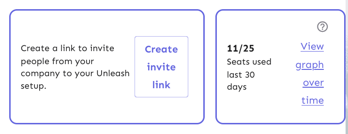
This PR throws in a number of fixes to the UsersHeader's invite link and
licensed users components:
- Change the border colors from the primary purple to being a standard
border color
- Fix text / button wrapping in the invite link component. It now wraps
such that the button goes onto the row below the text if it cannot fit
on the same row. The text within the button will not wrap until it
absolutely has to (and is on its own line).
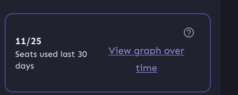
- Fix the wrapping behavior of the licensed users box: the bottom row
("seats used 30 days" and "view graph over time") will now wrap at the
same time as the other button in the other box.
- Fix some text sizes within the licensed users box
- Fix the button to look more like a link in the licensed users box
Most of it is pretty standard fare, but I've taken a slightly different
route when it comes to the licensed users box component.
I switched the whole component to be a "figure" instead of an article. I
was trying to figure out how I could make it behave the way we wanted
visually while still linking the "seats over 30 days" to the "11 /25"
counter text. The examples on MDN use things such as code snippets,
poems, quotes, etc, in addition to the more common image elements. And
in a way, 11/25 is a figure representing the number of seats used, so I
went with that for now. That said, I'd be very interested to hear some
other takes on this.
Now, because the `figcaption` has to be the first or last element of a
`figure` element, I had to include the "open sidebar" button inside the
caption, which isn't ideal. But I can live with it, I think.
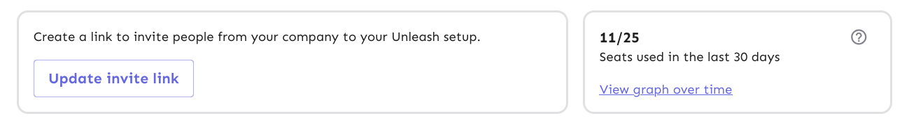
Before:


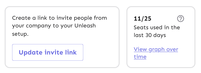
After:

This PR fixes the isOss check for the licensed users component. It also
addresses two things in the UI:
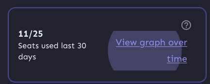
1. It right-aligns the text on the button so that when we get narrower,
the text doesn't slide to the center. There's a few more things that we
can fix later, though. When you press it, it'll still show the entire
button layout:
And when you focus it with a keyboard it still looks like a button.
We can get around that by using a regular button and just styling it a
bit, but making the text align will take some extra jimmying around (not
done in this pr, but got stashed changes for it)

But this is what it'd look like now with centered text:
2. It wraps the entire left column in a `p` tag, because they belong
together. They're not two logical paragraphs. So instead, we wrap them
in spans and surround them in a
p. `Display: contents` makes the p "invisible", so its children act as
if
they're children of the container above it instead.
https://linear.app/unleash/issue/2-2989/unleash-payg-auto-traffic-billing

Integrates auto traffic bundle billing with PAYG.

Currently assumes the PAYG traffic bundle will have the same
`$5/1_000_000` cost as the existing Pro traffic bundle, with the same
`53_000_000` included requests. However some adjustments are included so
it's easier to change this in the future.
This commit fixes invalid prop spreading warnings in all the table rows
I could find through a quick search in the code base.

The issue is that you can't spread the "key" prop into a component. It
*must* be an explicit prop.

The process is the same everywhere:
1. Instead of spreading `row.getRowProps()` into the component, we
extract and split it: `const {key, ...rowProps} = row.getRowProps()`.
2. Do the same thing for cellProps.
This fixes a bug where we didn't allow spaces in role descriptions.
The bug came about because we wanted to disallow empty descriptions,
but that means we need to trim them before validating, not necessarily
before setting it.

However, that does mean that you can have descriptions with leading
and trailing spaces now, but that's probably fine.

To fix this, we'd have to do the trimming of the description only at
submission time, I think.
Fixes all warnings about the "key" prop. The majority of the fixes fall
into one of the following categories:

- Extracting "key" props in tables (you're not allowed to just spread
them in)
- Adding "key" props to autocomplete options and chips
- fixing test data that didn't contain ids
don't use `act` from `react-dom`. Instead, use act from `react`
directly, as advised by the deprecation notice.

This PR fixes all of the deprecated import warnings, updates some
testing libraries we use (and tests), and fixes one or two other
warnings.
This fixes a bug where you can input just whitespace for
name/description. It also means that you can no longer have both "my
role" and "my role    " as separate roles.

API fix will follow.
Updates the instance stats endpoint with
- maxEnvironmentStrategies
- maxConstraints
- maxConstraintValues
It adds the following rows to the front end table:
- segments (already in the payload, just not used for the table before)
- API tokens (separate rows for type, + one for total) (also existed
before, but wasn't listed)
- Highest number of strategies used for a single flag in a single
environment
- Highest number of constraints used on a single strategy
- Highest number of values used for a single constraint

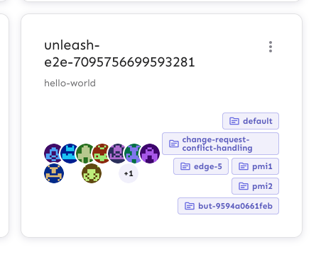
This PR updates the styling of the group cards to better handle edge
cases where you have a lot of assigned projects, long project names,
lots of members, etc.
In particular, it does the following things:
- aligns the avatars along the bottom of the card, so that even if
there's a lot of projects, the avatars stay close to the bottom edge
- adds word breaks for the project names, so that long names can break
when they need to
- adds some spacing between the two columns in the bottom row, so that
even when you they get close, they never quite touch.
Note: there is one more thing I'd like to address in a follow up: as
shown in the top row of the after image, there's some extra wrapping of
the first "This group has no users", even though it has the room to
grow. I'll keep looking into this and make a follow-up.
Before:

After:

Adding a link "Read more in [release
notes](https://github.com/Unleash/unleash/releases/tag/v6.1.0)" to
orphaned tokens.

This needs to be added on v6.1, with the following changelog entry:


> **SDK tokens for deleted projects**
>
> In previous versions of Unleash, when a project was deleted, the
associated SDK tokens were not removed. This issue has been addressed in
the current version of Unleash.
>
> Unfortunately, if you deleted a project in the past without manually
removing the associated tokens, these "orphaned" tokens were
automatically converted to “wildcard” tokens, granting access to all
feature flags across all projects.
>
> Our assessment indicates this poses a minor security concern due to
the following reasons:
>
> This issue only affects tokens whose entire project scope has been
deleted.
>
> Access requires knowledge of the token.
>
> SDK tokens have limited read access and must be assigned to a single
environment.
>
> In the SDK tokens overview, orphaned tokens are flagged with a
warning. We recommend discontinuing the use of these tokens and creating
new, dedicated tokens instead.
>
> With the latest version, when a project is deleted, all API tokens
scoped to that project will be removed as well. If you need further
assistance, please contact customer support.
Extracts the Avatar Group component into a `common` component and adds a
standard tooltip to all avatars.
Relates to linear issue 1-2606
This is a suggestion / proof of concept for how we can solve it. While I
think we can merge this as is, I'd also be happy to take any discussions
on other ways to approach it etc.
## Why are these changes made together?
Because extracting the avatar group without adding the new tooltip data
made the existing tooltip misbehave (it'd show up in the top left of the
screen, not synced to the avatar in any way).
I probably could have (and still can if you think it's prudent) split it
out such that the avatar gets a standardized tooltip first (and disable
it for the group card avatars), and split out the avatars in a
follow-up. Happy to do that if you think it's better.
## What does this mean?
It used to be that we had no consistent way of dealing with avatars and
tooltips. Some places had them, some places didn't. This change makes it
so that all avatars that we can show tooltips for will get the same
tooltip.
Previously, we had at least 4 different ways of dealing with tooltips:
- The HTML tooltip (that would be standardized with this PR) in the
project flags table

- The "title" that you'd get on your user avatar
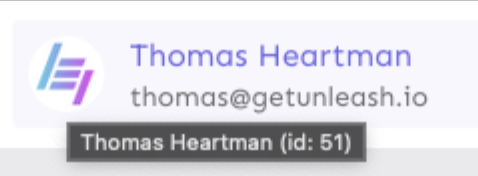
- The group card list tooltip

- And sometimes you'd get nothing at all

with this change, we'll always show the same kind of tooltip if we can:

## What goes in the tooltip?
We use the `UserAvatar` component for a fair few different things and I
didn't want to extract separate components for all the different use
cases. Instead, I wanted to get an overview over what we use it for and
what is relevant info to show.
I found all the places we used it and tried to form an opinion.
This tooltip will work with a user's email, name, username, and id. If
there is no user (such as for empty avatars and avatars displaying only
"+n" for remaining members), we show no tooltip.
Following the example set by the group card avatars, we'll try to use
email or username (in that order) as the main bit of text. If the user
has an email or a username and also a name, the name will be used as
secondary text.
If the user does not have an email or username, but has a name, we'll
use the name as the main text.
If the user does not have an email, a username, or a name, we'll try to
show "User ID: N" if they have an id.
If they do not have a username, a name, an email, or an ID, we bail out
and show nothing.
## Why can you disable the tooltip?
In some cases, you might want to disable the tooltip because you have
more information to feed into it. An example of that is in the project
flags table, where we want to show more information in cases where the
user is 'unknown':

## Additional fixes
This PR also adds a few lines of CSS to fix a minor avatar layout bug.
Before:
After:

This PR adds the UI part of feature flag collaborators. Collaborators are hidden on windows smaller than size XL because we're not sure how to deal with them in those cases yet.
Same as the OIDC changes we merged yesterday, this makes the frontend
ready for disabling SAML configuration page, if the SAML_ environment
variables are set.

---------

Co-authored-by: Nuno Góis <github@nunogois.com>