1
0
mirror of https://github.com/Unleash/unleash.git synced 2025-10-18 11:14:57 +02:00
Commit Graph

482 Commits

Author SHA1 Message Date
Simon Hornby
bf9fdd4f8d
feat: allow SCIM user deletion (#9190)
Co-authored-by: Gastón Fournier <gaston@getunleash.io>
2025-02-10 14:17:46 +02:00
Tymoteusz Czech
4e36d2285e
chore: remove sortProjectRoles flag (#9226) 2025-02-06 19:40:10 +01:00
Thomas Heartman
90e5adb695
chore: use union type for traffic search data (#9221)
Makes the data returned from the traffic search a union type to avoid
nasty object-is-undefined errors at runtime.

It requires more explicit handling, sure, but it means we don't need
to accept undefined.
2025-02-05 10:50:39 +00:00
Thomas Heartman
17a4099dbf
refactor: add functions to estimate monthly usage from data directly (#9219)
Adds new monthly estimation functions that operate on raw usage data
instead of chart data. This brings those methods in line with the rest
of the traffic calculation functions that we have in that file and means
we can remove other external dependencies.

 This is somewhat inspired by #9218, but not directly linked.
2025-02-05 11:12:17 +01:00
Thomas Heartman
543be6dede
chore(1-3342): extract into hook, use new endpoint if flag on (#9218)
Updates the existing BillingDetails pages (pro and payg) to use the new
traffic search endpoint (and calculations) if the flag to do so is on.
Otherwise, it falls back to using the existing method.

I've extracted the overage calculation into a separate shared hook.
2025-02-05 10:45:41 +01:00
Thomas Heartman
bd6a90ffd4
chore: add tests for new traffic usage functions (#9208)
This PR adds tests to all the TODOs created in
https://github.com/Unleash/unleash/pull/9191.

Additionally it finally manages to refactor the `toChartData` function.
2025-02-05 09:47:36 +01:00
Thomas Heartman
c85c687816
chore(1-3335): filters data coming from the API to remove data points we're not interested in (#9205)
Implements a function that cleans and filters incoming data from the
new traffic API.

Specifically, it:
- Removes `/edge` data points
- Removes any data from before may 2024, which is the first full month
we have on record

Because all uses of the existing hook do this filtering themselves, I
have added the filtering at the hook level. This is to avoid
forgetting this filtering later. If we find out we need this data, we
can move the filtering.
2025-02-04 13:26:08 +01:00
Thomas Heartman
96dac84880
refactor: period selector component (#9202)
Refactors the period selector component now that the design / system is
pretty much finished.

Main points are: change from using CSS selectors to using styled
components; use props instead of classes. This is in keeping with the
general Unleash approach.

There's two very slight visual changes here:
1. There is 4px of added space below the "range" "header" text.
2. The months in the grid are a little closer together and not as wide.
This is because we remove the explicit column gap due to the grid having
a set width. Previously the width was automatic, but because we want
this to line up with the button, we need to set the width explicitly on
both items. As such, with the padding, the grid was a little too wide,
so there was too little padding on the right. This rectifies that.
2025-02-04 11:37:58 +01:00
Thomas Heartman
2980c0de4e
refactor(1-3336): useTrafficData / NetworkTrafficUsage.tsx cleanup (#9191)
This PR refactors the `NetworkTrafficUsage.tsx` and `useTrafficData`
files a bit.

The primary objective was to make the network traffic usage component
easier to work with, so I suggest to the reviewer that they start there.

Part of that refactoring, was taking things out of the useTraffic hook
that didn't need to be there. In the end, I'd removed so much that I
didn't even need the hook itself in the new component, so I switched
that to a regular useState.

It made more sense to me to put some of the functions inside the hook
into a separate file and import them directly (because they don't rely
on any hook state), so I have done that and removed those functions from
the trafficData hook. In this case, I also moved the tests.

I have not added any new tests in this PR, but will do so in a
follow-up. The functions I intend to test have been marked as such.
2025-02-04 10:32:59 +01:00
Tymoteusz Czech
c1e41b2b05
fix: users groups table columns on small screens (#9194)
On page "edit users for group", prevent user names and avatars form
disappearing on devices with small screen.
2025-02-04 10:19:40 +01:00
Mateusz Kwasniewski
c68a542a63
refactor: project users virtual autocomplete (#9196) 2025-02-04 10:04:36 +01:00
Mateusz Kwasniewski
c86ea091b7
feat: virtual autocomplete (#9181) 2025-02-03 16:07:24 +01:00
Thomas Heartman
bd12cfce7c
fix(1-3334): re-align the dropdown menu with the dropdown (#9188)
Makes it so that the dropdown menu sits below the dropdown button,
rather than being offset to the end of the containing flexbox.

The issue was caused by the surrounding container being a flexbox.
This caused the popover anchor to grow to the full height of the box,
making the menu look offset.

By using `align-items: start`, we get around this.

Before

![image](https://github.com/user-attachments/assets/0f044627-05a3-4225-9a25-b20393c40158)


After:

![image](https://github.com/user-attachments/assets/9a6d1d7f-7f18-48d3-abdf-f4bb7c02ba68)
2025-02-03 11:00:15 +01:00
Thomas Heartman
e72a7c1197
chore(1-3316): update request info boxes to new design (#9180)
Updates the existing number of requests and overage info boxes to the
new design.

The existing versions of the boxes had some issues on narrower screens,
so it was easier to just leave them as is and start from scratch.

The previous boxes on narrow screens:

![image](https://github.com/user-attachments/assets/f3efa00d-ac0d-41ed-82d8-11766e043cb5)


The current ones (from wide to narrower):
Wide

![image](https://github.com/user-attachments/assets/0a48c013-afcd-4652-9229-0fca19a83733)

Mid (the text should probably ideally wrap at the same time here, but
I'm not sure how at the moment)

![image](https://github.com/user-attachments/assets/2ea3a672-80a6-4445-ae90-736c91c6e88e)

Narrow

![image](https://github.com/user-attachments/assets/03e3de0e-23c1-436a-8f6c-4c78cd4fdae7)

Extra narrow:

![image](https://github.com/user-attachments/assets/652c0c3b-71b1-4b2e-9e86-217f0c827aa6)


There's still some work we **could** do, but we should have UX have a
look first. In particular, it's about how the text wraps in certain
places etc, but I think it's good enough for now.

I'll come back with tests for the calculations and some refactoring and
cleanup in a followup.
2025-01-31 14:05:36 +01:00
Mateusz Kwasniewski
ec014c0fdf
feat: limit user filter options (#9179) 2025-01-31 10:09:29 +01:00
Thomas Heartman
08c016b755
chore: minor button style adjustments (#9170)
Make it look more like a dropdown
2025-01-29 15:43:10 +01:00
Thomas Heartman
f4556839c8
feat(1-3281): wraps the new datepicker in a dropdown (#9169)
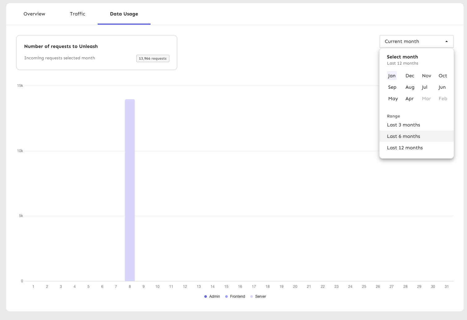
Wraps the datepicker in a popover, making it function largely the same
as a dropdown list.

The dropdown displays one of:
- "current month" if you've selected the current month
- "<month> <year>" (e.g. "December 2024") if you've selected a month
that isn't the current month
- "Last n months" (e.g. "Last 3 months") if you have selected a range

Additionally, the range selections have been updated to span the whole
row, aligning with the look of generic dropdown lists.


![image](https://github.com/user-attachments/assets/d356aec5-d51b-42fa-9591-60e2b5038a8e)

Like with the rest of this file (`PeriodSelector`), the code is rough
and not according to Unleash standards. However, I'm prioritizing fast
changes so UX can have a look before I clean up the code to switch to
using styled components etc later. It's still behind a flag, so I'm not
very worried about it.
2025-01-29 15:29:30 +01:00
Thomas Heartman
7ca8cc2276
fix: dynamic highlight width (#9166)
This makes the width of the highlight bars in the network dynamic and
based on the number of labels included in the chart.

Since the number of labels should always correspond to the number of
data points, this seems like a sensible approach.

With this, the label width will now be calculated on the fly, so even if
you resize the window or change the number of labels, the highlighting
will still work as expected.

Daily view:

![image](https://github.com/user-attachments/assets/e1d158db-0587-46b3-afb1-76dfc523505d)

Monthly aggregate:

![image](https://github.com/user-attachments/assets/8c74d2a3-afc8-4623-8ac7-0c263c7e6037)

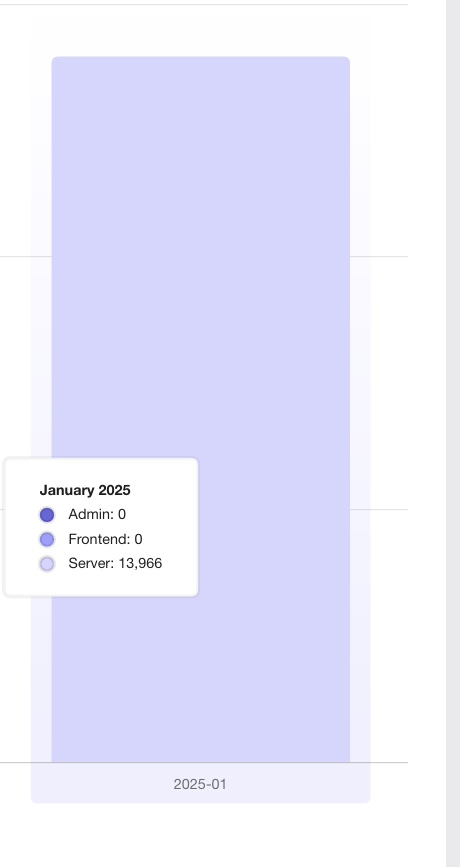
The labels are now a little narrower on the daily graphs, but it avoids
them being super wide on the monthly graphs
2025-01-29 12:03:31 +01:00
Thomas Heartman
87a84426ec
feat(1-3267): use new API for chart creation (#9149)
Adds support for the new /traffic-search API behind a flag. When active, you'll be able to select month ranges as well as specific single months.

Largely copies the existing network traffic component, and adds some minor tweaks to make it work with the new data.

This is quite rough, but it gives us a base to build on for later. There's still things that we need to solve for in following PRs.
2025-01-29 10:43:41 +01:00
Thomas Heartman
e4eab4587c
fix: add a hover color for buttons in the period selectors. (#9125)
Adds the same hover color as for the sidebar. Also adds a transition
animation.
2025-01-21 13:23:07 +01:00
Thomas Heartman
5846952d7c
fix: specify colors for buttons (#9124)
Fixes an issue where the buttons would be illegible in dark mode
because we don't set the color explicitly. It just happened to work in
light mode.
2025-01-21 12:51:20 +01:00
Thomas Heartman
857c91b803
feat(1-3262): initial impl of new month/range picker (#9122)
This PR implements a first version of the new month/range picker for the
data usage graphs. It's minimally hooked up to the existing
functionality to not take anything away.

This primary purpose of this PR is to get the design and interaction out
on sandbox so that UX can have a look and we can make adjustments.

As such, there are a few things in the code that we'll want to clean up
before removing the flag later:
- for faster iteration, I've used a lot of CSS nesting and element
selectors. this isn't usually how we do it here, so we'll probably want
to extract into styled components later
- there is a temporary override of the value in the period selector so
that you can select ranges. It won't affect the chart state, but it
affects the selector state. Again, this lets you see how it acts and
works.
- I've added a `NewHeader` component because the existing setup smushed
the selector (it's a MUI grid setup, which isn't very flexible). I don't
know what we want to do with this in the end, but the existing chart
*does* have some problems when you resize your window, at least
(although this is likely due to the chart, and can be solved in the same
way that we did for the personal dashboards).


![image](https://github.com/user-attachments/assets/f3ce3ff9-bab3-4d00-afbe-56f5624fbe16)
2025-01-21 12:15:43 +01:00
Tymoteusz Czech
08a28c99d6
fix: align project roles checkboxes (#9123)
Fix checkbox alignment and grouping
2025-01-21 10:34:20 +00:00
Thomas Heartman
f6479b1adb
chore(1-3267): use the user's locale settings for formatting the tooltip date (#9113)
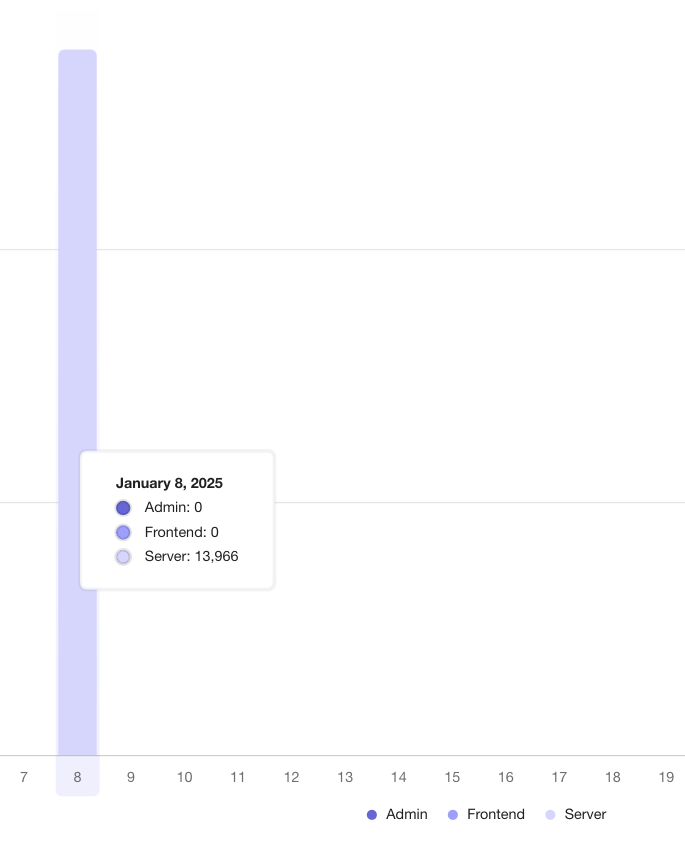
This PR updates the tooltip date display in the traffic usage chart to
use the user's chosen locale settings, falling back to en-US if the
settings are unavailable or otherwise unset.

So, for instance, if I have set my locale to "ja-JP", I'd get this
instead of the en US format:

![image](https://github.com/user-attachments/assets/4c1dbeab-3275-405d-ab8b-90f24531caff)
2025-01-17 11:56:40 +01:00
Nuno Góis
3eeab7e80b
chore: new release plan template card (#9096)
https://linear.app/unleash/issue/2-3125/improve-release-plan-template-cards

Improves the release plan template cards.

This PR introduces a new reusable `Card` component to help us render
cards with the new design. The GroupCard is also adapted to use this new
`Card` component in this PR, since that was the latest one to be
upgraded, however other items like projects and integrations are not. We
can migrate them to this new component at a later stage in separate PRs.

### Before


![image](https://github.com/user-attachments/assets/623454c7-77e9-4672-ad5b-cb6bd7cbf7f2)

### After


![image](https://github.com/user-attachments/assets/20bff73e-80d2-41b5-8f8b-de1c76e69caf)
2025-01-14 13:49:50 +00:00
Tymoteusz Czech
b5f0d3e86a
refactor: project permissions list (#9082)
Re-organized project permissions.
2025-01-14 14:24:25 +01:00
Nuno Góis
537ef42f7d
chore: mark SSO as an Enterprise only feature (#9071)
https://linear.app/unleash/issue/2-3124/mark-sso-as-an-enterprise-only-feature

For all intents and purposes, SSO seems to have always been an
Enterprise only feature. It just wasn't very clear previously.

See: https://github.com/Unleash/unleash/pull/9045/files#r1899635618


![image](https://github.com/user-attachments/assets/7ffed499-83d6-4dc2-ae11-6b0d930a82d1)
2025-01-09 13:07:28 +00:00
Nuno Góis
e7269473f3
chore: new hosted auth handler (#9045)
https://linear.app/unleash/issue/2-3074/add-sign-in-with-google-to-our-hosted-instances-when-only-password-is

https://linear.app/unleash/issue/2-3078/allow-viewer-access-from-auth-app-for-payg

Adds support for a new unified hosted auth handler.

This new auth handler provides a Google sign in option in case you don't
have an SSO provider configured. It also provides a way for auth-app to
sign in with Unleash's read-only user for Pro and Enterprise PAYG
instances.

Check the PR comments for more details.
2025-01-08 10:02:35 +00:00
Tymoteusz Czech
dc4a760172
feat: read logs and update cors maintenance root-role permissions (#8996)
Additional granular permissions related to instance-level access.

- CORS settings
- Reading logs (both instance logs and login history)

---------

Co-authored-by: Gastón Fournier <gaston@getunleash.io>
2025-01-08 10:03:40 +01:00
Nuno Góis
cb77b106bd
chore: make grid group cards have a consistent height (#9064)
https://linear.app/unleash/issue/2-3114/group-cards-should-have-a-consistent-height-in-their-grid

Makes the group cards height consistent in the grid.

<img width="1034" alt="image"
src="https://github.com/user-attachments/assets/27c2dbd4-4a72-419b-bbad-39a4309e5c30"
/>
2025-01-06 14:54:36 +00:00
gitar-bot[bot]
1c0431365e
[Gitar] Cleaning up stale flag: licensedUsers with value true (#9061)
[![Gitar](https://raw.githubusercontent.com/gitarcode/.github/main/assets/gitar-banner.svg)](https://gitar.ai)
This automated PR permanently enables the `licensedUsers` feature flag.
  
  ---
This automated PR was generated by [Gitar](https://gitar.ai). View
[docs](https://gitar.ai/docs).

---------

Co-authored-by: Gitar <noreply@gitar.ai>
2025-01-06 10:44:13 +02:00
Nuno Góis
3c16616c36
chore: improve group projects tooltip behavior (#9054)
https://linear.app/unleash/issue/2-3111/improve-group-card-projects-tooltip

Slight improvement to the group card projects tooltip.

This handles very long project names a little bit better by allowing
them to break into new lines.


![image](https://github.com/user-attachments/assets/8f30e729-7877-463b-8e1e-d05934396827)
2025-01-03 11:10:38 +00:00
Nuno Góis
67c1274a1b
chore: group cards redesign (#9048)
https://linear.app/unleash/issue/2-3108/cards-design-groups

Redesigns the group cards.

Like instructed in the task, I took inspiration from the project and
integration cards, along with the Figma sketch.

Also includes a new `Truncator` generic helper component.

### Before


![image](https://github.com/user-attachments/assets/e47ebb3d-a089-4cbb-962c-53af9f1933f9)

### After


![image](https://github.com/user-attachments/assets/ffeb96b7-e6c4-4433-a847-2e267beb72e9)

Hovering over the "X projects" label reveals the projects the group
belongs to. You can navigate to any project by clicking its badge.


![image](https://github.com/user-attachments/assets/cf06c7f5-011e-4b89-8e40-ed42e5817625)

Truncated titles and descriptions show a tooltip with the full text on
hover.


![image](https://github.com/user-attachments/assets/6fc598e7-b08a-4bfa-8cb2-4153a81f2a48)


![image](https://github.com/user-attachments/assets/91ceba73-c43e-4070-9de0-2a182a3d9257)
2025-01-02 15:08:15 +00:00
Jaanus Sellin
fdb20e94e1
chore: rename to seats used (#8993)
Instead of licensed users/used, we will use seats used.
2024-12-17 12:39:54 +02:00
Tymoteusz Czech
9b15343a79
feat: authentication configuration permission (#8987)
New permission for SSO config.
2024-12-17 10:16:24 +01:00
Tymoteusz Czech
5cc0e589e8
feat(cjux-278): maintenance root roles (#8875)
Custom root roles for changing maintenance mode state and banners.

Internal ticket: CJUX-278
2024-12-10 15:22:46 +01:00
Thomas Heartman
b2c58102dd
chore(unl-204): remove uses of toast text and confetti (#8941)
As of PR #8935, we no longer support both text and title, and confetti
has been removed.

This PR:
- removes `confetti` from the toast interface
- merges `text` and `title` into `text` and updates its uses across the
codebase.
- readjusts the text where necessary.
2024-12-10 13:38:04 +00:00
Thomas Heartman
39bf8f6068
1-3163: align copy to seats used and change in -> over (#8889)
Changes "licensed users" to "seats used" as requested. Also slightly
adjusts the copy a few other places.
2024-11-29 10:46:31 +01:00
Melinda Fekete
c83199db89
Remove admonitions from Proxy docs (#8860) 2024-11-28 14:08:09 +01:00
Thomas Heartman
eaca09b35a
chore: add licensed user data to the licensed users box (#8868)
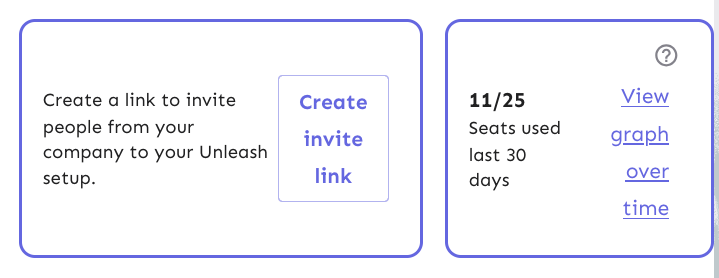
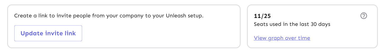
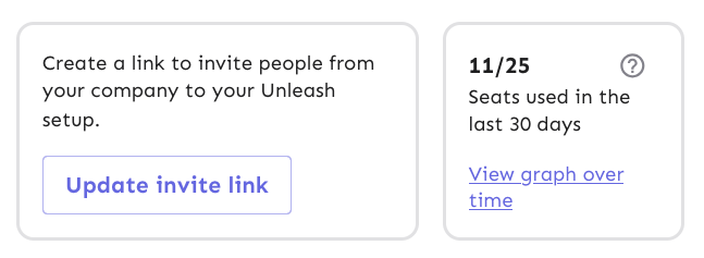
This change adds actual data from the server to the licensed users box
in the users header.

It also extracts the open sidebar button into its own component so
that we don't re-fetch the data when we open the sidebar. That's the
same issue we've had with project status and project creation screens,
etc.
2024-11-27 14:27:07 +01:00
Thomas Heartman
0e8365e47d
fix: user header layout on narrow screens (#8858)
This PR throws in a number of fixes to the UsersHeader's invite link and
licensed users components:

- Change the border colors from the primary purple to being a standard
border color
- Fix text / button wrapping in the invite link component. It now wraps
such that the button goes onto the row below the text if it cannot fit
on the same row. The text within the button will not wrap until it
absolutely has to (and is on its own line).
- Fix the wrapping behavior of the licensed users box: the bottom row
("seats used 30 days" and "view graph over time") will now wrap at the
same time as the other button in the other box.
- Fix some text sizes within the licensed users box
- Fix the button to look more like a link in the licensed users box

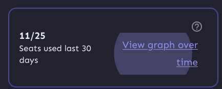
Most of it is pretty standard fare, but I've taken a slightly different
route when it comes to the licensed users box component.

I switched the whole component to be a "figure" instead of an article. I
was trying to figure out how I could make it behave the way we wanted
visually while still linking the "seats over 30 days" to the "11 /25"
counter text. The examples on MDN use things such as code snippets,
poems, quotes, etc, in addition to the more common image elements. And
in a way, 11/25 is a figure representing the number of seats used, so I
went with that for now. That said, I'd be very interested to hear some
other takes on this.

Now, because the `figcaption` has to be the first or last element of a
`figure` element, I had to include the "open sidebar" button inside the
caption, which isn't ideal. But I can live with it, I think.

Before:

![image](https://github.com/user-attachments/assets/60e14aad-89d6-4f04-b6f9-1eafb178639c)

![image](https://github.com/user-attachments/assets/61f6dee0-4a4f-428e-9e01-d68a78644a89)

![image](https://github.com/user-attachments/assets/c405d929-a53f-4d33-a6b2-9f73fa1260b4)

After:

![image](https://github.com/user-attachments/assets/d55817f1-5500-46c6-afd3-e7e7f38e3cec)

![image](https://github.com/user-attachments/assets/65dbf4ee-cd06-404f-b82c-09bcf65250e9)

![image](https://github.com/user-attachments/assets/c82a2dc7-3f9b-4ba2-9d16-1d0376c7bd2a)
2024-11-27 11:21:18 +01:00
Nuno Góis
29c0a3a557
chore: adapt billing page to custom billing scenarios (#8862)
https://linear.app/unleash/issue/2-3030/improve-the-billing-page-behavior-for-instances-with-custom-billing

Adapts the billing page to support custom billing scenarios.

Here’s how it will appear in such cases (notice a new "Your billing is
managed by Unleash" text, with no visible button to update billing
information):


![image](https://github.com/user-attachments/assets/39d7418a-1f22-41b3-9360-ca7c40a2ce7d)
2024-11-27 08:59:25 +00:00
Nuno Góis
ff164a0667
Revert "chore: adapt billing page to custom billing scenarios"
This reverts commit 13fbcec5b3.
2024-11-26 14:22:04 +00:00
Nuno Góis
13fbcec5b3
chore: adapt billing page to custom billing scenarios 2024-11-26 14:20:59 +00:00
Jaanus Sellin
9a269e3597
feat: licensed users chart (#8844)
Currently showing 2 lines, because backend is not sorting the data.


![image](https://github.com/user-attachments/assets/905001fb-2020-45b2-a1f4-ba497b594e61)
2024-11-25 10:03:21 +02:00
Jaanus Sellin
172e34d3e9
feat: licensed seats sidebar (#8834)
Currently mock data, next step is to create chart and connect to
backend.


![image](https://github.com/user-attachments/assets/4b91a3ea-b42a-4c6e-b953-803ff5765c07)
2024-11-22 11:37:41 +02:00
Mateusz Kwasniewski
cf741c6845
chore: update utm links (#8835) 2024-11-22 10:04:41 +01:00
Thomas Heartman
705a0e50d1
fix: isOss check + minor UI things (#8828)
This PR fixes the isOss check for the licensed users component. It also
addresses two things in the UI:

1. It right-aligns the text on the button so that when we get narrower,
the text doesn't slide to the center. There's a few more things that we
can fix later, though. When you press it, it'll still show the entire
button layout:

![image](https://github.com/user-attachments/assets/ea4606be-614a-455e-921f-45ed8d40df23)
And when you focus it with a keyboard it still looks like a button. 

We can get around that by using a regular button and just styling it a
bit, but making the text align will take some extra jimmying around (not
done in this pr, but got stashed changes for it)

![image](https://github.com/user-attachments/assets/33b2f32b-0027-45bf-84f2-4a5e99ef38b2)

But this is what it'd look like now with centered text: 

![image](https://github.com/user-attachments/assets/fe4c6b28-ede1-4418-a471-c2b6b959aacf)


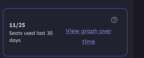
2. It wraps the entire left column in a `p` tag, because they belong
together. They're not two logical paragraphs. So instead, we wrap them
in spans and surround them in a
p. `Display: contents` makes the p "invisible", so its children act as
if
they're children of the container above it instead.
2024-11-22 09:26:52 +01:00
Jaanus Sellin
c18952f374
feat: licensed users ui rework (#8809)
1. Moved link creation bottom next to licensed users view
2. Created licensed users component
3. Added flag

OSS:

![image](https://github.com/user-attachments/assets/cfb2b971-3861-4093-91a5-f3118b906029)
All others

![image](https://github.com/user-attachments/assets/e8cf712f-7e66-44f6-9965-1bb785e4f3fc)
2024-11-21 11:46:40 +02:00
Mateusz Kwasniewski
4a769d14a5
feat: upgrade sso (#8813) 2024-11-20 16:42:34 +01:00
Nuno Góis
b7af9b7ec3
chore: PAYG traffic bundles (#8805)
https://linear.app/unleash/issue/2-2989/unleash-payg-auto-traffic-billing

Integrates auto traffic bundle billing with PAYG.

Currently assumes the PAYG traffic bundle will have the same
`$5/1_000_000` cost as the existing Pro traffic bundle, with the same
`53_000_000` included requests. However some adjustments are included so
it's easier to change this in the future.
2024-11-20 15:20:50 +00:00
David Leek
74535e98a3
chore: hide release plan template permissions behind feature flag (#8799) 2024-11-20 07:59:45 +01:00
Tymoteusz Czech
9d96052a3b
fix: update users session warning in users table (#8794) 2024-11-19 10:36:04 +00:00
Tymoteusz Czech
6d4e2e991f
fix: device count flag without variant (#8773) 2024-11-15 13:05:50 +01:00
Tymoteusz Czech
9d5fceb5bf
feat: show users with multiple parallel sessions (#8756) 2024-11-15 10:34:38 +00:00
Nuno Góis
395a4b6be3
chore: PAYG billing (#8743)
https://linear.app/unleash/issue/CTO-95/unleash-billing-page-for-enterprise-payg

Adds support for PAYG in Unleash's billing page.

Includes some refactoring, like splitting Pro and PAYG into different
details components. We're now also relying on shared billing-related
constants (see `BillingPlan.tsx`). This should make it much easier to
change any of these values in the future. I already changed a few that
were static / wrongly relying on instanceStatus.seats (we decided we're
not doing that for now).


![image](https://github.com/user-attachments/assets/97a5a420-a4f6-4b6c-93d6-3fffddbacbc7)
2024-11-14 11:29:05 +00:00
Tymoteusz Czech
1c9527654d
feat: traffic limits for enterprise-payg (#8596) 2024-10-31 10:26:47 +01:00
Thomas Heartman
622998c62e
fix: invalid spreading of keys into table rows everywhere (#8551)
This commit fixes invalid prop spreading warnings in all the table rows
I could find through a quick search in the code base.

The issue is that you can't spread the "key" prop into a component. It
*must* be an explicit prop.

The process is the same everywhere:
1. Instead of spreading `row.getRowProps()` into the component, we
extract and split it: `const {key, ...rowProps} = row.getRowProps()`.
2. Do the same thing for cellProps.
2024-10-28 13:47:22 +01:00
gitar-bot[bot]
589d9f1af7
[Gitar] Cleaning up stale flag: displayTrafficDataUsage with value true (#8481) 2024-10-24 08:05:06 +02:00
Mateusz Kwasniewski
d3294d58c2
chore: remove navigation sidebar leftover flag (#8504) 2024-10-22 10:08:27 +02:00
Mateusz Kwasniewski
9b3529d7cb
fix: missing page titles (#8477) 2024-10-18 13:12:58 +02:00
Thomas Heartman
88f396f6b6
fix: allow you to add spaces to role descriptions (#8475)
This fixes a bug where we didn't allow spaces in role descriptions.
The bug came about because we wanted to disallow empty descriptions,
but that means we need to trim them before validating, not necessarily
before setting it.

However, that does mean that you can have descriptions with leading
and trailing spaces now, but that's probably fine.

To fix this, we'd have to do the trimming of the description only at
submission time, I think.
2024-10-18 11:07:06 +02:00
Thomas Heartman
fe09ae214f
chore: fix "key" prop issues in front end tests (#8459)
Fixes all warnings about the "key" prop. The majority of the fixes fall
into one of the following categories:

- Extracting "key" props in tables (you're not allowed to just spread
them in)
- Adding "key" props to autocomplete options and chips
- fixing test data that didn't contain ids
2024-10-16 14:57:43 +02:00
Thomas Heartman
abef5deaef
chore: remove all deprecated imports of act (#8398)
don't use `act` from `react-dom`. Instead, use act from `react`
directly, as advised by the deprecation notice.

This PR fixes all of the deprecated import warnings, updates some
testing libraries we use (and tests), and fixes one or two other
warnings.
2024-10-15 13:53:26 +02:00
Thomas Heartman
e20ef56374
fix: trim name and description before validation (#8275)
This fixes a bug where you can input just whitespace for
name/description. It also means that you can no longer have both "my
role" and "my role    " as separate roles.

API fix will follow.
2024-09-26 11:54:16 +00:00
Mateusz Kwasniewski
e33f71a8f4
feat: highlighting flags chart (#8237) 2024-09-25 08:36:30 +02:00
Mateusz Kwasniewski
87b997698b
feat: placeholder flag metrics chart (#8197) 2024-09-20 11:05:53 +02:00
Nuno Góis
355b3eb58a
chore: remove unused SCIM setting - assumeControlOfExisting (#8101)
This property is unused and should be removed.

This fixes a logged schema error:

```
Invalid response: {
    "schema": "#/components/schemas/scimSettingsSchema",
    "errors": [
        {
            "instancePath": "",
            "schemaPath": "#/required",
            "keyword": "required",
            "params": {
                "missingProperty": "assumeControlOfExisting"
            },
            "message": "must have required property 'assumeControlOfExisting'"
        }
    ]
}
```
2024-09-05 13:45:20 +01:00
Tymoteusz Czech
79fccbd8f3
refactor: ts checking conditionallyrender props (#7840)
Fix issues found by TS checking after removing ConditionallyRender
2024-08-30 13:39:11 +02:00
gitar-bot[bot]
4615ff40ce
[Gitar] Cleaning up stale flag: resourceLimits with value true (#7964)
[![Gitar](https://raw.githubusercontent.com/gitarcode/.github/main/assets/gitar-banner.svg)](https://gitar.co)
  
  ---
This automated PR was generated by [Gitar](https://gitar.co). View
[docs](https://gitar.co/docs).

---------

Co-authored-by: Gitar <noreply@gitar.co>
Co-authored-by: Thomas Heartman <thomas@getunleash.io>
2024-08-22 13:20:53 +02:00
Thomas Heartman
b0541a0af2
feat: add remaining resource usage to instance stats (#7958)
Updates the instance stats endpoint with 
- maxEnvironmentStrategies
- maxConstraints
- maxConstraintValues

It adds the following rows to the front end table:
- segments (already in the payload, just not used for the table before)
- API tokens (separate rows for type, + one for total) (also existed
before, but wasn't listed)
- Highest number of strategies used for a single flag in a single
environment
- Highest number of constraints used on a single strategy
- Highest number of values used for a single constraint


![image](https://github.com/user-attachments/assets/57798f8e-c466-4590-820b-15afd3729243)
2024-08-22 13:09:26 +02:00
Tymoteusz Czech
c363fdcfc4
Expired invite link style (#7928) 2024-08-20 09:52:59 +02:00
Thomas Heartman
cf3379d0b3
fix: avoid awkward overlaps of group cards with lots of members, long project names, and small cards (#7915)
This PR updates the styling of the group cards to better handle edge
cases where you have a lot of assigned projects, long project names,
lots of members, etc.

In particular, it does the following things:
- aligns the avatars along the bottom of the card, so that even if
there's a lot of projects, the avatars stay close to the bottom edge
- adds word breaks for the project names, so that long names can break
when they need to
- adds some spacing between the two columns in the bottom row, so that
even when you they get close, they never quite touch.

Note: there is one more thing I'd like to address in a follow up: as
shown in the top row of the after image, there's some extra wrapping of
the first "This group has no users", even though it has the room to
grow. I'll keep looking into this and make a follow-up.

Before:

![image](https://github.com/user-attachments/assets/d612a1de-0aa7-4813-8e73-9345f449238d)

After:


![image](https://github.com/user-attachments/assets/a85308b3-dc42-4777-ab1e-4a89429507d2)
2024-08-19 12:58:46 +00:00
Tymoteusz Czech
b9ea24be8d
fix: orphaned token label only for items without projects (#7901)
Orphaned token label was incorrectly assigned.
Co-authored-by: Thomas Heartman <thomas@getunleash.io>
2024-08-16 10:58:44 +02:00
Simon Hornby
f276728688
feat: allow editing root role/description on SCIM group (#7874) 2024-08-14 15:11:56 +02:00
Gastón Fournier
ea92081545
fix: remove another scimApi flag (#7858) 2024-08-13 14:03:52 +02:00
Mateusz Kwasniewski
41c6d06093
fix: missing space in delete project message (#7771) 2024-08-06 14:11:37 +02:00
Tymoteusz Czech
29975a62c4
feat: link to release notes from orphaned tokens (#7731)
Adding a link "Read more in [release
notes](https://github.com/Unleash/unleash/releases/tag/v6.1.0)" to
orphaned tokens.

This needs to be added on v6.1, with the following changelog entry:


> **SDK tokens for deleted projects**
> 
> In previous versions of Unleash, when a project was deleted, the
associated SDK tokens were not removed. This issue has been addressed in
the current version of Unleash.
> 
> Unfortunately, if you deleted a project in the past without manually
removing the associated tokens, these "orphaned" tokens were
automatically converted to “wildcard” tokens, granting access to all
feature flags across all projects.
> 
> Our assessment indicates this poses a minor security concern due to
the following reasons:
> 
> This issue only affects tokens whose entire project scope has been
deleted. 
> 
> Access requires knowledge of the token.
> 
> SDK tokens have limited read access and must be assigned to a single
environment.
> 
> In the SDK tokens overview, orphaned tokens are flagged with a
warning. We recommend discontinuing the use of these tokens and creating
new, dedicated tokens instead.
> 
> With the latest version, when a project is deleted, all API tokens
scoped to that project will be removed as well. If you need further
assistance, please contact customer support.
2024-08-06 14:12:33 +03:00
Mateusz Kwasniewski
c7ececc429
feat: link to frontend api url (#7770) 2024-08-06 13:09:37 +02:00
Tymoteusz Czech
8aa812e0f5
feat: Orphaned tokens - new API tokens list icon (#7693)
Moving warning icon from "projects" column, to left icon.
2024-08-01 14:31:42 +00:00
Thomas Heartman
f1e95108d1
Wip: split out avatar group; use same tooltip for all avatars (#7681)
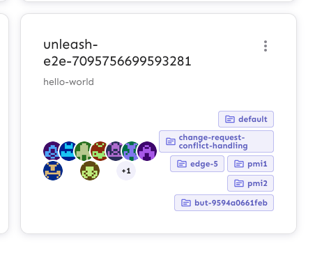
Extracts the Avatar Group component into a `common` component and adds a
standard tooltip to all avatars.

Relates to linear issue 1-2606

This is a suggestion / proof of concept for how we can solve it. While I
think we can merge this as is, I'd also be happy to take any discussions
on other ways to approach it etc.

## Why are these changes made together?

Because extracting the avatar group without adding the new tooltip data
made the existing tooltip misbehave (it'd show up in the top left of the
screen, not synced to the avatar in any way).

I probably could have (and still can if you think it's prudent) split it
out such that the avatar gets a standardized tooltip first (and disable
it for the group card avatars), and split out the avatars in a
follow-up. Happy to do that if you think it's better.

## What does this mean? 

It used to be that we had no consistent way of dealing with avatars and
tooltips. Some places had them, some places didn't. This change makes it
so that all avatars that we can show tooltips for will get the same
tooltip.

Previously, we had at least 4 different ways of dealing with tooltips:
- The HTML tooltip (that would be standardized with this PR) in the
project flags table

![image](https://github.com/user-attachments/assets/91098d31-a5e3-4091-9125-332fe5d106fd)
- The "title" that you'd get on your user avatar

![image](https://github.com/user-attachments/assets/39062b61-db8c-4bd5-9fa3-3ecc9bc192ee)
- The group card list tooltip

![image](https://github.com/user-attachments/assets/0d4a696a-e944-446c-8bff-4dcec02d8afb)
- And sometimes you'd get nothing at all

![image](https://github.com/user-attachments/assets/8975afaf-9ca1-4eb6-b443-9ab94b52bbd8)

with this change, we'll always show the same kind of tooltip if we can:


![image](https://github.com/user-attachments/assets/974c592c-c844-4b65-8a55-05e84d3df130)

## What goes in the tooltip? 

We use the `UserAvatar` component for a fair few different things and I
didn't want to extract separate components for all the different use
cases. Instead, I wanted to get an overview over what we use it for and
what is relevant info to show.

I found all the places we used it and tried to form an opinion. 

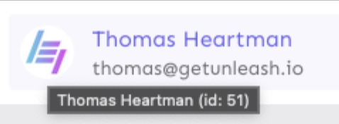
This tooltip will work with a user's email, name, username, and id. If
there is no user (such as for empty avatars and avatars displaying only
"+n" for remaining members), we show no tooltip.

Following the example set by the group card avatars, we'll try to use
email or username (in that order) as the main bit of text. If the user
has an email or a username and also a name, the name will be used as
secondary text.

If the user does not have an email or username, but has a name, we'll
use the name as the main text.

If the user does not have an email, a username, or a name, we'll try to
show "User ID: N" if they have an id.

If they do not have a username, a name, an email, or an ID, we bail out
and show nothing.

## Why can you disable the tooltip?

In some cases, you might want to disable the tooltip because you have
more information to feed into it. An example of that is in the project
flags table, where we want to show more information in cases where the
user is 'unknown':


![image](https://github.com/user-attachments/assets/758b4e86-e934-47e3-91ce-ce900f76bc54)


## Additional fixes

This PR also adds a few lines of CSS to fix a minor avatar layout bug.

Before:

![image](https://github.com/user-attachments/assets/0150efbf-c51a-40bb-898f-7ddd3565ce21)


After:

![image](https://github.com/user-attachments/assets/f337cf68-c572-4610-b1de-a27749325da8)
2024-08-01 10:45:24 +02:00
Thomas Heartman
e2b90ae91d
fix: add workaround for tooltip (#7649)
This PR adds the UI part of feature flag collaborators. Collaborators are hidden on windows smaller than size XL because we're not sure how to deal with them in those cases yet.
2024-07-24 09:33:29 +00:00
Christopher Kolstad
d397819fd3
feat: Make SAML dialog aware that it might be configured via env (#7606)
Same as the OIDC changes we merged yesterday, this makes the frontend
ready for disabling SAML configuration page, if the SAML_ environment
variables are set.

---------

Co-authored-by: Nuno Góis <github@nunogois.com>
2024-07-17 10:57:34 +00:00
Christopher Kolstad
7ed1d770a8
feat: make frontend aware that OIDC can be configured through env (#7597)
Co-authored-by: Nuno Góis <github@nunogois.com>
2024-07-16 13:53:30 +02:00
Tymoteusz Czech
e7627becec
feat: API Tokens limit - UI (#7561)
When approaching limit or limit reached for the number of API tokens, we
show a corresponding message.
2024-07-12 14:44:46 +02:00
Tymoteusz Czech
d440d3230a
feat: show orphaned API tokens (#7569)
Add a visual indication that a token was scoped to projects that have
been deleted.
2024-07-11 14:06:22 +02:00
Christopher Kolstad
f65afff6c1
feat: Disallow repeating last 5 passwords. (#7552)
We'll store hashes for the last 5 passwords, fetch them all for the user
wanting to change their password, and make sure the password does not
verify against any of the 5 stored hashes.

Includes some password-related UI/UX improvements and refactors. Also
some fixes related to reset password rate limiting (instead of an
unhandled exception), and token expiration on error.

---------

Co-authored-by: Nuno Góis <github@nunogois.com>
2024-07-09 16:18:35 +02:00
Tymoteusz Czech
f6c05eb877
API tokens - virtualized table (#7531)
API tokens table in both main list and project API tokens list can now
support more items - it doesn't slow the browser down if there is >500
items.
2024-07-09 13:22:55 +02:00
Gastón Fournier
bf2df49bd6
feat: change billing plan get in touch to support email (#7523) 2024-07-03 16:58:04 +02:00
Tymoteusz Czech
e916deda74
fix: prevent project cell overflow on api keys table (#7472)
Preparations for virtualizing API tokens table - projects column for tokens with a list of projects assigned will not overflow the cell.
2024-07-02 12:10:02 +02:00
Gastón Fournier
79628d3e7d
chore: change get in touch email and use biome from node_modules (#7496) 2024-07-01 12:07:07 +02:00
Jaanus Sellin
3acb3ad2c2
feat: upgrade from react v17 to v18 (#7265)
**Upgrade to React v18 for Unleash v6. Here's why I think it's a good
time to do it:**
- Command Bar project: We've begun work on the command bar project, and
there's a fantastic library we want to use. However, it requires React
v18 support.
- Straightforward Upgrade: I took a look at the upgrade guide
https://react.dev/blog/2022/03/08/react-18-upgrade-guide and it seems
fairly straightforward. In fact, I was able to get React v18 running
with minimal changes in just 10 minutes!
- Dropping IE Support: React v18 no longer supports Internet Explorer
(IE), which is no longer supported by Microsoft as of June 15, 2022.
Upgrading to v18 in v6 would be a good way to align with this change.

TS updates:
* FC children has to be explicit:
https://stackoverflow.com/questions/71788254/react-18-typescript-children-fc
* forcing version 18 types in resolutions:
https://sentry.io/answers/type-is-not-assignable-to-type-reactnode/

Test updates:
* fixing SWR issue that we have always had but it manifests more in new
React (https://github.com/vercel/swr/issues/2373)

---------

Co-authored-by: kwasniew <kwasniewski.mateusz@gmail.com>
2024-06-11 13:59:52 +03:00
Christopher Kolstad
63f3212624
fix: trim sso URL fields (#7301)
What the title says. There are input values that are whitespace
sensitive, so this will trim clientId and entity field, preventing the
form from sending leading or trailing whitespace. Will make a PR on
enterprise as well to trim on the backend as well.
2024-06-06 10:01:24 +02:00
Thomas Heartman
05b7f6f4d9
fix: involuntarily scrolled to the top when mousing off group/project avatars (#7287)
This PR fixes a bug where if you navigated to the projects page via the
menu, scrolled down, and hovered over a project's avatars, you'd be
scrolled to the top of the page when you moused off the avatar.

Turns out this issue was also in the group cards. It seems to be that
the popover attempts to restore focus back to where you where, which, if
you navigated via the menu, is at the top of the page. Because these
popovers don't have any focusable content, we can disable that
functionality.

Additionally, I've disabled the scroll lock when the popover is open.
The scroll lock made it impossible to scroll when one of the popovers is
open, which is confusing as a user.
2024-06-05 13:46:36 +02:00
Christopher Kolstad
0db5bc193f
task: upgraded semver dependency (and biome) (#7272)
Sorry for the extra noise here, but this seems to be the biome upgrade
altering formatting slightly.
2024-06-04 15:01:43 +02:00
Thomas Heartman
de74faac46
chore: remove flag for new project cards (#7225)
This PR removes the flag for the new project card design, making it GA.

It also removes deprecated components and updates one reference (in the
groups card) to the new components instead.
2024-05-31 10:58:31 +02:00
Thomas Heartman
abf4966a37
fix: handle overflowing avatars in the new project card (#7217)
This change prevents the project owner avatars in the new project card
footer from overflowing by making the number of avatars to show
configurable.

It defaults to 9, the old hard-coded number of avatars shown, but can
be configured.

The reason it overflows here is probably that the extra button in the
project card footer (the favorite) makes the footer smaller than what
we have for the group card footer.

Before: 

![image](https://github.com/Unleash/unleash/assets/17786332/972fe471-a78a-436a-a08d-18afefd2501e)

After:


![image](https://github.com/Unleash/unleash/assets/17786332/af569412-85e2-4b9b-97b8-12b91d372a70)
2024-05-30 12:01:17 +02:00
David Leek
bc6b23c740
fix: attempt a react friendly fix of summing (#7151)
## About the changes

Summing on Billing page got a little wonky after changing how the
summing worked when the estimation flag is off. This attempts to return
it to previous way of showing numbers when flag is off

If you go directly to the billing page it will not add user calculations
to the total. If you however interact with the UI, like change tabs back
and forth, it will suddenly show the correct sum:


![image](https://github.com/Unleash/unleash/assets/707867/af6eeddf-be3f-42ae-a588-f57c30d739ca)


![image](https://github.com/Unleash/unleash/assets/707867/b4a0b832-a550-4e87-aa69-7b27f96d3beb)

---------

Co-authored-by: Nuno Góis <github@nunogois.com>
Co-authored-by: Gastón Fournier <gaston@getunleash.io>
2024-05-28 09:08:23 +02:00
Mateusz Kwasniewski
8b5e39c997
feat: hide top nav (#7140) 2024-05-24 12:08:08 +02:00
Jaanus Sellin
8542cafc9f
chore: rename toggle to flag #2 (#7097) 2024-05-22 08:20:11 +03:00