Adjusts styling of the env dropdown now that we have both release plans
and strategies.
Key points:
- simplifies strategy separator, removes inherent height. Also: extracts
it from the draggable component (it has no business knowing whether to
add that or not)
- Puts release plans and strategies in the same list so that it becomes:
```markdown
- Release plan
- strategy 1
- strategy 2
- (OR) Strategy A
- (OR) Strategy B
```
- Adjusts some padding around to make it line up properly
- Swaps a couple conditional renders for ternaries
Rendered:

## Still todo:
Handle cases where you have >50 strats and we show the warning etc. It's
a little trickier because of how it interacts with release plans, so I
wanna leave that for later.
I'm also unsure about how we handle spacing today. All the little items
have their own different spacing and I'm not sure it won't get out of
sync, but I'm also not sure how else to handle it. We should look at it
later.
Updates the strategy list based on the new designs and moves the current
versions of the touched components into `Legacy...` files (the vast
majority of changes are that and updating imports). The relevant changes
to the components are listed in their original files.
Flag on:

Flag off:

## Next steps
There's two items to review for improving these current comments (also
noted inline):
- Whether to aria-hide the "or" separator or not (I need to read up a
bit and think whether it makes sense to show that or not)
- Changing the list of strategies into an actual ordered list (`ol`).
That'd reflect the semantics better.
Next would be checking the other places we use strategy lists and then
updating those too. In doing so, I might find that some things need to
be updated, but I'll handle those when I get there.
There's also handling release plans.
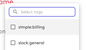
Makes the env selector on the flag page act the same way as the env
selector on the new project page or any of the filterable buttons in the
new project/flag dialogs.
Also slightly changes the styles of the existing dropdown lists to bring
them in line with the new env selector (more padding, full-width
highlights).
Selector:

Project/flag creation:
Before:

After:
## Technical notes
I was a little unsure how best to share the padding/spacing styles
between the search field and popover at first (as was requested by UX).
The easiest way (and most compliant with how we do it today) was to
define the spacing in a variable and move the relevant components into
the same file.
However, I actually think that using a CSS variable (e.g.
`--popover-spacing`) would be "better" here, but we don't really use
them much, so I've left that out for now. That said, if you agree, I'd
be more than happy to use that instead 🙋🏼
Fixes the issue where the skip link wouldn't take you to the main
content of the page anymore.
Also includes a few related minor semantic and a11y improvements:
1. The `main` element now only surrounds the actual main content of the
page. The sidebar is nav content and shouldn't be within it. The easiest
way to do this was to change the element that was previously a `main` to
a `div` and make the main content wrapper a `main` instead.
2. Makes the skip link target visible when focused. But invisible
otherwise. This has two benefits:
1. It's immediately obvious that using the skip link has worked. It
tells you that it's at the start of the main content.
2. Because the link now has text, it can be targeted by link search
(e.g. in Firefox, press `'` to search for links (I use this **a lot**)),
making it super easy to move your focus to the main content directly.
(Yes, landmark navigation should also work here, though, especially with
the `main` change).
The implementation of UI considerations of the skip link are based on
the CSS-tricks article [a deep dive on skipping to
content](https://css-tricks.com/a-deep-dive-on-skipping-to-content/)
from 2021.
Here's what it looks like when you skip to content:

When it doesn't have focus, it's invisible.
This makes the width of the highlight bars in the network dynamic and
based on the number of labels included in the chart.
Since the number of labels should always correspond to the number of
data points, this seems like a sensible approach.
With this, the label width will now be calculated on the fly, so even if
you resize the window or change the number of labels, the highlighting
will still work as expected.
Daily view:
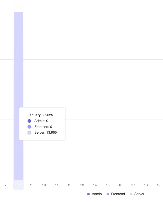
Monthly aggregate:
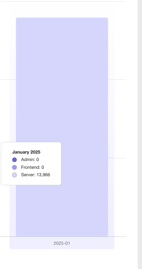
The labels are now a little narrower on the daily graphs, but it avoids
them being super wide on the monthly graphs
As of PR #8935, we no longer support both text and title, and confetti
has been removed.

This PR:
- removes `confetti` from the toast interface
- merges `text` and `title` into `text` and updates its uses across the
codebase.
- readjusts the text where necessary.
This PR adds a header and a tooltip to the lifecycle widget. Most of the
changes in ProjectLifecycleSummary is indentation changes due to
wrapping the component in another row container.
Additionally, this PR touches the `HelpIcon` component because we'd like
the tooltip to be wider than what we currently set as the default for
the help icon. The help icon uses the html tooltip component, which has
a maxWidth prop, but it does not expose that. So I've adjusted it to let
you do that.
Header with tooltip:

Addressing some oversights that led to browser console errors.

This PR fixes console errors related to the recently introduced
highlight component (#8643) and tag row component in the new flag
metadata panel (#8663).
Follow-up to: https://github.com/Unleash/unleash/pull/8642

Introduces a reusable `Highlight` component that leverages the Context
API pattern, enabling highlight effects to be triggered from anywhere in
the application.

This update refactors the existing highlight effect in the event
timeline to use the new Highlight component and extends the
functionality to include the Unleash AI experiment, triggered by its
entry in the "New in Unleash" section.