If the average number of days in a stage is 1, use `1 day` instead of
`1 days`.

Likewise, if your total number of archived flags is 1, use `1 flag
archived` instead of `1 flags archived`.

I grepped through the file, but couldn't find any other hardcoded
instances of "flags" or "days", so I think this is everything.
As of PR #8935, we no longer support both text and title, and confetti
has been removed.

This PR:
- removes `confetti` from the toast interface
- merges `text` and `title` into `text` and updates its uses across the
codebase.
- readjusts the text where necessary.
This PR removes all references to the `featuresExportImport` flag.

The flag was introduced in [PR
#3411](https://github.com/Unleash/unleash/pull/3411) on March 29th 2023,
and the flag was archived on April 3rd. The flag has always defaulted to
true.

We've looked at the project that introduced the flag and have spoken to CS about it: we can find no reason to keep the flag around. So well remove it now.
This PR adds a proper dark theme for the activity graph. We previously
used the exact same theme for both light and dark modes.
Before:

After (different chart):
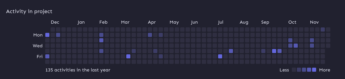
I'm also passing in the theme explicitly as the `colorScheme` property.
Without that prop, the graph uses your system color scheme (according to
the docs), which may not be the same as your Unleash theme color scheme.
To avoid getting visible borders for the activity squares, I've added a `svg rect` override on the containing element that sets the svg rect strokes to be invisible.
This change updates the stat for archived flags "this month".

Turns out we were accessing the wrong property on the data object.

Additionally, changes the label to say "last 30 days" instead of "this
month"  because that's more accurate.
This PR improves handling of very narrow screens for the project status
header:
- Add a right margin so that it won't overlap with the close button.
- Make it so the icon in the header doesn't shrink.
This PR updates the project status service (and schemas and UI) to use
the project's current health instead of the 4-week average.

I nabbed the `calculateHealthRating` from
`src/lib/services/project-health-service.ts` instead of relying on the
service itself, because that service relies on the project service,
which relies on pretty much everything in the entire system.

However, I think we can split the health service into a service that
*does* need the project service (which is used for 1 of 3 methods) and a
service (or read model) that doesn't. We could then rely on the second
one for this service without too much overhead. Or we could extract the
`calculateHealthRating` into a shared function that takes its stores as
arguments. ... but I suggest doing that in a follow-up PR.

Because the calculation has been tested other places (especially if we
rely on a service / shared function for it), I've simplified the tests
to just verify that it's present.

I've changed the schema's `averageHealth` into an object in case we want
to include average health etc. in the future, but this is up for debate.
This change updates the "view unhealthy flags" link in the project
status sidebar to use the correct filter. The previous link was put in
before we had a filter for potentially stale, so this updates the link
to use that filter.
This PR adds the option to select potentially stale flags from the UI.

It also updates the name we use for parsing from the API: instead of
`potentiallyStale` we use `potentially-stale`. This follows the
precedent set by "kill switch" (which we send as 'kill-switch'), the
only other multi-word option that I could find in our filters.
Remove everything related to the connected environment count for project
status. We decided that because we don't have anywhere to link it to at
the moment, we don't want to show it yet.
This change makes it so that the project status sidebar will close
when you follow a link within it. We do that by using JS event
bubbling and attaching a handler on the modal parent. We can listen
for events and check whether the target is an anchor and, if so, close
the modal.
This PR fixes a few small UI issues reported by UX. It:
- Adds hover colors to the lifecycle boxes
- Adjusts the font size for the health widget to match project resources
and lifecycle
- Makes the `view health over time tooltip` take you to the insights
page with the current project preselected

This pr adds tooltips to lifecycle boxes when they're hovered or
focused. There's also some small copy tweaks.
We decided to go with tooltips instead of buttons for this iteration
because it'd be an easier thing to implement, especially in regards to
keyboard navigation and avoiding overlapping other elements.
I've also not changed the background color of the tooltips just yet.
There's two reasons for this:
1. The practical reason is that our `HtmlTooltipComponent` doesn't allow
you to do that and I didn't wanna start messing about with that.
2. If all our other tooltips follow this color scheme, why not do the
same here? Especially because they're not buttons anymore, so using the
same color as other tooltips seems sensible.

This PR adds a header and a tooltip to the lifecycle widget. Most of the
changes in ProjectLifecycleSummary is indentation changes due to
wrapping the component in another row container.
Additionally, this PR touches the `HelpIcon` component because we'd like
the tooltip to be wider than what we currently set as the default for
the help icon. The help icon uses the html tooltip component, which has
a maxWidth prop, but it does not expose that. So I've adjusted it to let
you do that.
Header with tooltip:
