Implements client-side validation of constraint values before you can
add them to a constraint.

I've removed the extra server-side validation that used to happen for
each specific constraint, because the surrounding form itself uses
server side validation to check every constraint every time there's a
change. This is what controls disabling the submit button etc.

I wanna make the next PR a bit of a followup cleanup now that it's
clearer what properties we do and don't need.
<img width="371" alt="image"
src="https://github.com/user-attachments/assets/7c98708f-fcbe-40ca-8590-bb0f5b2ad167"
/>
<img width="361" alt="image"
src="https://github.com/user-attachments/assets/503d4841-d910-4e8e-b0ef-a3d725739534"
/>
In this PR I integrate the Unleash React SDK with the Admin UI.

We also take advantage of Unleash Hosted Edge behind the scenes with
multiple regions to get the evaluations close to the end user.
Adds a new dialog option for whats in new in Unleash items. This can be
tiggerred by setting `popout` to true when configuring the items.
To do this without setting fire to the code, I've also needed to
refactor the NewInUnleash components:
- NewInUnleashItem becomes a dumb item that decides if a dialog or
tooltip should be rendered and controls that render state
- The child item in NewInUnleashItem has been moved out into
NewInUnleashSideBarItem, which feels a bit better since that is a
distinct UI element from the popup
- NewInUnleashDialog now exists, which is a dialog version of the popup.
Meaningfully different to ask for a new component
## Screenshots

Fixes a small number of accessibility issues that Firefox was
complaining about (and some that I noticed myself):
1. In `CommandBar.tsx`, use a `Label` element instead of aria-label. We
can hide it with the `ScreenReaderOnly` component.
2. Add an `aria-label` to the icon button in the sidebar. (side note:
should we do any fancy detection on whether it's cmd + b or ctrl+b
there? I think we do that in the command bar)
3. Update the playground guidance popper;
i. Add an aria-label to the icon button
ii. Make the popper a `Popover` instead. This fixes a few issues: It
wasn't possible to focus or close just using the keyboard before.
Because it didn't steal focus, it also meant that it'd cover other parts
of the page. Now it traps focus so you can navigate to the close button,
and escape will also close it for you.
iii. Remove aria-describedby. Using aria-describedby on the button would
mean that the **button** is described by its content, which seems wrong.
aria-describedby should also only be used for plain strings. Complex
markups isn't supported. For that aria-details is the right way to go.
But because the popover is only rendered when it's open, the details or
describedby link will point to nothing most of the time.
iv. In doing this, there is a slight change in the popover shadow (I
couldn't find onef of our shadows that did the same thing as before),
but it matches other popovers we have, such as on the data usage tab.
Before:
After:

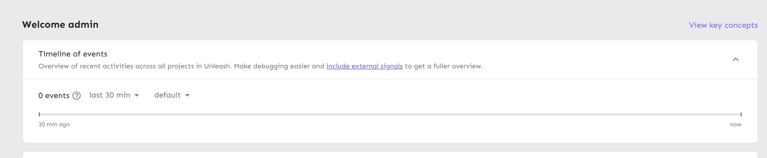
Moves the event timeline to the personal dashboard from the header when
the `frontendHeaderRedesign` flag is active.
When the flag is active, it also:
- hides the event timeline and corresponding button in the header
- renders the environment selector next to the time selector instead of
at the other end of the header
---------
Co-authored-by: Nuno Góis <github@nunogois.com>
Fixes the issue where the skip link wouldn't take you to the main
content of the page anymore.
Also includes a few related minor semantic and a11y improvements:
1. The `main` element now only surrounds the actual main content of the
page. The sidebar is nav content and shouldn't be within it. The easiest
way to do this was to change the element that was previously a `main` to
a `div` and make the main content wrapper a `main` instead.
2. Makes the skip link target visible when focused. But invisible
otherwise. This has two benefits:
1. It's immediately obvious that using the skip link has worked. It
tells you that it's at the start of the main content.
2. Because the link now has text, it can be targeted by link search
(e.g. in Firefox, press `'` to search for links (I use this **a lot**)),
making it super easy to move your focus to the main content directly.
(Yes, landmark navigation should also work here, though, especially with
the `main` change).
The implementation of UI considerations of the skip link are based on
the CSS-tricks article [a deep dive on skipping to
content](https://css-tricks.com/a-deep-dive-on-skipping-to-content/)
from 2021.
Here's what it looks like when you skip to content:

When it doesn't have focus, it's invisible.
Follow-up to: https://github.com/Unleash/unleash/pull/8642

Introduces a reusable `Highlight` component that leverages the Context
API pattern, enabling highlight effects to be triggered from anywhere in
the application.

This update refactors the existing highlight effect in the event
timeline to use the new Highlight component and extends the
functionality to include the Unleash AI experiment, triggered by its
entry in the "New in Unleash" section.