Currently, in enterprise we're struggling with setting service and
transactionality; all our verfications says that the setting key is not
present, so setting-store happily tries to insert a new row with a new
PK. However, somehow at the same time, the key already exists. This
commit adds conflict handling to the insertNewRow.
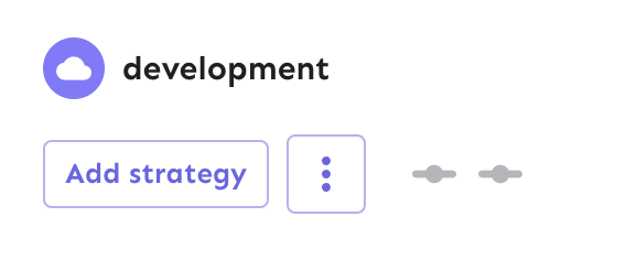
Fixes the height discrepancy between add strategy and more strategies
buttons, both with and without the flag enabled.
The essence of the fix is to make the "more strategies" button's height
dynamic and grow to match the height of the other button.
Before (flag enabled):
After (flag enabled):

Before (flag disabled):

After (flag disabled):

As a bonus: also enables the ui font redesign flag for server-dev.
If you're very sharp-eyed, you might notice a few things:
1. There's more padding on the new button. This was done in concert with
UX when we noticed there was more padding on other buttons. So as a
result, we set the button type to the default instead of "small".
1. The kebab button isn't perfectly square with the flag on. There's a
few issues here, but essentially: to use `aspect-ratio: 1`, you need
either a height or a width set. Because we want everything here to be
auto-generated (use the button's intrinsic height), I couldn't make it
work. In the end, I think this is close enough. If you have other ideas,
you're very welcome to try and fix it.
Also, use extra css selectors to increase specificity so that this
takes precedence over the MUI themes.

I don't like that we need to do this weird selector thing, but hey, it
is what it is.
## About the changes
Based on the first hypothesis from
https://github.com/Unleash/unleash/pull/9264, I decided to find an
alternative way of initializing the DB, mainly trying to run migrations
only once and removing that from the actual test run.

I found in [Postgres template
databases](https://www.postgresql.org/docs/current/manage-ag-templatedbs.html)
an interesting option in combination with jest global initializer.

### Changes on how we use DBs for testing

Previously, we were relying on a single DB with multiple schemas to
isolate tests, but each schema was empty and required migrations or
custom DB initialization scripts.

With this method, we don't need to use different schema names
(apparently there's no templating for schemas), and we can use new
databases. We can also eliminate custom initialization code.

### Legacy tests

This method also highlighted some wrong assumptions in existing tests.
One example is the existence of `default` environment, that because of
being deprecated is no longer available, but because tests are creating
the expected db state manually, they were not updated to match the
existing db state.

To keep tests running green, I've added a configuration to use the
`legacy` test setup (24 tests). By migrating these, we'll speed up
tests, but the code of these tests has to be modified, so I leave this
for another PR.

## Downsides
1. The template db initialization happens at the beginning of any test,
so local development may suffer from slower unit tests. As a workaround
we could define an environment variable to disable the db migration
2. Proliferation of test dbs. In ephemeral environments, this is not a
problem, but for local development we should clean up from time to time.
There's the possibility of cleaning up test dbs using the db name as a
pattern:
2ed2e1c274/scripts/jest-setup.ts (L13-L18)
but I didn't want to add this code yet. Opinions?

## Benefits
1. It allows us migrate only once and still get the benefits of having a
well known state for tests.
3. It removes some of the custom setup for tests (which in some cases
ends up testing something not realistic)
4. It removes the need of testing migrations:
https://github.com/Unleash/unleash/blob/main/src/test/e2e/migrator.e2e.test.ts
as migrations are run at the start
5. Forces us to keep old tests up to date when we modify our database
Adds the button styles that were removed from `app.css` into the
legacy theme file. These change very slightly when the flag is on, and
because the hardcoded `app.css` styles have been removed, we'll use
the legacy file as fallback.
Fixes a small number of accessibility issues that Firefox was
complaining about (and some that I noticed myself):
1. In `CommandBar.tsx`, use a `Label` element instead of aria-label. We
can hide it with the `ScreenReaderOnly` component.
2. Add an `aria-label` to the icon button in the sidebar. (side note:
should we do any fancy detection on whether it's cmd + b or ctrl+b
there? I think we do that in the command bar)
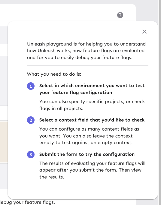
3. Update the playground guidance popper;
i. Add an aria-label to the icon button
ii. Make the popper a `Popover` instead. This fixes a few issues: It
wasn't possible to focus or close just using the keyboard before.
Because it didn't steal focus, it also meant that it'd cover other parts
of the page. Now it traps focus so you can navigate to the close button,
and escape will also close it for you.
iii. Remove aria-describedby. Using aria-describedby on the button would
mean that the **button** is described by its content, which seems wrong.
aria-describedby should also only be used for plain strings. Complex
markups isn't supported. For that aria-details is the right way to go.
But because the popover is only rendered when it's open, the details or
describedby link will point to nothing most of the time.
iv. In doing this, there is a slight change in the popover shadow (I
couldn't find onef of our shadows that did the same thing as before),
but it matches other popovers we have, such as on the data usage tab.
Before:
After:

The license check API call was giving me 404s in the console of the
OSS version of Unleash.

This changes the `useLicense` hook to use `useEnterpriseSWR` instead
of `useSWR` to avoid making the API call in the OSS version. This is
consistent with the `useLicenseCheck` hook in the same file.
Fixes a small visual glitch where the event timeline panel (which
usually doesn't have a bottom border on the summary) would get a
bottom border during the collapsing animation.

This happens because to make the border act as we want, we switch
between using the summary's bottom border and the content's top
border, and I'd only updated one of the borders to respect the new
design.
Extracts each panel into its own component for the personal dashboard.
This lets us use separate states for each panel, which in turn lets each
panel change its open / close state without causing the other panels to
re-render.

When you have a lot of flags and/or projects, the list to render becomes
very long, which causes performance problems, especially when you need
to rerender both flags and projects and the timeline whenever one of
them changes.

The problems were especially noticeable in Firefox for me. Even with
this, the event timeline is a little choppy. I suspect that's because of
it might take a long time to paint? But we can look into that later.

Also updates the dashboard state hook to let you only pass in the
flags/projects you want. We could extract this into three different
hooks that all use the same localhost key, but I'm not sure whether
that's better or worse 🤷🏼