1
0
mirror of https://github.com/Unleash/unleash.git synced 2025-10-13 11:17:26 +02:00
Commit Graph

3736 Commits

Author SHA1 Message Date
Thomas Heartman
63d4b8b0e4
chore: adjust env dropdown (#9382)
Adjusts styling of the env dropdown now that we have both release plans
and strategies.

Key points:
- simplifies strategy separator, removes inherent height. Also: extracts
it from the draggable component (it has no business knowing whether to
add that or not)
- Puts release plans and strategies in the same list so that it becomes:
```markdown
- Release plan
  - strategy 1
  - strategy 2
- (OR) Strategy A
- (OR) Strategy B
```
- Adjusts some padding around to make it line up properly
- Swaps a couple conditional renders for ternaries


Rendered:

![image](https://github.com/user-attachments/assets/d6d5cd56-572f-419e-90ed-6449a63fdc96)

## Still todo:

Handle cases where you have >50 strats and we show the warning etc. It's
a little trickier because of how it interacts with release plans, so I
wanna leave that for later.

I'm also unsure about how we handle spacing today. All the little items
have their own different spacing and I'm not sure it won't get out of
sync, but I'm also not sure how else to handle it. We should look at it
later.
2025-02-27 15:28:41 +01:00
Mateusz Kwasniewski
426f53cd8d
test: connection count chart functions (#9383) 2025-02-27 14:38:49 +01:00
Mateusz Kwasniewski
f46ec293df
feat: backend connections tab (#9381) 2025-02-27 13:38:42 +01:00
Thomas Heartman
359b7cc4c0
chore: handle release plans in new strategy list (#9380)
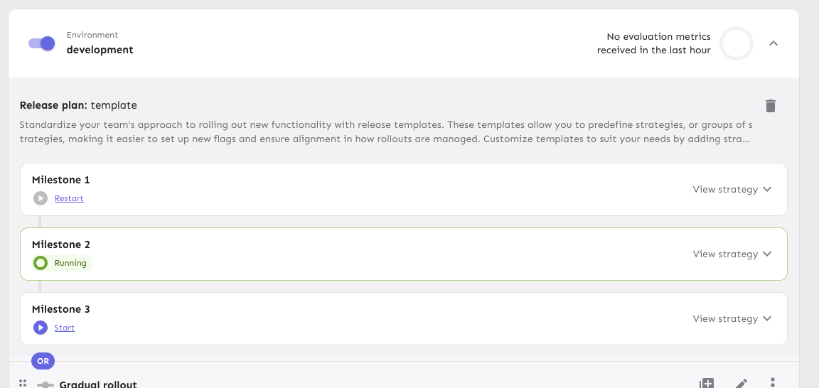
Splits the release plan component into a Legacy component and a new one
with the initial changes for the new strategy list view.

Here's what it looks like:
![image](https://github.com/user-attachments/assets/ecca20d5-1c29-42a9-93f4-61d158ba5a76)

Notice that the background color stops a little early (before the OR
token). I'll handle that in a follow-up because the changes also impact
how the rest of the env accordion body is rendered.
2025-02-27 11:16:24 +01:00
Mateusz Kwasniewski
e29eb51f3c
chore: consumption model flag (#9379) 2025-02-27 09:45:07 +01:00
Thomas Heartman
0c6ef912d4
chore(1-3420): wrap strategy list in an ordered list (#9377)
Improves the semantic correctness of the strategy list by wrapping it
in an `ol` tag.

Strategy order matters (due to variant resolution etc), so the order
is important (hence the `ol` instead of a `ul`).

Dragging still works and it's visually the same.
2025-02-27 08:15:08 +00:00
Jaanus Sellin
be3fa73244
chore: fix text on last seen instances (#9376) 2025-02-27 09:21:40 +02:00
Jaanus Sellin
9ae9221960
feat: now instances are only shown for last 24 hours (#9372) 2025-02-27 09:19:48 +02:00
Thomas Heartman
e25fb9f7c0
chore(1-3389): new env strategy containers (#9361)
Updates the strategy list based on the new designs and moves the current
versions of the touched components into `Legacy...` files (the vast
majority of changes are that and updating imports). The relevant changes
to the components are listed in their original files.

Flag on:

![image](https://github.com/user-attachments/assets/cd49c283-6044-46d4-bcef-182cb6a1de4e)

Flag off:

![image](https://github.com/user-attachments/assets/7ef92b6d-31e5-4218-90b2-dedd5e6cc6de)

## Next steps

There's two items to review for improving these current comments (also
noted inline):
- Whether to aria-hide the "or" separator or not (I need to read up a
bit and think whether it makes sense to show that or not)
- Changing the list of strategies into an actual ordered list (`ol`).
That'd reflect the semantics better.

Next would be checking the other places we use strategy lists and then
updating those too. In doing so, I might find that some things need to
be updated, but I'll handle those when I get there.

There's also handling release plans.
2025-02-26 16:24:50 +01:00
Nuno Góis
192bd83fa6
chore: improve release plan template form validation (#9371)
https://linear.app/unleash/issue/2-3321/improve-release-template-name-uniqueness-error-response-messages
https://linear.app/unleash/issue/2-3285/milestone-name-uniqueness

Slightly improves UX in our release plan template form validation.


![image](https://github.com/user-attachments/assets/2b3bf475-64cc-40ab-a78a-4fe2ca3cdbd1)
2025-02-26 13:01:34 +00:00
Tymoteusz Czech
4e7ce65567
chore: remove uiGlobalFontSize flag (#9331)
1-3383
2025-02-26 12:39:53 +01:00
Thomas Heartman
27bd4e2491
feat: allow command bar navigation to wrap around (#9370)
Lets you navigate to the top of the list when you're at the bottom,
and vice versa.

Arrow down at the end of the list takes you to the search field and
arrow up from the search field takes you to the end of the list.
2025-02-26 10:35:44 +01:00
Nuno Góis
a91876790e
chore: deprecate and undeprecate protected environments (#9360)
https://linear.app/unleash/issue/2-3320/allow-users-to-deprecate-and-undeprecate-protected-environments

Allows users to deprecate and undeprecate protected environments.


![image](https://github.com/user-attachments/assets/621684d3-21e3-4f58-b6b5-2d2731c9fd9e)
2025-02-25 13:41:41 +00:00
Nuno Góis
add4191381
chore: months old version banner (#9352)
https://linear.app/unleash/issue/2-3309/warn-users-of-lagging-versions-3-months-old

Adds a banner warning users in case they are running an outdated Unleash
version (>=3 months old) in case the build date data is present.

When clicking "Changelog" the users are redirected to
https://github.com/Unleash/unleash/releases.


![image](https://github.com/user-attachments/assets/f6b9b361-e780-4558-8b6c-5987b12efe68)
2025-02-25 12:48:55 +00:00
Thomas Heartman
000ee66692
fix: long flag names push table to overflow and flag descriptions are not truncated (#9350)
Addresses two issues related to flag names and descriptions overflowing:

1: In the project flag overview, long flag names push the environments
off screen. This is handled by setting overflow-wrap: anywhere on the
offending text. The text will now use ellipses instead.

Before full-width: 

![image](https://github.com/user-attachments/assets/1c63481a-6733-4f6e-a3a7-46c9035c38f7)

Before narrower:

![image](https://github.com/user-attachments/assets/86cf3531-8259-42f0-9905-4a22dd7f98a7)


After full-width:

![image](https://github.com/user-attachments/assets/e13fa6ff-4cbe-4f6e-8530-b089a8343c65)

After narrower:

![image](https://github.com/user-attachments/assets/c4df0e5d-e32f-4909-9351-afc864383c7b)

2: On the flag page, long descriptions are rendered in their entirety,
even if that's not sensible. They are now truncated after five lines.
There is a tooltip that shows the full text, or you can go the flag
settings to see the full description.

Before:

![image](https://github.com/user-attachments/assets/121ffeac-b92b-4b9b-bb79-17bf5d4ef734)


After:

![image](https://github.com/user-attachments/assets/cd4ff0c2-e110-42c1-8ce6-e0e897823420)


After (with tooltip):

![image](https://github.com/user-attachments/assets/90c147e4-a397-4e60-8318-9a08c4e069aa)


---

Note, I don't think this is necessarily the perfect solution (it'd be
nice to get tooltips for overflowing flag names a "show full
description" disclosure button instead of the stupidly long tooltip),
but I think it's a step in the right direction.
2025-02-25 13:39:30 +01:00
Tymoteusz Czech
7ec6c141f3
refactor: fix deprecation for string truncator (#9359) 2025-02-25 12:24:03 +00:00
Tymoteusz Czech
42a05ef418
feat: new environment box (#9342)
Co-authored-by: Thomas Heartman <thomas@getunleash.io>
2025-02-25 10:34:36 +00:00
David Leek
f19ffd0e7e
chore: fix small UI issues in release templates/plans (#9341) 2025-02-24 15:25:44 +01:00
Nuno Góis
7245112e14
chore: Edge observability width fix (#9345)
Makes the Edge instance node width consistent.
2025-02-21 12:11:50 +00:00
Thomas Heartman
1db97882c2
feat: make env selector filterable (#9340)
Makes the env selector on the flag page act the same way as the env
selector on the new project page or any of the filterable buttons in the
new project/flag dialogs.

Also slightly changes the styles of the existing dropdown lists to bring
them in line with the new env selector (more padding, full-width
highlights).

Selector:


![image](https://github.com/user-attachments/assets/83875aa3-f9d1-4763-b8eb-75f7dc493b13)


Project/flag creation:
Before:

![image](https://github.com/user-attachments/assets/97926ec8-64a0-4d08-900b-0acd5709ef92)


After:


![image](https://github.com/user-attachments/assets/2616615f-3382-4183-a048-5ea4defc8fb2)

## Technical notes

I was a little unsure how best to share the padding/spacing styles
between the search field and popover at first (as was requested by UX).
The easiest way (and most compliant with how we do it today) was to
define the spacing in a variable and move the relevant components into
the same file.

However, I actually think that using a CSS variable (e.g.
`--popover-spacing`) would be "better" here, but we don't really use
them much, so I've left that out for now. That said, if you agree, I'd
be more than happy to use that instead 🙋🏼
2025-02-21 11:20:43 +00:00
Nuno Góis
86c15d5253
chore: improve UX in the Edge observability latency table (#9343)
https://linear.app/unleash/issue/2-3298/make-latency-table-clearer

Improves UX of the Edge observability latency table.


![image](https://github.com/user-attachments/assets/c8b36bdf-7bb5-4646-8176-41b8de70fa30)
2025-02-21 10:00:23 +00:00
Thomas Heartman
9b282a436d
chore: reduce tab sizes on flag page + fix wrapping/overlapping issue with action buttons (#9339)
Reduces the size of the tab buttons on the flag page:
- Sets the min width to 100px instead of 160px on md screens. No change
for smaller screens
- Removes the min-height restriction imposed by theme.ts for the tab
bar, instead relying on the tab buttons to determine the height
(effectively changes the height from 70px to 62px).

Additionally: fixes an issue where the action buttons would overlap with
the tab buttons before wrapping and makes the tab bar scrollable. I can
no longer reproduce the issue where the action buttons force the tab bar
to be too small, but even if they should do that now, the tab bar is
scrollable so the remaining tabs are still accessible.

Because we only override the tabs' min-width on wider screens and mui
sets a default min-width, I changed the `onNarrowHeader` function to
`onWideHeader` and adjusted the other components accordingly. As a
bonus, the tab width and header wrapping now happens at the same time 🥳

After the change:

![image](https://github.com/user-attachments/assets/b164cc7d-ca96-4877-b507-cec9e00a2302)


## Accessibility

This PR also addresses some of the a11y issues with this tab bar, namely
that it adds an `aria-label`, as mentioned in the [MUI
docs](https://v5.mui.com/material-ui/react-tabs/#accessibility).

It does **not**, however, connect the tabs to their corresponding tab
panels. The main reason for this is that we're not using tab panels and
that they're spread over 4 different components. We're probably using
the tabs component for something it isn't really designed to do in this
way. (Arguably they should be links and not buttons, for instance.) I'm
not going to touch this now, because that would probably be a lot of
work and it's not something I expect the business would prioritize.

## Changing theme.ts

While it's tempting to go in and change the `min-height` in `theme.ts`,
that would potentially affect all the other tab bars we have (although
maybe not, because we set a different min height for the tabs
themselves), I want to leave that for now. There is apparently some work
being done/prepared for the tabs, so it's probably better to leave that
for then.
2025-02-20 15:02:04 +01:00
Nuno Góis
ac8d742e5f
chore: make Edge instance node width consistent (#9335)
https://linear.app/unleash/issue/2-3295/make-edge-instance-nodes-width-consistent-in-the-connected-edges-view

When manually testing this feature I noticed that sometimes Edge
instance nodes had different widths depending on their content.

This makes it so they stretch to the available space, making all
instance nodes in a group (app-name) the same width.
2025-02-20 09:53:43 +00:00
Thomas Heartman
6e1f683902
chore(1-3380): handle narrow windows for the flag header. (#9321)
Makes it so that the actions/tabs wrap on narrow width screens.

Constraints:
- When wrapping, the actions should go **before** the tabs, when not
wrapping, they should be placed **after**
- Need to maintain a logical tab order for wrapping, so just using
`flex-flow: row wrap-reverse` doesn't work because the tab order will be
wrong
- When the elements switch, you shouldn't lose your tab place in the
document

This solution uses container queries to determine the container size and
uses that to set the wrapping. Falls back to media queries if container
queries aren't supported (it's supported on >93% of browsers according
to caniuse).

The wrapping points don't use predefined media queries because:
- containers don't care about the size of the screen. It's the intrinsic
size of the container that matters.
- wrapping at 900px seemed too far out if container queries are
unsupported. But it's a fallback, so we can switch to that if we want.

If your keyboard focus is on one of the actions on a wide screen, and
the screen goes narrow, your focus will still be after the tabs (staying
consistent), so tabbing to the next element will take you into the flag
details, while backtab takes you back to the tabs.


Before wrapping:

![image](https://github.com/user-attachments/assets/21557d9d-e083-4c0c-a7e5-400751fe5822)

After wrapping:

![image](https://github.com/user-attachments/assets/efc482b9-39b0-446c-8d8e-cfa551ce5edd)

## A note on accessibility:

The spec for flexbox (taken from [MDN's
doc](https://developer.mozilla.org/en-US/docs/Web/CSS/CSS_flexible_box_layout/Ordering_flex_items))
states:

> "Authors must not use order or the *-reverse values of
[flex-flow](https://developer.mozilla.org/en-US/docs/Web/CSS/flex-flow)/flex-direction
as a substitute for correct source ordering, as that can ruin the
accessibility of the document."

So even if wrap-reverse works visually, it's not a good solution for
this.
2025-02-20 09:31:08 +00:00
Nuno Góis
7340c74b1b
refactor: rename networkViewEnabled to prometheusAPIAvailable (#9330)
https://linear.app/unleash/issue/2-3290/rename-networkviewenabled-to-prometheusapiavailable

Follow-up to: https://github.com/Unleash/unleash/pull/9325

See: https://github.com/Unleash/unleash/pull/9325#discussion_r1960085303

Renames `networkViewEnabled` to `prometheusAPIAvailable`. This new name
better reflects what it stands for.
2025-02-19 14:38:59 +00:00
Tymoteusz Czech
e095411de4
feat: show add strategy button when release plan (#9329)
Should show "add strategy" for redesigned page
2025-02-19 14:22:50 +01:00
Nuno Góis
b4bfadd95e
chore: visualize connected edges (#9325)
https://linear.app/unleash/issue/2-3233/visualize-connected-edge-instances

Adds a new tab in the Network page to visualize connected Edges.

This is behind a `edgeObservability` flag.

Also opens up the Network page even if you don't have a Prometheus API
configured. When accessing the tabs that require it to set, and it
isn't, we show some extra information about this and redirect you to the
respective section in our docs.


![image](https://github.com/user-attachments/assets/1689f785-7544-450b-8c33-159609fc0f7d)


![image](https://github.com/user-attachments/assets/a7a14805-0488-41d2-885f-5e11a8495127)


![image](https://github.com/user-attachments/assets/918cba87-5538-4600-a71f-1143b2e33e2a)
2025-02-19 12:23:52 +00:00
David Leek
c938b0fa6c
chore: await so change requests banner shows up after adding release plans changes (#9328) 2025-02-19 11:18:10 +01:00
Tymoteusz Czech
2a6487e7e9
feat: show and hide environments (#9323)
- Button to show and hide environments
- Refactored hook storing state of hidden environments
- Changed the way flag is triggered for feature overview
- Visual updates for new page look

---------

Co-authored-by: Thomas Heartman <thomas@getunleash.io>
2025-02-19 09:48:07 +00:00
Gastón Fournier
1bb2756161
chore: remove references to admin token kill switch (#9324)
This feature has been removed
2025-02-19 09:08:21 +01:00
Thomas Heartman
14b6b38238
feat(1-3379): add stale badge to the new header (#9320)
Without this, there's no way to tell if a flag is stale or not on the
flag page, so we're adding it back in. However, we'll only show the
badge if it's stale, not if it's an active flag.

Stale flag with badge:

![image](https://github.com/user-attachments/assets/eded97ab-0bba-41e5-8e1c-37cc90684c63)

When it wraps:

![image](https://github.com/user-attachments/assets/223eb672-20d2-4f3c-a5d9-34c3b739ce5e)

To make the badge line up properly when it wraps, I removed the
hard-coded margin in the badge. To counteract that, I've also removed
the hard-coded margin in the "copy name" button and switched to using
flex gaps to sort that.

It still looks right.

Before:

![image](https://github.com/user-attachments/assets/d945b067-c182-4448-967f-5505cf2e47ca)

After:

![image](https://github.com/user-attachments/assets/3b78b9fc-82b9-4d21-a53a-a3849819e916)
2025-02-18 12:34:46 +00:00
Thomas Heartman
4701dc1552
refactor: move feature overview header into separate file (#9319)
This PR moves the flag page header into a separate file, so that the
overview file is more clearly focused on the overview.

Additionally, it moves the modals that are triggered from the header
into the new file. This should give a nice little performance boost, as
opening and closing these modals should no longer trigger a re-rendering
of the full flag overview page, only the header.
2025-02-18 11:35:40 +01:00
Tymoteusz Czech
2ede2a6578
feat: new flag info box (#9308)
- updated spacing of elements
- modified header and "flag type" 
- added "collaborators"
- refactored tags

Co-authored-by: Thomas Heartman <thomas@getunleash.io>
2025-02-18 10:30:52 +01:00
Thomas Heartman
b15502ec5e
fix(1-3377): handle singular counts in project status lifecycle boxes (#9317)
If the average number of days in a stage is 1, use `1 day` instead of
`1 days`.

Likewise, if your total number of archived flags is 1, use `1 flag
archived` instead of `1 flags archived`.

I grepped through the file, but couldn't find any other hardcoded
instances of "flags" or "days", so I think this is everything.
2025-02-17 12:41:04 +00:00
Thomas Heartman
134c32589a
fix(1-3375): Fix unintended scroll on dashboard (#9316)
Fixes a bug where the dashboard would scroll you down from the top of
the page on load if your window was too short too see both the
selected flag and the selected project.

This solves it by immediately scrolling to the top of the page after
scrolling your selected element into view. Because this hook only runs
on page load, it shouldn't be safe. (At least I couldn't make this
misbehave with manual testing).

It also changes the list scroll behavior to scroll your selected item
to the top of the list instead of to the bottom (effectively). During
testing, that seems like a better solution to me.

## Background (or why do we auto-scroll here?)

The dashboard's flag and projects panels stores your last selection,
so that when you return to the page you'll be shown what you were
looking at last. This is especially useful if you have a lot of flags
but you're focusing on one in particular.

However, if you **do** have a lot of flags, then it's also quite
likely that your selection will be "below the fold" of the panel, and
you won't see your selected flag/project immediately in the
list (without scrolling).

It seemed like a nice UI affordance to automatically bring your
selected item into view (especially because without it, there's no way
to see what flag/project) you're looking at, so I added the

[`scrollIntoView`](https://developer.mozilla.org/en-US/docs/Web/API/Element/scrollIntoView)
hook.

What I didn't realize, however, is that it scrolls all scrollable
ancestor containers, which means that if your screen is too short,
it'll scroll you down the page.

From my reading of the docs and some local testing, I don't think
there is a way to limit the scrolling to only the nearest ancestor, so
the easiest way to ensure that we're always at the top seemed to be to
just scroll to the immediately after.
2025-02-17 12:07:35 +01:00
Mateusz Kwasniewski
b207606800
fix: delete project segment with change request (#9315) 2025-02-17 10:41:56 +01:00
Thomas Heartman
aafacc68cf
feat: new flag header (#9302)
Initial spike to add the new design for the flag page header
2025-02-14 14:33:35 +01:00
Thomas Heartman
243088fdca
fix: Add strategy and more strategies button are different heights (#9300)
Fixes the height discrepancy between add strategy and more strategies
buttons, both with and without the flag enabled.

The essence of the fix is to make the "more strategies" button's height
dynamic and grow to match the height of the other button.


Before (flag enabled):

![image](https://github.com/user-attachments/assets/4dda44b3-3add-40cd-93ed-48150e73ac35)

After (flag enabled):

![image](https://github.com/user-attachments/assets/2788f141-fe64-4733-9202-f9f115396001)


Before (flag disabled):

![image](https://github.com/user-attachments/assets/c3a9d396-cb30-4a61-9400-45458189d3f2)

After (flag disabled):

![image](https://github.com/user-attachments/assets/0570ff85-401a-4e6f-93e7-d1619a4cd848)

As a bonus: also enables the ui font redesign flag for server-dev.

If you're very sharp-eyed, you might notice a few things:

1. There's more padding on the new button. This was done in concert with
UX when we noticed there was more padding on other buttons. So as a
result, we set the button type to the default instead of "small".

1. The kebab button isn't perfectly square with the flag on. There's a
few issues here, but essentially: to use `aspect-ratio: 1`, you need
either a height or a width set. Because we want everything here to be
auto-generated (use the button's intrinsic height), I couldn't make it
work. In the end, I think this is close enough. If you have other ideas,
you're very welcome to try and fix it.
2025-02-12 13:54:06 +01:00
Thomas Heartman
5c23a52119
fix: add some missing button labels on the project page (#9299)
Adds aria-labels to the env visibility toggle button and the "copy
env" button.
2025-02-12 09:39:03 +01:00
Thomas Heartman
f4e87389f1
fix: make the chip in the playground project selector small (#9298)
This makes it the same size as the env selector, fixing a slight
visual misalignment.

Doing a reference check, I can't find any other uses of this selector,
so I'm making the changes directly.

Before:

![image](https://github.com/user-attachments/assets/a9847dc7-8237-46bd-8d5b-7149a5682a59)

After:

![image](https://github.com/user-attachments/assets/a78d71ed-3391-4f72-9c8f-64f926a821cf)
2025-02-12 09:38:49 +01:00
Tymoteusz Czech
b035299a18
fix: command bar spacing (#9288) 2025-02-11 16:17:24 +01:00
Mateusz Kwasniewski
54766fd4a0
feat: connection count usage (#9294) 2025-02-11 16:15:45 +01:00
Thomas Heartman
abb0450a6a
fix: Use the right theme even if the payload is a variant. (#9292)
Also, use extra css selectors to increase specificity so that this
takes precedence over the MUI themes.

I don't like that we need to do this weird selector thing, but hey, it
is what it is.
2025-02-11 13:28:36 +00:00
Thomas Heartman
43a5d59225
fix: add legacy button styles (#9283)
Adds the button styles that were removed from `app.css` into the
legacy theme file. These change very slightly when the flag is on, and
because the hardcoded `app.css` styles have been removed, we'll use
the legacy file as fallback.
2025-02-11 09:32:26 +00:00
Thomas Heartman
fd1ad5ac5b
fix: some accessibility issues (#9282)
Fixes a small number of accessibility issues that Firefox was
complaining about (and some that I noticed myself):

1. In `CommandBar.tsx`, use a `Label` element instead of aria-label. We
can hide it with the `ScreenReaderOnly` component.
2. Add an `aria-label` to the icon button in the sidebar. (side note:
should we do any fancy detection on whether it's cmd + b or ctrl+b
there? I think we do that in the command bar)
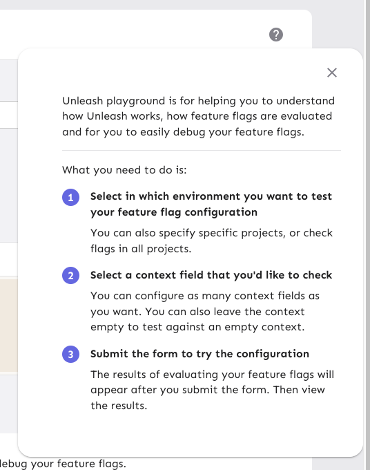
3. Update the playground guidance popper;
  i. Add an aria-label to the icon button
ii. Make the popper a `Popover` instead. This fixes a few issues: It
wasn't possible to focus or close just using the keyboard before.
Because it didn't steal focus, it also meant that it'd cover other parts
of the page. Now it traps focus so you can navigate to the close button,
and escape will also close it for you.
iii. Remove aria-describedby. Using aria-describedby on the button would
mean that the **button** is described by its content, which seems wrong.
aria-describedby should also only be used for plain strings. Complex
markups isn't supported. For that aria-details is the right way to go.
But because the popover is only rendered when it's open, the details or
describedby link will point to nothing most of the time.
iv. In doing this, there is a slight change in the popover shadow (I
couldn't find onef of our shadows that did the same thing as before),
but it matches other popovers we have, such as on the data usage tab.

Before:
![image](https://github.com/user-attachments/assets/8c2a3471-949f-4c01-b467-cde06c8980b5)

After:

![image](https://github.com/user-attachments/assets/980114c6-6552-4e75-8a6c-281b97a8af03)
2025-02-11 09:16:20 +01:00
Tymoteusz Czech
23e8040cd9
refactor: theme - font size (#9273) 2025-02-11 09:07:27 +01:00
Thomas Heartman
c4fa86b1aa
chore: make playground code editor height dynamic (#9271)
The playground code editor had a fixed height of `150px`. This works
well with the current font size, but if we're changing it, we'll end
up with too much height compared to the font size.

So instead, let's calculate the font size based on the current font
size.

Before this change (if you shrink font size):

![image](https://github.com/user-attachments/assets/cd6a5cc7-c5dc-421e-a34b-456cb1c318c7)

After this change:
 

![image](https://github.com/user-attachments/assets/b38cbc3d-7687-485f-8c36-244636b56f46)


It still looks the same with the old font size:

![image](https://github.com/user-attachments/assets/54cb69b3-4039-4422-9034-594aebc5a523)


Furthermore, this change uses `minHeight` instead of `height`, so that
if you have more JSON data, then you won't be stuck scrolling through 6
and 6 lines.

Before with lots of json:

![image](https://github.com/user-attachments/assets/8234fcd6-342c-44e7-a900-9893905c6191)


After with lots of json:

![image](https://github.com/user-attachments/assets/d77ee654-dfa5-4932-b0ed-0e6a39ca0b96)


And yes, the button doesn't respect the font size, but that's a
different task.
2025-02-10 12:36:16 +00:00
Nuno Góis
3bc72c84e0
chore: make truncator a span (#9272)
https://linear.app/unleash/issue/2-3255/make-truncator-a-span-instead-of-a-box

Makes the Truncator a `span` instead of a `Box`.

This should make it more flexible and help us avoid DOM nesting errors.
2025-02-10 12:29:58 +00:00
Simon Hornby
bf9fdd4f8d
feat: allow SCIM user deletion (#9190)
Co-authored-by: Gastón Fournier <gaston@getunleash.io>
2025-02-10 14:17:46 +02:00
Thomas Heartman
cdeb515488
chore: removes extra border on collapse for the event timeline (#9270)
Fixes a small visual glitch where the event timeline panel (which
usually doesn't have a bottom border on the summary) would get a
bottom border during the collapsing animation.

This happens because to make the border act as we want, we switch
between using the summary's bottom border and the content's top
border, and I'd only updated one of the borders to respect the new
design.
2025-02-10 10:52:32 +01:00