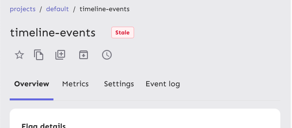
Reduces the size of the tab buttons on the flag page:
- Sets the min width to 100px instead of 160px on md screens. No change
for smaller screens
- Removes the min-height restriction imposed by theme.ts for the tab
bar, instead relying on the tab buttons to determine the height
(effectively changes the height from 70px to 62px).
Additionally: fixes an issue where the action buttons would overlap with
the tab buttons before wrapping and makes the tab bar scrollable. I can
no longer reproduce the issue where the action buttons force the tab bar
to be too small, but even if they should do that now, the tab bar is
scrollable so the remaining tabs are still accessible.
Because we only override the tabs' min-width on wider screens and mui
sets a default min-width, I changed the `onNarrowHeader` function to
`onWideHeader` and adjusted the other components accordingly. As a
bonus, the tab width and header wrapping now happens at the same time 🥳
After the change:

## Accessibility
This PR also addresses some of the a11y issues with this tab bar, namely
that it adds an `aria-label`, as mentioned in the [MUI
docs](https://v5.mui.com/material-ui/react-tabs/#accessibility).
It does **not**, however, connect the tabs to their corresponding tab
panels. The main reason for this is that we're not using tab panels and
that they're spread over 4 different components. We're probably using
the tabs component for something it isn't really designed to do in this
way. (Arguably they should be links and not buttons, for instance.) I'm
not going to touch this now, because that would probably be a lot of
work and it's not something I expect the business would prioritize.
## Changing theme.ts
While it's tempting to go in and change the `min-height` in `theme.ts`,
that would potentially affect all the other tab bars we have (although
maybe not, because we set a different min height for the tabs
themselves), I want to leave that for now. There is apparently some work
being done/prepared for the tabs, so it's probably better to leave that
for then.
Makes it so that the actions/tabs wrap on narrow width screens.
Constraints:
- When wrapping, the actions should go **before** the tabs, when not
wrapping, they should be placed **after**
- Need to maintain a logical tab order for wrapping, so just using
`flex-flow: row wrap-reverse` doesn't work because the tab order will be
wrong
- When the elements switch, you shouldn't lose your tab place in the
document
This solution uses container queries to determine the container size and
uses that to set the wrapping. Falls back to media queries if container
queries aren't supported (it's supported on >93% of browsers according
to caniuse).
The wrapping points don't use predefined media queries because:
- containers don't care about the size of the screen. It's the intrinsic
size of the container that matters.
- wrapping at 900px seemed too far out if container queries are
unsupported. But it's a fallback, so we can switch to that if we want.
If your keyboard focus is on one of the actions on a wide screen, and
the screen goes narrow, your focus will still be after the tabs (staying
consistent), so tabbing to the next element will take you into the flag
details, while backtab takes you back to the tabs.
Before wrapping:

After wrapping:
## A note on accessibility:
The spec for flexbox (taken from [MDN's
doc](https://developer.mozilla.org/en-US/docs/Web/CSS/CSS_flexible_box_layout/Ordering_flex_items))
states:
> "Authors must not use order or the *-reverse values of
[flex-flow](https://developer.mozilla.org/en-US/docs/Web/CSS/flex-flow)/flex-direction
as a substitute for correct source ordering, as that can ruin the
accessibility of the document."
So even if wrap-reverse works visually, it's not a good solution for
this.
- Button to show and hide environments
- Refactored hook storing state of hidden environments
- Changed the way flag is triggered for feature overview
- Visual updates for new page look

---------

Co-authored-by: Thomas Heartman <thomas@getunleash.io>
This fixes a problem where the yggdrasil-engine does not send the
correct value for bucket.start. In practice clients sends metrics every
60s and it does not matter if we use start or the stop timestamp to
resolve the nearest full hour.
This PR moves the flag page header into a separate file, so that the
overview file is more clearly focused on the overview.

Additionally, it moves the modals that are triggered from the header
into the new file. This should give a nice little performance boost, as
opening and closing these modals should no longer trigger a re-rendering
of the full flag overview page, only the header.
If the average number of days in a stage is 1, use `1 day` instead of
`1 days`.

Likewise, if your total number of archived flags is 1, use `1 flag
archived` instead of `1 flags archived`.

I grepped through the file, but couldn't find any other hardcoded
instances of "flags" or "days", so I think this is everything.
Fixes a bug where the dashboard would scroll you down from the top of
the page on load if your window was too short too see both the
selected flag and the selected project.

This solves it by immediately scrolling to the top of the page after
scrolling your selected element into view. Because this hook only runs
on page load, it shouldn't be safe. (At least I couldn't make this
misbehave with manual testing).

It also changes the list scroll behavior to scroll your selected item
to the top of the list instead of to the bottom (effectively). During
testing, that seems like a better solution to me.

## Background (or why do we auto-scroll here?)

The dashboard's flag and projects panels stores your last selection,
so that when you return to the page you'll be shown what you were
looking at last. This is especially useful if you have a lot of flags
but you're focusing on one in particular.

However, if you **do** have a lot of flags, then it's also quite
likely that your selection will be "below the fold" of the panel, and
you won't see your selected flag/project immediately in the
list (without scrolling).

It seemed like a nice UI affordance to automatically bring your
selected item into view (especially because without it, there's no way
to see what flag/project) you're looking at, so I added the

[`scrollIntoView`](https://developer.mozilla.org/en-US/docs/Web/API/Element/scrollIntoView)
hook.

What I didn't realize, however, is that it scrolls all scrollable
ancestor containers, which means that if your screen is too short,
it'll scroll you down the page.

From my reading of the docs and some local testing, I don't think
there is a way to limit the scrolling to only the nearest ancestor, so
the easiest way to ensure that we're always at the top seemed to be to
just scroll to the immediately after.
Currently, in enterprise we're struggling with setting service and
transactionality; all our verfications says that the setting key is not
present, so setting-store happily tries to insert a new row with a new
PK. However, somehow at the same time, the key already exists. This
commit adds conflict handling to the insertNewRow.
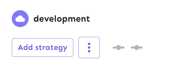
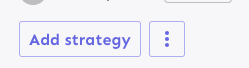
Fixes the height discrepancy between add strategy and more strategies
buttons, both with and without the flag enabled.
The essence of the fix is to make the "more strategies" button's height
dynamic and grow to match the height of the other button.
Before (flag enabled):
After (flag enabled):

Before (flag disabled):

After (flag disabled):
As a bonus: also enables the ui font redesign flag for server-dev.
If you're very sharp-eyed, you might notice a few things:
1. There's more padding on the new button. This was done in concert with
UX when we noticed there was more padding on other buttons. So as a
result, we set the button type to the default instead of "small".
1. The kebab button isn't perfectly square with the flag on. There's a
few issues here, but essentially: to use `aspect-ratio: 1`, you need
either a height or a width set. Because we want everything here to be
auto-generated (use the button's intrinsic height), I couldn't make it
work. In the end, I think this is close enough. If you have other ideas,
you're very welcome to try and fix it.