1
0
mirror of https://github.com/Unleash/unleash.git synced 2025-02-23 00:22:19 +01:00
Commit Graph

3959 Commits

Author SHA1 Message Date
Thomas Heartman
14b6b38238
feat(1-3379): add stale badge to the new header (#9320)
Without this, there's no way to tell if a flag is stale or not on the
flag page, so we're adding it back in. However, we'll only show the
badge if it's stale, not if it's an active flag.

Stale flag with badge:

![image](https://github.com/user-attachments/assets/eded97ab-0bba-41e5-8e1c-37cc90684c63)

When it wraps:

![image](https://github.com/user-attachments/assets/223eb672-20d2-4f3c-a5d9-34c3b739ce5e)

To make the badge line up properly when it wraps, I removed the
hard-coded margin in the badge. To counteract that, I've also removed
the hard-coded margin in the "copy name" button and switched to using
flex gaps to sort that.

It still looks right.

Before:

![image](https://github.com/user-attachments/assets/d945b067-c182-4448-967f-5505cf2e47ca)

After:

![image](https://github.com/user-attachments/assets/3b78b9fc-82b9-4d21-a53a-a3849819e916)
2025-02-18 12:34:46 +00:00
Thomas Heartman
4701dc1552
refactor: move feature overview header into separate file (#9319)
This PR moves the flag page header into a separate file, so that the
overview file is more clearly focused on the overview.

Additionally, it moves the modals that are triggered from the header
into the new file. This should give a nice little performance boost, as
opening and closing these modals should no longer trigger a re-rendering
of the full flag overview page, only the header.
2025-02-18 11:35:40 +01:00
Tymoteusz Czech
2ede2a6578
feat: new flag info box (#9308)
- updated spacing of elements
- modified header and "flag type" 
- added "collaborators"
- refactored tags

Co-authored-by: Thomas Heartman <thomas@getunleash.io>
2025-02-18 10:30:52 +01:00
Thomas Heartman
b15502ec5e
fix(1-3377): handle singular counts in project status lifecycle boxes (#9317)
If the average number of days in a stage is 1, use `1 day` instead of
`1 days`.

Likewise, if your total number of archived flags is 1, use `1 flag
archived` instead of `1 flags archived`.

I grepped through the file, but couldn't find any other hardcoded
instances of "flags" or "days", so I think this is everything.
2025-02-17 12:41:04 +00:00
Thomas Heartman
134c32589a
fix(1-3375): Fix unintended scroll on dashboard (#9316)
Fixes a bug where the dashboard would scroll you down from the top of
the page on load if your window was too short too see both the
selected flag and the selected project.

This solves it by immediately scrolling to the top of the page after
scrolling your selected element into view. Because this hook only runs
on page load, it shouldn't be safe. (At least I couldn't make this
misbehave with manual testing).

It also changes the list scroll behavior to scroll your selected item
to the top of the list instead of to the bottom (effectively). During
testing, that seems like a better solution to me.

## Background (or why do we auto-scroll here?)

The dashboard's flag and projects panels stores your last selection,
so that when you return to the page you'll be shown what you were
looking at last. This is especially useful if you have a lot of flags
but you're focusing on one in particular.

However, if you **do** have a lot of flags, then it's also quite
likely that your selection will be "below the fold" of the panel, and
you won't see your selected flag/project immediately in the
list (without scrolling).

It seemed like a nice UI affordance to automatically bring your
selected item into view (especially because without it, there's no way
to see what flag/project) you're looking at, so I added the

[`scrollIntoView`](https://developer.mozilla.org/en-US/docs/Web/API/Element/scrollIntoView)
hook.

What I didn't realize, however, is that it scrolls all scrollable
ancestor containers, which means that if your screen is too short,
it'll scroll you down the page.

From my reading of the docs and some local testing, I don't think
there is a way to limit the scrolling to only the nearest ancestor, so
the easiest way to ensure that we're always at the top seemed to be to
just scroll to the immediately after.
2025-02-17 12:07:35 +01:00
Mateusz Kwasniewski
b207606800
fix: delete project segment with change request (#9315) 2025-02-17 10:41:56 +01:00
Thomas Heartman
aafacc68cf
feat: new flag header (#9302)
Initial spike to add the new design for the flag page header
2025-02-14 14:33:35 +01:00
Tymoteusz Czech
b5bd5ee3f2
refactor: MuiTab font sizes (#9296)
I didn't find where this style is taken into account, but I don't like
leaving `1rem` when everything else is scaled down to 15px
2025-02-12 15:13:22 +01:00
Thomas Heartman
243088fdca
fix: Add strategy and more strategies button are different heights (#9300)
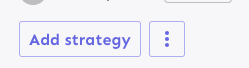
Fixes the height discrepancy between add strategy and more strategies
buttons, both with and without the flag enabled.

The essence of the fix is to make the "more strategies" button's height
dynamic and grow to match the height of the other button.


Before (flag enabled):

![image](https://github.com/user-attachments/assets/4dda44b3-3add-40cd-93ed-48150e73ac35)

After (flag enabled):

![image](https://github.com/user-attachments/assets/2788f141-fe64-4733-9202-f9f115396001)


Before (flag disabled):

![image](https://github.com/user-attachments/assets/c3a9d396-cb30-4a61-9400-45458189d3f2)

After (flag disabled):

![image](https://github.com/user-attachments/assets/0570ff85-401a-4e6f-93e7-d1619a4cd848)

As a bonus: also enables the ui font redesign flag for server-dev.

If you're very sharp-eyed, you might notice a few things:

1. There's more padding on the new button. This was done in concert with
UX when we noticed there was more padding on other buttons. So as a
result, we set the button type to the default instead of "small".

1. The kebab button isn't perfectly square with the flag on. There's a
few issues here, but essentially: to use `aspect-ratio: 1`, you need
either a height or a width set. Because we want everything here to be
auto-generated (use the button's intrinsic height), I couldn't make it
work. In the end, I think this is close enough. If you have other ideas,
you're very welcome to try and fix it.
2025-02-12 13:54:06 +01:00
Thomas Heartman
5c23a52119
fix: add some missing button labels on the project page (#9299)
Adds aria-labels to the env visibility toggle button and the "copy
env" button.
2025-02-12 09:39:03 +01:00
Thomas Heartman
f4e87389f1
fix: make the chip in the playground project selector small (#9298)
This makes it the same size as the env selector, fixing a slight
visual misalignment.

Doing a reference check, I can't find any other uses of this selector,
so I'm making the changes directly.

Before:

![image](https://github.com/user-attachments/assets/a9847dc7-8237-46bd-8d5b-7149a5682a59)

After:

![image](https://github.com/user-attachments/assets/a78d71ed-3391-4f72-9c8f-64f926a821cf)
2025-02-12 09:38:49 +01:00
Tymoteusz Czech
b035299a18
fix: command bar spacing (#9288) 2025-02-11 16:17:24 +01:00
Mateusz Kwasniewski
54766fd4a0
feat: connection count usage (#9294) 2025-02-11 16:15:45 +01:00
Thomas Heartman
abb0450a6a
fix: Use the right theme even if the payload is a variant. (#9292)
Also, use extra css selectors to increase specificity so that this
takes precedence over the MUI themes.

I don't like that we need to do this weird selector thing, but hey, it
is what it is.
2025-02-11 13:28:36 +00:00
Tymoteusz Czech
cac38b0cee
fix: font size flag change to boolean (#9290)
## About the changes
Fix for `uiGlobalFontSize` flag being returned as an object, which is truthy.
2025-02-11 13:24:18 +01:00
Thomas Heartman
63dbd40a2e
chore: add button styles to dark mode too (#9285)
This adds the same button stylings to the dark theme as we did to the
light theme in #9275.
2025-02-11 11:17:05 +01:00
Thomas Heartman
43a5d59225
fix: add legacy button styles (#9283)
Adds the button styles that were removed from `app.css` into the
legacy theme file. These change very slightly when the flag is on, and
because the hardcoded `app.css` styles have been removed, we'll use
the legacy file as fallback.
2025-02-11 09:32:26 +00:00
Thomas Heartman
65bec89d3c
chore(1-3356): make mui buttons respect font size changes (#9275)
Makes the MUI buttons use `body1.fontSize` for their own font size.

Turns out we had a hardcoded `16px` in the `app.css` file, which made it
hard to override. This change removes mui button styling in `app.css`
and puts it into the `theme.ts` file instead.

Also updates the border radius to match the one we use in the theme
(from 3px to 4px). It's a subtle change:

before:

![image](https://github.com/user-attachments/assets/a6f94250-9b4b-43e0-aa65-280f3fa007bb)


after:

![image](https://github.com/user-attachments/assets/3ef205c8-8119-4bf1-9541-39371b26dda9)
2025-02-11 08:33:27 +00:00
Thomas Heartman
fd1ad5ac5b
fix: some accessibility issues (#9282)
Fixes a small number of accessibility issues that Firefox was
complaining about (and some that I noticed myself):

1. In `CommandBar.tsx`, use a `Label` element instead of aria-label. We
can hide it with the `ScreenReaderOnly` component.
2. Add an `aria-label` to the icon button in the sidebar. (side note:
should we do any fancy detection on whether it's cmd + b or ctrl+b
there? I think we do that in the command bar)
3. Update the playground guidance popper;
  i. Add an aria-label to the icon button
ii. Make the popper a `Popover` instead. This fixes a few issues: It
wasn't possible to focus or close just using the keyboard before.
Because it didn't steal focus, it also meant that it'd cover other parts
of the page. Now it traps focus so you can navigate to the close button,
and escape will also close it for you.
iii. Remove aria-describedby. Using aria-describedby on the button would
mean that the **button** is described by its content, which seems wrong.
aria-describedby should also only be used for plain strings. Complex
markups isn't supported. For that aria-details is the right way to go.
But because the popover is only rendered when it's open, the details or
describedby link will point to nothing most of the time.
iv. In doing this, there is a slight change in the popover shadow (I
couldn't find onef of our shadows that did the same thing as before),
but it matches other popovers we have, such as on the data usage tab.

Before:

![image](https://github.com/user-attachments/assets/8c2a3471-949f-4c01-b467-cde06c8980b5)

After:

![image](https://github.com/user-attachments/assets/980114c6-6552-4e75-8a6c-281b97a8af03)
2025-02-11 09:16:20 +01:00
Tymoteusz Czech
23e8040cd9
refactor: theme - font size (#9273) 2025-02-11 09:07:27 +01:00
Thomas Heartman
c3cef5be18
fix: don't check license in OSS (#9277)
The license check API call was giving me 404s in the console of the
OSS version of Unleash.

This changes the `useLicense` hook to use `useEnterpriseSWR` instead
of `useSWR` to avoid making the API call in the OSS version. This is
consistent with the `useLicenseCheck` hook in the same file.
2025-02-10 15:16:34 +01:00
Thomas Heartman
c4fa86b1aa
chore: make playground code editor height dynamic (#9271)
The playground code editor had a fixed height of `150px`. This works
well with the current font size, but if we're changing it, we'll end
up with too much height compared to the font size.

So instead, let's calculate the font size based on the current font
size.

Before this change (if you shrink font size):

![image](https://github.com/user-attachments/assets/cd6a5cc7-c5dc-421e-a34b-456cb1c318c7)

After this change:
 

![image](https://github.com/user-attachments/assets/b38cbc3d-7687-485f-8c36-244636b56f46)


It still looks the same with the old font size:

![image](https://github.com/user-attachments/assets/54cb69b3-4039-4422-9034-594aebc5a523)


Furthermore, this change uses `minHeight` instead of `height`, so that
if you have more JSON data, then you won't be stuck scrolling through 6
and 6 lines.

Before with lots of json:

![image](https://github.com/user-attachments/assets/8234fcd6-342c-44e7-a900-9893905c6191)


After with lots of json:

![image](https://github.com/user-attachments/assets/d77ee654-dfa5-4932-b0ed-0e6a39ca0b96)


And yes, the button doesn't respect the font size, but that's a
different task.
2025-02-10 12:36:16 +00:00
Nuno Góis
3bc72c84e0
chore: make truncator a span (#9272)
https://linear.app/unleash/issue/2-3255/make-truncator-a-span-instead-of-a-box

Makes the Truncator a `span` instead of a `Box`.

This should make it more flexible and help us avoid DOM nesting errors.
2025-02-10 12:29:58 +00:00
Simon Hornby
bf9fdd4f8d
feat: allow SCIM user deletion (#9190)
Co-authored-by: Gastón Fournier <gaston@getunleash.io>
2025-02-10 14:17:46 +02:00
Thomas Heartman
cdeb515488
chore: removes extra border on collapse for the event timeline (#9270)
Fixes a small visual glitch where the event timeline panel (which
usually doesn't have a bottom border on the summary) would get a
bottom border during the collapsing animation.

This happens because to make the border act as we want, we switch
between using the summary's bottom border and the content's top
border, and I'd only updated one of the borders to respect the new
design.
2025-02-10 10:52:32 +01:00
Thomas Heartman
2b668bc5c8
fix: open/close animation on personal dashboard is choppy (#9253)
Extracts each panel into its own component for the personal dashboard.
This lets us use separate states for each panel, which in turn lets each
panel change its open / close state without causing the other panels to
re-render.

When you have a lot of flags and/or projects, the list to render becomes
very long, which causes performance problems, especially when you need
to rerender both flags and projects and the timeline whenever one of
them changes.

The problems were especially noticeable in Firefox for me. Even with
this, the event timeline is a little choppy. I suspect that's because of
it might take a long time to paint? But we can look into that later.

Also updates the dashboard state hook to let you only pass in the
flags/projects you want. We could extract this into three different
hooks that all use the same localhost key, but I'm not sure whether
that's better or worse 🤷🏼
2025-02-10 10:40:26 +01:00
Nuno Góis
c07fb589a7
chore: add release management to new in unleash (#9257)
https://linear.app/unleash/issue/2-3244/add-release-management-to-new-in-unleash

Adds release management to "New in Unleash".


![image](https://github.com/user-attachments/assets/5bbfc502-f730-4cd4-bf5e-747f1fe9e773)
2025-02-07 14:33:25 +00:00
Nuno Góis
13ac0567c5
chore: make the milestone status a button (#9255)
https://linear.app/unleash/issue/2-3251/make-the-milestone-status-action-link-and-icon-a-proper-button-that

Makes the milestone status a button while trying to keep most of the
original design intact.


![image](https://github.com/user-attachments/assets/677cb9df-8ae2-4244-8d07-6cd2bd1da5fe)
2025-02-07 14:03:59 +00:00
Thomas Heartman
c02c5a4d47
fix(1-3296): don't navigate through the list on tab (#9259)
Prevents tab from navigating you through the list of results. Instead
makes it so that the tab key always takes you to the next item in the
same hierarchy.

As a bonus: also automatically closes the menu when you navigate
away (the previous implementation has a bug where it wouldn't if you
shift-tab).

The behavior of not letting you navigate the list with tab is
consistent with native HTML select elements as well as MUI select
elements. You typically navigate them with the arrow keys.
2025-02-07 14:58:05 +01:00
Thomas Heartman
4f30ce7155
chore(1-3349): no border for event timeline / dropdowns to the right (#9252)
Removes the border between the accordion summary and its contents for
the event timeline, and moves dropdown selectors to the right to avoid
overcrowding on the left.


![image](https://github.com/user-attachments/assets/b0df4c11-8e61-46f8-b844-349a709bd4e9)
2025-02-07 11:11:54 +01:00
Thomas Heartman
f9bd9d2d03
Adds a more visible focus indicator to the filter chips (#9251)
When the filter chip is focused, adds a 1px solid outline in the theme's
primary color. This makes it easier to tell when the chip has focused.

Additionally, adds a slight refactor in how we call the event log result
component. I'm pretty sure I've seen react docs say that you should
always use the component calling instead of a regular function call, so
this does that.

Before (the first chip has focus; can you tell?):

![image](https://github.com/user-attachments/assets/8fb4382c-9a38-4d77-acc2-35ae9fed1180)

After:

![image](https://github.com/user-attachments/assets/7f6969c3-059f-4c0f-bbfc-9a295adf4070)


Optionally, we could do something similar to on hover (first one has
focus again), but it's kinda subtle and .. I don't think it's a theme
color we have defined:

![image](https://github.com/user-attachments/assets/3fc10d34-858f-4007-9a80-06c4df2fc756)
2025-02-07 10:22:08 +01:00
Tymoteusz Czech
4e36d2285e
chore: remove sortProjectRoles flag (#9226) 2025-02-06 19:40:10 +01:00
Nuno Góis
21fb9a3118
chore: release management plausible events (#9230)
https://linear.app/unleash/issue/2-2834/plausible

Adds the following Plausible events to the Release management feature:
 - Add plan
 - Start milestone
 - Remove plan
 - Create template
 - Edit template
 - Delete template
2025-02-06 16:09:15 +00:00
David Leek
e689e2e3d2
feat: implement dialogs for changerequest milestone handling and removing release plans (#9240) 2025-02-06 16:45:24 +01:00
Thomas Heartman
61f8236711
chore: changes the panel title to "Event timeline" (#9245)
Keeps it consistent with the previous title for this component and
with what it's known as in the docs.
2025-02-06 15:30:27 +01:00
Thomas Heartman
56c9584bb6
feat: move timeline to panel (#9243)
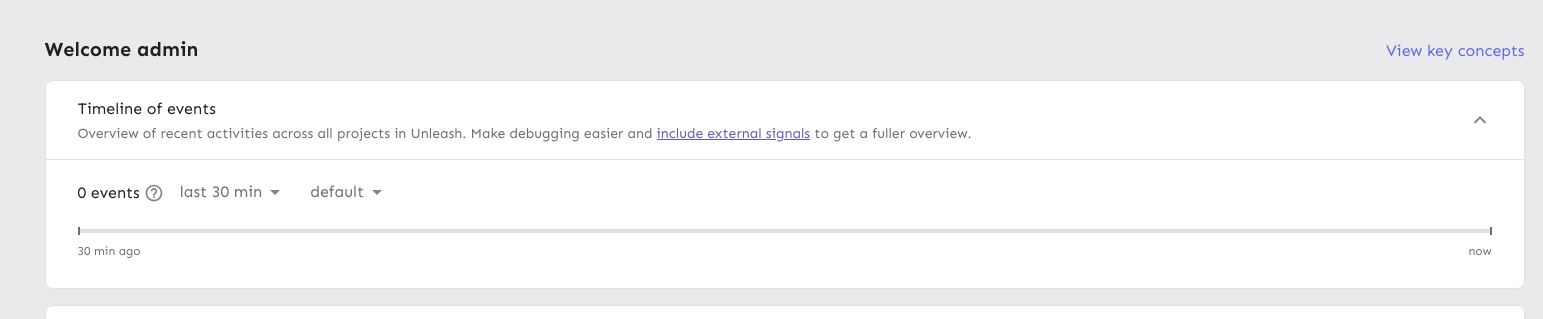
Moves the event timeline to the personal dashboard from the header when
the `frontendHeaderRedesign` flag is active.

When the flag is active, it also:
- hides the event timeline and corresponding button in the header
- renders the environment selector next to the time selector instead of
at the other end of the header


![image](https://github.com/user-attachments/assets/cccd8f07-d42a-4180-807f-20937019442d)

---------

Co-authored-by: Nuno Góis <github@nunogois.com>
2025-02-06 13:55:59 +00:00
Tymoteusz Czech
54e4fd2190
chore: remove lifecycle v2 flag (#9224) 2025-02-06 14:54:45 +01:00
Nuno Góis
4871cd57d1
chore: mark release management as an enterprise feature (#9229)
https://linear.app/unleash/issue/2-3093/sales-pitch-ui-for-release-management-to-show-non-enterprise-users

Marks Release Management as a premium Enterprise feature.

Once the `releasePlans` flag is enabled for everyone / removed, this is
what non-Enterprise users will see:


![image](https://github.com/user-attachments/assets/7191fb09-976e-4e14-8e2f-6db114b5e2ca)
2025-02-06 09:59:38 +00:00
Thomas Heartman
2ff385a4b6
fix(1-3295): fix broken skip link (#9239)
Fixes the issue where the skip link wouldn't take you to the main
content of the page anymore.

Also includes a few related minor semantic and a11y improvements:

1. The `main` element now only surrounds the actual main content of the
page. The sidebar is nav content and shouldn't be within it. The easiest
way to do this was to change the element that was previously a `main` to
a `div` and make the main content wrapper a `main` instead.
2. Makes the skip link target visible when focused. But invisible
otherwise. This has two benefits:
1. It's immediately obvious that using the skip link has worked. It
tells you that it's at the start of the main content.
2. Because the link now has text, it can be targeted by link search
(e.g. in Firefox, press `'` to search for links (I use this **a lot**)),
making it super easy to move your focus to the main content directly.
(Yes, landmark navigation should also work here, though, especially with
the `main` change).

The implementation of UI considerations of the skip link are based on
the CSS-tricks article [a deep dive on skipping to
content](https://css-tricks.com/a-deep-dive-on-skipping-to-content/)
from 2021.

Here's what it looks like when you skip to content:

![image](https://github.com/user-attachments/assets/c22819e6-f801-47d8-a9d9-908c250fd6ba)


When it doesn't have focus, it's invisible.
2025-02-06 10:21:56 +01:00
Nuno Góis
9fa7f5aa7b
chore: release plan changes in change request view (#9225)
https://linear.app/unleash/issue/2-3169/add-release-plan-ui-representation-in-change-request-ui

Adds visual representations for release plan change requests.

### Add release plan


![image](https://github.com/user-attachments/assets/8511c6a3-c83e-4eee-aa18-9affe4a9ac1d)

### Remove release plan


![image](https://github.com/user-attachments/assets/ed13f9ac-140c-40c9-a1a2-3c066c89c09a)

### Start milestone


![image](https://github.com/user-attachments/assets/ac8e5408-e877-470c-a98b-295b41444bfa)


![image](https://github.com/user-attachments/assets/abf19a55-89df-4dd8-8738-9dfcd63949b7)
2025-02-05 15:27:36 +00:00
Thomas Heartman
90e5adb695
chore: use union type for traffic search data (#9221)
Makes the data returned from the traffic search a union type to avoid
nasty object-is-undefined errors at runtime.

It requires more explicit handling, sure, but it means we don't need
to accept undefined.
2025-02-05 10:50:39 +00:00
Thomas Heartman
17a4099dbf
refactor: add functions to estimate monthly usage from data directly (#9219)
Adds new monthly estimation functions that operate on raw usage data
instead of chart data. This brings those methods in line with the rest
of the traffic calculation functions that we have in that file and means
we can remove other external dependencies.

 This is somewhat inspired by #9218, but not directly linked.
2025-02-05 11:12:17 +01:00
Thomas Heartman
543be6dede
chore(1-3342): extract into hook, use new endpoint if flag on (#9218)
Updates the existing BillingDetails pages (pro and payg) to use the new
traffic search endpoint (and calculations) if the flag to do so is on.
Otherwise, it falls back to using the existing method.

I've extracted the overage calculation into a separate shared hook.
2025-02-05 10:45:41 +01:00
Thomas Heartman
bd6a90ffd4
chore: add tests for new traffic usage functions (#9208)
This PR adds tests to all the TODOs created in
https://github.com/Unleash/unleash/pull/9191.

Additionally it finally manages to refactor the `toChartData` function.
2025-02-05 09:47:36 +01:00
Gastón Fournier
a4a5687687
feat: render markdown in toats (#9207)
## About the changes
Toasts sometimes render messages that are in markdown format. This
changes how we display them from

![image](https://github.com/user-attachments/assets/61930d1d-b54c-49a0-b982-af1484cd2981)
to this:
![Screenshot from 2025-02-04
15-23-36](https://github.com/user-attachments/assets/a569345c-abf5-4d9d-9cf6-4c94701689c7)
2025-02-04 16:35:25 +01:00
Gastón Fournier
ae65919f92
fix: license banner using message type (#9209)
## About the changes
Actually uses messageType and maps from warn to warning.
2025-02-04 15:14:47 +00:00
Thomas Heartman
c85c687816
chore(1-3335): filters data coming from the API to remove data points we're not interested in (#9205)
Implements a function that cleans and filters incoming data from the
new traffic API.

Specifically, it:
- Removes `/edge` data points
- Removes any data from before may 2024, which is the first full month
we have on record

Because all uses of the existing hook do this filtering themselves, I
have added the filtering at the hook level. This is to avoid
forgetting this filtering later. If we find out we need this data, we
can move the filtering.
2025-02-04 13:26:08 +01:00
Thomas Heartman
96dac84880
refactor: period selector component (#9202)
Refactors the period selector component now that the design / system is
pretty much finished.

Main points are: change from using CSS selectors to using styled
components; use props instead of classes. This is in keeping with the
general Unleash approach.

There's two very slight visual changes here:
1. There is 4px of added space below the "range" "header" text.
2. The months in the grid are a little closer together and not as wide.
This is because we remove the explicit column gap due to the grid having
a set width. Previously the width was automatic, but because we want
this to line up with the button, we need to set the width explicitly on
both items. As such, with the padding, the grid was a little too wide,
so there was too little padding on the right. This rectifies that.
2025-02-04 11:37:58 +01:00
Thomas Heartman
2980c0de4e
refactor(1-3336): useTrafficData / NetworkTrafficUsage.tsx cleanup (#9191)
This PR refactors the `NetworkTrafficUsage.tsx` and `useTrafficData`
files a bit.

The primary objective was to make the network traffic usage component
easier to work with, so I suggest to the reviewer that they start there.

Part of that refactoring, was taking things out of the useTraffic hook
that didn't need to be there. In the end, I'd removed so much that I
didn't even need the hook itself in the new component, so I switched
that to a regular useState.

It made more sense to me to put some of the functions inside the hook
into a separate file and import them directly (because they don't rely
on any hook state), so I have done that and removed those functions from
the trafficData hook. In this case, I also moved the tests.

I have not added any new tests in this PR, but will do so in a
follow-up. The functions I intend to test have been marked as such.
2025-02-04 10:32:59 +01:00
Tymoteusz Czech
c1e41b2b05
fix: users groups table columns on small screens (#9194)
On page "edit users for group", prevent user names and avatars form
disappearing on devices with small screen.
2025-02-04 10:19:40 +01:00