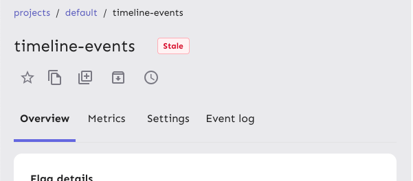
Reduces the size of the tab buttons on the flag page:
- Sets the min width to 100px instead of 160px on md screens. No change
for smaller screens
- Removes the min-height restriction imposed by theme.ts for the tab
bar, instead relying on the tab buttons to determine the height
(effectively changes the height from 70px to 62px).
Additionally: fixes an issue where the action buttons would overlap with
the tab buttons before wrapping and makes the tab bar scrollable. I can
no longer reproduce the issue where the action buttons force the tab bar
to be too small, but even if they should do that now, the tab bar is
scrollable so the remaining tabs are still accessible.
Because we only override the tabs' min-width on wider screens and mui
sets a default min-width, I changed the `onNarrowHeader` function to
`onWideHeader` and adjusted the other components accordingly. As a
bonus, the tab width and header wrapping now happens at the same time 🥳
After the change:

## Accessibility
This PR also addresses some of the a11y issues with this tab bar, namely
that it adds an `aria-label`, as mentioned in the [MUI
docs](https://v5.mui.com/material-ui/react-tabs/#accessibility).
It does **not**, however, connect the tabs to their corresponding tab
panels. The main reason for this is that we're not using tab panels and
that they're spread over 4 different components. We're probably using
the tabs component for something it isn't really designed to do in this
way. (Arguably they should be links and not buttons, for instance.) I'm
not going to touch this now, because that would probably be a lot of
work and it's not something I expect the business would prioritize.
## Changing theme.ts
While it's tempting to go in and change the `min-height` in `theme.ts`,
that would potentially affect all the other tab bars we have (although
maybe not, because we set a different min height for the tabs
themselves), I want to leave that for now. There is apparently some work
being done/prepared for the tabs, so it's probably better to leave that
for then.
Makes it so that the actions/tabs wrap on narrow width screens.
Constraints:
- When wrapping, the actions should go **before** the tabs, when not
wrapping, they should be placed **after**
- Need to maintain a logical tab order for wrapping, so just using
`flex-flow: row wrap-reverse` doesn't work because the tab order will be
wrong
- When the elements switch, you shouldn't lose your tab place in the
document
This solution uses container queries to determine the container size and
uses that to set the wrapping. Falls back to media queries if container
queries aren't supported (it's supported on >93% of browsers according
to caniuse).
The wrapping points don't use predefined media queries because:
- containers don't care about the size of the screen. It's the intrinsic
size of the container that matters.
- wrapping at 900px seemed too far out if container queries are
unsupported. But it's a fallback, so we can switch to that if we want.
If your keyboard focus is on one of the actions on a wide screen, and
the screen goes narrow, your focus will still be after the tabs (staying
consistent), so tabbing to the next element will take you into the flag
details, while backtab takes you back to the tabs.
Before wrapping:

After wrapping:
## A note on accessibility:
The spec for flexbox (taken from [MDN's
doc](https://developer.mozilla.org/en-US/docs/Web/CSS/CSS_flexible_box_layout/Ordering_flex_items))
states:
> "Authors must not use order or the *-reverse values of
[flex-flow](https://developer.mozilla.org/en-US/docs/Web/CSS/flex-flow)/flex-direction
as a substitute for correct source ordering, as that can ruin the
accessibility of the document."
So even if wrap-reverse works visually, it's not a good solution for
this.
- Button to show and hide environments
- Refactored hook storing state of hidden environments
- Changed the way flag is triggered for feature overview
- Visual updates for new page look

---------

Co-authored-by: Thomas Heartman <thomas@getunleash.io>
This PR moves the flag page header into a separate file, so that the
overview file is more clearly focused on the overview.

Additionally, it moves the modals that are triggered from the header
into the new file. This should give a nice little performance boost, as
opening and closing these modals should no longer trigger a re-rendering
of the full flag overview page, only the header.
If the average number of days in a stage is 1, use `1 day` instead of
`1 days`.

Likewise, if your total number of archived flags is 1, use `1 flag
archived` instead of `1 flags archived`.

I grepped through the file, but couldn't find any other hardcoded
instances of "flags" or "days", so I think this is everything.
Fixes a bug where the dashboard would scroll you down from the top of
the page on load if your window was too short too see both the
selected flag and the selected project.

This solves it by immediately scrolling to the top of the page after
scrolling your selected element into view. Because this hook only runs
on page load, it shouldn't be safe. (At least I couldn't make this
misbehave with manual testing).

It also changes the list scroll behavior to scroll your selected item
to the top of the list instead of to the bottom (effectively). During
testing, that seems like a better solution to me.

## Background (or why do we auto-scroll here?)

The dashboard's flag and projects panels stores your last selection,
so that when you return to the page you'll be shown what you were
looking at last. This is especially useful if you have a lot of flags
but you're focusing on one in particular.

However, if you **do** have a lot of flags, then it's also quite
likely that your selection will be "below the fold" of the panel, and
you won't see your selected flag/project immediately in the
list (without scrolling).

It seemed like a nice UI affordance to automatically bring your
selected item into view (especially because without it, there's no way
to see what flag/project) you're looking at, so I added the

[`scrollIntoView`](https://developer.mozilla.org/en-US/docs/Web/API/Element/scrollIntoView)
hook.

What I didn't realize, however, is that it scrolls all scrollable
ancestor containers, which means that if your screen is too short,
it'll scroll you down the page.

From my reading of the docs and some local testing, I don't think
there is a way to limit the scrolling to only the nearest ancestor, so
the easiest way to ensure that we're always at the top seemed to be to
just scroll to the immediately after.
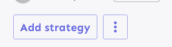
Fixes the height discrepancy between add strategy and more strategies
buttons, both with and without the flag enabled.
The essence of the fix is to make the "more strategies" button's height
dynamic and grow to match the height of the other button.
Before (flag enabled):
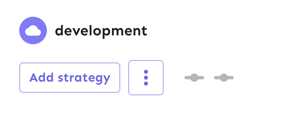
After (flag enabled):

Before (flag disabled):

After (flag disabled):
As a bonus: also enables the ui font redesign flag for server-dev.
If you're very sharp-eyed, you might notice a few things:
1. There's more padding on the new button. This was done in concert with
UX when we noticed there was more padding on other buttons. So as a
result, we set the button type to the default instead of "small".
1. The kebab button isn't perfectly square with the flag on. There's a
few issues here, but essentially: to use `aspect-ratio: 1`, you need
either a height or a width set. Because we want everything here to be
auto-generated (use the button's intrinsic height), I couldn't make it
work. In the end, I think this is close enough. If you have other ideas,
you're very welcome to try and fix it.
Also, use extra css selectors to increase specificity so that this
takes precedence over the MUI themes.

I don't like that we need to do this weird selector thing, but hey, it
is what it is.
Adds the button styles that were removed from `app.css` into the
legacy theme file. These change very slightly when the flag is on, and
because the hardcoded `app.css` styles have been removed, we'll use
the legacy file as fallback.
Fixes a small number of accessibility issues that Firefox was
complaining about (and some that I noticed myself):
1. In `CommandBar.tsx`, use a `Label` element instead of aria-label. We
can hide it with the `ScreenReaderOnly` component.
2. Add an `aria-label` to the icon button in the sidebar. (side note:
should we do any fancy detection on whether it's cmd + b or ctrl+b
there? I think we do that in the command bar)
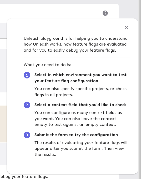
3. Update the playground guidance popper;
i. Add an aria-label to the icon button
ii. Make the popper a `Popover` instead. This fixes a few issues: It
wasn't possible to focus or close just using the keyboard before.
Because it didn't steal focus, it also meant that it'd cover other parts
of the page. Now it traps focus so you can navigate to the close button,
and escape will also close it for you.
iii. Remove aria-describedby. Using aria-describedby on the button would
mean that the **button** is described by its content, which seems wrong.
aria-describedby should also only be used for plain strings. Complex
markups isn't supported. For that aria-details is the right way to go.
But because the popover is only rendered when it's open, the details or
describedby link will point to nothing most of the time.
iv. In doing this, there is a slight change in the popover shadow (I
couldn't find onef of our shadows that did the same thing as before),
but it matches other popovers we have, such as on the data usage tab.
Before:
After:

The license check API call was giving me 404s in the console of the
OSS version of Unleash.

This changes the `useLicense` hook to use `useEnterpriseSWR` instead
of `useSWR` to avoid making the API call in the OSS version. This is
consistent with the `useLicenseCheck` hook in the same file.
Fixes a small visual glitch where the event timeline panel (which
usually doesn't have a bottom border on the summary) would get a
bottom border during the collapsing animation.

This happens because to make the border act as we want, we switch
between using the summary's bottom border and the content's top
border, and I'd only updated one of the borders to respect the new
design.
Extracts each panel into its own component for the personal dashboard.
This lets us use separate states for each panel, which in turn lets each
panel change its open / close state without causing the other panels to
re-render.

When you have a lot of flags and/or projects, the list to render becomes
very long, which causes performance problems, especially when you need
to rerender both flags and projects and the timeline whenever one of
them changes.

The problems were especially noticeable in Firefox for me. Even with
this, the event timeline is a little choppy. I suspect that's because of
it might take a long time to paint? But we can look into that later.

Also updates the dashboard state hook to let you only pass in the
flags/projects you want. We could extract this into three different
hooks that all use the same localhost key, but I'm not sure whether
that's better or worse 🤷🏼
Prevents tab from navigating you through the list of results. Instead
makes it so that the tab key always takes you to the next item in the
same hierarchy.

As a bonus: also automatically closes the menu when you navigate
away (the previous implementation has a bug where it wouldn't if you
shift-tab).

The behavior of not letting you navigate the list with tab is
consistent with native HTML select elements as well as MUI select
elements. You typically navigate them with the arrow keys.
https://linear.app/unleash/issue/2-2834/plausible

Adds the following Plausible events to the Release management feature:
 - Add plan
 - Start milestone
 - Remove plan
 - Create template
 - Edit template
 - Delete template
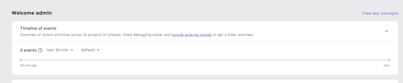
Moves the event timeline to the personal dashboard from the header when
the `frontendHeaderRedesign` flag is active.
When the flag is active, it also:
- hides the event timeline and corresponding button in the header
- renders the environment selector next to the time selector instead of
at the other end of the header
---------
Co-authored-by: Nuno Góis <github@nunogois.com>
Fixes the issue where the skip link wouldn't take you to the main
content of the page anymore.
Also includes a few related minor semantic and a11y improvements:
1. The `main` element now only surrounds the actual main content of the
page. The sidebar is nav content and shouldn't be within it. The easiest
way to do this was to change the element that was previously a `main` to
a `div` and make the main content wrapper a `main` instead.
2. Makes the skip link target visible when focused. But invisible
otherwise. This has two benefits:
1. It's immediately obvious that using the skip link has worked. It
tells you that it's at the start of the main content.
2. Because the link now has text, it can be targeted by link search
(e.g. in Firefox, press `'` to search for links (I use this **a lot**)),
making it super easy to move your focus to the main content directly.
(Yes, landmark navigation should also work here, though, especially with
the `main` change).
The implementation of UI considerations of the skip link are based on
the CSS-tricks article [a deep dive on skipping to
content](https://css-tricks.com/a-deep-dive-on-skipping-to-content/)
from 2021.
Here's what it looks like when you skip to content:

When it doesn't have focus, it's invisible.
Makes the data returned from the traffic search a union type to avoid
nasty object-is-undefined errors at runtime.

It requires more explicit handling, sure, but it means we don't need
to accept undefined.
Adds new monthly estimation functions that operate on raw usage data
instead of chart data. This brings those methods in line with the rest
of the traffic calculation functions that we have in that file and means
we can remove other external dependencies.

 This is somewhat inspired by #9218, but not directly linked.
Updates the existing BillingDetails pages (pro and payg) to use the new
traffic search endpoint (and calculations) if the flag to do so is on.
Otherwise, it falls back to using the existing method.

I've extracted the overage calculation into a separate shared hook.
Implements a function that cleans and filters incoming data from the
new traffic API.

Specifically, it:
- Removes `/edge` data points
- Removes any data from before may 2024, which is the first full month
we have on record

Because all uses of the existing hook do this filtering themselves, I
have added the filtering at the hook level. This is to avoid
forgetting this filtering later. If we find out we need this data, we
can move the filtering.
Refactors the period selector component now that the design / system is
pretty much finished.

Main points are: change from using CSS selectors to using styled
components; use props instead of classes. This is in keeping with the
general Unleash approach.

There's two very slight visual changes here:
1. There is 4px of added space below the "range" "header" text.
2. The months in the grid are a little closer together and not as wide.
This is because we remove the explicit column gap due to the grid having
a set width. Previously the width was automatic, but because we want
this to line up with the button, we need to set the width explicitly on
both items. As such, with the padding, the grid was a little too wide,
so there was too little padding on the right. This rectifies that.
This PR refactors the `NetworkTrafficUsage.tsx` and `useTrafficData`
files a bit.

The primary objective was to make the network traffic usage component
easier to work with, so I suggest to the reviewer that they start there.

Part of that refactoring, was taking things out of the useTraffic hook
that didn't need to be there. In the end, I'd removed so much that I
didn't even need the hook itself in the new component, so I switched
that to a regular useState.

It made more sense to me to put some of the functions inside the hook
into a separate file and import them directly (because they don't rely
on any hook state), so I have done that and removed those functions from
the trafficData hook. In this case, I also moved the tests.

I have not added any new tests in this PR, but will do so in a
follow-up. The functions I intend to test have been marked as such.
## About the changes
This gives us the ability to communicate other license messages which
are not errors. By default they'll be warning but I'm opening the
possibility of using a backend-provided value to make them informative
instead of warning.

The intention is to communicate things like:
- Your license is about to expire in x days.
- You are getting close to the maximum number of seats in your license
- etc
The test was breaking because it assumed a month would have at least
30 days.

Because the test relies on the current month, this isn't necessarily
true.

Further, there's parts of the code that relies on "impure" state via
the "current date" (which will change based on when you run it), so
setting a specific month in the test won't work.

As such, this test makes the calculation explicit and uses the number
of days in the current month.
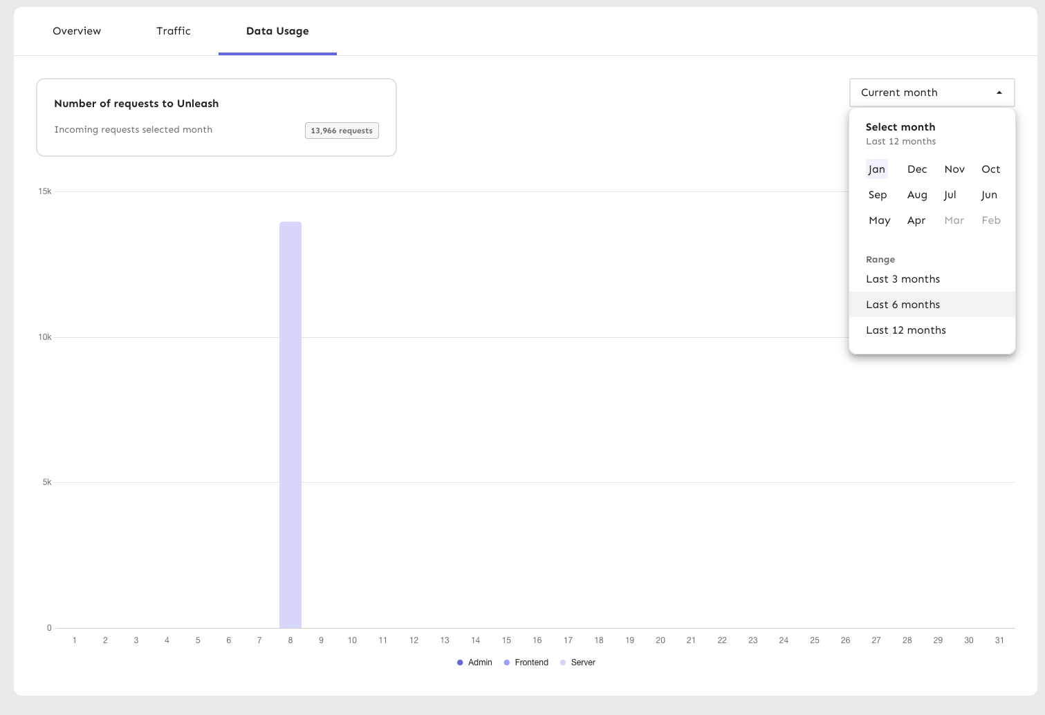
Wraps the datepicker in a popover, making it function largely the same
as a dropdown list.
The dropdown displays one of:
- "current month" if you've selected the current month
- "<month> <year>" (e.g. "December 2024") if you've selected a month
that isn't the current month
- "Last n months" (e.g. "Last 3 months") if you have selected a range
Additionally, the range selections have been updated to span the whole
row, aligning with the look of generic dropdown lists.
Like with the rest of this file (`PeriodSelector`), the code is rough
and not according to Unleash standards. However, I'm prioritizing fast
changes so UX can have a look before I clean up the code to switch to
using styled components etc later. It's still behind a flag, so I'm not
very worried about it.
This makes the width of the highlight bars in the network dynamic and
based on the number of labels included in the chart.
Since the number of labels should always correspond to the number of
data points, this seems like a sensible approach.
With this, the label width will now be calculated on the fly, so even if
you resize the window or change the number of labels, the highlighting
will still work as expected.
Daily view:
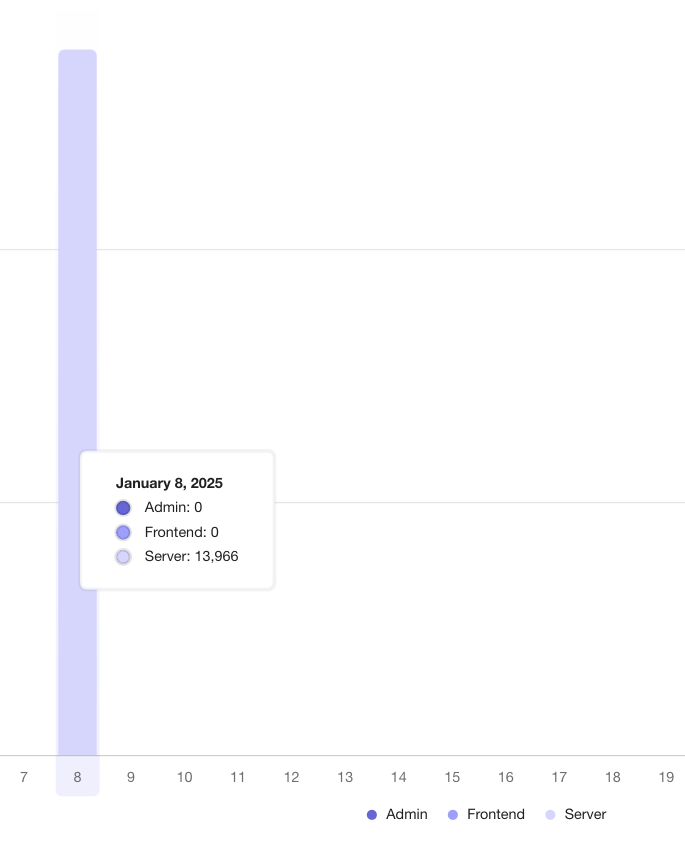
Monthly aggregate:
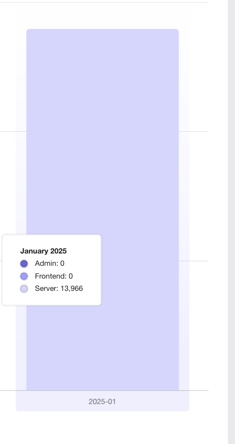
The labels are now a little narrower on the daily graphs, but it avoids
them being super wide on the monthly graphs
Adds support for the new /traffic-search API behind a flag. When active, you'll be able to select month ranges as well as specific single months.

Largely copies the existing network traffic component, and adds some minor tweaks to make it work with the new data.

This is quite rough, but it gives us a base to build on for later. There's still things that we need to solve for in following PRs.
This PR sets up the application to accept a value from a variant we
control to set the font size of the application on a global level. If it
fails, the value falls back to the previously set CSS value.
This PR implements a first version of the new month/range picker for the
data usage graphs. It's minimally hooked up to the existing
functionality to not take anything away.
This primary purpose of this PR is to get the design and interaction out
on sandbox so that UX can have a look and we can make adjustments.
As such, there are a few things in the code that we'll want to clean up
before removing the flag later:
- for faster iteration, I've used a lot of CSS nesting and element
selectors. this isn't usually how we do it here, so we'll probably want
to extract into styled components later
- there is a temporary override of the value in the period selector so
that you can select ranges. It won't affect the chart state, but it
affects the selector state. Again, this lets you see how it acts and
works.
- I've added a `NewHeader` component because the existing setup smushed
the selector (it's a MUI grid setup, which isn't very flexible). I don't
know what we want to do with this in the end, but the existing chart
*does* have some problems when you resize your window, at least
(although this is likely due to the chart, and can be solved in the same
way that we did for the personal dashboards).

This PR updates the tooltip date display in the traffic usage chart to
use the user's chosen locale settings, falling back to en-US if the
settings are unavailable or otherwise unset.
So, for instance, if I have set my locale to "ja-JP", I'd get this
instead of the en US format:

Fixes a bug where we'd call the project overview every second when on a
project page.

The reason this happens is that the connect SDK dialog sets up a fetcher
to re-fetch it every second.

The request should only be fired when the dialog is open, but because of
the way it's set up, we we're setting up the repeated fetch regardless
of whether the dialog was open or not.

This PR moves the dialog and all it's content into a nested component
that's only rendered if the dialog should be opened.
This PR fixes a bug wherein the list of tags to remove from a group of
tags wouldn't be correctly updated.

## Repro steps
- Add a console log line to
`frontend/src/component/feature/FeatureView/FeatureOverview/ManageTagsDialog/ManageBulkTagsDialog.tsx`'s
`ManagebulkTagsDialog`. Log the value of the`payload` variable.
- Pick a flag with no tags.
- Add tag A -> before submitting, you should have one added tag and zero
removed flags. After submitting, both should be empty.
- Now remove tag A -> before submitting, you should have one removed tag
and zero added tag. After submitting, both should be empty
- Notice that removed flags hasn't been emptied, but still contains tag
A.
- Now add tab B -> before submitting, you should have tag B in added and
nothing in removed. Notice that tag A is still in removed.


## Discussion points

This gives us both a `clear` and a `reset` event, which is unfortunate
because they sound like they do the same thing. I'd suggest renaming the
`clear` event (because it doesn't really clear the state completely),
but I'm not sure to what. Happy to do that if you have a suggestion.

I have not tested that submission of the form actually resets the state.
I spent about 45 minutes looking at it, but couldn't find a way that was
sensible and worked (considered spying: couldn't make it work;
considered refactoring and extracting components: think that's too much
of a change). I think this is benign enough that it can go without a
test for that thing actually being called.

I did, however, test the different reducer commands.
As of PR #8935, we no longer support both text and title, and confetti
has been removed.

This PR:
- removes `confetti` from the toast interface
- merges `text` and `title` into `text` and updates its uses across the
codebase.
- readjusts the text where necessary.
This PR removes all references to the `featuresExportImport` flag.

The flag was introduced in [PR
#3411](https://github.com/Unleash/unleash/pull/3411) on March 29th 2023,
and the flag was archived on April 3rd. The flag has always defaulted to
true.

We've looked at the project that introduced the flag and have spoken to CS about it: we can find no reason to keep the flag around. So well remove it now.