Fixes a bug where we'd call the project overview every second when on a
project page.

The reason this happens is that the connect SDK dialog sets up a fetcher
to re-fetch it every second.

The request should only be fired when the dialog is open, but because of
the way it's set up, we we're setting up the repeated fetch regardless
of whether the dialog was open or not.

This PR moves the dialog and all it's content into a nested component
that's only rendered if the dialog should be opened.
This PR fixes a bug wherein the list of tags to remove from a group of
tags wouldn't be correctly updated.

## Repro steps
- Add a console log line to
`frontend/src/component/feature/FeatureView/FeatureOverview/ManageTagsDialog/ManageBulkTagsDialog.tsx`'s
`ManagebulkTagsDialog`. Log the value of the`payload` variable.
- Pick a flag with no tags.
- Add tag A -> before submitting, you should have one added tag and zero
removed flags. After submitting, both should be empty.
- Now remove tag A -> before submitting, you should have one removed tag
and zero added tag. After submitting, both should be empty
- Notice that removed flags hasn't been emptied, but still contains tag
A.
- Now add tab B -> before submitting, you should have tag B in added and
nothing in removed. Notice that tag A is still in removed.


## Discussion points

This gives us both a `clear` and a `reset` event, which is unfortunate
because they sound like they do the same thing. I'd suggest renaming the
`clear` event (because it doesn't really clear the state completely),
but I'm not sure to what. Happy to do that if you have a suggestion.

I have not tested that submission of the form actually resets the state.
I spent about 45 minutes looking at it, but couldn't find a way that was
sensible and worked (considered spying: couldn't make it work;
considered refactoring and extracting components: think that's too much
of a change). I think this is benign enough that it can go without a
test for that thing actually being called.

I did, however, test the different reducer commands.
As of PR #8935, we no longer support both text and title, and confetti
has been removed.

This PR:
- removes `confetti` from the toast interface
- merges `text` and `title` into `text` and updates its uses across the
codebase.
- readjusts the text where necessary.
This PR removes all references to the `featuresExportImport` flag.

The flag was introduced in [PR
#3411](https://github.com/Unleash/unleash/pull/3411) on March 29th 2023,
and the flag was archived on April 3rd. The flag has always defaulted to
true.

We've looked at the project that introduced the flag and have spoken to CS about it: we can find no reason to keep the flag around. So well remove it now.
https://linear.app/unleash/issue/2-3038/release-plans-misc-ux-improvements
Includes various UX improvements focused on release plans:
- **New milestone status:** Introduced a "Paused" status for milestones.
A milestone is marked as "Paused" when it is active but the associated
environment is disabled.
- **Status display:** Paused milestones are labeled as "Paused (disabled
in environment)" for clarity.
- **Styling cleanup:** Removed unused disabled styling in the release
plan component.
- **Accordion stability:** Fixed visual shifting in milestone accordions
when toggling.
- **Strategy count:** Updated the "View Strategies" label to reflect the
total number of strategies in the milestone.
- **Edge case handling:** Improved rendering for milestones without
strategies.
- **Component extraction:** Refactored milestone status into a
standalone component.
- **Component organization:** Grouped milestone-specific components
under a `ReleasePlanMilestone` parent folder.
- **Template card cursor enhancement:** Set the cursor on the template
card to "pointer", so we better reflect the interactivity of the
element.
- **Template card created by enhancement:** Added an avatar for the
"Created by" field in release plan template cards, replacing the
creator's ID.
- **Navigation improvement:** After creating or editing a release plan
template, users are now redirected back to the release management page.


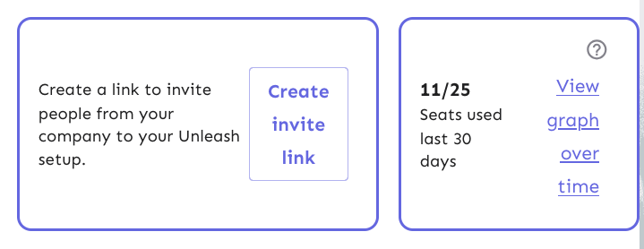
This change adds actual data from the server to the licensed users box
in the users header.

It also extracts the open sidebar button into its own component so
that we don't re-fetch the data when we open the sidebar. That's the
same issue we've had with project status and project creation screens,
etc.
This PR adds a proper dark theme for the activity graph. We previously
used the exact same theme for both light and dark modes.
Before:

After (different chart):
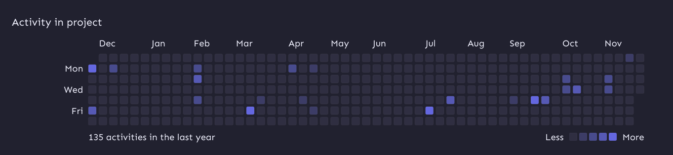
I'm also passing in the theme explicitly as the `colorScheme` property.
Without that prop, the graph uses your system color scheme (according to
the docs), which may not be the same as your Unleash theme color scheme.
To avoid getting visible borders for the activity squares, I've added a `svg rect` override on the containing element that sets the svg rect strokes to be invisible.
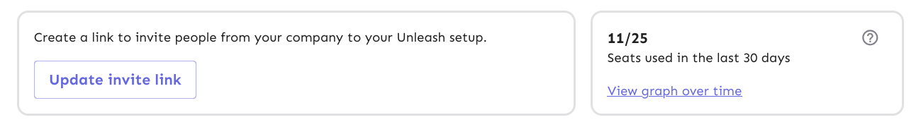
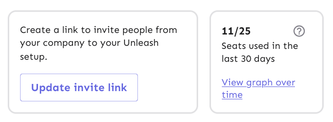
This PR throws in a number of fixes to the UsersHeader's invite link and
licensed users components:
- Change the border colors from the primary purple to being a standard
border color
- Fix text / button wrapping in the invite link component. It now wraps
such that the button goes onto the row below the text if it cannot fit
on the same row. The text within the button will not wrap until it
absolutely has to (and is on its own line).
- Fix the wrapping behavior of the licensed users box: the bottom row
("seats used 30 days" and "view graph over time") will now wrap at the
same time as the other button in the other box.
- Fix some text sizes within the licensed users box
- Fix the button to look more like a link in the licensed users box
Most of it is pretty standard fare, but I've taken a slightly different
route when it comes to the licensed users box component.
I switched the whole component to be a "figure" instead of an article. I
was trying to figure out how I could make it behave the way we wanted
visually while still linking the "seats over 30 days" to the "11 /25"
counter text. The examples on MDN use things such as code snippets,
poems, quotes, etc, in addition to the more common image elements. And
in a way, 11/25 is a figure representing the number of seats used, so I
went with that for now. That said, I'd be very interested to hear some
other takes on this.
Now, because the `figcaption` has to be the first or last element of a
`figure` element, I had to include the "open sidebar" button inside the
caption, which isn't ideal. But I can live with it, I think.
Before:


After:
