Implements playground results for strategies.
Old design:

New design:

Still left: segments.
I also discovered during this that some of the new hooks (and also some
of the new components) accept deprecated types
(`IFeatureStrategyPayload` in this case). If that should indeed be
deprecated, then we also shouldn't use it in the new hooks / components
if we can avoid it. I'll make a task for it.
---------
Co-authored-by: Tymoteusz Czech <2625371+Tymek@users.noreply.github.com>
Implements the new design for playground constraints. They're not in use
in segments yet, and strategy parameters have not been touched. This PR
establishes a pattern that we can follow for strategies and parameters
later.
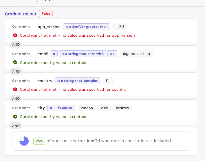
The PR also includes a change in how the constraint item organizes its
children: it now takes care adding padding and spacing itself, instead
of the children doing that. It looks right most places, but segments
aren't quite right anymore. However, as this is behind a flag, I'd
rather fix that in a separate PR.
---------
Co-authored-by: Tymoteusz Czech <2625371+Tymek@users.noreply.github.com>
Previously, the entire card was draggable, which meant that you couldn't
select text inside the card or inside the milestone title when editing.
This makes it so that only the drag handle is draggable.
Fixes a number of issues that would surface in UTC-n (where n > 1)
timezones. I've not found a way to check this with tests (and it looks
like [we weren't able to last time
either](https://github.com/Unleash/unleash/pull/9110/files#r1919746328)),
so all the testing's been done manually by adjusting my system time and
zone. (From what I understand, you can't generate a Date with a specific
TZ offset in JS: it's only utc or local time)

Resolved:
- [x] Selecting "Jan" in the dropdown results in the selection being
"December" (off by one in the selector)

- [x] Selecting a month view only gives you one data point (and it's
probably empty). Wrong date parsing on the way out resulted in sending
`{ from: "2025-02-28", to: "2025-02-28"}` instead of `{ from:
"2025-03-01", to: "2025-03-31"}`

- [x] The dates we create when making "daysRec" need to be adjusted.
They showed the wrong month, so the dates were off.

- [x] Make sure the labels are correct when hovering over. Again: we
used the wrong month for generating these.

- [x] The available months are wrong. Incorrect month parsing again.

- [x] The request summary month is wrong. You guessed it: incorrect
month parsing
- new way of showing strategy variants
- fixed wrapping issue in strategy editing, for a lot of variants
defined (`SplitPreviewSlider.tsx` change)
- aligned difference between API and manually added types
Initial rough work on adapting the playground strategies to the new
designs. This PR primarily splits components into Legacy files and adds
new replacements. There are *some* updates (including spacing and text
color), but nothing juicy yet. However, I wanted to get this in now,
before this PR grows even bigger.
Implements the new strategy list design for default strategies. Moves
the old impl into a legacy file. Also: removes the description from the
strategy item. From my digging, we only showed this for default strategy
items and it didn't really provide any useful information. The only
other place you can add a description is for custom strategies (at least
that I could find), but these are deprecated and we never show the
description when you apply the strategy anyway.
Rendered:
Without the flag (nothing changes):

Fixes a visual bug where envs without release plans would get too much
spacing on the top of their first strategy.
It does this flattening the list of strategies if there are no release
plans. In doing so, I have extracted the strategy list rendering into a
separate component (to make things more legible and re-usable) and have
also removed the FeatureStrategyEmpty component and marked it as
deprecated. In the new designs, you can't expand envs without
strategies, so the component is no longer needed.
Before (what looks like a shadow is actually the extra list being
rendered with a bit of padding):

After:
Moves strategy titles and names onto the same line, as per the new
designs.
In doing so, I've also updated the component to use a more semantic
hgroup with the header being the strategy title if it exists or the
strategy name if not.
The downside of being more semantically correct here is that we need to
know what header level we want the strategy to use. In most cases,
that's 3 (e.g. flag name > environment > strategy, release plan >
milestone > strategy), but for plans on flag envs, it's 4 (flag name >
env > milestone name > strategy).
I've also taken the opportunity to fix a little mistake I made earlier.
`ol`s can only have `li` children, and I'd forgotten to wrap a nested
`ol` inside an `li`. The changes in `EnvironmentAccordionBody` all
relate to that change. Because we now have several layers of lists
nested within each other, dealing with styling and padding gets a little
tricky, but CSS has the power do help us out here.
Rendered:

Use new design for release plans in flag environments.
- Move old ReleasePlanMilestone into Legacy file and update imports
- In the new version, use the same strategy list and item as in the
general strategy list and milestone template creation (components to be
extracted in the future)
- Fix an issue with the border being obscured by overflow by hiding
overflow

For past months, customers can refer to their invoices instead. Hiding
it when the selection is not the current month avoids weird things such
as estimation errors due to to a month not having finished (vs what it
actually *was* when it finished), potential changes in traffic package
pricing, etc.
Fixes an issue where, when dragging large expanded milestone cards, the
position would revert from the current visual state to the previous one
when you drop the item.
Avoids absolutely positioning the drag handle by instead creating a two
column grid where column 1 is the drag handle, column two is the
milestone card. The grid has a negative margin based on the padding of
the form container. I wanted to avoid modifying the form container
component (because we use it in so many places), so I used css variables
to store the information and hook into that further down the line.
Rendered:
Wide:
Narrow:

## Known bugs and limitations
The current drag implementation has some issues if you try to drag
something over a large, expanded card. They'll trade places visually,
but when you let go, the revert back to where they were. We can avoid
that by modifying the onDrop function in the drag handler, but I don't
want to do that before checking all the other places where we do drag
and drop ([linear
ticket](https://linear.app/unleash/issue/1-3458/drag-and-drop-is-a-little-finicky)).
I also want to get UX to sign off on this before making those changes.
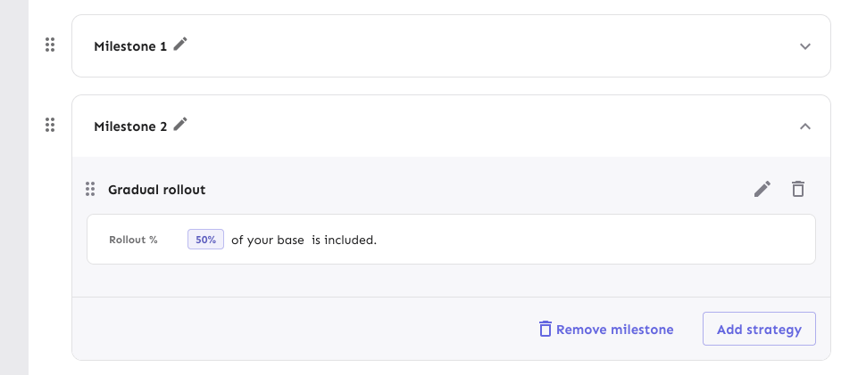
Here's an initial first pass of replacing the strategy lists in release
plan milestones.
The existing MilestoneCard has been moved to a Legacy file to avoid
conflicts.
This PR places the strategies in a list and changes the background color
of the list items (the strategies themselves still have a white
background, however).
It also re-orders the buttons in the footer and places the
milestone-level drag handle outside the milestone card.

## For later
Changing out the strategy list item itself hasn't been done yet. I want
to see if we can re-use the existing strategy draggable item instead of
making a copy. There's some dependencies on project path params etc that
need to be worked out first, though, so I'd prefer to do get these
initial changes through first.
Removes the `() => {} as any` args from the StrategyDraggableItem
invocation when you have paginated strats. Instead makes all the drag
params optional. It defaults to a no op if not provided.

Also, the reason it had to be typed as `any` before is probably because
it was missing a function. The correct empty param is `() => () => {}` 💁
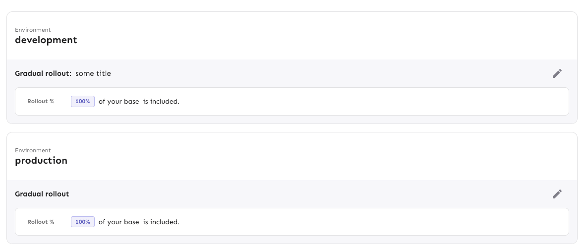
Adjusts styling of the env dropdown now that we have both release plans
and strategies.
Key points:
- simplifies strategy separator, removes inherent height. Also: extracts
it from the draggable component (it has no business knowing whether to
add that or not)
- Puts release plans and strategies in the same list so that it becomes:
```markdown
- Release plan
- strategy 1
- strategy 2
- (OR) Strategy A
- (OR) Strategy B
```
- Adjusts some padding around to make it line up properly
- Swaps a couple conditional renders for ternaries
Rendered:

## Still todo:
Handle cases where you have >50 strats and we show the warning etc. It's
a little trickier because of how it interacts with release plans, so I
wanna leave that for later.
I'm also unsure about how we handle spacing today. All the little items
have their own different spacing and I'm not sure it won't get out of
sync, but I'm also not sure how else to handle it. We should look at it
later.
Splits the release plan component into a Legacy component and a new one
with the initial changes for the new strategy list view.
Here's what it looks like:
Notice that the background color stops a little early (before the OR
token). I'll handle that in a follow-up because the changes also impact
how the rest of the env accordion body is rendered.
Improves the semantic correctness of the strategy list by wrapping it
in an `ol` tag.

Strategy order matters (due to variant resolution etc), so the order
is important (hence the `ol` instead of a `ul`).

Dragging still works and it's visually the same.
Updates the strategy list based on the new designs and moves the current
versions of the touched components into `Legacy...` files (the vast
majority of changes are that and updating imports). The relevant changes
to the components are listed in their original files.
Flag on:

Flag off:

## Next steps
There's two items to review for improving these current comments (also
noted inline):
- Whether to aria-hide the "or" separator or not (I need to read up a
bit and think whether it makes sense to show that or not)
- Changing the list of strategies into an actual ordered list (`ol`).
That'd reflect the semantics better.
Next would be checking the other places we use strategy lists and then
updating those too. In doing so, I might find that some things need to
be updated, but I'll handle those when I get there.
There's also handling release plans.
Lets you navigate to the top of the list when you're at the bottom,
and vice versa.

Arrow down at the end of the list takes you to the search field and
arrow up from the search field takes you to the end of the list.
Makes the env selector on the flag page act the same way as the env
selector on the new project page or any of the filterable buttons in the
new project/flag dialogs.
Also slightly changes the styles of the existing dropdown lists to bring
them in line with the new env selector (more padding, full-width
highlights).
Selector:

Project/flag creation:
Before:

After:
## Technical notes
I was a little unsure how best to share the padding/spacing styles
between the search field and popover at first (as was requested by UX).
The easiest way (and most compliant with how we do it today) was to
define the spacing in a variable and move the relevant components into
the same file.
However, I actually think that using a CSS variable (e.g.
`--popover-spacing`) would be "better" here, but we don't really use
them much, so I've left that out for now. That said, if you agree, I'd
be more than happy to use that instead 🙋🏼
Reduces the size of the tab buttons on the flag page:
- Sets the min width to 100px instead of 160px on md screens. No change
for smaller screens
- Removes the min-height restriction imposed by theme.ts for the tab
bar, instead relying on the tab buttons to determine the height
(effectively changes the height from 70px to 62px).
Additionally: fixes an issue where the action buttons would overlap with
the tab buttons before wrapping and makes the tab bar scrollable. I can
no longer reproduce the issue where the action buttons force the tab bar
to be too small, but even if they should do that now, the tab bar is
scrollable so the remaining tabs are still accessible.
Because we only override the tabs' min-width on wider screens and mui
sets a default min-width, I changed the `onNarrowHeader` function to
`onWideHeader` and adjusted the other components accordingly. As a
bonus, the tab width and header wrapping now happens at the same time 🥳
After the change:

## Accessibility
This PR also addresses some of the a11y issues with this tab bar, namely
that it adds an `aria-label`, as mentioned in the [MUI
docs](https://v5.mui.com/material-ui/react-tabs/#accessibility).
It does **not**, however, connect the tabs to their corresponding tab
panels. The main reason for this is that we're not using tab panels and
that they're spread over 4 different components. We're probably using
the tabs component for something it isn't really designed to do in this
way. (Arguably they should be links and not buttons, for instance.) I'm
not going to touch this now, because that would probably be a lot of
work and it's not something I expect the business would prioritize.
## Changing theme.ts
While it's tempting to go in and change the `min-height` in `theme.ts`,
that would potentially affect all the other tab bars we have (although
maybe not, because we set a different min height for the tabs
themselves), I want to leave that for now. There is apparently some work
being done/prepared for the tabs, so it's probably better to leave that
for then.
Makes it so that the actions/tabs wrap on narrow width screens.
Constraints:
- When wrapping, the actions should go **before** the tabs, when not
wrapping, they should be placed **after**
- Need to maintain a logical tab order for wrapping, so just using
`flex-flow: row wrap-reverse` doesn't work because the tab order will be
wrong
- When the elements switch, you shouldn't lose your tab place in the
document
This solution uses container queries to determine the container size and
uses that to set the wrapping. Falls back to media queries if container
queries aren't supported (it's supported on >93% of browsers according
to caniuse).
The wrapping points don't use predefined media queries because:
- containers don't care about the size of the screen. It's the intrinsic
size of the container that matters.
- wrapping at 900px seemed too far out if container queries are
unsupported. But it's a fallback, so we can switch to that if we want.
If your keyboard focus is on one of the actions on a wide screen, and
the screen goes narrow, your focus will still be after the tabs (staying
consistent), so tabbing to the next element will take you into the flag
details, while backtab takes you back to the tabs.
Before wrapping:

After wrapping:
## A note on accessibility:
The spec for flexbox (taken from [MDN's
doc](https://developer.mozilla.org/en-US/docs/Web/CSS/CSS_flexible_box_layout/Ordering_flex_items))
states:
> "Authors must not use order or the *-reverse values of
[flex-flow](https://developer.mozilla.org/en-US/docs/Web/CSS/flex-flow)/flex-direction
as a substitute for correct source ordering, as that can ruin the
accessibility of the document."
So even if wrap-reverse works visually, it's not a good solution for
this.
- Button to show and hide environments
- Refactored hook storing state of hidden environments
- Changed the way flag is triggered for feature overview
- Visual updates for new page look

---------

Co-authored-by: Thomas Heartman <thomas@getunleash.io>
This PR moves the flag page header into a separate file, so that the
overview file is more clearly focused on the overview.

Additionally, it moves the modals that are triggered from the header
into the new file. This should give a nice little performance boost, as
opening and closing these modals should no longer trigger a re-rendering
of the full flag overview page, only the header.
If the average number of days in a stage is 1, use `1 day` instead of
`1 days`.

Likewise, if your total number of archived flags is 1, use `1 flag
archived` instead of `1 flags archived`.

I grepped through the file, but couldn't find any other hardcoded
instances of "flags" or "days", so I think this is everything.
Fixes a bug where the dashboard would scroll you down from the top of
the page on load if your window was too short too see both the
selected flag and the selected project.

This solves it by immediately scrolling to the top of the page after
scrolling your selected element into view. Because this hook only runs
on page load, it shouldn't be safe. (At least I couldn't make this
misbehave with manual testing).

It also changes the list scroll behavior to scroll your selected item
to the top of the list instead of to the bottom (effectively). During
testing, that seems like a better solution to me.

## Background (or why do we auto-scroll here?)

The dashboard's flag and projects panels stores your last selection,
so that when you return to the page you'll be shown what you were
looking at last. This is especially useful if you have a lot of flags
but you're focusing on one in particular.

However, if you **do** have a lot of flags, then it's also quite
likely that your selection will be "below the fold" of the panel, and
you won't see your selected flag/project immediately in the
list (without scrolling).

It seemed like a nice UI affordance to automatically bring your
selected item into view (especially because without it, there's no way
to see what flag/project) you're looking at, so I added the

[`scrollIntoView`](https://developer.mozilla.org/en-US/docs/Web/API/Element/scrollIntoView)
hook.

What I didn't realize, however, is that it scrolls all scrollable
ancestor containers, which means that if your screen is too short,
it'll scroll you down the page.

From my reading of the docs and some local testing, I don't think
there is a way to limit the scrolling to only the nearest ancestor, so
the easiest way to ensure that we're always at the top seemed to be to
just scroll to the immediately after.
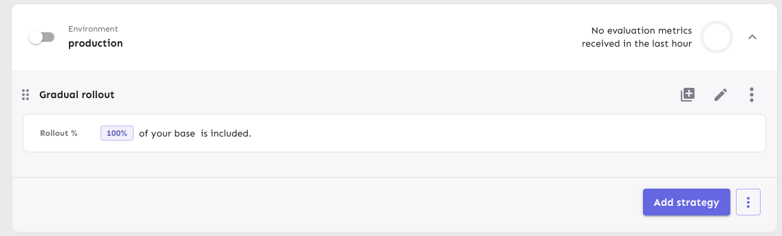
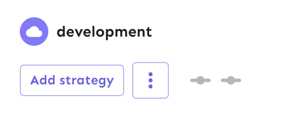
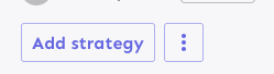
Fixes the height discrepancy between add strategy and more strategies
buttons, both with and without the flag enabled.
The essence of the fix is to make the "more strategies" button's height
dynamic and grow to match the height of the other button.
Before (flag enabled):
After (flag enabled):

Before (flag disabled):

After (flag disabled):
As a bonus: also enables the ui font redesign flag for server-dev.
If you're very sharp-eyed, you might notice a few things:
1. There's more padding on the new button. This was done in concert with
UX when we noticed there was more padding on other buttons. So as a
result, we set the button type to the default instead of "small".
1. The kebab button isn't perfectly square with the flag on. There's a
few issues here, but essentially: to use `aspect-ratio: 1`, you need
either a height or a width set. Because we want everything here to be
auto-generated (use the button's intrinsic height), I couldn't make it
work. In the end, I think this is close enough. If you have other ideas,
you're very welcome to try and fix it.
Also, use extra css selectors to increase specificity so that this
takes precedence over the MUI themes.

I don't like that we need to do this weird selector thing, but hey, it
is what it is.
Adds the button styles that were removed from `app.css` into the
legacy theme file. These change very slightly when the flag is on, and
because the hardcoded `app.css` styles have been removed, we'll use
the legacy file as fallback.
Fixes a small number of accessibility issues that Firefox was
complaining about (and some that I noticed myself):
1. In `CommandBar.tsx`, use a `Label` element instead of aria-label. We
can hide it with the `ScreenReaderOnly` component.
2. Add an `aria-label` to the icon button in the sidebar. (side note:
should we do any fancy detection on whether it's cmd + b or ctrl+b
there? I think we do that in the command bar)
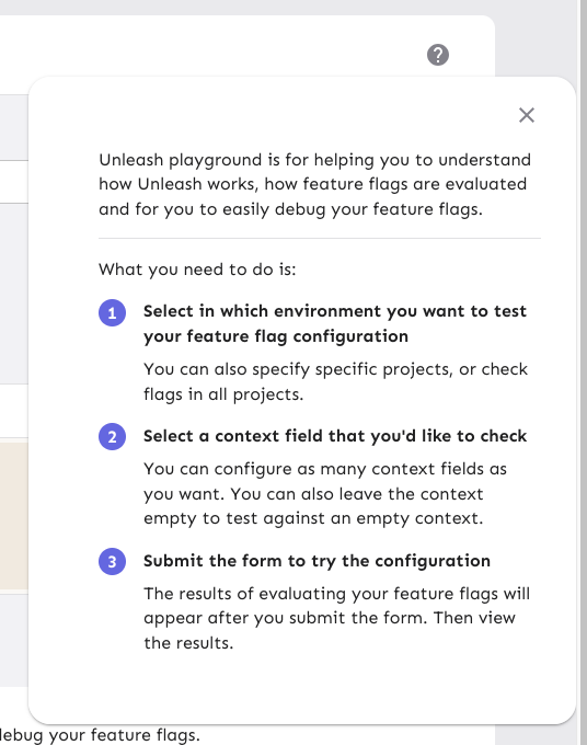
3. Update the playground guidance popper;
i. Add an aria-label to the icon button
ii. Make the popper a `Popover` instead. This fixes a few issues: It
wasn't possible to focus or close just using the keyboard before.
Because it didn't steal focus, it also meant that it'd cover other parts
of the page. Now it traps focus so you can navigate to the close button,
and escape will also close it for you.
iii. Remove aria-describedby. Using aria-describedby on the button would
mean that the **button** is described by its content, which seems wrong.
aria-describedby should also only be used for plain strings. Complex
markups isn't supported. For that aria-details is the right way to go.
But because the popover is only rendered when it's open, the details or
describedby link will point to nothing most of the time.
iv. In doing this, there is a slight change in the popover shadow (I
couldn't find onef of our shadows that did the same thing as before),
but it matches other popovers we have, such as on the data usage tab.
Before:
After:

The license check API call was giving me 404s in the console of the
OSS version of Unleash.

This changes the `useLicense` hook to use `useEnterpriseSWR` instead
of `useSWR` to avoid making the API call in the OSS version. This is
consistent with the `useLicenseCheck` hook in the same file.
Fixes a small visual glitch where the event timeline panel (which
usually doesn't have a bottom border on the summary) would get a
bottom border during the collapsing animation.

This happens because to make the border act as we want, we switch
between using the summary's bottom border and the content's top
border, and I'd only updated one of the borders to respect the new
design.
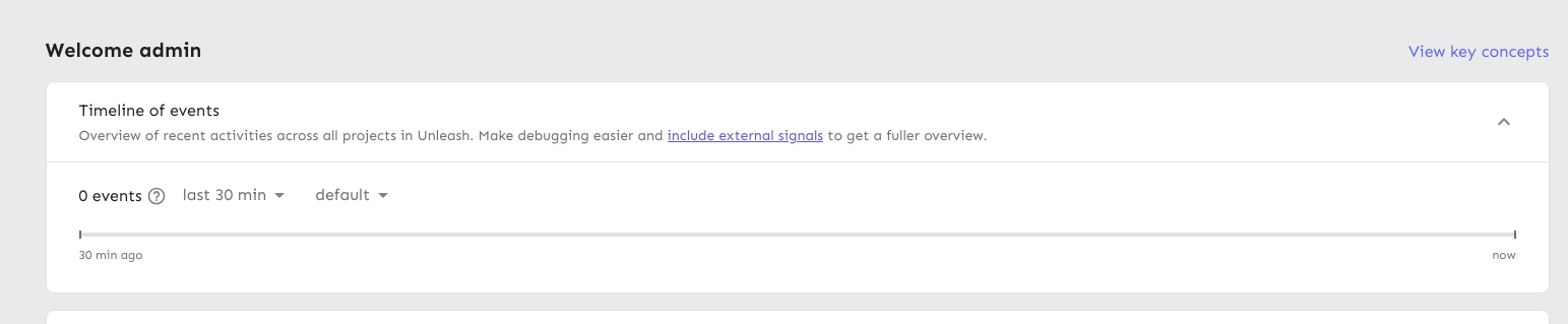
Extracts each panel into its own component for the personal dashboard.
This lets us use separate states for each panel, which in turn lets each
panel change its open / close state without causing the other panels to
re-render.

When you have a lot of flags and/or projects, the list to render becomes
very long, which causes performance problems, especially when you need
to rerender both flags and projects and the timeline whenever one of
them changes.

The problems were especially noticeable in Firefox for me. Even with
this, the event timeline is a little choppy. I suspect that's because of
it might take a long time to paint? But we can look into that later.

Also updates the dashboard state hook to let you only pass in the
flags/projects you want. We could extract this into three different
hooks that all use the same localhost key, but I'm not sure whether
that's better or worse 🤷🏼
Prevents tab from navigating you through the list of results. Instead
makes it so that the tab key always takes you to the next item in the
same hierarchy.

As a bonus: also automatically closes the menu when you navigate
away (the previous implementation has a bug where it wouldn't if you
shift-tab).

The behavior of not letting you navigate the list with tab is
consistent with native HTML select elements as well as MUI select
elements. You typically navigate them with the arrow keys.
https://linear.app/unleash/issue/2-2834/plausible

Adds the following Plausible events to the Release management feature:
 - Add plan
 - Start milestone
 - Remove plan
 - Create template
 - Edit template
 - Delete template
Moves the event timeline to the personal dashboard from the header when
the `frontendHeaderRedesign` flag is active.
When the flag is active, it also:
- hides the event timeline and corresponding button in the header
- renders the environment selector next to the time selector instead of
at the other end of the header
---------
Co-authored-by: Nuno Góis <github@nunogois.com>
Fixes the issue where the skip link wouldn't take you to the main
content of the page anymore.
Also includes a few related minor semantic and a11y improvements:
1. The `main` element now only surrounds the actual main content of the
page. The sidebar is nav content and shouldn't be within it. The easiest
way to do this was to change the element that was previously a `main` to
a `div` and make the main content wrapper a `main` instead.
2. Makes the skip link target visible when focused. But invisible
otherwise. This has two benefits:
1. It's immediately obvious that using the skip link has worked. It
tells you that it's at the start of the main content.
2. Because the link now has text, it can be targeted by link search
(e.g. in Firefox, press `'` to search for links (I use this **a lot**)),
making it super easy to move your focus to the main content directly.
(Yes, landmark navigation should also work here, though, especially with
the `main` change).
The implementation of UI considerations of the skip link are based on
the CSS-tricks article [a deep dive on skipping to
content](https://css-tricks.com/a-deep-dive-on-skipping-to-content/)
from 2021.
Here's what it looks like when you skip to content:

When it doesn't have focus, it's invisible.
Makes the data returned from the traffic search a union type to avoid
nasty object-is-undefined errors at runtime.

It requires more explicit handling, sure, but it means we don't need
to accept undefined.
Adds new monthly estimation functions that operate on raw usage data
instead of chart data. This brings those methods in line with the rest
of the traffic calculation functions that we have in that file and means
we can remove other external dependencies.

 This is somewhat inspired by #9218, but not directly linked.
Updates the existing BillingDetails pages (pro and payg) to use the new
traffic search endpoint (and calculations) if the flag to do so is on.
Otherwise, it falls back to using the existing method.

I've extracted the overage calculation into a separate shared hook.
Implements a function that cleans and filters incoming data from the
new traffic API.

Specifically, it:
- Removes `/edge` data points
- Removes any data from before may 2024, which is the first full month
we have on record

Because all uses of the existing hook do this filtering themselves, I
have added the filtering at the hook level. This is to avoid
forgetting this filtering later. If we find out we need this data, we
can move the filtering.
Refactors the period selector component now that the design / system is
pretty much finished.

Main points are: change from using CSS selectors to using styled
components; use props instead of classes. This is in keeping with the
general Unleash approach.

There's two very slight visual changes here:
1. There is 4px of added space below the "range" "header" text.
2. The months in the grid are a little closer together and not as wide.
This is because we remove the explicit column gap due to the grid having
a set width. Previously the width was automatic, but because we want
this to line up with the button, we need to set the width explicitly on
both items. As such, with the padding, the grid was a little too wide,
so there was too little padding on the right. This rectifies that.
This PR refactors the `NetworkTrafficUsage.tsx` and `useTrafficData`
files a bit.

The primary objective was to make the network traffic usage component
easier to work with, so I suggest to the reviewer that they start there.

Part of that refactoring, was taking things out of the useTraffic hook
that didn't need to be there. In the end, I'd removed so much that I
didn't even need the hook itself in the new component, so I switched
that to a regular useState.

It made more sense to me to put some of the functions inside the hook
into a separate file and import them directly (because they don't rely
on any hook state), so I have done that and removed those functions from
the trafficData hook. In this case, I also moved the tests.

I have not added any new tests in this PR, but will do so in a
follow-up. The functions I intend to test have been marked as such.
## About the changes
This gives us the ability to communicate other license messages which
are not errors. By default they'll be warning but I'm opening the
possibility of using a backend-provided value to make them informative
instead of warning.

The intention is to communicate things like:
- Your license is about to expire in x days.
- You are getting close to the maximum number of seats in your license
- etc
The test was breaking because it assumed a month would have at least
30 days.

Because the test relies on the current month, this isn't necessarily
true.

Further, there's parts of the code that relies on "impure" state via
the "current date" (which will change based on when you run it), so
setting a specific month in the test won't work.

As such, this test makes the calculation explicit and uses the number
of days in the current month.
Wraps the datepicker in a popover, making it function largely the same
as a dropdown list.
The dropdown displays one of:
- "current month" if you've selected the current month
- "<month> <year>" (e.g. "December 2024") if you've selected a month
that isn't the current month
- "Last n months" (e.g. "Last 3 months") if you have selected a range
Additionally, the range selections have been updated to span the whole
row, aligning with the look of generic dropdown lists.
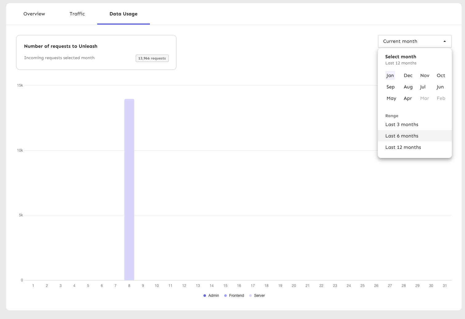
Like with the rest of this file (`PeriodSelector`), the code is rough
and not according to Unleash standards. However, I'm prioritizing fast
changes so UX can have a look before I clean up the code to switch to
using styled components etc later. It's still behind a flag, so I'm not
very worried about it.
This makes the width of the highlight bars in the network dynamic and
based on the number of labels included in the chart.
Since the number of labels should always correspond to the number of
data points, this seems like a sensible approach.
With this, the label width will now be calculated on the fly, so even if
you resize the window or change the number of labels, the highlighting
will still work as expected.
Daily view:
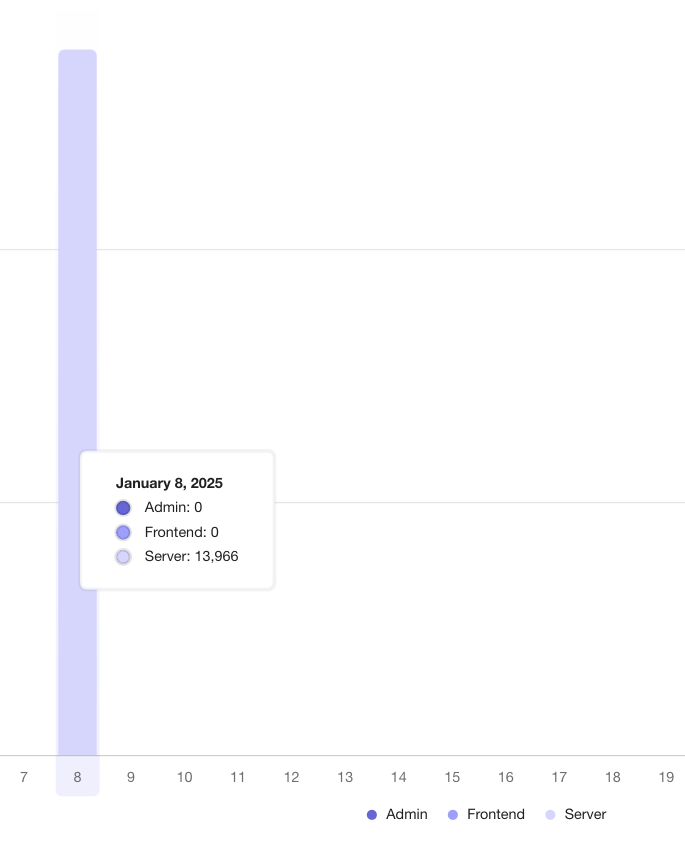
Monthly aggregate:
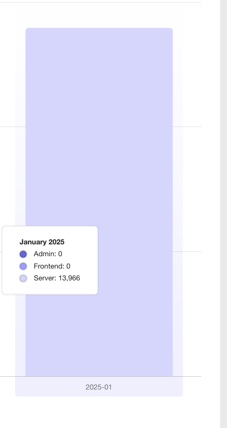
The labels are now a little narrower on the daily graphs, but it avoids
them being super wide on the monthly graphs
Adds support for the new /traffic-search API behind a flag. When active, you'll be able to select month ranges as well as specific single months.

Largely copies the existing network traffic component, and adds some minor tweaks to make it work with the new data.

This is quite rough, but it gives us a base to build on for later. There's still things that we need to solve for in following PRs.
This PR sets up the application to accept a value from a variant we
control to set the font size of the application on a global level. If it
fails, the value falls back to the previously set CSS value.
This PR implements a first version of the new month/range picker for the
data usage graphs. It's minimally hooked up to the existing
functionality to not take anything away.
This primary purpose of this PR is to get the design and interaction out
on sandbox so that UX can have a look and we can make adjustments.
As such, there are a few things in the code that we'll want to clean up
before removing the flag later:
- for faster iteration, I've used a lot of CSS nesting and element
selectors. this isn't usually how we do it here, so we'll probably want
to extract into styled components later
- there is a temporary override of the value in the period selector so
that you can select ranges. It won't affect the chart state, but it
affects the selector state. Again, this lets you see how it acts and
works.
- I've added a `NewHeader` component because the existing setup smushed
the selector (it's a MUI grid setup, which isn't very flexible). I don't
know what we want to do with this in the end, but the existing chart
*does* have some problems when you resize your window, at least
(although this is likely due to the chart, and can be solved in the same
way that we did for the personal dashboards).

This PR updates the tooltip date display in the traffic usage chart to
use the user's chosen locale settings, falling back to en-US if the
settings are unavailable or otherwise unset.
So, for instance, if I have set my locale to "ja-JP", I'd get this
instead of the en US format:

Fixes a bug where we'd call the project overview every second when on a
project page.

The reason this happens is that the connect SDK dialog sets up a fetcher
to re-fetch it every second.

The request should only be fired when the dialog is open, but because of
the way it's set up, we we're setting up the repeated fetch regardless
of whether the dialog was open or not.

This PR moves the dialog and all it's content into a nested component
that's only rendered if the dialog should be opened.
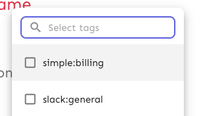
This PR fixes a bug wherein the list of tags to remove from a group of
tags wouldn't be correctly updated.

## Repro steps
- Add a console log line to
`frontend/src/component/feature/FeatureView/FeatureOverview/ManageTagsDialog/ManageBulkTagsDialog.tsx`'s
`ManagebulkTagsDialog`. Log the value of the`payload` variable.
- Pick a flag with no tags.
- Add tag A -> before submitting, you should have one added tag and zero
removed flags. After submitting, both should be empty.
- Now remove tag A -> before submitting, you should have one removed tag
and zero added tag. After submitting, both should be empty
- Notice that removed flags hasn't been emptied, but still contains tag
A.
- Now add tab B -> before submitting, you should have tag B in added and
nothing in removed. Notice that tag A is still in removed.


## Discussion points

This gives us both a `clear` and a `reset` event, which is unfortunate
because they sound like they do the same thing. I'd suggest renaming the
`clear` event (because it doesn't really clear the state completely),
but I'm not sure to what. Happy to do that if you have a suggestion.

I have not tested that submission of the form actually resets the state.
I spent about 45 minutes looking at it, but couldn't find a way that was
sensible and worked (considered spying: couldn't make it work;
considered refactoring and extracting components: think that's too much
of a change). I think this is benign enough that it can go without a
test for that thing actually being called.

I did, however, test the different reducer commands.
As of PR #8935, we no longer support both text and title, and confetti
has been removed.

This PR:
- removes `confetti` from the toast interface
- merges `text` and `title` into `text` and updates its uses across the
codebase.
- readjusts the text where necessary.
This PR removes all references to the `featuresExportImport` flag.

The flag was introduced in [PR
#3411](https://github.com/Unleash/unleash/pull/3411) on March 29th 2023,
and the flag was archived on April 3rd. The flag has always defaulted to
true.

We've looked at the project that introduced the flag and have spoken to CS about it: we can find no reason to keep the flag around. So well remove it now.
https://linear.app/unleash/issue/2-3038/release-plans-misc-ux-improvements
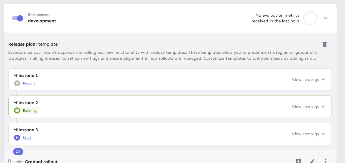
Includes various UX improvements focused on release plans:
- **New milestone status:** Introduced a "Paused" status for milestones.
A milestone is marked as "Paused" when it is active but the associated
environment is disabled.
- **Status display:** Paused milestones are labeled as "Paused (disabled
in environment)" for clarity.
- **Styling cleanup:** Removed unused disabled styling in the release
plan component.
- **Accordion stability:** Fixed visual shifting in milestone accordions
when toggling.
- **Strategy count:** Updated the "View Strategies" label to reflect the
total number of strategies in the milestone.
- **Edge case handling:** Improved rendering for milestones without
strategies.
- **Component extraction:** Refactored milestone status into a
standalone component.
- **Component organization:** Grouped milestone-specific components
under a `ReleasePlanMilestone` parent folder.
- **Template card cursor enhancement:** Set the cursor on the template
card to "pointer", so we better reflect the interactivity of the
element.
- **Template card created by enhancement:** Added an avatar for the
"Created by" field in release plan template cards, replacing the
creator's ID.
- **Navigation improvement:** After creating or editing a release plan
template, users are now redirected back to the release management page.


This change adds actual data from the server to the licensed users box
in the users header.

It also extracts the open sidebar button into its own component so
that we don't re-fetch the data when we open the sidebar. That's the
same issue we've had with project status and project creation screens,
etc.
This PR adds a proper dark theme for the activity graph. We previously
used the exact same theme for both light and dark modes.
Before:

After (different chart):
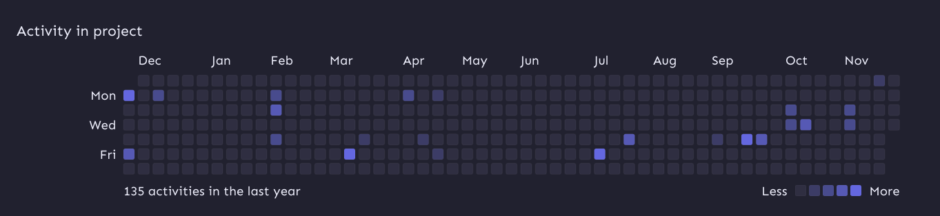
I'm also passing in the theme explicitly as the `colorScheme` property.
Without that prop, the graph uses your system color scheme (according to
the docs), which may not be the same as your Unleash theme color scheme.
To avoid getting visible borders for the activity squares, I've added a `svg rect` override on the containing element that sets the svg rect strokes to be invisible.
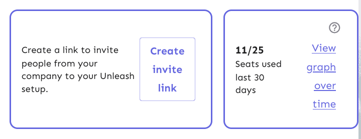
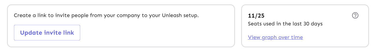
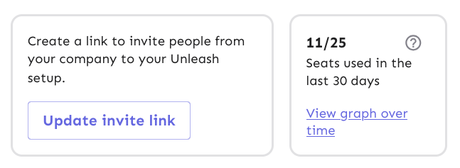
This PR throws in a number of fixes to the UsersHeader's invite link and
licensed users components:
- Change the border colors from the primary purple to being a standard
border color
- Fix text / button wrapping in the invite link component. It now wraps
such that the button goes onto the row below the text if it cannot fit
on the same row. The text within the button will not wrap until it
absolutely has to (and is on its own line).
- Fix the wrapping behavior of the licensed users box: the bottom row
("seats used 30 days" and "view graph over time") will now wrap at the
same time as the other button in the other box.
- Fix some text sizes within the licensed users box
- Fix the button to look more like a link in the licensed users box
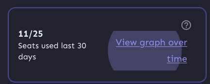
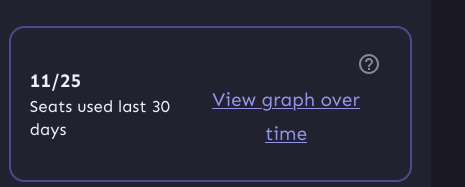
Most of it is pretty standard fare, but I've taken a slightly different
route when it comes to the licensed users box component.
I switched the whole component to be a "figure" instead of an article. I
was trying to figure out how I could make it behave the way we wanted
visually while still linking the "seats over 30 days" to the "11 /25"
counter text. The examples on MDN use things such as code snippets,
poems, quotes, etc, in addition to the more common image elements. And
in a way, 11/25 is a figure representing the number of seats used, so I
went with that for now. That said, I'd be very interested to hear some
other takes on this.
Now, because the `figcaption` has to be the first or last element of a
`figure` element, I had to include the "open sidebar" button inside the
caption, which isn't ideal. But I can live with it, I think.
Before:


After:

This change updates the stat for archived flags "this month".

Turns out we were accessing the wrong property on the data object.

Additionally, changes the label to say "last 30 days" instead of "this
month"  because that's more accurate.
This PR fixes the isOss check for the licensed users component. It also
addresses two things in the UI:
1. It right-aligns the text on the button so that when we get narrower,
the text doesn't slide to the center. There's a few more things that we
can fix later, though. When you press it, it'll still show the entire
button layout:
And when you focus it with a keyboard it still looks like a button.
We can get around that by using a regular button and just styling it a
bit, but making the text align will take some extra jimmying around (not
done in this pr, but got stashed changes for it)

But this is what it'd look like now with centered text:
2. It wraps the entire left column in a `p` tag, because they belong
together. They're not two logical paragraphs. So instead, we wrap them
in spans and surround them in a
p. `Display: contents` makes the p "invisible", so its children act as
if
they're children of the container above it instead.
This PR improves handling of very narrow screens for the project status
header:
- Add a right margin so that it won't overlap with the close button.
- Make it so the icon in the header doesn't shrink.
https://linear.app/unleash/issue/2-2989/unleash-payg-auto-traffic-billing

Integrates auto traffic bundle billing with PAYG.

Currently assumes the PAYG traffic bundle will have the same
`$5/1_000_000` cost as the existing Pro traffic bundle, with the same
`53_000_000` included requests. However some adjustments are included so
it's easier to change this in the future.
This PR fixes an issue where the personal dashboard would fail to render
if the flag was called `.` (Curiously, it was not an issue with `..`;
probably because they end up accessing different URLs).
I've taken the very pragmatic approach here of saying "right, we know
that `.` and `..` cause issues, let's just not even try to fetch data
for them".
The option, of course, is to bake in more error handling in the
components, but due to how we've got hooks depending on each other, it's
a bit of a rabbit hole to go down. I think this is a good compromise for
now.
So now, you'll get this instead:

I've also gone and updated the text for when we get a metrics fetching
error, because this probably isn't due to the flag name anymore. If it
is, we want to know.
This PR updates the project status service (and schemas and UI) to use
the project's current health instead of the 4-week average.

I nabbed the `calculateHealthRating` from
`src/lib/services/project-health-service.ts` instead of relying on the
service itself, because that service relies on the project service,
which relies on pretty much everything in the entire system.

However, I think we can split the health service into a service that
*does* need the project service (which is used for 1 of 3 methods) and a
service (or read model) that doesn't. We could then rely on the second
one for this service without too much overhead. Or we could extract the
`calculateHealthRating` into a shared function that takes its stores as
arguments. ... but I suggest doing that in a follow-up PR.

Because the calculation has been tested other places (especially if we
rely on a service / shared function for it), I've simplified the tests
to just verify that it's present.

I've changed the schema's `averageHealth` into an object in case we want
to include average health etc. in the future, but this is up for debate.
This change updates the "view unhealthy flags" link in the project
status sidebar to use the correct filter. The previous link was put in
before we had a filter for potentially stale, so this updates the link
to use that filter.
This PR adds the option to select potentially stale flags from the UI.

It also updates the name we use for parsing from the API: instead of
`potentiallyStale` we use `potentially-stale`. This follows the
precedent set by "kill switch" (which we send as 'kill-switch'), the
only other multi-word option that I could find in our filters.
Remove everything related to the connected environment count for project
status. We decided that because we don't have anywhere to link it to at
the moment, we don't want to show it yet.
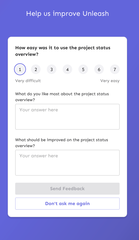
This PR fixes a number of keyboard accessibility issues with the
feedback sidebar. They are (in no particular order):
1. The radio inputs don't have a focus style for `focus-visible` (when
keyboard focused).
2. There's two close buttons there for some reason? One is invisible,
but you can tab to it?
3. The sidebar doesn't trap focus, so you can tab out of the modal and
continue tabbing through the main page (with the modal still open)
4. The sidebar doesn't steal focus. When you open it, your focus remains
on the button you used to open it. So if you want to navigate to it, you
have to go through the entire page (behind the modal) to get to it.
5. The sidebar can't be closed by 'escape'.
The fixes are:
1. Apply the same styles when focus visible as when hover
2. Wrap the component in the `BaseModal` component
3. Wrap the component in the `BaseModal` component
4. Wrap the component in the `BaseModal` component
5. Wrap the component in the `BaseModal` component
(see a theme here?)
Additionally, because the base modal has its own `open` state, I removed
the wrapping conditionally render, reducing nesting by one stop. Most of
the changes in the file are just whitespace changes.
I considered also applying an auto-focus to the first input in the
sidebar, but our linter doesn't like it. Additionally MDN lists the
following [accessibility
concerns](https://developer.mozilla.org/en-US/docs/Web/HTML/Global_attributes/autofocus#accessibility_concerns)
> Automatically focusing a form control can confuse visually-impaired
people using screen-reading technology and people with cognitive
impairments. When autofocus is assigned, screen-readers "teleport" their
user to the form control without warning them beforehand.
>
> Use careful consideration for accessibility when applying the
autofocus attribute. Automatically focusing on a control can cause the
page to scroll on load. The focus can also cause dynamic keyboards to
display on some touch devices. While a screen reader will announce the
label of the form control receiving focus, the screen reader will not
announce anything before the label, and the sighted user on a small
device will equally miss the context created by the preceding content.
So I'll leave it off.
Refetch actionable change requests whenever you perform an action on a
change request. This ensures that the change request notifications are
up-to-date for you. Of course, it can still get out of sync if someone
else performs an action on the change request, but that's more of an
edge case.
This change makes it so that the project status sidebar will close
when you follow a link within it. We do that by using JS event
bubbling and attaching a handler on the modal parent. We can listen
for events and check whether the target is an anchor and, if so, close
the modal.
This PR fixes a few small UI issues reported by UX. It:
- Adds hover colors to the lifecycle boxes
- Adjusts the font size for the health widget to match project resources
and lifecycle
- Makes the `view health over time tooltip` take you to the insights
page with the current project preselected

This PR adds stale flag count to the project status payload. This is
useful for the project status page to show the number of stale flags in
the project.
This pr adds tooltips to lifecycle boxes when they're hovered or
focused. There's also some small copy tweaks.
We decided to go with tooltips instead of buttons for this iteration
because it'd be an easier thing to implement, especially in regards to
keyboard navigation and avoiding overlapping other elements.
I've also not changed the background color of the tooltips just yet.
There's two reasons for this:
1. The practical reason is that our `HtmlTooltipComponent` doesn't allow
you to do that and I didn't wanna start messing about with that.
2. If all our other tooltips follow this color scheme, why not do the
same here? Especially because they're not buttons anymore, so using the
same color as other tooltips seems sensible.

This PR adds a header and a tooltip to the lifecycle widget. Most of the
changes in ProjectLifecycleSummary is indentation changes due to
wrapping the component in another row container.
Additionally, this PR touches the `HelpIcon` component because we'd like
the tooltip to be wider than what we currently set as the default for
the help icon. The help icon uses the html tooltip component, which has
a maxWidth prop, but it does not expose that. So I've adjusted it to let
you do that.
Header with tooltip:

Hooks up the project status lifecycle data to the UI. Adds some minor
refactoring as part of that effort.

## Other files

There's been some small changes to
`frontend/src/component/feature/FeatureView/FeatureOverview/FeatureLifecycle/FeatureLifecycleStageIcon.tsx`
and `frontend/src/hooks/useLoading.ts` as well to accommodate their
usage here and to remove unused stuff. The inline comments mention the
same thing but for posterity (especially after this is merged), the
comments are:

For
`frontend/src/component/feature/FeatureView/FeatureOverview/FeatureLifecycle/FeatureLifecycleStageIcon.tsx`:

> The icon only needs the name to pick.
https://github.com/Unleash/unleash/pull/7049 deliberately changed the
logic so that the completed stage gets the same icon regardless of its
status. As such, to make the icon easier to use other places (such as in
the lifecycle widget), we'll only require the name.

For `frontend/src/hooks/useLoading.ts`:
> There's no reason we should only be able to put refs on divs, as far
as I'm aware. TS was complaining that that a `ul` couldn't hold a div
reference, so I gave it a type parameter that defaults to the old
version.
The archived functionality has been moved into the feature list, and we
are showing a tooltip. However, it doesn’t make sense to display it to
new customers, as they wouldn’t be familiar with the previous behavior.

I've introduced a "new/old user" classification, where I’m setting
08.11.2024 as the dividing line. All customers created after 08.11.2024
will be considered new, and we won’t display the tooltip for them.
Everyone else will be treated as old customers.

This approach means there will be a brief period from 08.11.2024 until
the release date where any customers created during this time will be
categorized as new, even if they still have access to the old archive.
For simplicity, I’m willing to accept this risk, as it's likely that in
95% of cases, for those few customers (0–10), they won’t need the
archive functionality immediately, so it’s acceptable not to display the
tooltip for them.

This setup is temporary in our code base and will be removed with a
feature flag.
Fixes browser console warnings and errors related to the event timeline
and strategy form.

- **Event Timeline**: Addressed a warning where the environment filter
rendered with a default environment value (production) before
environments were fully loaded.
- **Strategy Form**: Resolved an error caused by forwarding the enabled
prop as a boolean.
Add rough implementation of the lifecycle summary components.
This PR adds components for all the different lifecycle stages. We don't
have any data yet, so they're all hardcoded for now, just to get the
visuals right. I'm expecting the lines of code to drop and to
refactor/extract some structures as development continues.
For now, this is what they look like:

Things to note:
- The lifecycle stage icon colors don't match up with the sketches, but
they match up with what we currently have in the app. If we change them,
we should change them together.
- This implementation does not contain the "Flag lifecycle" header or
the "view graphs" link.
This change opens up the project segments page to OSS users. They
could navigate to it explicitly before, but would be told it was a
premium feature (which it is not (since 5.5)).
After this, it'll show up in the settings sidebar as for
pro/enterprise, and you'll get the actual segments table instead of
"this is a premium feature" message.

This PR adds member, api token, and segment counts to the project status
payload. It updates the schemas and adds the necessary stores to get
this information. It also adds a new query to the segments store for
getting project segments.
I'll add tests in a follow-up.
We found an issue where we'd get a minified react error referencing the
LazyProjectExport component.

We suspect that the issue might be the conditional rendering of this
component, so the fix is to always render it, but to use the flag to
check whether we should show the count or not.
Addressing some oversights that led to browser console errors.
This PR fixes console errors related to the recently introduced
highlight component (#8643) and tag row component in the new flag
metadata panel (#8663).
This PR wires up the connectedenvironments data from the API to the
resources widget.
Additionally, it adjusts the orval schema to add the new
connectedEnvironments property, and adds a loading state indicator for
the resource values based on the project status endpoint response.
As was discussed in a previous PR, I think this is a good time to update
the API to include all the information required for this view. This
would get rid of three hooks, lots of loading state indicators (because
we **can** do them individually; check out
0a334f9892)
and generally simplify this component a bit.
Here's the loading state:

This change adds a few small bits of styling to the status modal to
get us going. It:
- adds padding to the whole modal
- adds a row for the health and resources widgets
- add project health placeholder
It leaves the project activity widget alone for now.
it makes the modal look like this:

**Issue fix:** Resolves#8618, where environments were incorrectly
appended to the route.
**Change:** Introduces `ossPath` specifically for OSS users, as OSS
lacks the default `/settings` path, starting instead from `api-access`.
Follow-up to: https://github.com/Unleash/unleash/pull/8642
Introduces a reusable `Highlight` component that leverages the Context
API pattern, enabling highlight effects to be triggered from anywhere in
the application.
This update refactors the existing highlight effect in the event
timeline to use the new Highlight component and extends the
functionality to include the Unleash AI experiment, triggered by its
entry in the "New in Unleash" section.
This PR begins to stub out the project resources widget. I still need
one more piece of data and then to work on the styling, but it's a
placeholder for now. I've also moved the project status modal to its own
folder so we can group the widgets etc. I'd like to get that merged
quickly to avoid any future conflicts, which is why I'm making the PR
ready now.
This PR hooks up the actionable change request data to the counter in
the UI. It:
- creates a getter for the data. It only exposes data. We don't really
care about error or loading for this (it's not an important piece of
data), so we don't expose that just yet.
- Adds orval-generated schema
- Uses the hook in the UI.
It also stwitches the previous "notification badge" for MUI's built-in
badge. We already use that badge component for the event timeline, so I
thought it would make sense to do it here too. Overall, the effect is
pretty good, but there's a few kinks we might wanna work out. I'll make
a follow-up for that (worked out in this PR after all)
The two lints being turned off are new for 1.9.x and caused a massive
diff inside frontend if activated. To reduce impact, these were turned off for
the merge. We might want to look at turning them back on once we're
ready to have a semantic / a11y refactor of our frontend.
Archived features can be searched now.
This is the backend and small parts of frontend preparing to add
filters, buttons etc in next PR.
---------
Co-authored-by: Thomas Heartman <thomas@getunleash.io>
This commit fixes invalid prop spreading warnings in all the table rows
I could find through a quick search in the code base.
The issue is that you can't spread the "key" prop into a component. It
*must* be an explicit prop.
The process is the same everywhere:
1. Instead of spreading `row.getRowProps()` into the component, we
extract and split it: `const {key, ...rowProps} = row.getRowProps()`.
2. Do the same thing for cellProps.